Bastian Baker as guest presenter

Another high-profile addition to «Glanz & Gloria»: Following Melanie Oesch, Swiss singer-songwriter Bastian Baker is now also trading the music stage for the studio and will spend a week as a guest host presenting the latest news from the world of show business.

Celebrities report on celebrities. This was the motto of "Glanz & Gloria" back in 2012, when six well-known personalities from show and sport appeared in front of the camera to present the people magazine for one week each. The series of celebrity guest presenters continued with folk music star Melanie Oesch in September 2013. Now the young Swiss singer-songwriter Bastian Baker is following in her footsteps and will host the show in the week from October 14 to 18, 2013.

1.baker_.bild_

Lucerne youth culture station Radio 3fach turns 15

Radio 3fach became Switzerland’s first youth culture radio station when it went on the air on October 17, 1998: a success for the student experiment. Since then, the Lucerne-based local station has launched the careers of several radio talents, organized concerts, and promoted bands.

The commercial-free radio station from Lucerne is aimed at 16 to 25-year-olds from the region. It is also produced by young people of this age. The creators often improvise and, according to their own statements, avoid "commercial hit parade droning". Instead, programs on metal, hip hop, indie and Swiss music can be heard every evening. The program also includes political background shows such as "Krass Politic" or "Campus Radio". The station also organizes the "Funk am See" music festival, the annual "Kick Ass Award" for up-and-coming bands and the Volière summer bar in Lucerne. 3fach is mainly financed by federal fee money and sponsorship contributions. Today, the station has four permanent employees and over 40 freelancers.

Springboard for media people

The station, nicknamed "Kick Ass Radio", has already produced several talents, including SRF3 presenter Anic Lautenschlager and entertainer Dominic Deville. According to those responsible, there is a clear recipe for success: "Our age guillotine", says 24-year-old Radio 3fach managing director Mike Walker to the news agency SDA. Young people up to 25 are allowed behind the microphone at the station. Anyone older has to leave. This means that new people are constantly joining the team, providing fresh ideas.

Difficult phases

3fach had to fight hard for the honor. Founder Attila Revesz worked hard on the project for six years. He started it in 1993 as a 16-year-old cantonal schoolboy. After several applications, the federal government finally granted a definitive license in 1997. Founder Revesz had previously reached an agreement with the radio competition that 3fach would do without commercial advertising. In return, the youth station received 230,000 francs a year from the private radio stations Pilatus and Central until 2004. A shock came in 2003: radio founder Attila Revesz committed suicide. The station also went through difficult times in 2006 when it was in dire financial straits. Presenters and permanent employees sometimes had to wait several months for their wages.

Birthday book

The staff and fans will be celebrating the 15-year anniversary with several events in the week from October 14 to 20, 2013. For example, former presenters will be back behind the microphone during the week. And on October 17, the radio producers will publish a book about the station to mark the anniversary.
(SDA)
 

An obituary for Paul. From Paul.

By Paul Gredinger, transcribed by Reinhold Weber.

The task is to write an obituary for Paul Gredinger. We thought about it: nobody can write an obituary for Paul Gredinger more authentically than Paul Gredinger. The solution: We publish Paul's original statements one-to-one, published in the 365-page GGKalender 1992, among others. He might find anything else too pretentious.

nachruf-2

The Advertising Week impact check September 2013

We show how current campaigns are performing with consumers.

In terms of awareness, the Emmentaler ad with the new wrestling king from Leo Burnett is in first place, followed by the Credit Suisse ad from the advertising agency Scholz&Friends. In third place is the ad for Michel by the Erdmannpeisker agency. The Rent a Rentner ad from the Werbeanstalt agency won the Uniqueness criterion ahead of the London ad for Tibits from the Wirz advertising agency and the Swiss Meat ad from the Polyconsult agency. In the Brand Fit criterion, Schweizer Fleisch won ahead of Michel and Emmentaler. Rent a Rentner came out on top for Likeability, followed by Schweizer Fleisch and Tibits.

Impact Check of Werbewoche September 2013 (PDF)
Detailed results (PDF)

On the matter: dubious dialogue

Every journalist knows that all it takes is a few trigger words to make the comment sections in newspapers’ online editions literally explode. Such trigger words include Blocher, crime committed by foreigners, reckless drivers, welfare, animal abusers, and Europe. But terms like “scammers,” “bonuses,” “soccer hooligans,” and “teenage drinkers” also generate a lot of comments. Some comments are good and valuable, while others are borderline. Very often, only the very first comments address the actual topic; then the discussion devolves into mutual insults. The comment trolls strike again.

Something similar happens on Twitter and Facebook. Some politicians have already found that their emotional, below-the-belt tweets and remarks have not helped their careers. Such inappropriate comments and tweets are proof for some people that such statements should not be taken seriously. Michael Ringier also tried to prove this at the media congress with quotes from comment columns.

What was it like in the old days? In the pre-Internet era, you could simply throw letters to the editor that didn't suit the editor in charge or that were out of tone into the trash. That was censorship. Monologues were the trump card. Today, people are liberal and often allow a tougher discussion. The reader should be able to have his say. Dialog is sought. So far, so good.

The Lampedusa refugee drama shows the limits of dialogue. Christof Moser wrote in Schweiz am Sonntag: "Twice this week I had tears in my eyes. The first time when I saw the TV images of the refugee tragedy off Lampedusa: over 300 drowned refugees, including pregnant women and children. And the second time when I read the comments under the articles about the tragedy."

One can only agree with him, because what went on in the comment columns was simply disgusting. It was little consolation that some of the racist and inhuman comments abroad were even more blatant. For me, at least, I briefly wished for the return of censorship. But that would be the wrong way to go. In the context of the discussion about the quality of the media, one hears again and again the opinion that journalists generally write past their readers and that they would not take seriously what moves the population. Maybe so. But I don't want to take the dull-witted Lampedusa comment writers seriously at all, otherwise it makes me sick. Unfortunately, I don't have a solution for a dialogue either. It would be important.

Pierre C. Meier, Editor-in-Chief [email protected]
 

Postfinance sponsors The Tent

Since 2013, Postfinance has been the new main partner of the Swiss Touring Theater. Publicis is launching a campaign to mark the new touring program.

With the sponsorship, the financial services provider wants to expand its commitment in the cultural sector in the long term and strengthen it nationally. The company wrote in a statement on Thursday that the tour schedule had already been expanded from 16 to 21 venues.

Postfinance's commitment is communicated in the style of the umbrella brand "Everyone has what it takes to...". This time, however, the Postfinance customer does not have "...what it takes to be a financial expert" - but "what it takes to be a mega-fan" after visiting Das Zelt. The campaign starts around a month before the communication of the new 2014 tour program of Das Zelt - Chapiteau Postfinance and will be present until mid-November.

Responsible at Publicis: Roger Ruegger (CD), Bettina Klossner and Tom Kees (AD), Oliver Gisi (text), Barbara Lagger (consulting), Beni Kägi (art buying), Tiago Dias, Simon Grasser, Andy Günter (digital), Andrea Achermann (DTP), Bianca Nerlich (production), Diana Scheunemann (photography).

1.circus1
1.circus2
1.circus3_0

The Product is the Hero

Marti Communications lets SIGG show its colors. Three steps to a new campaign, including a brand workshop.

SIGG's aluminum bottles have long since found numerous fans outside the country's borders as well. In addition to Europe, the USA and China are among the key markets. The brand is increasingly confronted with global positioning issues that can no longer be answered with a pure "Made in Switzerland" label. Against this background, Marti Communications was commissioned to develop a positioning platform for SIGG that would meet international requirements.

Unbenannt-9_13

Two-dimensional target group model

Characteristic of SIGG is the two-dimensional target group structure. On the one hand, through the sociodemographic axis, which appeals to children from the age of three to adults of retirement age. On the other hand, the psychological axis, which separates urban trendsetters from nature-loving traditionalists. This had to be decisively taken into account for the development of the positioning platform. "To master the balancing act between target groups and markets, the conceptual work was divided into a three-stage model," explains consultant Thomas Krebs. It began with a brand workshop that introduced participants to a shared brand vision. In SIGG's case, this was attended by around 20 people from all relevant markets, who used imagery and association exercises, among other things, to develop their own brand worlds for their brand. On this basis, Marti Communications developed various creative concepts. Together with DemoScope, these were subsequently subjected to a representative pre-test in all markets to check their suitability.

Colors make bottles

In all markets, it has become clear that the colors of the SIGG bottles are a decisive feature that earns SIGG a great deal of sympathy. Be it as a colorful fashion accessory, as an expression of a vital and non-conformist lifestyle, or as an actual color signal to differentiate from the social environment. It is not only in less developed markets that the bottle and its contour are an important feature for the perception of SIGG. "Only when the bottle is shown in a large and vivid way do the ads meet with acceptance and were able to attract the necessary attention," Peter Marti's creative team concluded from the tests. They created three subjects that will be used as the first generation of the new campaign from fall 2013 and position the brand as a colorful original. The visuals can be seen on- and offline in national and international media. A further development for 2014 is already in the works.

Brand workshop

The tool developed by Peter Marti for the efficient development of sustainable brand strategies can be implemented as a brand workshop in a few weeks, unlike other strategy processes. It requires only a few hours of commitment from the client. Another advantage is that different bodies (VR, management, marketing, sales) of the client are actively integrated. This opens up the optics and increases internal acceptance. Besides SIGG, Marti's method has also been developed and implemented for companies such as Sunrise, Charles Vögele, Schulthess, Domino's Pizza, Manpower or Diethelm Keller Brands.

New headquarters on historic site

The place where one stays and the impressions of the surroundings are reflected in the expression and creativity of the people who inhabit that place. "At least that's what I've experienced over and over again over the years," says Peter Marti. Since this fall, his Marti Communications is newly rented in the Art Nouveau building at Forchstrasse 280. In the 4-meter-high and bright rooms, the creatives of the famous agency Wiener, Deville & Wälchli used to work. Max Wiener's crew experienced its most important growth phase here from 1963 to 1972, before the agency moved to Küsnacht. Peter Marti also later worked there at Wiener, Deville. The rest is coincidence.
 
Andreas Panzeri

Unbenannt-10_9

Impaled: Nostalgic rejuvenation

Anne-Friederike Heinrich, a freelance contributor to *Werbewoche*, on childhood memories worth revisiting.

One thing is probably the same between all parents and children: although you have long led a life independent of mom and dad, you are still a child at home with your elders, or even the "little one" in serious cases. This is often annoying, but it doesn't just have disadvantages. Because in this parental sanctuary, you can always return to the bookshelves of your childhood and youth and dive into the worlds and stories of yesteryear. If you're lucky, the books are even still in the old children's room, which has become a sewing room or guest room, or they are neatly gathered in cardboard boxes in the basement.

The dives between the old book covers awaken wonderful memories of nightly forbidden reading hours under the covers, of stories that were always loved to listen to or read, and of pages that were never allowed to be opened again because of an eerie picture or a terrifying tale. Sometimes you even discover that you had the same favorite books as your spouse, which is nice and like a piece of childhood spent together. At least, when it's not "Hanni and Nanni at the Pony Farm."

Books (let) live

Especially for those who have small children of their own, a foray into the bookshelves of yesteryear can be very fruitful. After all, why not save what was good and beautiful in one's own childhood, what inspired imagination and dreams, for one's own offspring in the here and now? And at the same time, be a little child, fantasist and dreamer yourself once again. Thought, done. As I recently packed a few of my paper childhood companions into my suitcase at home for our son, a thought popped into my head: "Will these books one day end up in the hands of our children's children? Or will our grandchildren someday ask our son 'You, Dad, where are our childhood books anyway?" and get the answer 'I deleted them all from my tablet.'"

The ravages of time

Sure, the children's books I'm lugging home now are heavy - I'll probably have to pay excess baggage. I don't know where to put them at home, because our son's nursery is not particularly spacious. Besides, the books exude the smell of bygone days and one or the other page gives information about a menu or a chocolate snack from 35 years ago. Some of the spines are broken, some of the pages are crumpled or scribbled on - and yet the idea of neat, clean, space-saving books stored and finally deleted on the tablet sends a sad shiver down my spine. Because all the memories that pop up alongside and between the stories being told are worth more to me than hygiene, practicality, and new value. It's like I'm a little younger since the old books are back with me. That's why I hope that, despite all the technological progress, I will one day rediscover one or the other of my books on our grandchildren's bookshelves - because the old can also be a fountain of youth. And one day I'll be able to use it even more than I already do today.
 

Heating replacement due?

With a campaign by Metapur, WWZ wants to address potential natural gas users along the natural gas pipelines and publicize the new sustainable natural gas products.

WWZ sees a high potential for densification along the installed natural gas pipelines, the company announces. A campaign is now being launched to encourage investors to consider natural gas as an option when replacing their heating systems. To this end, WWZ has developed new natural gas products geared towards sustainability requirements with the addition of renewable biogas. WWZ wants to strengthen its image as a sustainable company. To convey this message, the "sunflower visual" from the VSG (Association of the Swiss Gas Industry) natural gas campaign was adapted and combined with the core messages of WWZ's densification communication and a background motif that is well-known in the region.

Responsible at WWZ Energie: Nathalie Lüthi, Robert Watts. Responsible at Metapur: Jens Riedweg (AD), Nicole Fink (graphics), Daniel Steiner (text/concept).

1.wwz_.bild_

New paths in search engine optimization

Search engine marketing specialists are happy to offer recommendations on how to get a website to appear at the top of search results. However, some strategies that were considered top-notch just a short time ago are now a flop. That’s reason enough to highlight what needs to be considered today when optimizing a website for search engines.

What is sometimes sold as search engine optimization is quite simply the basis for launching or relaunching a website. This includes the evaluation of the right keywords, the naming convention (page title, URL, headlines). It should go without saying that the old URLs are redirected to the new ones during the relaunch (redirects), as well as speaking URLs and an XML sitemap. The search engines require that the search results can be used equally by all users. This is why websites that do not display information adequately on smartphones or tablets can be penalized by search engines. Responsive design is therefore an important requirement for the search engine optimization of a website today.
 
In recent years, search engine optimization has focused too much on keyword evaluation and optimizing website content for keywords. Too little attention has been paid to the meaning of a search query and the provision of information after the search. Google is now counteracting this with algorithm updates (Panda etc.) and a new algorithm (Hummingbird). With these measures, Google is separating the valuable information on a topic from the worthless information in order to provide users with the best possible answers to their needs, questions, requirements and wishes. This rethink at Google demands more marketing thinking from website operators: in order to be placed at the top of the search results, a company must strive for an authoritative position by providing information on a topic or specialist area on the web:
 
- The intentions, needs and problems of consumers must be known 
- The content of a website must be structured in such a way that it anticipates the questions of (search engine) visitors and provides the corresponding answers 
- Rich snippets are intended to support semantic searches. The content of the rich snippets appears in part in the search result and gives the user an idea of what information the website has to offer: Restaurant reviews, prices, opening hours, audio samples of a CD, etc. The snippets allow search engine users to better assess whether a website is relevant to their search query.
 
For websites that provide the best possible information for the needs and wishes of their visitors, the Hummingbird algorithm has not changed much. For everyone else, there is work to be done.
 
Nicolas Kaufmann

The sky hangs full of fonts

The «Tÿpo St. Gallen» symposium was held for the second time in St. Gallen, the City of Books, from September 20 to 22, 2013. At this high-profile event, presentations were given on the topic of «white space,» fonts (typeface design), ideas and concepts, and book design. With 300 guests in attendance, the auditorium at the St. Gallen School of Design was once again sold out.

Unbenannt-7_15

There are as few absolutely new things to be invented in typography as there are in bed or in the art of cooking." None other than the unforgettable design professor Kurt Weidemann, who died two years ago, put this thesis into the world. Indeed, it is hard to refute. Nevertheless, what is different today than in the past, when typography was still a leaden craft? The time when the best typefaces (fonts) in use had their roots in the Middle Ages - and are still in use today? What has certainly remained is that today, just as in the past, there are two types of typography - good and bad (see also "Intermission talk with Jost Hochuli"). What has also changed is the proliferation of new fonts, the many "private" fonts; that is, fonts that can be "designed" relatively easily on the computer. Mostly based on existing typefaces. "Dinosaurs", i.e. old typographers, who are of the opinion that these new fonts can be thrown into the Atlantic without causing cultural damage, are often rebuked with the remark that there are always new things in clothing fashion, new skirt lengths, other colors, other cuts, etc., and that these new fonts enrich life and typography.

White space is not empty space

Talking about something that is not there - namely about white space - proved to be not so easy for the nineteen international expert speakers. Thus, in addition to the rhythm between black and white, the interaction between negative and positive, and further on particularly successful works, ideas and concepts as well as book design were lectured. In addition, the designer Clemens Theobert Schedler led the audience as a moderator as usual light-footed, with charm and wit through the conference program. Around 300 guests listened to speeches by typography luminaries such as Jonas Vögeli, Erik Spiekermann, Veronika Burian, Jost Hochuli and other interesting personalities. The crowning finale was the letter walk on Sunday morning through the city of St. Gallen with Florian Hardwig. (It should be noted that the symposium could have been completed in two days. Three days are simply "too much" in this day and age).

Spiekermann's "staccato" language

"A hole is where something is not. The hole is an eternal companion of the non-hole: hole alone does not occur, as sorry as I am" (Kurt Tucholsky). This quote came to the mind of the speaker Erik Spiekermann during his research on the topic of white space. Indeed, the first few sentences of Tucholsky's "sociological psychology of holes" can be compared with the conference topic "white space". If there were no white space, there would be no typography and thus no Tÿpo St. Gallen, said Spiekermann, who is a typesetter, printer, art historian, information designer, type designer, specialist author, professor, and Dr. h.c.

Typography as a vanity fair?

Spiekermann, too, likes to lend a hand when it comes to modifying existing fonts. At the time, he whittled down the first drafts of "Helvetica" and eliminated the really bad details (see picture). Today, he says of "Helvetica": "You can use it for anything, but it's not really sexy." Other sans serifs have more pizzazz, he says, but you can't use them for everything. Recently, he has been working on a redesign of "Helvetica," with his new variant (e.g., the lowercase "g") reminiscent of American Art Gothic. Therefore, a former typesetter involuntarily asks himself: Why is he doing this, and doesn't he just use Art Gothic? Typography as a vanity fair? Those who are not vain, according to Spiekermann, are often content with the average. Towards the end of his talk, Spiekermann didn't miss the opportunity to give the audience a tangible piece of advice that advertising professionals (consultants and others) could also take to heart: "Never work with and for assholes!" Spiekermann was certainly among the more renowned speakers, yet his manner of speaking - staccato, d'origine de Berlin - must be chalked up. He spoke - as usual - too fast, so that many, especially French-speaking Swiss, could not follow him completely. He should, with respect, also modify his 08/15 machine-gun way of speaking, not only writings. His "Spieke" was an imposition for all non-Berliners.

Typography that is pleasing to the eye and takes readability to the extreme
 
Yes, they still exist today. The young Swiss designers Samuel Bänziger (28), Rosario Florio (32) and Larissa Kasper (27) create books, magazines, ephemera, websites and visuals for the fields of art, music and architecture. They convinced with the design relaunch of the magazine Saiten. Saiten has been published monthly since April 1994 as a cultural magazine for Eastern Switzerland and is available in numerous cultural venues, stores, restaurants and public institutions in the region of Eastern Switzerland. The main impetus for the launch was the lack of cultural coverage in the local and regional media. Since 1999, the Saiten association has been responsible for publishing the magazine. Saiten is the only cultural magazine of its kind in eastern Switzerland. As an independent product with high journalistic and design quality, the magazine has made a name for itself far beyond eastern Switzerland. Reportages, interviews and portraits from culture and society open the view for the multitude of worlds that take place in the small. The central idea is to open up borders between city and country, world and "province", old and young, "elitist" and "alternative " culture. The Ostschweizer Kulturmagazin is self-financed and receives no subsidies. Moreover, it sees itself as a service to the population (calendar of events) and as a forum that reflects and reflects cultural and social developments in the region, thus complementing the regional daily press.

A magazine to be collected

The trio Bänziger, Florio, Kasper was commissioned in 2012 to redesign the magazine; the publisher deliberately wanted a team from the region, as close cooperation between the editorial team and the designers was desired. The magazine is not sold on newsstands. The aim of the repositioning or redesign was to adapt the content to the times and generally make the magazine competitive - as a magazine that should also be collected and kept. The cultural magazine Saiten is characterized by good journalism. A logo was deliberately omitted; the designers opted for a word mark with strong recognition value, and a distinctive typeface was chosen accordingly. It is also courageous that the editorial pages are kept in black and white; only advertisements are occasionally presented in four colors. The magazine is overseen every month by the designers themselves, who take on the art direction for each issue.

Exhibition within the framework of the symposium

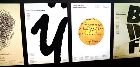
As part of the Tÿpo typography symposium, handwritten letters from the private collection of the St. Gallen designer and typeface designer Jost Hochuli were also on display in a small, fine exhibition. Also on display were the prize-winning books from the 2012 competitions "The Most Beautiful Swiss Books" and "The Most Beautiful German Books". As two years ago, this year's Tÿpo St. Gallen can be considered a success. "What better thing can happen to a school than to create such a public platform for sharing knowledge and experience? The commitment of the School of Design St. Gallen thus becomes visible for the working world of art, design and creation in a sympathetic way - and far beyond the country's borders," explained Thomas Gerig, Head of Department at the School of Design St. Gallen. Claude Bürki

Unbenannt-8_14
Tÿpo again with international luminaries: In addition to the above-mentioned speakers, the following appeared: Jonas Vögeli, Mathieu Lommen, Jost Hochuli, Anna Rüegg, Veronika Burian, Kurt Höretzeder, Susanne Zippel, Willi Kunz. The speakers came from Austria, the Czech Republic, the Netherlands, Germany, the USA and Switzerland. In addition to the topic of "white space," they also spoke at the symposium about ideas and concepts, about historical and art-historical aspects, and about the difference between Latin and Asian scripts.


"Every time has its needs, has the right to express itself differently".
 
Jost Hochuli is probably one of the best-known Swiss typographers and is considered Switzerland's best book designer. Incidentally, he presented an exhibition especially for the event: For one week, letters and posters were on display in the foyer of the School of Design under the title "Some Letters Written by Hand." The letters all come from Hochuli's collection and, to a certain extent, represent the correspondence of world-famous designers. - For Hochuli, writing is just as much design as typography, it is shaping with the body. Claude Bürki spoke with graphic designer, typographer and book designer Jost Hochuli during a coffee break.
 
Jost Hochuli, among other things, there is also talk of type design at this symposium, and not in short supply. We both learned the craft of hot metal typesetting and had to make do with the existing classical and classicistic typefaces of hot metal typesetting - and that went well. Today, we're talking about fonts, numerous new fonts, which I would like to call "private labels" somewhat disrespectfully. Soon every graphic designer will be making his own fonts, based on existing typefaces. What is your attitude to this "fonts-itis", this huge supply of new fonts being passed around? Is it really an enrichment?
 Jost Hochuli: To be honest, I have to say that I am very undecided about this. Of course, I have already asked myself this question, and it has also been asked of me by other people. I'm actually quite sensitive and also a bit conservative. Some of this writing that has come out recently, for example, from the Guardian, the English daily newspaper, is quite excellent. But in my personal work, I can't do anything with "daytime writings" that one anticipates will have disappeared in two or three years. In the case of Rotis (published by Otl Aicher in 1988), I already found at a conference that this typeface - if it survives - will not outlast a period of 20 years, at most in rare applications. And that is exactly how it turned out. It is so far away from the normal, from what one should not notice - because writing is always only a means of transporting language and should not stand out too much as a form. Of course, every typeface has something additional to it, its own climate, its own mood, it is sympathetic, it is cold, it is warm or even repellent. Professor Dr. Antonio Loprieno, rector and Egyptologist at the University of Basel, calls this the "iconic added value". I think that's a very good expression. However, this is nothing new; the old typesetters called this the "mood content of the typeface". But if this mood content is now too noticeable, that's not good.
 
Ninety percent of these fonts could be thrown into the sea without causing any cultural loss, said another professor, Kurt Weidemann. He also said that there was nothing new left to invent in typography. Your opinion? I also came to this symposium with this view ...
I think it's the way it's always been: there's been good typography and there's been bad. Basically, I'm not pessimistic. I certainly don't think it's a negative thing that there are so many typefaces. For certain things, a crazy fashion font can definitely serve its purpose. But I pick and choose. There is nothing fundamentally new. The interiors of the letters, the spacing have to be right. That remains. Every time has its needs, has the right to express itself differently. At these congresses or symposia I let myself be stimulated and take with me what I can use. There were great things presented here. There is a pluralism that I personally appreciate. I certainly don't want to go back to the time when certain ideologues were in charge and thought everything had to be middle-axial. And there are also old Basler Kläuse who think that it must not be symmetrical at any price. The principle that occurs in nature, on trees, leaves, etc., is still true today. Take also the human body, it has not only symmetry. The ideological, the either-or cannot be. The both-as-also is the only reasonable answer.
 
We live in the age of the Internet. Do the same basic rules apply there as in print?
The human eye does not change after all. Of course, the whole thing has to be adapted to the technical conditions. We have the light from behind, and we constantly have movement on the screen. The same applies to building signage. If they are illuminated, larger distances are needed. But the basic principle remains the same, because our eyes have remained the same.

Claude Bürki

Neat guerrilla campaign for Marionnaud

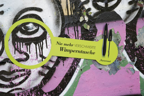
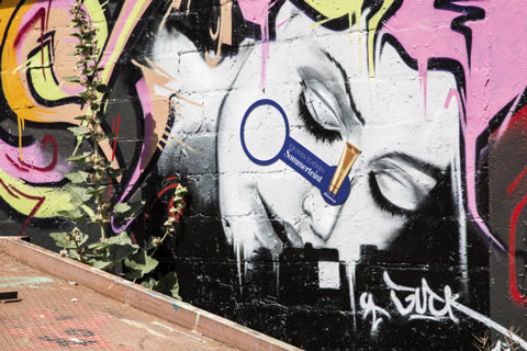
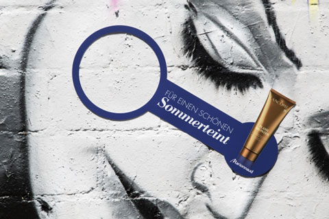
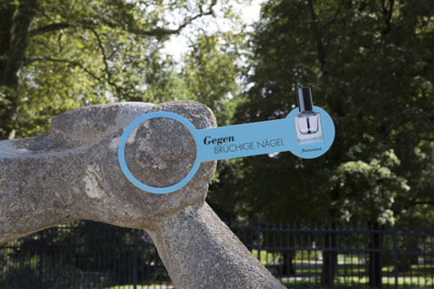
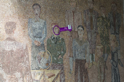
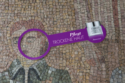
Wunderman is launching a campaign for Marionnaud. It uses beauty products to tackle the "beauty flaws" of monuments and sculptures.

The French perfumery chain Marionnaud is continuously expanding its Swiss store network. As a supporting measure, Wunderman launched a guerrilla campaign in Zurich in late summer. The agency took advantage of the fact that in the urban environment, sculptures, monuments and street art have beauty flaws - just like us humans. Wunderman went in search of these flaws with giant stickers featuring beauty products. The perfume chain Marionnaud wants to show that it has a solution for every problem, according to a statement on Thursday.

Responsible at Marionnaud: Vanesa Baleiron (Trade Director), Martina Müller (Marketing Manager). Responsible at Wunderman: Markus Gut (CCO), Daniel Bieri (CD), Silke Heinzelmann, Miloslav Cerny (AD), Nora Bertoli (graphics), Laureen Zanotti (text), Stéphanie Bertschi, Sonja Bernardi (consulting).

1.kosmetik1
1.kosmetik2
1.kosmetik3
1.kosmetik4
1.kosmetik5
1.kosmetik6
1.kosmetik7
get_footer();