

Marty/Trezzini and Liah make life easier
Marty/Trezzini's new content strategy for Swiss furniture manufacturer Liah Design is designed to inspire people to get back to the essence of life.


 The claim "Light Hearted Living" is not only intended to represent the philosophy of Liah Design, but is also reflected in the diverse range of products offered by the furniture manufacturer. The focus is on flexible and changeable furnishings with weightless lightness. Because rooms lose their functional allocation, Liah Design understands the living space, the terrace as well as the garden as a symbiosis that can be combined again and again.
To market Liah Design's new furniture collection, the Zurich agency Marty/Trezzini was commissioned to launch an integrated content campaign. The result can be understood as a kind of "sign of the times". Because after an intense year marked by uncertainty and monotony, society seems to be slowly moving back to normality.
This is exactly where Marty/Trezzini's content concept picks up: "From the very beginning, the goal of the content strategy for Liah was to present the diverse range of furniture in a lively and original way in order to stand out from other furniture stores in terms of marketing. Above all, we tried to reflect this lightness, which Liah products stand for at their core, also in the storytelling and by means of the content style. Due to the current global situation, we feel an increasing need for more joie de vivre, more looseness. This is exactly the feeling we want to convey together with Liah," writes Marty/Trezzini in a statement.
The result was "The Art of Living," a holistic content campaign consisting of a short film, various content snacks, and a new visual world. Using storytelling, charm and a dash of humor, Liah Design's new content strategy aims to represent the lightness of being.
The content will be featured on all Liah Design digital channels and social media with immediate effect.
Responsible at Liah Design: Nicolas Müller (Marketing). Responsible at Marty/Trezzini (Strategy & Production): Yves Marty (project management & direction), Nino Michel (camera), Gianluca Trezzini (photography), Raphael Schulze-Schilddorf (1st AC), Oliver Muff (lighting), Alix Gerber (art direction), Rominia Häner, Leon Frielingsdorf, Natalie Fitzgerald (set design).


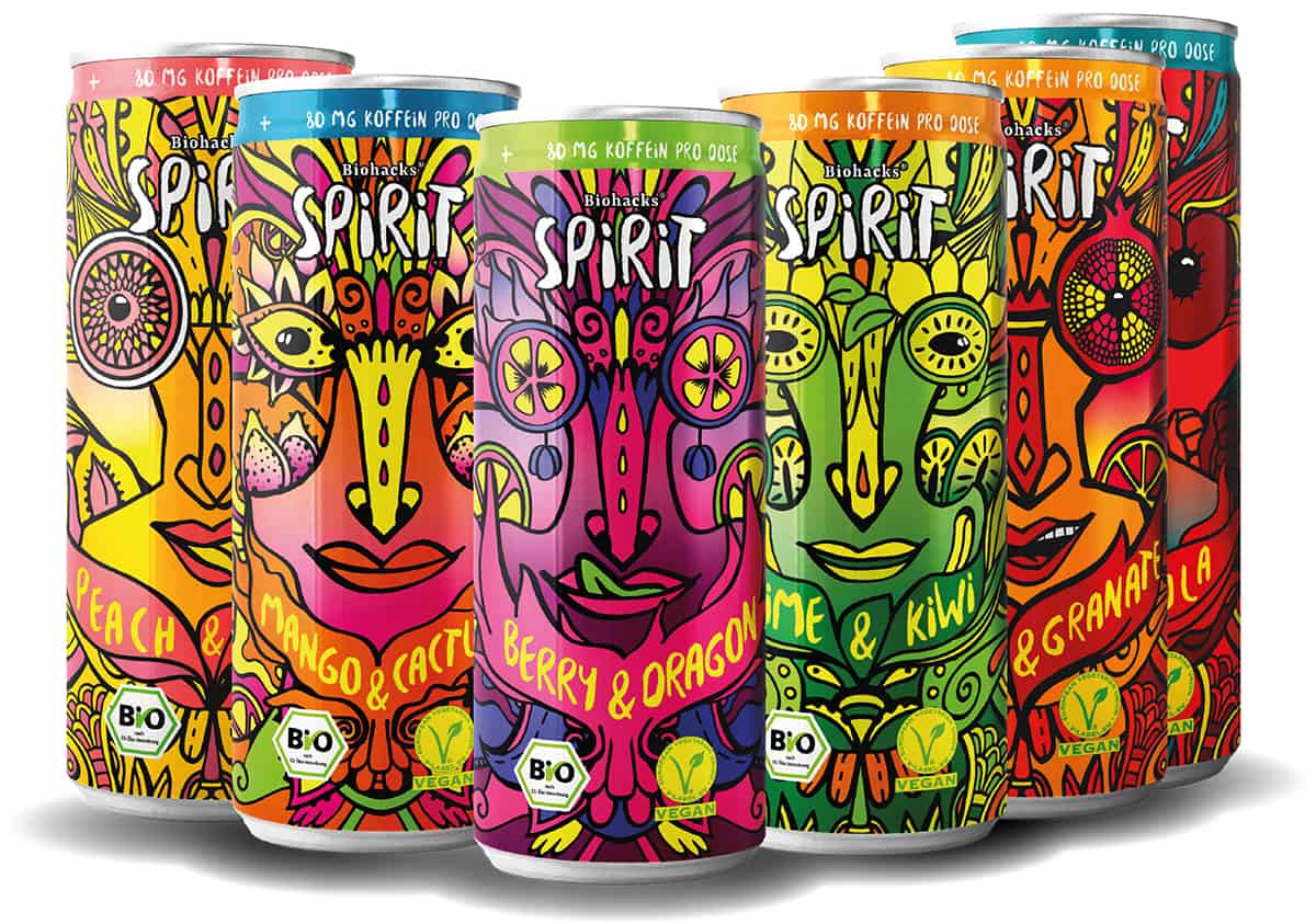
 Biohacks operates in the high-growth functional foods market, developing and marketing organic vegan beverages and nutritional supplements. In addition, the company communicates and promotes biohacking, people's deeper understanding of their own organism with nutrition experts and biohackers. Supported by knowledge, data and technical tools, people should better exploit their physical and mental potential.


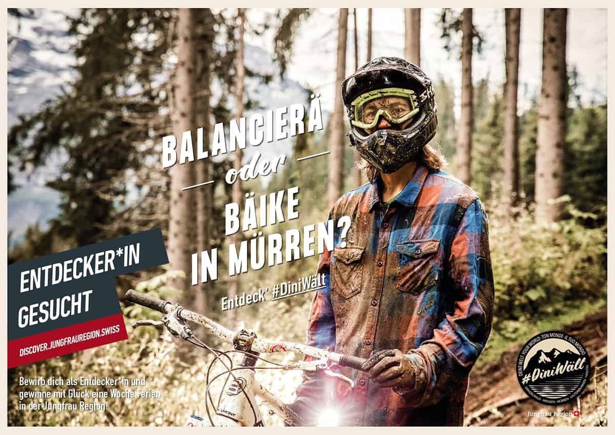
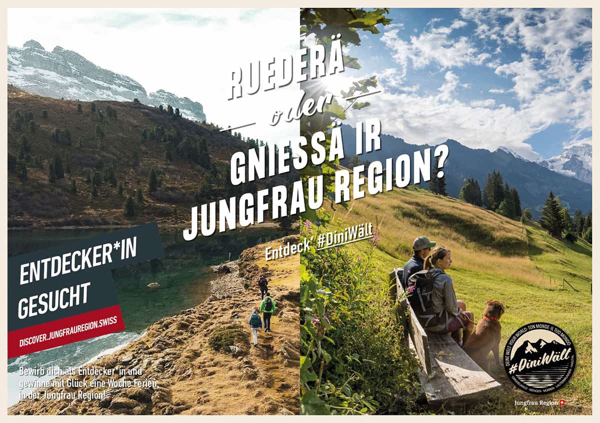
 "With the summer campaign, we want to bring our customers closer to beautiful places in Switzerland, but also introduce them to well-known Swiss authors from a previously unknown, personal side. Moving pictures are ideal for this purpose, as last year's summer campaign "Swiss Book Tour" had already shown. Through the narratives in the videos, the authors' favorite places become destinations for excursions that bring reading to life. That's why we are also implementing a video campaign this year with a focus on social media," explains Christine Roth, Head of Marketing & Communications at Orell Füssli Thalia.





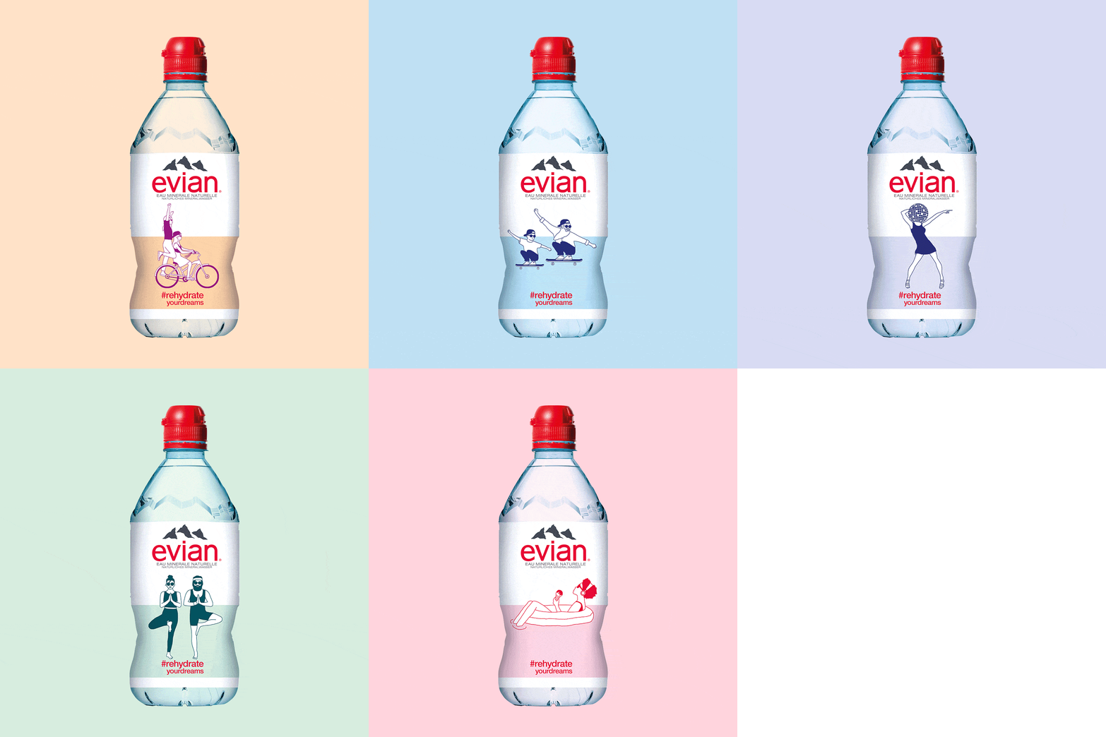
 Summer is on its way and with it the thirst for cooling refreshment and the longing for normality. On behalf of Evian, the Zurich agency Inhalt und Form refreshed the label of the 75-centiliter bottle as part of a POS activation, thus celebrating the slow return to normality.
 Coca-Cola is changing its design for Coca-Cola Zero sugar in a further development of the one-brand strategy launched globally in 2016. The new design is simplified and focuses on type as Coca-Cola's iconic trademark. The original and globally recognized brand color, red cola, takes center stage. Combined with the black typeface, it represents the new Coca-Cola Zero sugar. The new design is simplified and removes additional elements such as the red disc to enhance the typeface as Coca-Cola's trademark and make the packaging more consistent. The new Coca-Cola logo has been raised to the top of the label in the new design.
