Corporate Design for Founders - The Dos and Don'ts

Designer and content creator Louis Victor offers founders tips on how to successfully develop their corporate design. A distinctive look is an important part of a marketing strategy.

Louis VictorIf you see the lettering from the Coca-Cola logo or its typical color combination, you immediately know which product is behind it. This also applies to the color of Telekom, the bald head of Meister Proper or the bitten apple of the technology giant. It is the corporate design that makes a company unmistakable and recognizable at first glance.

The corporate design includes the logo, the colors, the homepage and printed products such as business cards. Once you have decided on certain details, you should use them consistently.

Meeting the expectations of the target group

All doctors have a website with shades of blue? Then you shouldn't think it's a good idea to choose red just to be original. Colors have a psychological effect that cannot simply be reversed. Every target group has certain expectations and patterns that they trust. This starts with the navigation on the website and doesn't end with the color. Which font looks trustworthy? Which wording is appropriate? Which symbols and signs are suitable for the message?

The expectations of your own target group, which may not be looking for originality but for trust, should not be ignored under any circumstances.

You need to know exactly who your target group is, but this is one of the most important questions when setting up a business anyway. You should also consider the following: if you want to sell across Europe or even worldwide, you need to do your research particularly well. This is because colors, words and symbols sometimes have a completely different meaning in other countries. In European countries, for example, the color white stands for purity and innocence, while in many Asian countries and in Buddhism and Hinduism it stands for mourning.

Not too complicated

You can invest a lot of time in designing a logo that combines all the statements you want to make in one image. The problem is that if the logo is too complicated, it can no longer be identified on small printed matter. The logo should also be easily recognizable on a business card and on a cell phone screen.

There is nothing wrong with starting with a simple logo, perhaps with the initials of the founder or the first letter of the company. Later on, the look can easily become more complex.

Don't keep changing your look

The following applies to all decisions that you make for your own company: once you've made them, you stick with them. It's normal to start doubting some things quickly, especially if you haven't gained much experience yet. But how are you supposed to find out what works if you don't give it a serious try?

Sufficient time should be invested in thinking about how things should work. Of course, this also applies to the corporate design. Once the look has been established, you should always be careful with changes. Even large labels can damage themselves immensely by re-branding.

Working with professionals

Many founders don't have the money to outsource their corporate design tasks to professionals - or so they think. They try to draw their logo, decide on a color scheme or program their website themselves. This is usually not the best decision.

If building websites or designing logos is not one of your core competencies, then it is best to outsource these tasks. Working with professionals also ensures that you don't inadvertently infringe any rights.

Delegating tasks doesn't always have to be expensive! Other founders or freelancers who need references usually offer good quality at a fair price.

Filling the corporate design with content

Having a look is all well and good and ensures that you are remembered and recognized. But what exactly do you want people to remember? Not primarily a pretty logo, but the skills.

It is the emotions that ensure that we remain in someone's memory. Here, the focus should be on your own customers so that you can trigger positive emotions in them. You should offer the best possible service and ensure that they associate the right things with your corporate design. Ultimately, it's all about creating a coherent corporate identity. In addition to appearance, this includes above all the values that are lived within the company and communicated to the outside world.

Conclusion: It's not witchcraft, but it's time-consuming

A functioning corporate design is not rocket science, but it is also not something that can be organized on the side. It makes sense to turn to experts for these tasks and work everything out together. Your company's identity begins with the corporate look, but it is personality and values that form the corporate identity that really matters in the end.


* Louis Victor is a designer, book author and content creator on Instagram and Tiktok. He has been an expert in the field of design, including social media, for over ten years and has already helped many companies achieve success.

Banks, telcos and the like are squandering consumer trust

In a study by Callsign, half of the consumers surveyed blame banks, retailers, telecom companies, and social media for the prevalence of scams. The problem is so pervasive that consumers even distrust the technology designed to protect them from scammers. They want an online identification system that prevents fraud.

Telkos und Co.In a study by Callsign, half of the roughly 10,000 consumers surveyed blame banks, retailers, telcos and social media for the frequent occurrence of scamming. The problem is so pervasive that consumers even distrust the technology designed to protect them from scammers. They want an online identification system that prevents scams.
"The data shows that consumer trust in our digital world has disappeared and, rightly or wrongly, brands are being blamed for it," says Stuart Dobbie, senior vice president, innovation at Callsign. In fact, he says, little is being done to specifically restore digital trust through complete and accurate digital identities.

45 percent of consumers surveyed worldwide complain about ongoing fraud involving fake brand names. 42 percent call on mobile operators in particular, among others, to do more to prevent criminals from abusing their platforms. 33 percent believe that banks should do more to ensure the security of their customers.

Better identifications

Respondents complain of fraud attempts via email (67 percent), text message (57 percent), phone (46 percent), messaging apps (33 percent) and social media (23 percent). Thirty-seven percent don't know who to report fraud attempts to or are exposed to so many that they can't take care of them. More than half do not trust companies to ensure the security of their data.

"The solution is to rethink how we fight fraud and how we identify people online. Current approaches only identify fraud attempts," says Namrata Jolly, Callsign General Manager Asia Pacific. She says this only prevents a fraudster using stolen credentials from looking like a real user accessing accounts or performing transactions. "However, if protection measures are designed to positively identify genuine users, that automatically prevents fraud," Jolly concludes. (pte)

The answer: an icy fist for the "No" to the 99% initiative

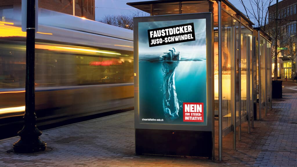
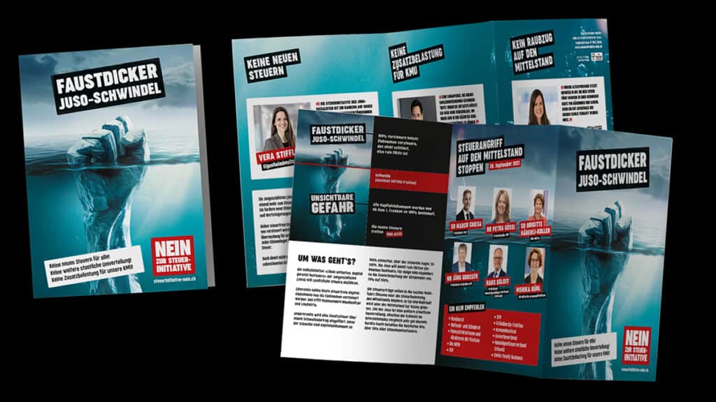
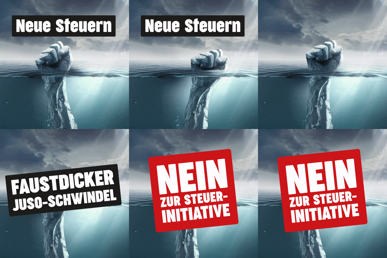
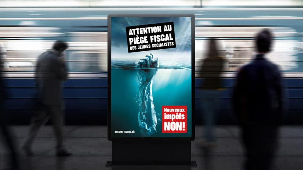
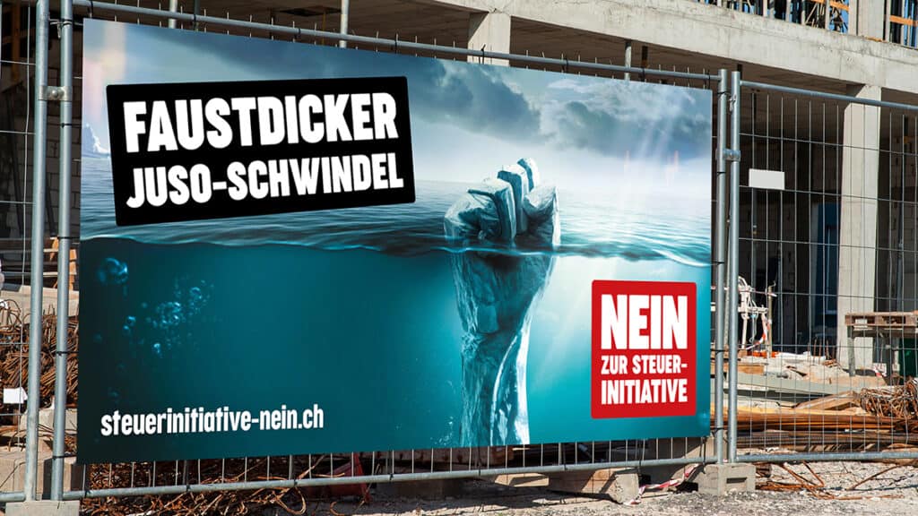
On Sunday, the Juso’s 99% initiative went to a public vote. A broad coalition of political and business leaders had spoken out against the failed initiative in the run-up to the vote. Antwort designed and implemented a cross-media campaign for the occasion.

99%-Initiative

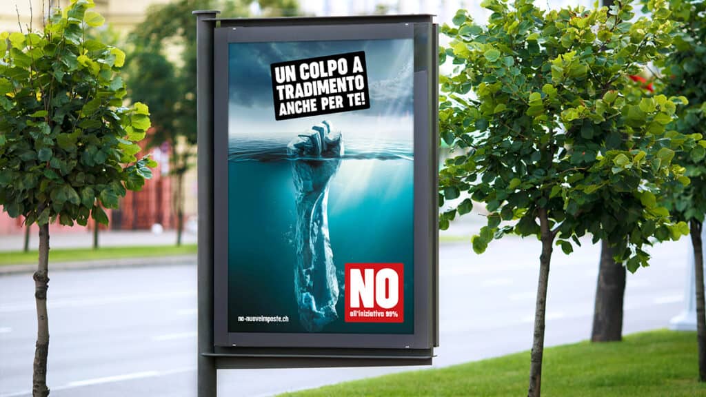
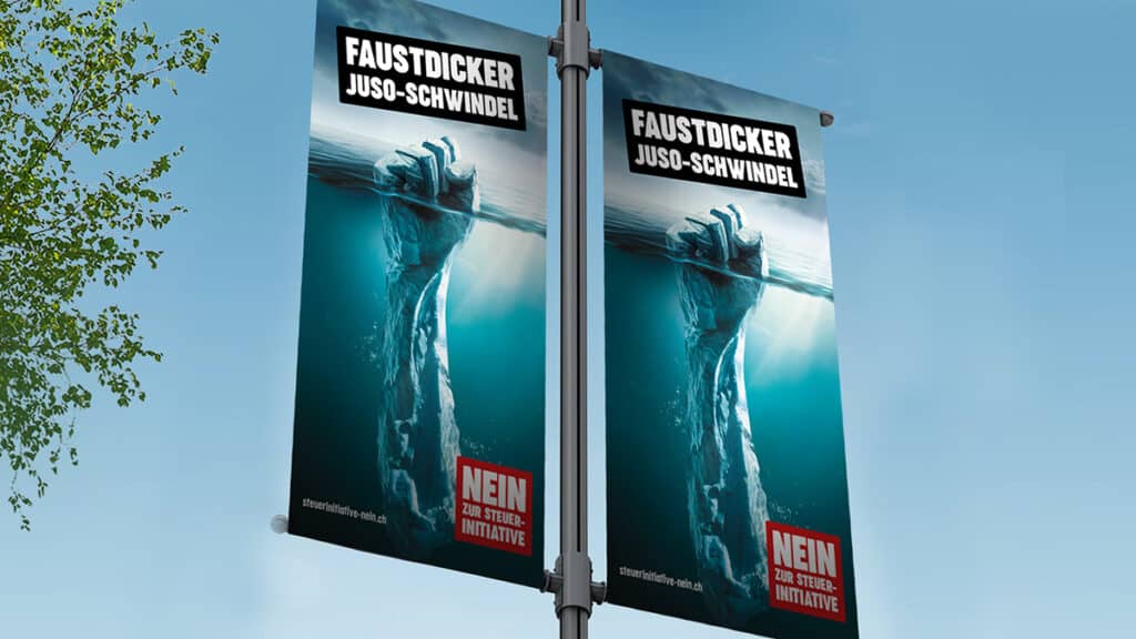
In June, Economiesuisse, together with an alliance of politicians and business leaders, launched the No campaign to the Juso tax initiative. (Werbewoche.ch reported). The key visual - a fist in the shape of an iceberg - was intended to show that the visible part of the iceberg is the much smaller part of the whole. This is also the case with the 99% initiative: if the initiative had been accepted, considerably more than the visible one percent of the Swiss population would have been punished, according to the No Alliance.

The campaign was played out on almost all digital and analog advertising media throughout Switzerland.

Jung von Matt Limmat: A "Chleiderchäschtli" for Zalando's 10th anniversary

Zalando Switzerland is turning 10. In its anniversary campaign, the online fashion retailer is celebrating the diversity of the Swiss «Chleiderchäschtli»—and, together with singer Nemo and rapper KT Gorique, has dedicated a song to it. Jung von Matt Limmat is responsible for the concept and execution of the 360° campaign.

ChleiderchäschtliFor ten years now, Zalando has been bringing stylish diversity to the "Chleiderchäschtli" of the Swiss*. To celebrate the Swiss anniversary, singer Nemo and rapper KT Gorique have dedicated the song "Chleiderchäschtli" to Zalando. Based on the best-known Swiss-German term "Chuchichäschtli", the song with the neologism is both a homage and a thank-you to Zalando's Swiss customers. The song is accompanied by a 360° campaign in which the artist acts as the central campaign ambassador.

The campaign - which originates from the house of Jung von Matt Limmat - will kick off with the release of the song on Friday on all popular streaming and download portals and on the radio, accompanied by influencer marketing and social content on Zalando's Facebook and YouTube channel. From Monday, the TV and online campaign will start, and one week later the OOH campaign in twenty Swiss cities.

Diversity in music, fashion and lifestyle

With "Chleiderchäschtli," five-time Swiss Music Award winner Nemo has recorded his first dialect song in more than two years. With his willingness to experiment when it comes to fashion, the 22-year-old from Biel embodies Zalando's values: he doesn't let himself be restricted by social conventions when it comes to fashion, likes to store online and has an eye for fashion that is produced more sustainably.

As a feature artist, West Swiss rapper KT Gorique contributes a verse to the song.

"Switzerland is one of our most important markets. Our awareness level of 94 percent proves that almost all Swiss people know Zalando. We are an emotional brand for our Swiss customers and are proud to have been the nation's "Chleiderchäschtli" for ten years," said Florian Jodl, General Manager DACH of Zalando. "With the anniversary campaign, we want to thank our Swiss Zalando customers for their trust."

Swiss German and independent

In October 2011, Zalando supplied Switzerland for the first time. At the time, with a particularly Helvetian advertising slogan: "Schueh und Fashion online poschte". Ten years later, the current campaign still has a strong Swiss focus.

"The campaign revolves around the neologism "Chleiderchäschtli" - which is played in all language regions of Switzerland. We reach people's hearts with an independent, chartable song that also authentically represents the artists and the brand. The other advertising materials build on this. This has rarely been done before for the Swiss market," says Rob Hartmann, Executive Creative Director of Jung von Matt Limmat.


Responsible at Zalando: Tina Klussmann (Marketing Team Lead AT/CH), Fabienne Bickel (Marketing Manager CH), Lydia Gries (Head of Creative Direction), Yuki Kappes (Art Director), Louise McIlroy (Senior Manager Visual Merchandising), Riani Tanjasila (PR Manager DACH), Max Straubmüller (Senior PR Manager AT/CH), Caroline Reimer (Senior Manager Influencer Marketing DACH), Josephine Hedderich (Copywriter CH-DE), Veronica Bataclan (Copywriter CH-FR), Simone Abati (Junior Retail Manager CH). Responsible at Jung von Matt Limmat: Jehmsei Keo (text), Sebastian Danielsson (art direction), Mutasin Grabenhorst (graphic design), Michel Nellen (concept/project management), Rob Hartmann (executive creative direction), Fabian Dörr (client direction). Responsible at Jung von Matt Services: Jlona Kopf, Fabrizio Rutishauser, Chiara Killer (media realization). External partners: Nemo & KT Gorique, Bakara Music (music), Lina Baumann/Studio Voile (production), Stini Röhrs (direction), Pierre Castillo (DoP), Diana Pfammatter (photography), Anouck Mutsaerts (styling), Rachel Bredy (hair), Helve Leal (make-up), Mira Zawrzykraj, Raphael Nellen / PRfact (consumer PR).

Hej gives the Quality in Journalism Association a new coat of paint

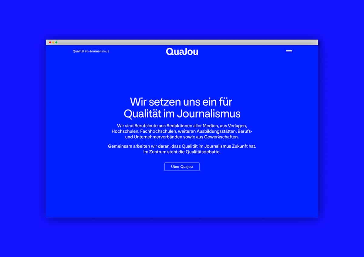
Rich blue and a logo that stands out: Two months before Journalism Day 21, QuaJou, the association Quality in Journalism, presents itself in a new dress. The Zurich agency Hej developed the appearance for the association.

QuaJou"The website is now very dynamic and user-friendly. It represents our values in a contemporary way," Frank Hänecke, a long-time QuaJou board member, was quoted as saying in a statement. With the relaunch of the website Quajou.ch/ the appearance was also refreshed at the same time.
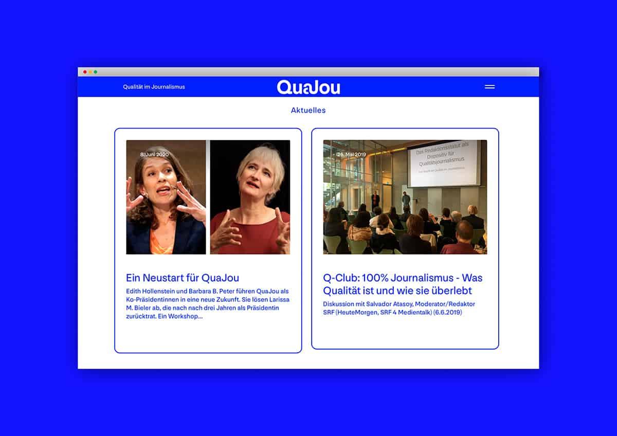
"The new logo visualizes the initiative's mission to combine quality and journalism," says Janine Widler, managing director and partner of Hej, about the new communications presence. "The rich blue lends new radiance to the long-standing commitment as a quality lobby for the Swiss journalism industry, and the typeface 'Nouvelle Grotesk' joins the tradition of Swiss type design with the claim to inspire and elicit a smile." The website was programmed by Werkstatt für Digitales in Zurich.

The relaunch comes about two months before Journalism Day.21, where aspects of journalistic work will again be debated. The Event is organized by QuaJou and will take place on Thursday, November 25, 2021. The focus is on digital journalism, science journalism and future-oriented business models.

The association Quality in Journalism - QuaJou - has been in existence since 1999 and is committed to promoting and ensuring journalistic quality in the Swiss media. It is aimed at journalists - employed or freelance. In addition, scientists and professionals who deal with professional communication are among the current 130 members.

Jacqueline Holzer becomes Director of the Department of Design & Art at HSLU

The University Council of Lucerne University of Applied Sciences and Arts has elected Jacqueline Holzer as the new director of the Department of Design & Art. She will succeed Gabriela Christen on March 1, 2022.

Jacqueline HolzerAfter a multi-stage evaluation process, the Lucerne University of Applied Sciences and Arts Board has elected Jacqueline Holzer as the new Director of the Department of Design & Art. On March 1, 2022, she will succeed Gabriela Christen, who wishes to take on new challenges.


Holzer studied German linguistics and literature, economics and philosophy at the University of Zurich. After her licentiate, she worked as a research assistant at the German Seminar and as a fellow at the Collegium Helveticum at ETH Zurich. This was followed by research stays in Berlin, London and Chicago, during which she dealt with questions of linguistic anthropology in the history of science and sociology. Research always remained an important field of interest in the further course of her career. She investigated the conditions for success in the field of "innovation organizations" and dealt with "gamification" in theaters.

Since 2003, Holzer has been a lecturer at various universities of applied sciences. At the Lucerne University of Applied Sciences and Arts, she was a lecturer in cultural sociology in the CAS Cultural Management & Practice, and at the ZHAW she taught philosophy of science.

She demonstrated her management skills as coordinator of the newly conceived MA Cultural Analysis at the University of Zurich. From 2013 to 2020, she was also responsible for the Department of Theater at the Zurich University of the Arts as program director.

For the past year, she has been responsible for interdisciplinarity and transformation at the Lucerne School of Art & Design as Vice Director. In addition, she is in charge of the further development of the preliminary course, the Bachelor of Art & Communication, and the Master of Fine Arts, as well as in the interdisciplinary teaching area and in continuing education.

Driftwood realizes new appearance for GKB Hockey School

The GKB Hockey School has renewed its visual appearance for the upcoming 2021/2022 season. A new website, three video clips and an expanded presence in social media are intended to inspire young girls and boys and their parents for the sport of ice hockey. Driftwood is responsible for the implementation.

GKB Hockeyschule

Every year, over 500 girls and boys aged between four and eight from all over the canton of Graubünden learn to play ice hockey at the GKB Hockey School. The passion for the fast game on the ice is palpable in every training session. Now this enthusiasm should also be visible in the communication of the GKB Hockey School to the outside world.

Video clips are intended to arouse anticipation for training

The website Gkb-hockeyschool.ch is the new hub of the GKB Hockey School. It contains all the information about the 17 locations in the canton where the locally based hockey clubs offer training.

This appearance is supplemented with a social wall as well as tips on recommended equipment. Three short video clips, in which a young ice hockey player is already looking forward to training in summer temperatures, with the voice of Grisons actor Christian Sprecher, call for registration. Registration takes place via a form on the website. As an additional motivation, the young players may choose an autograph card of their favorite HC Davos player, which they will receive by mail after registration.

Social wall as a connecting element

In the future, the GKB Hockey School will consistently implement the sustainability concept of its sponsor, Graubündner Kantonalbank. Wherever possible, paper in the form of flyers and posters will be dispensed with. Instead, increased emphasis will be placed on activities in social media. The social wall on the website summarizes all posts from the Facebook, Instagram and YouTube communities under the hashtag #gkbhockeyschule, showing their diversity at a glance.

Instruction video and podcasts

In addition to the innovations implemented at the end of August and beginning of September, GR Hockey is planning further communication measures for the fall. An instructional video, produced in collaboration with field hockey equipment supplier Ochsner Hockey Pro Shop Chur, will explain to young field hockey cracks and their parents what to look out for when choosing equipment. A podcast series will also highlight the Grisons ice hockey sport from different angles - interviews will be conducted with everyone from young players to officials and spectators to professional players who are passionate about ice hockey and want to share their passion with others.


Responsible bei GR Hockey: Marco Ritzmann (President), Sandra Schmid (Project Manager Junior Staff). Responsible for Driftwood | The Content Company: Thomas Hobi (Project Manager and Content Creator), Alex Tobisch (Head of Video and Podcast Producer).

A pink glitter Mercedes for the managing partner of Jeff

A pink Mercedes-Benz G-Class with colorful flowers and fairy glitter is currently making the streets of Zurich unsafe. What looks like something straight out of a Barbie dream is not DJ Antoine, who missed the exit to Basel on his way home from St. Tropez, but the managing partner of Jeff Zurich, who - along with his beloved G-Class - fell victim to a prank among employees.

Managing Partner von Jeff
Tears of joy - or not? Linus Eidenbenz, Managing Partner of Jeff, sees his "Baby-G" for the first time.

Together with the Zurich agency Staay, Jeff developed the Mercedes-Benz Kids App in spring 2020, with which children can design cars themselves, print them out and finally play with them in real life. (Werbewoche.ch reported).

According to Jeff, the game is met with great enthusiasm by the youngest players. And to ensure that this continues, the agency decided to test the central app functions on a - literally - grand scale. A project that was not only actively supported by Mercedes-Benz Switzerland, Kenny's and Nolina Applica, but also managed to win over the up-and-coming young artist Francis E. as designer. And since Linus Eidenbenz, Jeff's managing partner and coincidentally the young artist's father, drives a G-Class, it was also clear which car would receive the glamorous makeover.

Designer Francis gets to work - with a little help.

Jeff documented the implementation, the pleasing test result and also the first meeting of Eidenbenz and his "Baby-G" in a video. Perhaps the biggest surprise for some, however, is not: Eidenbenz actually drives around on public roads with his pink vehicle. In daylight. So keep your eyes open: Legend has it that anyone who looks at "Baby-G" for longer than three seconds will be reborn as a unicorn in their next life.

The prototype on the original - and the proud owner in the background.

What does... "ticket" actually mean?

In his column «What Does It Actually Mean…?», Benno Maggi explains terms from the fields of marketing and communications. This time, he shares his thoughts on the term «ticket.».

Benno MaggiAnyone who is still sitting on an Alba festival ticket can sing a song about how worthless a ticket can suddenly be. Now that all events except for this one seem possible again, the word has virtually high season. But as the current example teaches, it is unfortunately no longer enough to just have a ticket: It also takes a certificate to enjoy a benefit. However, this is not the reason why the word has also gained importance in our industry.

No ticket, no service

It all started with digitization, then called EDP (electronic data processing), later IT (information technology). We remember: No matter whether helpdesk, support or hotline, the waiting lines took forever. On the other hand, when it was your turn, you had the solution to the problem in front of you and you got it solved ad hoc. Today, such solutions are a thing of the past and a ticket is needed for everything. Of course, to protect the technicians, it should be mentioned here that the complexity has increased to such an extent that ad hoc solutions are no longer effective or comprehensible. On the one hand, this has to do with us users, who demand far too much support and require services related to operation or problem resolution, and on the other hand, with the increasing cadence, complexity and, in larger organizations, even compliance. Tickets make this work prioritizable, plannable and traceable by logging what has been changed.

However, the original German meaning of the word - admission ticket - is much closer to the start-up field of application, and not just since "Höhle des Löwen". There, a ticket defines the size of the investment. Not to be confused with the deal ticket, which means the recording of all terms, conditions and basic information of an investment or deal. Which brings us back to the beginning, now that the ticket refund orgy is underway. Investing in an Alba Festival ticket definitely didn't pay off this year. But that's another story.


* Benno Maggi is co-founder and CEO of Partner & Partner. He has been eavesdropping on the industry for over 30 years, discovering words and terms for us that can either be used for small talk, pomposity, excitement, playing Scrabble, or just because.

These are the winners of the Swiss Print Award 2021

On Thursday, the Swiss Print Award was presented for the ninth time at the Papiersaal in Zurich. Once again, more than 40 companies submitted entries in various categories to the jury. Anna Kohler, editor-in-chief of m&k/Werbewoche, hosted the evening.

Swiss Print Award
The gold winners of the Swiss Print Award 2021 and the winners of the Peter Grob Award.

In addition to the purely technical performance, the impact of the print products and the interplay between idea, implementation and artistic-creative impression were also evaluated. This year's thirteen award winners in the categories Books, Printed Matters, Printed Objects, Publications and the Peter Grob Special Award stand out for their exceptionally high standard.

The jury spared no time, despite difficult working conditions due to the pandemic. It was thoroughly discussed, evaluated, discarded, considered, decided.

"Making people want to see print" has always been the credo of the Swiss Print Award. Less is printed than ten years ago, but it is printed differently: the eye of the beholder - and therefore also that of the layman - does not evaluate objectively, but incorruptibly subjectively, as those responsible for the Swiss Print Awards write. What counts today is impact - that certain something, that little bit of "more," that extra mile.

The jury of the 9th Swiss Print Award consisted of the chairman Christian Theiler, Visual Designer, Head of Department Graphic Design School Zurich, Ursula Heilig, Atelier Ursula Heilig SGD, Anna Kohler, Editor-in-Chief/Publicist Director m&k/advertising week, Frederick Rossmann, Graphic Design and Advertising, Andy Ruf, Ruf ASW Advertising Agency and Patrick Werder from Canon Switzerland.

Books category

  • Gold: "The essential peculiarity, however, lies in the bloom", Engelberger Druck, Stans
  • Silver: "Geschichte der evangelisch-reformierten Kirchgemeinde zum Grossmünter", von Ah Druck AG, Sarnen
  • Bronze: "Habitat", Bubu, Mönchaltorf

Category Printed Matters

  • Gold: "Greeting Card 2021 - Homburger", Hochstrasser Grafikdesign, Boppelsen
  • Silver: "Touch! - Naturally more haptic!", Fischer Papier, St. Gallen
  • Bronze: "Series of printed communication media", Neidhart+Schön Print, Zurich

Category Printed Objects

  • Gold: "pure soap", Kasimir Meyer, Wohlen
  • Silver: "ABC Mania", d+u, Zurich
  • Bronze: "Annual Report 2020 Swissgas", Köpflipartners, Neuenhof

Category Publications

  • Gold: "Integrated Report 2019", Neidhart+Schön Print, Zurich
  • Silver: "Gender", Odermatt print shop, Dallenwil
  • Bronze: "Magazine THIS IS IT Winter/Summer", Engelberger Druck, Stans

Special Award: Peter Grob Award

  • Special prize: "Empty book", Triner, Schwyz

Creasquare for Fors: Why Christian Stucki now finds it easier to do many things

In the spring of 2021, Christian Stucki launched a multi-year partnership with the Seeland-based company Fors. This partnership is now being publicly showcased through an initial online campaign. The young agency Creasquare produced three video spots for the campaign.

Creasquare für Fors

The wrestling king Christian Stucki realizes that many things are now easier for him. However, this is less due to his title and more to the household appliances from the Swedish company Asko, which are distributed by Fors. Stucki, Fors' new Brand Ambassador, is launching a three-year cooperation with the company with this brand awareness campaign.

The aim of the campaign was to combine the high-quality features of Asko household appliances with the benefits of being a swinging king. This resulted in three short online spots on the topics of washing, cooking and dishwashing.

The videos can be seen as an online campaign primarily on YouTube as well as social media.


Responsible at Fors: Simon Leray, Fabian Lederberger, Christian Stucki (Ambassador), Rolf Huser (Manager Christian Stucki). Responsible at Creasquare: Fabio Nell, Marc Deriaz, Nicolas Jossi.

Boutiq and Pascal Schelbli produce Spec commercial for Fürst Guitars

Up-and-coming Swiss director and student Oscar winner Pascal Schelbli worked with Boutiq to develop a spec commercial for Fürst Guitars that explosively unhinges the world in a clash of live action and CGI.

Fürst GuitarsFürst guitars, handmade in Wädenswil, are among Switzerland's finest instrument exports. Pascal Schelbli's idea for this commercial is based on a quote from Pablo Picasso: "Everything you can imagine is real". Whether painter, architect or musician, a principle that applies equally to all artists, provided they have the right tools at their disposal. In this promotional film, a guitarist uses his vision to transform an old industrial hall into a cubist construction, paying tribute to one of the greatest artists of the last century.

An ambitious project

This spectacular idea was realized together with the two producers Chantal Gugger and Theresa Berres. The film was shot at night in an old industrial hall in Winterthur. The experimental team opted for anamorphic lenses, lots of haze and a reduced lighting concept. These were very creative decisions, but they quickly benefited the VFX project.

The night-time filming for the lavishly produced Spec commercial.

Right from the start of production, it was clear to everyone involved that this would be a complex and elaborate project. With the support of all crew members on set, as well as the dedicated VFX and animation team at Pulk, this spec film by Pascal Schelbli was realized.

A good foundation for animation and VFX

The foundation for the cubist transformation of the industrial structures with steel beams, bridges and pillars envisaged in the film was the development of the visual effects. During the editing phase, the focus was on how the industrial structures in the hall could be arranged, efficiently adapted and animated. CG supervisor Linus Schneider developed an elaborate setup for this in Houdini, which made it possible to realize the basic idea of a cubist construction. The lighting and look were dictated by the filmed material. Many Asteras - programmable light tubes - were used on the set, which helped a lot with the lighting, especially in the final shot.

A well-rehearsed team: Linus Schneider (CG Supervisor), Jonas Wolf (Guitarist & Cast), Reto Fürst (Fürst Guitars), Pascal Schelbli (Director), Theresa Berres (Producer) and Chantal Gugger (Executive Producer).

Music composed especially for the film

Jonas Wolf, guitarist in the band Eluveitie and protagonist in the Spec film, composed the music for this commercial together with Berlin composer Alexander Wolf David. Scottish actor Stuart Martin, who can currently be seen in the Netflix film "Army of Thieves", was recruited for the voice over.


Responsible at Fürst Guitars: Reto Fürst. Responsible at Boutiq (production): Pascal Schelbli (Director), Linus Schneider (CG Supervisor), Theresa Berres (Producer), Chantal Gugger (Executive Producer), Pulk (Post-Production), Jonas Wolf (Cast), Stuart Martin (Voice), Jonas Wolf & Alexander Wolf David (Composer), Marvin Schatz (DoP), Janis Willbold (Trinity Operator), Manuel Dolderer (Gaffer), Peter Hacker (Color Grading), Robin Harff (Sound Design), Linus Schneider, Florian Baumann & Pascal Schelbli (Animation, VFX).

get_footer();