ONLINE MARKETING What developments do companies need to pay particular attention to in online marketing? Harald Grabner from Webdirekt names nine forecasts for 2016. (more…)
Customer Navigation: Sell easily - increase sales
Editorial
-
January 4, 2016
BOOK TIP In the book "Customer Navigation", author Martin Krengel explains how you can release buying brakes, accelerate purchasing decisions and increase profits. (more…)
Operational market research
Editorial
-
December 29, 2015
BOOK TIP In the book "Operational Market Research", authors Marco Ottawa and Christian Rietz explain what characterizes operational market research, how it works and where the challenges of the future lie. (more…)
Mobile first. Also in e-commerce.
Editorial
-
December 29, 2015
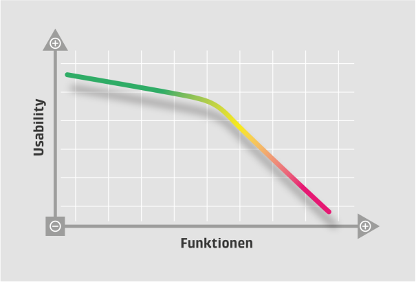
Back to the roots or long live the new "simplicity". We are currently experiencing a trend on the web towards reduction to the essentials. Be it in design, where the trend is moving back to flat design after the era of 3D effects and shadows. Or in functionality, where after years of "featureitis", the range of functions of hardware and software is moving back towards simple operation. The trendsetters of this development were smartphones, where designers and developers were forced to make do with the very limited screen area of the devices. In the world of e-commerce, this development is only just beginning. However, it can be worth adapting quickly.Concentration on the essentialsThe starting point for this development was the smartphone and its apps. The screen of a smartphone is many times smaller than a laptop or desktop screen. In addition, using a finger to navigate is not as precise as clicking with a mouse. So not only is there a smaller screen area available, the user is also much less precise with their finger than on a normal PC. In order for an app to be usable on a small screen, the elements (menus, buttons, links, etc.) must therefore be larger. Designers and developers are therefore forced to limit their functionality to the essentials as space on a small touchscreen is very limited, so less is actually more. However, this credo does not only apply to mobile applications. The success of apps shows that users can generally handle simple, greatly reduced applications much better than overloaded software. This is why the concept of reducing the range of functions has quickly spread to the desktop. The starting point for a promising concept should be the question: which functionalities of an application are really important? Which functions does the target group really need and which would be better left out on a small device? the photo platform "Flickr" asked itself precisely these questions when the mobile app was created and drastically reduced the range of functions for the mobile version. Flickr then went one step further and, after creating the mobile app, also removed some of the previous functions of the existing photo platform because, when analyzing the functionalities, it was determined that almost nobody needed some of the functions. Apple must have asked itself the same question about the essential functions when the iPod was being developed: The first iPod had only a few functions on the device itself, most of them were packed into the desktop program iTunes, because there were more possibilities to map somewhat more complicated functionalities. The user-friendliness of the iPod could thus be kept high - certainly an important reason why the iPod and the later iPhone became a worldwide success story.Mobile FirstExamples such as Flickr show that it is also worth considering which functions should be implemented at all when developing desktop applications or designing entire online stores. It is perfectly legitimate to ask whether the functions that are omitted from the mobile solution can also be omitted from the desktop version. Like Flickr, it is not uncommon to find that functions are also superfluous in the desktop version and only make it more difficult to get an overview of the really central functions. This approach, also known as "mobile first", is highly recommended. Even if only a desktop browser solution is created. Incidentally, this kind of "backporting" of findings has also been done for Windows 8 and Windows 10, which has adopted parts of the user interface from Windows Phone, and a look at the access statistics can also help to distinguish important from unnecessary functions. The fewer functions are placed on a screen, the easier it is for the user to operate the application or website. It is always important to bear in mind that usability inevitably deteriorates with an increasing number of functions, and even dramatically from a certain number of functions onwards.
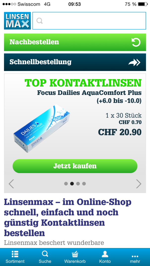
Mobile first. Also in e-commerce.Insights from conversion optimizationOf course, it's not just the small screens of smartphones that have shaped this development towards reduction to the essentials. In e-commerce, it is above all tangible findings from usability and conversion optimization. If you look at stores such as Amazon, eBay & Co, you will notice that practically all of them are simpler, clearer and tidier today than in previous versions - although there is still a lot of potential here too, we are only at the beginning of this development. But why are these providers starting to streamline their platforms? Because these players have started to optimize their stores for conversion in recent years. In other words, to ensure that as many visitors as possible who come to the website "complete" the purchase, i.e. "convert". And here in particular, it has been shown that the conversion rate can be massively increased by reducing "distraction factors". Distraction factors include unnecessary functions, forms that are too long and confusing, logins in the wrong place, a design that distracts from the essentials and much more. This is not just about a good user experience, but also about hard cash. After all, once you have finally attracted potential customers to your online store with costly advertising measures, you want to turn them into buyers and not distract them from buying with super additional functions. The numerical value of the number of purchases in relation to the number of visitors to the store is called the conversion rate and is considered one of, if not the most important key figure in e-commerce.Reduce distraction factors and hurdlesConversion optimization has an incredible leverage effect. And one of the most important factors in improving the conversion rate is reducing the number of distractions and hurdles. Of course, it's nice if you can share a product you want to buy with your Facebook friends beforehand. Or if you don't "have" to buy a product straight away, but can save it in a watch list first. Or if, during the checkout process, you can also see what other products match the product you have already selected. But each of these functions ultimately discourages people from buying. Not to mention hurdles such as cumbersome registration before the first purchase, too many steps in the checkout process and so on. There are hurdles like these in every store. And therefore also corresponding optimization potential. There are a thousand reasons why users who actually came with the intention to buy do not make a purchase. And very often it is overly complicated or incomprehensible operating elements that unsettle potential customers. Reducing to the absolute essentials and removing unnecessary hurdles can be very relevant to the success of an online store. Who wants to lose a customer who is willing to buy just because the hurdles to completing the purchase were too great?We often stand in our own wayWhy then, one wonders, are there still so many online stores that pay too little attention to usability? And this despite the fact that figures prove in black and white that higher usability leads to higher conversion rates and therefore also to more sales. An incredible number of functions are described in specifications for new online stores. These are usually compiled from countless other online stores. The question of the benefits for the customer is rarely asked. It is often sufficient to explain that the function is also available at another "big" online store or at a competitor and that this is very successful. However, whether the provider in question is successful precisely because of or despite this function is a completely different question. Whether the function makes sense at all in the context of your own online store is also rarely checked, and the idea of "mobile first" can help here. The focus should not be on us online professionals, but on the masses. The functions should be reduced as much as possible in order to make the online store easy to use. Ultimately, every customer with a purchase intention wants to reach their destination as quickly and easily as possible.Keeping an eye on the target groupThe additional functionalities are often only designed for a small group, namely for "power users" who are very familiar with web applications. The decision-makers on the operator side usually also belong to this small group of "power users". It is therefore very dangerous to use only oneself as a yardstick when assessing the usefulness and usability of new functions - but unfortunately this is all too often done anyway. In workshops, the objection "but I would use or appreciate this function" is often used. You have to be aware that the target group for an online store is not the very small group of "power users", but usually the masses. The strong sales growth in e-commerce comes to a large extent from people who have not previously ordered online. These customers are interesting in two respects: firstly, they are new customers who generate additional sales and secondly, it is known that this group of new customers often stays with their first online provider after a good experience. These customers therefore have great potential to become loyal regular customers.Mobile is a realityThe widespread use of the Internet via smartphones is now a reality and will continue to increase. This not only means that new small devices are being added for Internet use, it also means that the Internet is available at all times and therefore the time of use is also changing. Today, the Internet is used more and more across different devices. In addition to a desktop PC or laptop, people also use a smartphone when they are out and about and sometimes a tablet at home. For this reason alone, it makes sense to adopt a "mobile first" strategy when redesigning an online store today, and mobile apps have another advantage: personalization. A smartphone usually belongs to just one person and is usually used exclusively by that person. You can use this fact in the mobile app and leave the customer logged in, which can massively simplify ordering. There is no need to log in, enter an address or even a payment method to place an order. A repeat order (here using the Linsenmax app as an example) is very easy to manage.
ConclusionIt is often difficult for a project team to decide to do without certain functions. After all, a relaunch is often associated with the idea of integrating new functions. However, with the aim of gaining new customers and increasing sales disproportionately to the market, we should focus more on usability. Less is actually more here. The "mobile first" concept can help the project team to identify the functions that can be dispensed with. In this way, above-average usability can be achieved on all devices and thus also a high level of user acceptance, which will ultimately be reflected in sales growth.Author: Mike Müller, owner and member of the management board of MySign AG. Expert in the field of e-commerce and usability.
How companies can successfully master crises
Editorial
-
December 28, 2015
CRISIS COMMUNICATION Reacting correctly in crisis situations is a major challenge for companies. Many problems can be avoided through effective crisis communication. Early recognition of potential risks and suitable structures are crucial. (more…)
Branded Interactions
Editorial
-
December 26, 2015
BOOK TIP In the book "Branded Interactions", author Marco Spies explains how digital brand management works, how to optimize the development process and how to ensure that digital communication is always up to date. (more…)
"In 2016, users can pay in-store, online and in-app"
Editorial
-
23 December 2015
MOBILE PAYMENT The "Paymit" payment app from UBS Switzerland won the "Best of Swiss App" award at the best app. Andreas Kubli, Head of Multichannel Management & Digitization at UBS, talks about the idea behind the app, the challenges involved in developing it and its planned use in retail.(more…)
The downside of digitization in the poster market
Editorial
-
December 22, 2015
PLAKAT MARKET The Swiss poster market is in a state of flux: Poster spaces are being re-tendered and allocated, digitization is progressing, the two major providers are increasing their efforts and smaller providers are also looking to get a slice of the advertising pie.(more…)
"To save money, we invented the damage sketches".
Matthias Freuler, now Creative Director at Spinas Civil Voices, is responsible for advertising classics such as the «Damage Sketches» and “Lovely the Cow”—and for answering our “13 Questions.”.
Editorial
-
21 December 2015
1. what would you work for free? For my son Tobias, who has set up an aid project for destitute students in North Vietnam.
2. where and how have you ever bluffed in your life? When I reserved a table in the restaurant under the name of the ex-Velor racing driver Urs Freuler. (Went wrong, the lady on the phone had never heard of an Urs Freuler).
3. what does not come to the office under any circumstances? Yucca palms.
Have you ever thought about leaving the advertising industry? Yes, for about two hours. Until I realized that I have a nice work portfolio, but not a single job reference.
5. was there a moment in your life when you thought: Wow. This is awesome. And it's from me! When I received a Gold Lion for the football-playing Milk Cow in Cannes by John Hegarty.
6. can you tell us a little secret? Because the first Liebe-Mobiliar films swallowed up too much money, there wasn't enough left for a print campaign. So out of necessity, we invented the damage sketches to save on photo costs.
7. name a campaign that has recently caught your eye in a positive way - but did not originate with you. The UBS pension campaign, precisely because it found favor with a client like UBS.
8. What inspired you to enter the advertising/communications industry? My grandfather, who was a co-founder of BSW and one of the very first copywriters in Switzerland at the time.
9. if you had not become an advertiser - what then? Architect or curator.
10. Do you fall for advertising? When? Again and again, sometimes even on my own.
11. what is impossible for you to do without? On my oldie Italian Laverda 1000.
12. which professional colleague would you take with you to a desert island? Markus Ruf, with whom I have already spent two months on the island of Boracay when it was still lonely.
13. when you have an idea, how do you know it is good? If it's really good, I have to show it to others immediately. ALL.
Matthias Freuler has been a copywriter/CD at Spinas Civil Voices since 2010. Prior to that, he worked for Advico Y&R, Aebi and Publicis. Most recently, he spent eleven years at Wirz Werbung as Executive Creative Director. His best-known campaigns include the milk advertising with the cow Lovely and the Mobiliar advertising with the damage sketches. Matthias Freuler is a member of the Art Directors Club.
The "13 Questions" appear both online and in the print edition of Werbewoche.
Implementation 13 Questions: Thomas Häusermann
Marketing Trophy 2016: The Nominees Have Been Announced
Editorial
-
December 18, 2015
MARKETING TROPHY Wer kann sich in diesem Jahr die prestigeträchtige Marketing-Trophy sichern? Zwölf Projekte wurden für die Endauswahl nominiert.(more…)
Swisscontent launches communication platform "The Next Step"
Editorial
-
December 17, 2015
COMMUNICATION Swisscontent launches "The Next Step", a digital communication platform. The Swisscontent Digital Lab's in-house development meets the requirements for employee and customer communication of the future. (more…)
Responsive launches Christmas competition
Editorial
-
December 17, 2015
GAMIFICATION Responsive, a Swiss agency for customized, high-involvement promotions, is launching a competition with attractive prizes for the Christmas season. (more…)