Typography creates brand value
Only on the basis of a typeface with a strong character can consistently applied and individual typography achieve an intended effect. This has been shown by a diploma thesis at the HWZ Hochschule für Wirtschaft Zürich, communication course.


How can a medium that is supposed to be inconspicuously designed have great potential as a branding element? Stefan Lieberherr - a trained and qualified typographer - investigated this question in his diploma thesis "Branding durch Typografie - Das Potenzial der Schrifttwahl zur Profilierung einer Marke" (Branding through typography - the potential of typeface selection for brand profiling), which he wrote last year at the Hochschule für Wirtschaft in Zurich (HWZ). The diploma thesis explains and proves the potential of typography and font choice for profiling a brand.
Precisely because a good typeface is defined by its unobtrusiveness, it often falls short. In some corporate design projects in which the author has been involved, the value of an individual typeface was recognized but not implemented. In trained marketing slang, there was talk of uniqueness and differentiation, but the font choice was still oriented towards Helvetica, Frutiger, Times or even Arial. Mainly because these fonts are already pre-installed on all computers. This decision disregards a central element of the branding and gives away its effect.
Anyone who has been to London knows the feeling when they see the first signalization of the Tube. While the airport still has an international appeal, the Tube's lettering looks like a sign of arrival or coming home. Initially, the London Underground marked its stations with huge lettering on the facades. It wasn't until 1908 that managing director Frank Pick developed the first visual concept with designer Harold Stabler. This resulted in the logo with a circle and crossbar. In 1916, Edward Johnston stepped in for the first revision, also commissioned by Pick. Johnston also created the sans serif typeface Johnston RailwaySans, which, like the logo, is still in use today with few modifications.
From the Tube to the Times of London to Kuoni Travel, the author's employer, one thing is true: type has an impact. And typography works. The fact that this only takes place in the reader's subconscious is not fundamentally doubted. But the author pleads for a more differentiated approach.
He argues that consumers notice typefaces that are used specifically for branding purposes, and they will remember the company that appeals to them again. "Provided the typeface used - or at least its application - can be memorized," the author writes. "It's surprising, then, that typefaces are often not consciously selected and used."
This statement is indirectly supported by the fact that in works on the subject of branding, the basic elements of communication, typeface and typography, eke out a shadowy existence. Why are such an important element and its effect simply given away in branding? This question also preoccupies the numerous experts interviewed for the thesis, both in Germany and abroad.
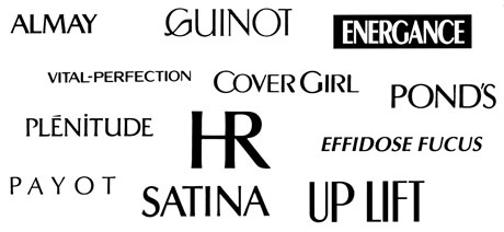
Of course, the success of a brand cannot be attributed exclusively to the typefaces used, but there are nevertheless quite a few examples that speak in favor of this. If one believes several studies that have examined international cosmetics advertisements, the Optima font was used almost without exception. On the one hand, it is a pity that the same typeface is always used, but on the other hand, it confirms that it is the typeface used to communicate that matters and that certain typefaces suit certain industries. If this were not the case, you would find the usual font mix of Helvetica, Futura, Times or Courier in cosmetics advertising. But when an entire industry relies on this one typeface, it is almost impossible for consumers to find a brand that differentiates itself. The best-known cosmetics brand is the exception and confirms the potential of its own typeface: Nivea. A success that is largely based on the typeface. In 1930, Metroblack served as the inspiration for Nivea's logo, and in 1992 it evolved into an entire typeface, Nivea Bold. Like no other brand, Nivea has relied on the expressiveness of five letters since the 1930s. This was only possible because, without exception, Nivea avoided following advertising trends and consistently made sure that its typography was internationally recognizable.
The appearance of Mercedes Daimler-Benz has been more or less unchanged for almost 12 years, which creates a consistent and stable effect and inspires confidence. The typeface also reflects a noble and value-conservative attitude. Kurt Weidemann was able to convince the management back in 1985 that a typeface with a few cuts was not enough. In Corporate ASE, A stands for Antiqua, S for Sans and E for Egyptienne. Within the ASE typeface family, each of the three families with their weights has a specific area of use: the classic Corporate A for continuous text, the S for headlines, short advertising messages or informational texts in small print, and the E with a technical feel, which is intended for the commercial vehicle sector. In the meantime, those responsible at the time regret that they did not license the typeface exclusively for themselves. Consequently, any company can make these fonts their own, which of course minimizes the value of a corporate font.
For some brands, however, the ideal value takes precedence over the monetary value. In the age of globalization, language variants are in great demand. The characters of a font should also radiate the same values in Cyrillic, Arabic, or Chinese applications. Porsche Design takes care to ensure that even a Cyrillic display retains the familiar appearance of the typeface. This is of central importance for a company's globally uniform appearance.
"Brands need character to stand out from the competition. This can of course be acquired or supported by the choice of typeface," notes the accompanying lecturer, Max Meister. It is therefore incomprehensible that competitors use different colors, logos and visual language, but at the same time use the same or at least very similar-looking fonts.
"Communication is language, language is type, and type is typography. Just as you can't hit the right note with words, typographic design doesn't work if it doesn't harmonize with the message of a text or the image of a company," the author states in his work. Typography can be used in a targeted manner and serves as a carrier of messages of all kinds: from AHV numbers and love letters to advertising copy and the core values of corporate strategies. And this not only through the statement of the letters alone, but also quite specifically through the selection, arrangement and design, in other words by means of typography and typeface. Because fonts have "feelings" and can also convey them.
Apparently, only a few agencies have mastered the art of typography: As a reference, the author examined the SonntagsZeitung of February 15, 2009 and found 13 larger advertisements, but only just 5 differed in their fonts. A similar situation can be observed with the magazine of February 14, 2009: nine advertisements with likewise only five fonts that can be distinguished from each other. It should be noted here that even the typographically trained eye of the author had to look twice to recognize these differences. With a Helvetica or at least very similar font, Audi, BMW, Jeep, Hyundai, Teleclub, Cablecom and Orange vie for the reader's attention in the advertisements in question. It is highly doubtful whether the reader will notice any difference to Univers, Frutiger or Gill, which are used by Peugeot, SwissLife, Raiffeisen, AXA Bank, Sunrise and Schweizer Berghilfe. Therefore, it must be assumed that these advertisements present themselves to the layman as if they were designed with the same typeface.
This is all too often ignored in daily work. Yet the practical implementation of this insight, which is substantiated in the thesis by means of theory, numerous examples from the business world, and a historical excursus, is of great interest to both clients and branding agencies. For the latter, it is certainly also lucrative.
Stefan Lieberherr and Max Meister
Precisely because a good typeface is defined by its unobtrusiveness, it often falls short. In some corporate design projects in which the author has been involved, the value of an individual typeface was recognized but not implemented. In trained marketing slang, there was talk of uniqueness and differentiation, but the font choice was still oriented towards Helvetica, Frutiger, Times or even Arial. Mainly because these fonts are already pre-installed on all computers. This decision disregards a central element of the branding and gives away its effect.
Anyone who has been to London knows the feeling when they see the first signalization of the Tube. While the airport still has an international appeal, the Tube's lettering looks like a sign of arrival or coming home. Initially, the London Underground marked its stations with huge lettering on the facades. It wasn't until 1908 that managing director Frank Pick developed the first visual concept with designer Harold Stabler. This resulted in the logo with a circle and crossbar. In 1916, Edward Johnston stepped in for the first revision, also commissioned by Pick. Johnston also created the sans serif typeface Johnston RailwaySans, which, like the logo, is still in use today with few modifications.
From the Tube to the Times of London to Kuoni Travel, the author's employer, one thing is true: type has an impact. And typography works. The fact that this only takes place in the reader's subconscious is not fundamentally doubted. But the author pleads for a more differentiated approach.
He argues that consumers notice typefaces that are used specifically for branding purposes, and they will remember the company that appeals to them again. "Provided the typeface used - or at least its application - can be memorized," the author writes. "It's surprising, then, that typefaces are often not consciously selected and used."
This statement is indirectly supported by the fact that in works on the subject of branding, the basic elements of communication, typeface and typography, eke out a shadowy existence. Why are such an important element and its effect simply given away in branding? This question also preoccupies the numerous experts interviewed for the thesis, both in Germany and abroad.
Of course, the success of a brand cannot be attributed exclusively to the typefaces used, but there are nevertheless quite a few examples that speak in favor of this. If one believes several studies that have examined international cosmetics advertisements, the Optima font was used almost without exception. On the one hand, it is a pity that the same typeface is always used, but on the other hand, it confirms that it is the typeface used to communicate that matters and that certain typefaces suit certain industries. If this were not the case, you would find the usual font mix of Helvetica, Futura, Times or Courier in cosmetics advertising. But when an entire industry relies on this one typeface, it is almost impossible for consumers to find a brand that differentiates itself. The best-known cosmetics brand is the exception and confirms the potential of its own typeface: Nivea. A success that is largely based on the typeface. In 1930, Metroblack served as the inspiration for Nivea's logo, and in 1992 it evolved into an entire typeface, Nivea Bold. Like no other brand, Nivea has relied on the expressiveness of five letters since the 1930s. This was only possible because, without exception, Nivea avoided following advertising trends and consistently made sure that its typography was internationally recognizable.
The appearance of Mercedes Daimler-Benz has been more or less unchanged for almost 12 years, which creates a consistent and stable effect and inspires confidence. The typeface also reflects a noble and value-conservative attitude. Kurt Weidemann was able to convince the management back in 1985 that a typeface with a few cuts was not enough. In Corporate ASE, A stands for Antiqua, S for Sans and E for Egyptienne. Within the ASE typeface family, each of the three families with their weights has a specific area of use: the classic Corporate A for continuous text, the S for headlines, short advertising messages or informational texts in small print, and the E with a technical feel, which is intended for the commercial vehicle sector. In the meantime, those responsible at the time regret that they did not license the typeface exclusively for themselves. Consequently, any company can make these fonts their own, which of course minimizes the value of a corporate font.
For some brands, however, the ideal value takes precedence over the monetary value. In the age of globalization, language variants are in great demand. The characters of a font should also radiate the same values in Cyrillic, Arabic, or Chinese applications. Porsche Design takes care to ensure that even a Cyrillic display retains the familiar appearance of the typeface. This is of central importance for a company's globally uniform appearance.
"Brands need character to stand out from the competition. This can of course be acquired or supported by the choice of typeface," notes the accompanying lecturer, Max Meister. It is therefore incomprehensible that competitors use different colors, logos and visual language, but at the same time use the same or at least very similar-looking fonts.
"Communication is language, language is type, and type is typography. Just as you can't hit the right note with words, typographic design doesn't work if it doesn't harmonize with the message of a text or the image of a company," the author states in his work. Typography can be used in a targeted manner and serves as a carrier of messages of all kinds: from AHV numbers and love letters to advertising copy and the core values of corporate strategies. And this not only through the statement of the letters alone, but also quite specifically through the selection, arrangement and design, in other words by means of typography and typeface. Because fonts have "feelings" and can also convey them.
Apparently, only a few agencies have mastered the art of typography: As a reference, the author examined the SonntagsZeitung of February 15, 2009 and found 13 larger advertisements, but only just 5 differed in their fonts. A similar situation can be observed with the magazine of February 14, 2009: nine advertisements with likewise only five fonts that can be distinguished from each other. It should be noted here that even the typographically trained eye of the author had to look twice to recognize these differences. With a Helvetica or at least very similar font, Audi, BMW, Jeep, Hyundai, Teleclub, Cablecom and Orange vie for the reader's attention in the advertisements in question. It is highly doubtful whether the reader will notice any difference to Univers, Frutiger or Gill, which are used by Peugeot, SwissLife, Raiffeisen, AXA Bank, Sunrise and Schweizer Berghilfe. Therefore, it must be assumed that these advertisements present themselves to the layman as if they were designed with the same typeface.
This is all too often ignored in daily work. Yet the practical implementation of this insight, which is substantiated in the thesis by means of theory, numerous examples from the business world, and a historical excursus, is of great interest to both clients and branding agencies. For the latter, it is certainly also lucrative.
Stefan Lieberherr and Max Meister
In a nutshell
Stefan Lieberherr successfully completed his Bachelor for Business Communications at the HWZ Hochschule für Wirtschaft Zürich. Today he works in Zurich at Kuoni Reisen AG both as a designer and as a coordinator in the Global Design Team. The Bachelor's degree complements his many years of design experience with strategic knowledge that enriches and substantiates his daily work.
Max Meister is a lecturer in strategic communication and a thesis expert at the Hochschule für Wirtschaft Zürich HWZ (Zurich School of Economics) as well as Managing Partner of Branding-Institute AG.