TBS supports Terresta with repositioning and website relaunch
Terresta Immobilien- und Verwaltungs AG is realigning itself for the future. TBS Marken Partner supported the real estate division of the SKKG Foundation throughout the process—from developing the brand strategy and redesigning the brand to reimagining and implementing the website. The new brand identity is intended to clearly and transparently convey the company’s values and culture.


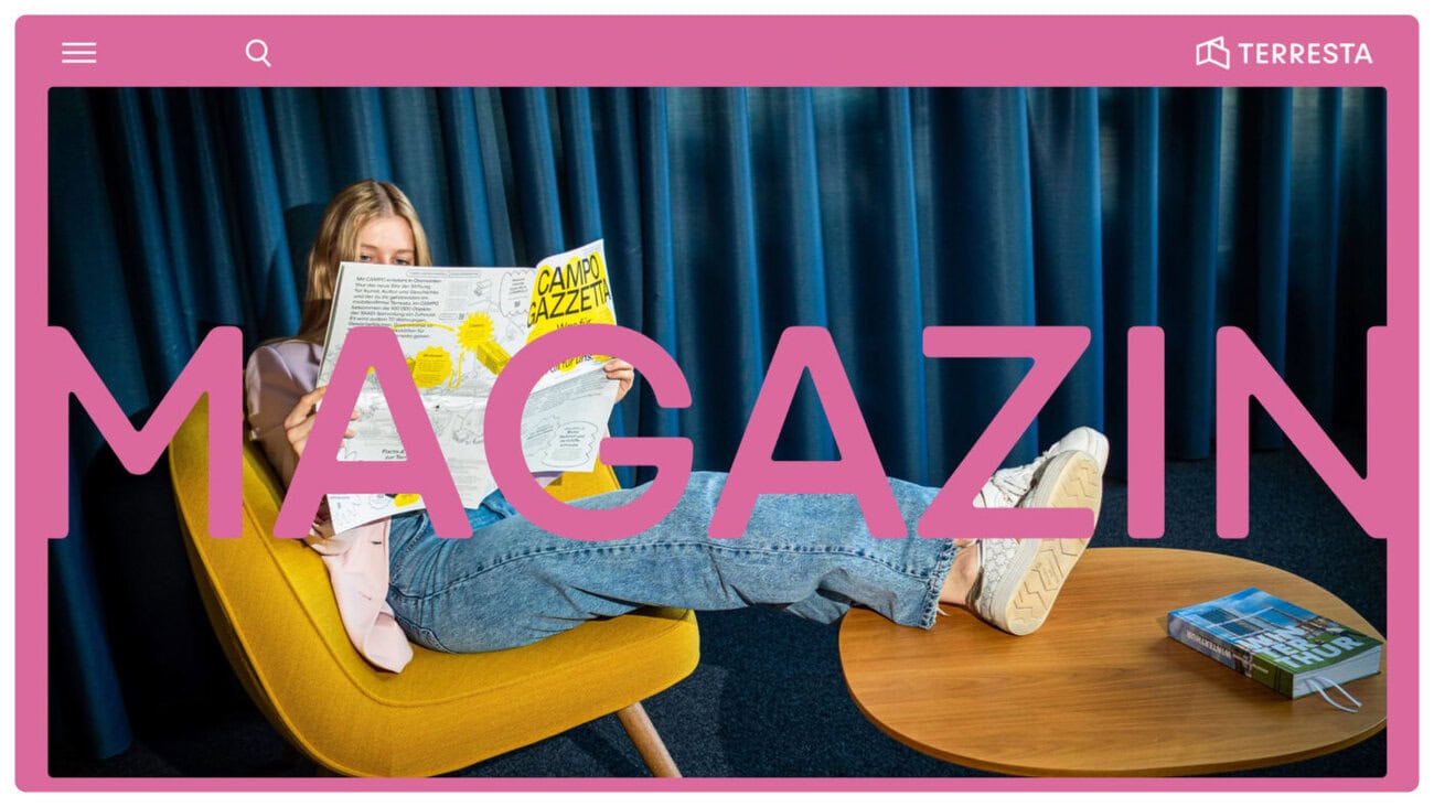
Terresta - the real estate division of the SKKG Foundation - is realigning itself for the future. The sharpened positioning is to be expressed in a self-confident and contemporary brand image. To this end, the website is being developed from scratch as a central point of contact. TBS accompanied the process from the development of the brand strategy to the redesign, redesign and realization of the website.
Terresta Immobilien- und Verwaltungs AG manages the approximately 200 properties and 2,200 apartments of the SKKG Foundation in a sustainable manner - the income supports the foundation's purpose. The new brand identity is intended to convey the values and culture of the Terresta brand clearly and transparently.
Clearly defined roles and brand affiliation
The first step was to develop a future-oriented brand positioning, specifically tailored to Terresta's role as a real estate company. This involved sharpening the messages to the various stakeholders in the communicative presence and defining a content strategy for the wide range of topics, channels and vehicles. The newly defined brand house makes Terresta's mission, values and various activities directly visible and serves as a content compass for communication.
In the new claim "Fair and committed.", Terresta expresses its fair treatment of tenants and partners as well as its commitment to building culture and the brand's curiosity. A clear promise to the outside world and a daily motivation to the inside. Building on this foundation of content, the visual brand identity was further developed in a second step.
Evolutionary and visibly new
The updated brand identity expands the existing CD with new design options and thus makes the variety of themes and new sides of Terresta visible. To this end, TBS developed a new design system that allows the elements to be handled more freely and cheerfully. The newly defined formal construction kit offers significantly more possibilities for more flexible and emotional forms of expression. The established moss green and the earthy color palette are supplemented by more intense tones and new, stronger traffic light colors.
New facets of the brand
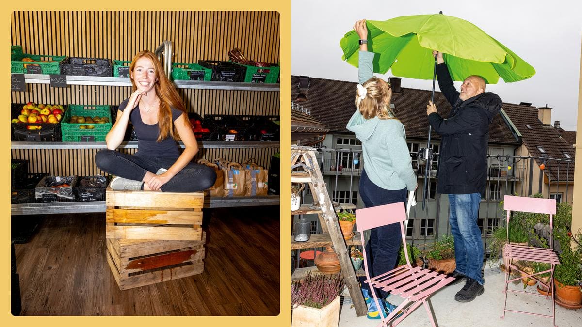
The new website provides insights into everyday life at Terresta and its residents. This makes Terresta more accessible as a real estate management company and gives it a face. Terresta's entire range of topics and activities can be experienced in a digital portrait via the new website and the newly designed online magazine. New communication channels have also been developed to reach the various stakeholders and target groups with relevant content.
The expanded color palette makes the diversity tangible, while new images and themes allow the various facets of the brand to be conveyed coherently. The frame derived from the logo characterizes the new communication presence as a design element - and sets new accents, especially in the magazine section. The properties and architectural objects are now confidently staged with bold, high-contrast colors, while on a communicative level, the focus will be on people in the future. The result is a lively and authentic world. The first portraits of estate life and the company have already been realized.
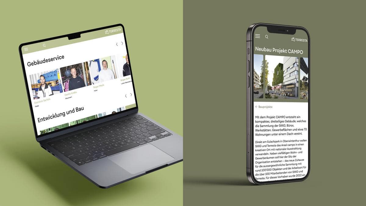
Contemporary design and experience combined
At the same time, access for the various user groups has been simplified and functionalities optimized. The content structure and navigation have been redesigned to make the user experience simple, contemporary and mobile-friendly. New modules and functional elements create a better overview, inspiration and clear reader guidance.
The refreshed appearance was consistently implemented across all touchpoints and the updated CD system was tested for various formats and use cases and documented in a new manual. In addition to the business stationery, the general e-newsletter and templates for construction boards and initial letting documents were also redesigned.