Swiss graphic: a solid thing
The Museum für Gestaltung Zürich is dedicating an exhibition to the theme of Swiss graphic design. Through early June, visitors to the museum on Limmatstrasse can view graphic design masterpieces from the past 100 years—ranging from posters to flyers and logos to commercials.


Swiss graphic art achieved international fame in the 1950s and 1960s. It was considered the export good par excellence. Even though national thinking is long gone, Swiss graphic art still enjoys a very good reputation. And it's not just within the graphics community that interest is high. "We sense a sensitization for designed things among the general public," explains Karin Gimmi of the Museum für Gestaltung, who is curating the exhibition together with Barbara Junod. "It's in the air: graphics are pretty cool."
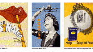
The museum's current exhibition is aimed at the public interested in graphics. It offers an insight into outstanding graphic works and lines of development, with the poster occupying an important position and acting as a constant companion: A frieze of around 100 notices from the poster collection of the Museum für Gestal-tung Zürich adorns the upper part of the winding exhibition space. Arranged chronologically from 1912 to 2012, they lead through the collection in a counterclockwise direction. Posters by Emil Cardinaux, Max Bill and Herbert Matter are followed by advertising posters by Globus, Henkel, Cynar, PKZ, Bally and Wernli. The sequence illustrates how important and present the poster medium is - both at the beginning of the last century and today. "The poster is still unique in terms of its ease of use and enormous effectiveness," says Gimmi, explaining the medium's success.
To the point
A look at the present and the past shows that although design has changed fundamentally as a result of the media and much work is now done digitally, the quality of the works has remained as a characteristic of Swiss graphic design. The works are characterized by precision and reduction to the essentials. "Swiss graphic design is a solid thing," Gimmi said. Showing this, he said, is one of the concerns of the exhibition.
The curator attributes the fact that the works are outstanding in terms of design and craftsmanship to the professional training in Switzerland. She sees it as an advantage that graphic designers in this country not only complete an artistic education at universities, but also complete an apprenticeship. This leads to quality in the area of craftsmanship. They are graphic designers who, especially in their exchange with the print shop, have a precise sense of what is possible. This leads to more precise and possibly more varied designs.
Advertising classics, typography and signal ethics
In addition to the posters, the visitor's tour reveals the breadth of visual communication across thirteen thematic focal points. In the case study Swissair, for example, the appearance of the legendary Swiss airline (1931 to 2002) is presented - from the winged arrow with the fantasy lettering designed by Rudolf Bircher in 1953 to the signet with the Swiss cross, which was created in 1978 after the renewal of the corporate design by Karl Gerstner. Right next to it shines the big orange M of Migros, above it hangs the old neon sign of its competitor Coop, on the other side the SBB signet. Alongside the popular Knorrli and Globi advertising figures are design classics such as the ABM plastic bag designed by Ernst and Ursula Hiestand in the 1960s.
The exhibition pays tribute to the ubiquitous Swiss typography with its own areas - the thematic focus "Typo-Graphics" and a corner for the grotesque Helvetica font. An explicit space is also dedicated to commercial advertising. Here, the exhibitors were not primarily interested in showing award-winning advertising, as Gimmi explains. Instead, they have selected campaigns that have a high impact on the public and are known to the general public. The legendary Toni yogurt campaign by Aebi & Partner from 1982, advertising for Sinalco and classics by the advertising agency GGK will be on display. Also present is Swissmilk's sporty dairy cow Lovely, with which Advico Young & Rubicam originally began advertising almost 20 years ago and which even made it onto the cover of Annabelle magazine in 2009 thanks to Ruf Lanz. An entire series is shown - from the tetrapack to the poster to the commercial.
While many of the exhibits belong to the museum's collections - for example, the sample collection of graphically important exhibits that the museum maintains for the students of the Zurich University of the Arts (ZHdK) - others were provided by advertising agencies. The museum has been in contact with many of the major agencies for some time. This also applies to the Wirz agency, which opened up its entire digital archive for the exhibitors. In addition to APG, Advico Young & Rubicam and Spillmann Felser Leo Burnett also support the museum as partners.
Isabel Imper