Contexta: Appenzeller cheese repackaged and spicy as ever advertised
Contexta has designed a new packaging design for Appenzeller cheese and is promoting it itself.


Around two-thirds of all consumers decide which cheese to buy only before they reach the shelf. So attracting attention is becoming increasingly important not only in advertising but also at the POS - all the more so in view of the growing variety of products on offer.
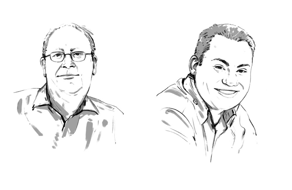
That's why Appenzeller Käse commissioned its long-standing lead agency Contexta to develop a new, uniform and independent packaging design that meets current nutritional trends such as the call for fresh, regional and naturally produced quality products. It's no wonder, then, that the redesigned packaging centers on two illustrated dairymen, handwritten variety names, and a unified color and naming scheme: all Appenzeller cheese varieties now have the same names as they taste.
The new packaging design is communicated on the one hand with advertisements in retail newspapers, and on the other hand with two TV and online spots featuring the popular Alpine dairymen. For once, they have left their familiar surroundings in idyllic Appenzellerland and are now making sure that Switzerland's spiciest cheese really does end up in consumers' shopping carts in the new packaging - as always without words and with a lot of humor.


Responsible at Appenzeller cheese: Christoph Holenstein (Director), Monika Walser (Head of Marketing and Communications). Responsible agency: Contexta, Bern. Production film: Onfilm (production), Simon Nagel (director), Jan Mettler (DoP), Nicolas Senn (music). Production Photo: Caspar Martig, Claudia Linsi (photo), Süsstrunk & Jericke (photo editing), Ward Schumaker (illustration). Media: Mediaplus, Bern.