Staging letters
Typography began with Gutenberg, and thanks to computers, there are virtually no limits to it today—new typefaces are created every day.


Typography began with Gutenberg, and thanks to the computer there are hardly any limits today - new fonts are created every day. "Typography is the staging of a message on the surface." That is probably the shortest definition. The only decisive factor for typographic success can therefore be the way in which the message is staged. There are all kinds of stagings in typography too, e.g. good and bad, excessive and staid, loud and quiet. So a typographer is to a certain extent a director of letters - and typography is the art of staging letters.
Typography has only existed since the day Johannes Gutenberg invented printing with movable type. Before that, everything to do with writing was calligraphy. Because Gutenberg was the first printer, he had to make everything he needed to practice his craft himself - including his letters. He couldn't just go into a store and order a box of lead or wooden letters. Gutenberg was therefore the first real type designer.
Printing works were quickly set up all over Europe. Every self-respecting duke wanted his own print shop. One of the biggest employers was the Vatican, which printed in over a hundred languages. All these printers had to produce their own typefaces. The typeface became a printing company's trademark. Whoever had the most beautiful typeface had the most orders. In the beginning, everyone printed Fraktur typefaces, simply trying to convert the beautiful calligraphic forms into movable type.
Absolute freedom of design
Only gradually did they find their own design language. The Italians had an advantage here, as the Roman capitalis was part of their everyday life. It is therefore not surprising that even the Frenchman Nicolas Jenson began to design his Fraktur letters with round forms (rotunda) shortly after the invention of letterpress printing in Venice (1470 to 1480). Today, however, Jenson is mainly known for his Roman, the Rotunda is almost forgotten.
The names of today's classic typefaces, such as Garamond or Bodoni, are all the surnames of famous printers of past centuries.
At some point, the art of cutting letters took on a life of its own and became a profession in its own right. Perhaps a printer had an employee who could cut much more beautiful letters than he could himself. All he then had to do was cut letters, which was hard work in those days - and certainly not a privilege. The new profession had already been invented.
It was not until the Industrial Revolution that the first type publishers emerged, offering type as a commodity. The employed designers usually remained nameless. At the beginning of the 20th century, some designers set up their own type foundries, e.g. Deberny & Peignot in France.
The rapid development from lead typesetting to phototypesetting to computer-controlled typesetting to the possibilities that every PC offers today has finally given typography and type designers absolute freedom of design. Anyone who thinks they can do it can now open their own "digital type foundry". And many do. Never before have so many new fonts been designed (and old ones copied) as today. The largest Internet font seller, myfonts.com, publishes around six new fonts a day, which, with 200 working days, amounts to 1200 new fonts a year. If we assume that 80 percent of these are copies of existing fonts and a further 10 percent are too amateurish to last, that still leaves 120 genuine new fonts per year. Incidentally, the trend here is clearly towards scripts (see box).
Who needs new fonts?
In our day-to-day work as graphic designers, we are constantly faced with the question of which typeface is right for the job or client.
Let's assume, for example, that a bank is the customer. Banks always want to appear reserved and thus inspire trust. They want to avoid their customers realizing that it's "only" about money. So the bank needs a font that has as little personality of its own as possible. The font of choice is Helvetica, which was originally developed specifically for this purpose. Unfortunately, however, most banks already use this Helvetica as their corporate font.
The decisive ladies and gentlemen of the fictitious customer would like to have Helvetica - but perhaps with a little more independence ... And the need for a new font has already arisen. For this very reason, a large number of grotesque fonts have been designed over the last 15 years. Banks wanted to stand out from their competitors without really distinguishing themselves. Many variations of Helvetica were created with imaginative names such as Swiss. But new classics were also born, such as Meta and Thesis. In a very short space of time, however, these have become so widespread among bank customers that they are already showing signs of wear and tear. And - the need for a new generation of "bank fonts" has already arisen. If we now equate "bank" with institution, then it quickly becomes apparent how widespread such a font really is.
This mechanism of eternally new demand is undergoing a parallel development in other industries. In publishing, for example, it was Times that was used by literally every publisher. Then, to stand out, some publishers used Sabon, only to be overtaken by the masses a few years later. The next reaction was for someone to dig up Eric Gill's beautiful Joanna, which is now also suffering the same fate.
Mainly for this reason - namely for a special purpose or client - we always need new fonts. Another reason is that someone has an idea for a new typeface or enjoys designing a new typeface.
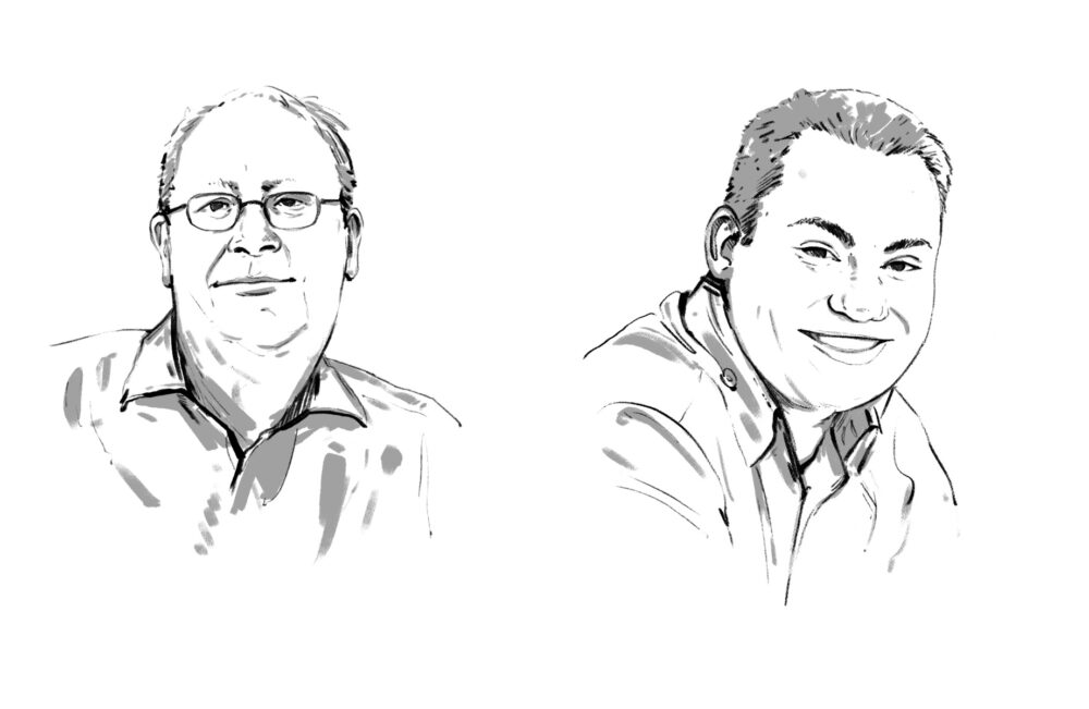
About the authorGert Wiescher was infected by the typography bug during his childhood friendship with Erik Spiekermann. Wiescher has designed over 200 typefaces and written several books on typography. After working in Paris, Barcelona and Johannesburg, he has lived and worked as a freelance graphic designer and type designer in Munich for 30 years.
For the past year, he has concentrated exclusively on font development and markets his fonts himself. They can be purchased from all major online retailers. The latest range can always be found at www.myfonts.com/foundry/wiescherdesign or on his own website www.wiescher-design.de. He has named his latest font, a script with three styles that can be combined with each other, Donna Bodoni in honor of Bodoni's widow.
Gert Wiescher
Typography has only existed since the day Johannes Gutenberg invented printing with movable type. Before that, everything to do with writing was calligraphy. Because Gutenberg was the first printer, he had to make everything he needed to practice his craft himself - including his letters. He couldn't just go into a store and order a box of lead or wooden letters. Gutenberg was therefore the first real type designer.
Printing works were quickly set up all over Europe. Every self-respecting duke wanted his own print shop. One of the biggest employers was the Vatican, which printed in over a hundred languages. All these printers had to produce their own typefaces. The typeface became a printing company's trademark. Whoever had the most beautiful typeface had the most orders. In the beginning, everyone printed Fraktur typefaces, simply trying to convert the beautiful calligraphic forms into movable type.
Absolute freedom of design
Only gradually did they find their own design language. The Italians had an advantage here, as the Roman capitalis was part of their everyday life. It is therefore not surprising that even the Frenchman Nicolas Jenson began to design his Fraktur letters with round forms (rotunda) shortly after the invention of letterpress printing in Venice (1470 to 1480). Today, however, Jenson is mainly known for his Roman, the Rotunda is almost forgotten.
The names of today's classic typefaces, such as Garamond or Bodoni, are all the surnames of famous printers of past centuries.
At some point, the art of cutting letters took on a life of its own and became a profession in its own right. Perhaps a printer had an employee who could cut much more beautiful letters than he could himself. All he then had to do was cut letters, which was hard work in those days - and certainly not a privilege. The new profession had already been invented.
It was not until the Industrial Revolution that the first type publishers emerged, offering type as a commodity. The employed designers usually remained nameless. At the beginning of the 20th century, some designers set up their own type foundries, e.g. Deberny & Peignot in France.
The rapid development from lead typesetting to phototypesetting to computer-controlled typesetting to the possibilities that every PC offers today has finally given typography and type designers absolute freedom of design. Anyone who thinks they can do it can now open their own "digital type foundry". And many do. Never before have so many new fonts been designed (and old ones copied) as today. The largest Internet font seller, myfonts.com, publishes around six new fonts a day, which, with 200 working days, amounts to 1200 new fonts a year. If we assume that 80 percent of these are copies of existing fonts and a further 10 percent are too amateurish to last, that still leaves 120 genuine new fonts per year. Incidentally, the trend here is clearly towards scripts (see box).
Who needs new fonts?
In our day-to-day work as graphic designers, we are constantly faced with the question of which typeface is right for the job or client.
Let's assume, for example, that a bank is the customer. Banks always want to appear reserved and thus inspire trust. They want to avoid their customers realizing that it's "only" about money. So the bank needs a font that has as little personality of its own as possible. The font of choice is Helvetica, which was originally developed specifically for this purpose. Unfortunately, however, most banks already use this Helvetica as their corporate font.
The decisive ladies and gentlemen of the fictitious customer would like to have Helvetica - but perhaps with a little more independence ... And the need for a new font has already arisen. For this very reason, a large number of grotesque fonts have been designed over the last 15 years. Banks wanted to stand out from their competitors without really distinguishing themselves. Many variations of Helvetica were created with imaginative names such as Swiss. But new classics were also born, such as Meta and Thesis. In a very short space of time, however, these have become so widespread among bank customers that they are already showing signs of wear and tear. And - the need for a new generation of "bank fonts" has already arisen. If we now equate "bank" with institution, then it quickly becomes apparent how widespread such a font really is.
This mechanism of eternally new demand is undergoing a parallel development in other industries. In publishing, for example, it was Times that was used by literally every publisher. Then, to stand out, some publishers used Sabon, only to be overtaken by the masses a few years later. The next reaction was for someone to dig up Eric Gill's beautiful Joanna, which is now also suffering the same fate.
Mainly for this reason - namely for a special purpose or client - we always need new fonts. Another reason is that someone has an idea for a new typeface or enjoys designing a new typeface.
About the authorGert Wiescher was infected by the typography bug during his childhood friendship with Erik Spiekermann. Wiescher has designed over 200 typefaces and written several books on typography. After working in Paris, Barcelona and Johannesburg, he has lived and worked as a freelance graphic designer and type designer in Munich for 30 years.
For the past year, he has concentrated exclusively on font development and markets his fonts himself. They can be purchased from all major online retailers. The latest range can always be found at www.myfonts.com/foundry/wiescherdesign or on his own website www.wiescher-design.de. He has named his latest font, a script with three styles that can be combined with each other, Donna Bodoni in honor of Bodoni's widow.
Gert Wiescher