tibits: new corporate design, revamped visual identity, and flexible design system by Bold
After more than 25 years, tibits is revamping its brand identity—with a new corporate design, a fresh visual style, and a consistent design system. It was developed by the Bern-based agency BOLD and is being implemented in collaboration with tibits’ in-house marketing team.



The tibits rebranding marks a turning point: After more than 25 years in business, the Swiss vegetarian restaurant is revamping its brand identity—with a new corporate design, a revised visual language, and a flexible design system intended to function consistently across all channels. The new visual identity was developed by the Bern-based agency BOLD and is being implemented in collaboration with tibits’ in-house marketing team.
Refined, not reinvented
What began in 1998 as an idea at the ETH Venture 98 business plan competition is now a family-owned business with 13 restaurants. Together with Zurich restaurateur Rolf Hiltl, the Frei brothers brought their vision to life in December 2000—the first tibits in Zurich’s Seefeld district. The brand identity has evolved over more than 25 years, layer by layer. That was the impetus for the brand refresh.
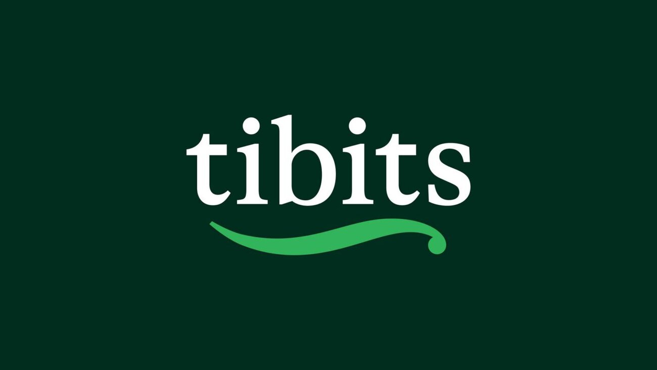
At the heart of the new corporate design is the redesigned logo, the tibits bean. It has been carefully refined—with cleaner lines, a more contemporary look, and a more distinctive character than before. The logo is complemented by a new typeface, a refreshed color palette and visual style, and a flexible design system that ties the brand’s identity together, from restaurants to social media.
«A brand like tibits can’t be reinvented from scratch. We were looking for an agency that understands what has grown here over the past 25 years—and that has the courage to take it to the next level,» says Daniel Frei, CEO and co-founder of tibits.
People and Community at the Heart of Visual Narrative
Communication has also been revamped: The visual and design language is intended to come across as more vibrant, immediate, and self-assured. People are taking center stage. Guests and employees from the tibits community were specifically invited to participate in the photo and video shoots. According to the press release, this results in visual content that not only showcases the brand but also highlights its community and conveys genuine emotions.
The design system behind it is crucial: It ties the brand’s image together—whether it’s being showcased in the restaurant or on social media.
tibits Rebranding with an Eco-Friendly Rollout
The initiative kicks off in September with a launch campaign that will unveil the new brand identity to the public for the first time. According to the press release, plans include a «Vegi Legi» poster campaign, social media activities, digital initiatives, and various communication activities surrounding the Zurich Film Festival—a partnership that has been in place for 20 years.
At the same time, the gradual rollout is taking place across the 13 restaurants and all other communication channels. There is deliberately no set date by which everything existing will be replaced: Each element is being reviewed individually and replaced carefully. According to the press release, sustainability is also a key issue here—with 13 restaurants, any other approach would contradict the company’s own values and what guests appreciate about tibits every day.
More about tibits' new brand identity: tibits.ch/neuer-auftritt
Person in charge at tibits: Daniel Frei, CEO and co-founder. Responsible agency: BOLD, Bern (Lena Kaufmann, Consulting). Visuals: Studio Canapé, Zurich.