BKW Brand Identity: How 110 Logos Became One
Strichpunkt Identity, in collaboration with BKW, has developed a new brand identity that reorganizes the energy and infrastructure company’s evolving brand landscape and creates a unified, digital design system for the «Solutions 2030» strategy.


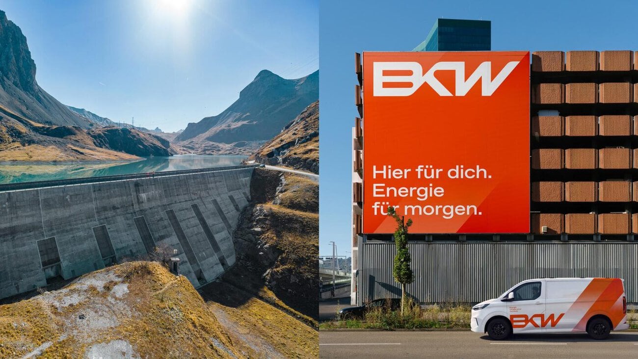
BKW's Brand Identity as a Response to Increasing Brand Diversity
In collaboration with BKW, Strichpunkt Identity developed the new BKW brand identity, thereby reorganizing the brand architecture of the Swiss energy and infrastructure company. The brand design was refined and expanded to include a digital design system. According to those involved, the result forms a central foundation for BKW’s «Solutions 2030» strategy and the associated consistent brand identity across the entire group.
Since 2024, Strichpunkt Identity has been providing strategic and design support to the company on its journey toward «One BKW,» a more cohesive brand landscape under the BKW umbrella brand. The assignment encompasses the entire transformation process: from brand analysis to the development of a new brand strategy—in collaboration with partner GMK Markenberatung—and brand architecture, all the way through to corporate design, a digital design system, a brand portal, and operational support for the rollout.
With its «Solutions 2030» strategy, BKW aims to more effectively unify the growing diversity of its companies under the umbrella brand. The starting point was a brand landscape that had expanded through numerous acquisitions, comprising more than 110 brands and logo variations. Together with BKW, Strichpunkt Identity therefore developed a new brand strategy and brand architecture that strengthens the umbrella brand, provides clarity, and at the same time allows the individual companies room to develop their own identities.
From Brand Strategy to Brand Design
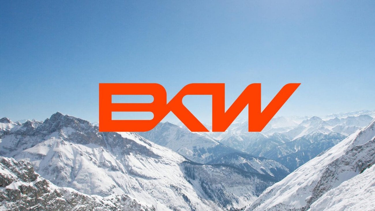
Based on their joint strategic work, Strichpunkt Identity designed a visual system that brings BKW’s reorientation to life under the motto «We’re moving forward.» The central element is the redesigned logo: The previous orange square has been removed, and the three interconnected letters BKW now take center stage. This creates a link to the first logo from 1908. At the same time, the new logo is intended to underscore BKW’s pioneering spirit and capture the idea of dynamism, a new beginning, and a group growing closer together.
Strichpunkt Identity redesigned the color palette, the key visual pattern, the typography, the illustration style, and the visual language. BKW electric orange takes center stage as the defining brand color. With «BKW Favorit,» which is based on Dinamo’s ABC Favorit, a typographic foundation was created that is intended to appear modern and personal. According to the company, the new brand identity conveys BKW’s vision of a world worth living in and its commitment to helping shape it through forward-looking solutions for energy, infrastructure, and buildings. The new identity is being rolled out across all touchpoints and also ensures additional visibility through sponsorship—particularly in Swiss winter sports with Swiss-Ski, as well as at the Alpine and Nordic FIS World Cups in Switzerland.
Flexible branding system for the entire BKW Group
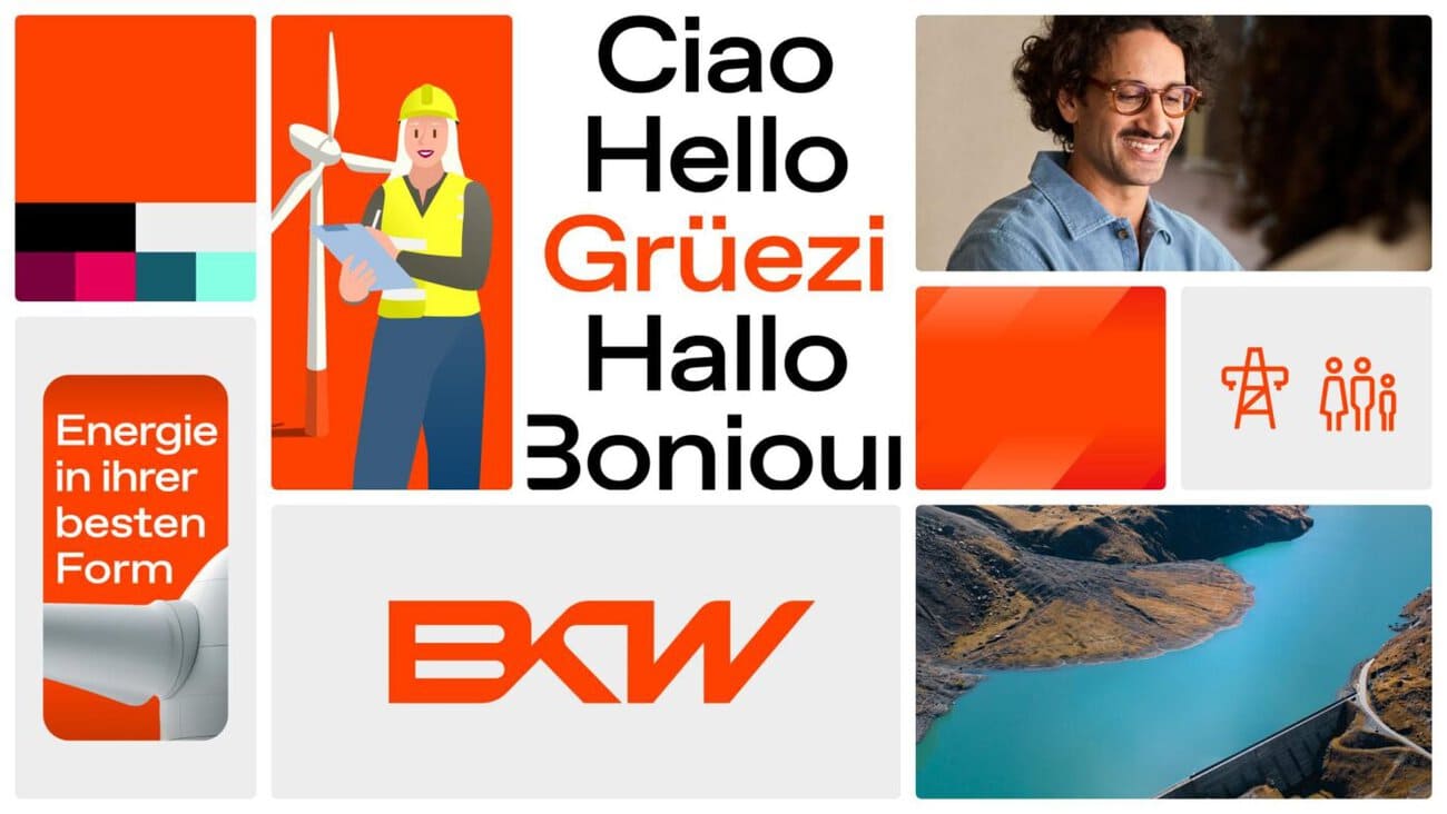
To ensure consistent brand usage across the entire BKW Group, Strichpunkt Identity created a digital design system and a comprehensive brand portal. The system is designed to bring together different companies, applications, and touchpoints under a shared visual framework. In addition, Strichpunkt Identity developed the layout assets and design guidelines for BKW’s Brand Creator, which was developed by netzwerk P. This enables employees to independently and easily create brand-compliant communication materials based on clearly defined design and application guidelines. At the same time, the system lays the groundwork for the future use of AI-powered applications in brand management.
Michael Morgenthaler, Head of Group Brand & Marketing Communications at BKW, says: «Strichpunkt Identity quickly understood that this project was about much more than just a new design. It’s about strategy, our portfolio, and making BKW stronger as a whole. What convinced us was their clarity of thought, their deep brand expertise, and above all, a team that engaged with our organization and our employees with great dedication.»
Martin Schweikert, Chief Communications Officer at BKW, adds: «Brand follows strategy: »Solutions 2030’ provides BKW with a clear strategic direction—our new brand identity translates this into a unified image. We’re creating more clarity in our portfolio, strengthening the ‘One BKW’ spirit, and pooling our resources. The fact that we’ve had more than 110 logo variations to date shows that now is the right time to make this change.”
Thomas Dirfard, Head of Project Management at Strichpunkt Identity, summarizes: «The unique challenge with BKW was to make the identity of a diverse corporate group—one that has grown over the years—visibly apparent. Together with BKW, we therefore strategically reorganized the brand landscape and integrated brand architecture, design, and digital systems from the very beginning. The result is a brand identity that brings together the diversity of the BKW Group, significantly strengthens the umbrella brand, and at the same time works effectively in day-to-day use.»
For more information on BKW’s brand identity and the «Solutions 2030» strategy, please visit the company’s website: https://www.bkw.ch
Responsible at BKW: Michael Morgenthaler, Head of Group Brand & Marketing Communications; Martin Schweikert, Chief Communications Officer. Person in charge at Strichpunkt Identity: Thomas Dirfard, Project Management Division.