Züriwerk Brand Identity: «Changing What Holds Us Back»
The Züriwerk Foundation is revamping its brand identity in collaboration with the agency Evoq—in a participatory, accessible manner involving more than 100 participants. The new design, featuring magenta and the distinctive «Ü» as a super symbol, brings the “Inclusion 2035” strategy to life.


Züriwerk Brand Identity: From Risk of Confusion to a Clear Identity
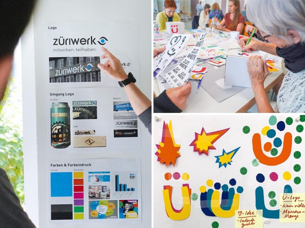
The Züriwerk Foundation, one of the largest social enterprises in the canton of Zurich, has completely revamped its brand identity. In collaboration with the Zurich-based agency evoq, a bold corporate design was created that brings the strategic vision «Inclusion 2035» to life—with more than 100 employees, residents, specialists, and members of the executive board and the foundation board all participating as equal contributors.
The previous brand identity was showing its age: the technical-looking logo, the blue-and-white color scheme, and the text-heavy website regularly led to confusion with municipal utilities. At the same time, Züriwerk completed a far-reaching strategic realignment. The 10-year «Inclusion 2035» strategy has the clear goal of creating a society that does not discriminate against people with disabilities. A new brand identity was needed—one that authentically embodies this mission.
«The old brand no longer aligned with our vision for Züriwerk,» says Roger Stäger, managing director. «We didn’t just want a new logo. We wanted a brand that authentically reflects our mission and with which our entire organization can identify.»
A participatory process puts inclusion first
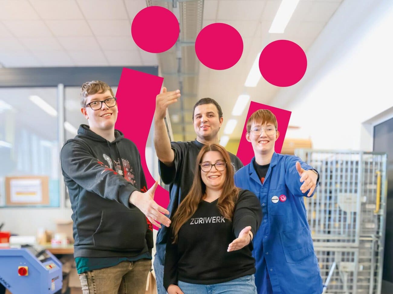
Instead of traditional brand development, Züriwerk opted for the participatory process developed by evoq based on the Double Diamond principle. This process involves multiple cycles of broad-based input gathering within the organization and expert synthesis at the agency. More than 100 people from the organization—employees, residents, specialized staff, the board of trustees, and executive management—took part in the process. All workshops were deliberately designed to be inclusive: without time pressure, with individual breaks, joint feedback sessions, and creative outcomes.
«Brand renewal is more than just design; it’s a strategic tool,» says Myriam Mojon, Head of Marketing, Communications & Fundraising at Züriwerk. «We were only able to achieve this through a participatory process in which everyone’s voice is heard—without compromising on quality.»
According to the press release, the result is a brand identity that is not dictated from above but emerges organically from within the organization. This authenticity and broad sense of identification are difficult to achieve through traditional brand development processes.
Accessible Design with Magenta and the "Ü" as a Special Character
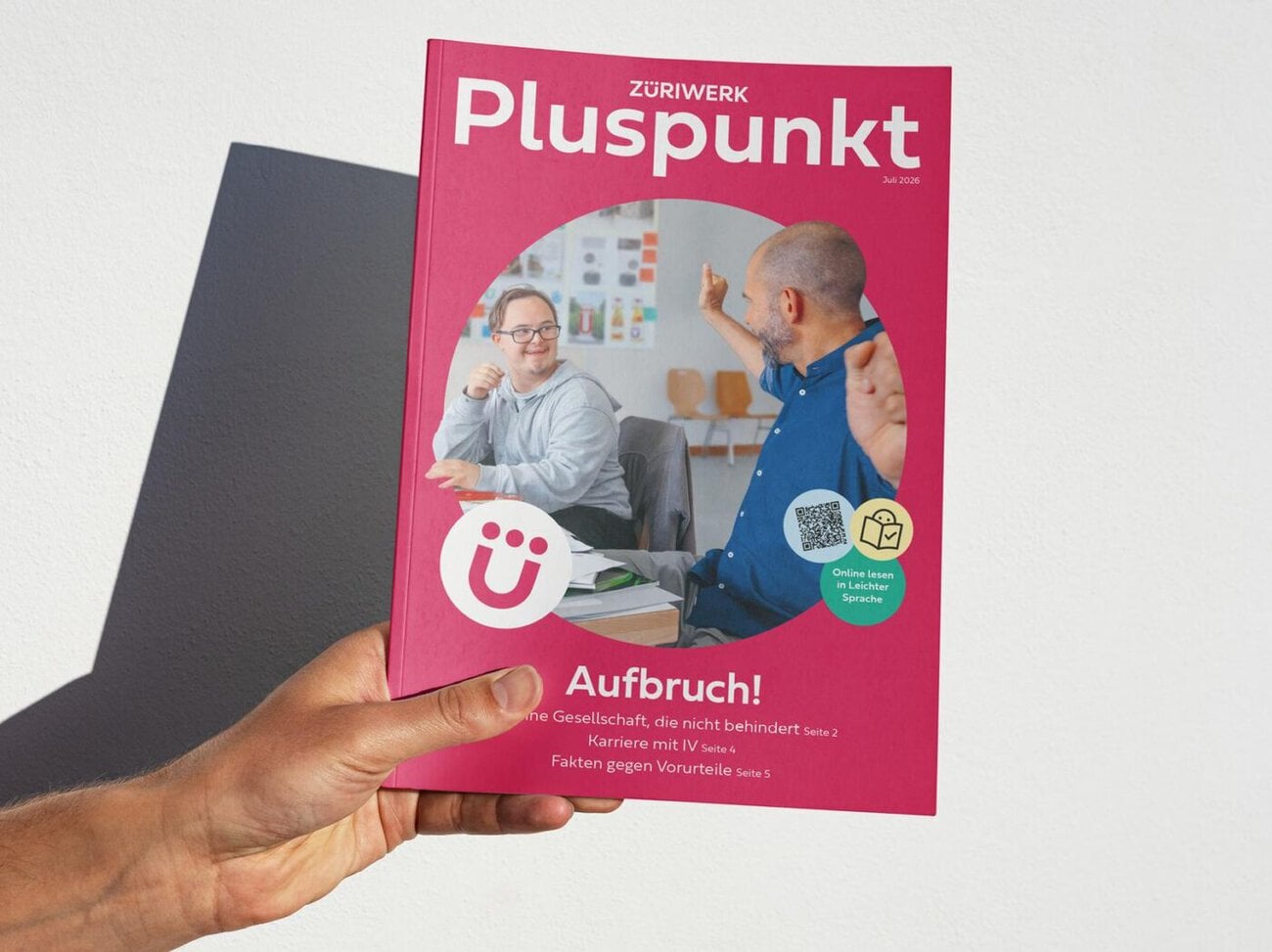
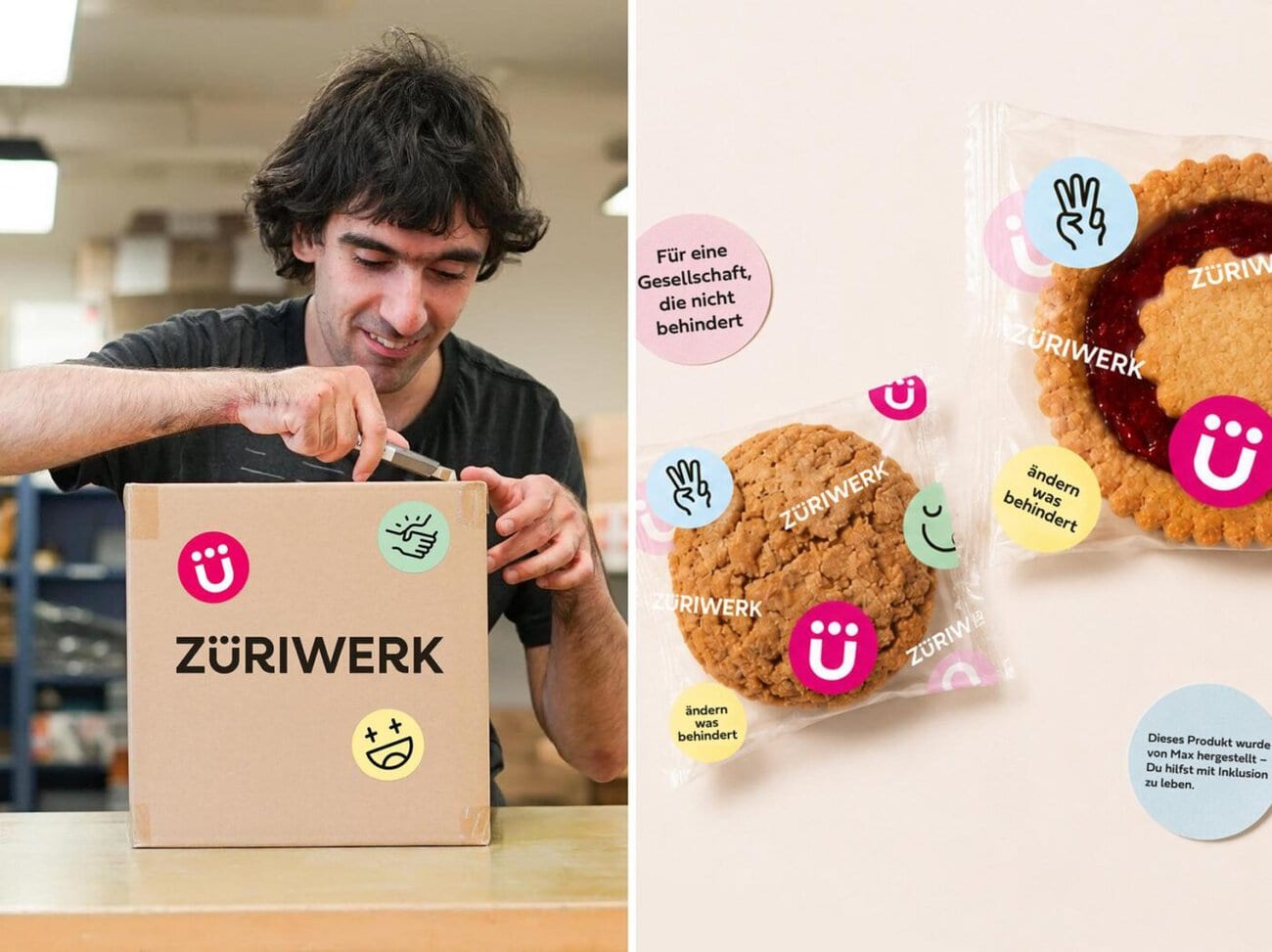
The new visual identity of the Züriwerk brand is dominated by the distinctive “Ü” with three dots—the so-called “super symbol.” It can be interpreted in different ways: Some see a society where everyone is on equal footing, while others see a smiling face. The primary color is changing from the previous blue to magenta—a statement of creativity, modernity, and diversity that also immediately sets Züriwerk apart from municipal enterprises.
In collaboration with the typeface specialists at TypoType, evoq also developed the custom typeface Zueriwerk Sans, which is accessible and highly legible. A special headline variant integrates the three dots from the super symbol into all umlauts. The icon set is based on Augmentative and Alternative Communication (AAC), a multimodal form of communication that Züriwerk uses on a daily basis. All icons are placed on light-colored circles in one of the secondary colors—this is intended to create an accessible and visually consistent system.
«We were delighted to develop an expressive and vibrant identity that puts the voices of the Züriwerk community front and center,» says Markus Wohlhüter, Head of Design at evoq. «The participatory development of the brand identity—from digital to physical—is reflected in every element of the design system.»
New Website as an Accessible Core Application
The core component of the revamped brand identity is the website, which was conceived and designed by evoq and programmed in-house to ensure accessibility. The information architecture is centered on the needs of the target audiences. For example, the job search function was designed to be inclusive, making no distinction between specialists and staff members. Key pages are also available in plain language. The existing online store system was redesigned, and services such as the donation tool, the newsletter, and the HR platform were fully integrated.
Authenticity Through Participation
The new slogan, «Changing What Holds Us Back,» succinctly summarizes Züriwerk’s mission. The focus is not merely on participation, but on actively driving change—not on making people conform, but on reshaping society. This strong brand is intended to help Züriwerk increase its visibility, attract new people and resources, and reframe its mission.
Contact at Züriwerk: Myriam Mojon (Head of Marketing, Communications & Fundraising), Caroline Waldburger, Alexandra Elser (Marketing, Communications & Fundraising), Roger Stäger (Executive Director), Andrea Kaufmann (Head of Operations), Marc Hämmerli, (Head of Decentralized Housing & SEBE), Martin Schär (Head of Production, Baslerstrasse & Bubikon), David Schildknecht (Romeo & Jane GmbH, website copy) and a large number of people at Züriwerk. Contact at evoq: Adrian Schaffner (Project Management, Consulting, Workshop Facilitation), Markus Wohlhüter (Consulting and Design Lead), Gianluca Flütsch, Marta Freitas, Kira Riccius (Graphic Design and UX Design), Susanne Pfäffli (Copy and Wording), Dominique Haussener (Concept and Website Project Management), Giannina Binder, Marcel Marty (Programming).