Stringent architecture
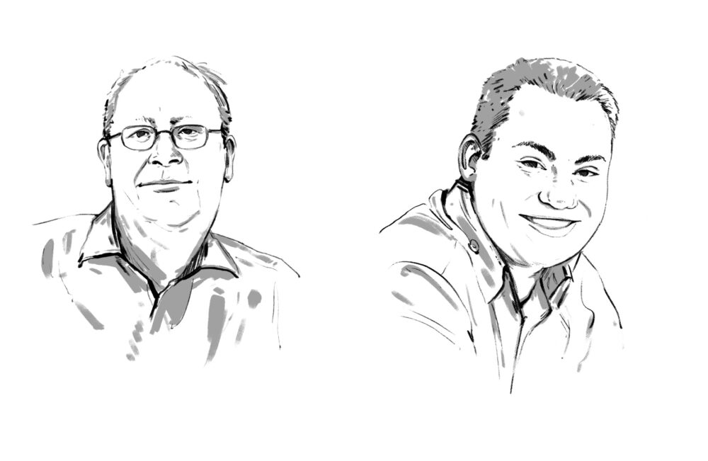
Samuel Helbling on the redesigned WerbeWoche


Samuel Helbling on the redesigned WerbeWocheYou are holding the first issue of WerbeWoche with its new look in your hands. Anyone who - like us - regularly holds up a mirror to the media and communications industry would do well to take a look in the mirror themselves from time to time. As the leading Swiss weekly newspaper for advertising, marketing and media professionals, we feel obliged to continue offering the most attractive product on the market in the future. The new WerbeWoche is to be more clearly structured, easier to read and more reader-friendly. To this end, we have streamlined the magazine and reincorporated the many small innovations of the past few years into a consistent, clear magazine dramaturgy, revising both the look, including the logo, and the content structure. The renovated WerbeWoche has a modern yet classically elegant look. The cornerstones of the redesign include the revised newspaper head, the subtle use of color and a stringent page architecture. The two sections "Marketing & Communication" and "Media & Media" now each have their own front page. We have also introduced an "Opinion" page in the first section. This is intended to sharpen our profile and offer you more guidance in the ever-increasing flow of information. On the opinion page, you will find statements on relevant events, guest commentaries and columns by distinguished contemporaries such as Peter Glotz, Ulrich Saxer, Walter Bosch, Heribert Seifert, Kenneth Angst and Constantin Seibt.
We created the redesign in close cooperation with MediaGroup, Berlin, under the direction of Lukas Kircher. He and his team also developed the new concept for Tele, the Financial Times Deutschland and the Frankfurter Allgemeine Sonntagszeitung.
We wish you an inspiring read and look forward to your feedback.
> Samuel Helbling, Editor-in-Chief
We created the redesign in close cooperation with MediaGroup, Berlin, under the direction of Lukas Kircher. He and his team also developed the new concept for Tele, the Financial Times Deutschland and the Frankfurter Allgemeine Sonntagszeitung.
We wish you an inspiring read and look forward to your feedback.
> Samuel Helbling, Editor-in-Chief