Rivella in a new look - Yves Béhar designs brand identity
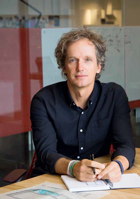
Rivella has completely revamped its brand identity in collaboration with Yves Béhar. *Die Werbewoche* spoke with the internationally acclaimed designer and founder of the San Francisco-based agency Fuseproject about the brand’s modernization and how Rivella is now implementing this new era in design and production.


Werbewoche: Rivella has completely revamped its brand identity - together with your San Francisco-based design agency Fuseproject. Why were you exactly the right person for the new brand design?
Yves Béhar: We started working together two years ago. When I got a call for this project, I was honestly very surprised. But working with Rivella made perfect sense to me because they wanted a new perspective. Having grown up in Lausanne and having drunk Rivella myself as a teenager, I understood the meaning behind this modernization very well. I also knew exactly how we could transform the brand identity into something unique.
You drank Rivella yourself as a teenager. What image did you have of the brand back then?
Yves Béhar: Rivella brings back memories of being outdoors and doing sports - such as skiing in Villars as a child and running the Morat-Fribourg as a teenager. That definitely played a role in the design process.
What fascinates you about the Rivella brand today?
Yves Béhar: Rivella has deep roots in Swiss culture. The brand reflects the Swiss. People in Switzerland have almost patriotic feelings towards the company. Rivella has the red and white color palette of the Swiss flag, drawing on the themes of mountains and the outdoors - these qualities are part of the new identity, but in an abstract way, rather than a literal, direct representation.
How did the collaboration for the Rivella appearance work out?
Yves Béhar: I think Rivella is a very authentic company and authentically Swiss. Both the brand and the design work that came out of the collaboration are true for both the brand and the customers. And it seems to make people quite curious about Rivella's future! From that point of view, I would consider the whole thing a success.
What opportunities do you generally see for modernizing a brand? Where are the risks?
Yves Béhar: There are many risks involved in such a process. For example, there is a risk of negating people's emotional connection with the brand. Modernizing a brand also means identifying where the brand is going, but it also means knowing where it came from. The perfect balance is a visual design that feels right, that feels the same as before - but shows the brand in a contemporary way.
Why did you decide to design the brand identity for Rivella instead of designing a new gadget?
Yves Béhar: Fortunately, it wasn't a question of either or. Ultimately, the approach to designing an iconic beverage is the same as for new technology - it's about telling a story about why this product exists. Then it's about creating a visual and physical experience that clearly personalizes that story.
Which projects do you take on with Fuseproject?
Yves Béhar: We are a multidisciplinary studio. We do branding for established companies such as Nivea and Paypal, but also design products in technology, furniture and consumer products. At the same time, we design digital experiences along the brand and its products. We also do a lot of development work, be it non-profit projects such as the One Laptop per Child project or VerBien in Mexico, the largest distributor of glasses for schoolchildren in the world. We have also supported new businesses whose products have benefited young women in Kenya, Uganda and Rwanda. The studio is now expanding to support start-ups in Asia.
Digital experiences, development work, new technologies - where is branding heading in general?
Yves Béhar: We are in an interesting time for branding, now more than ever. People are in a much more personal and direct dialog with the brand. Whereas brands used to justify their image through advertising, the relationship is based on direct experience with the product, apps and social media. I think that's a great thing. Brands can now get immediate and direct feedback from their customers - they need to be much more transparent and accountable for this kind of customer relationship in a way that's never been done before. This means brands are more accountable for their designs. Design has become more important as a direct touch point - and that's a good thing!
What new branding opportunities do you see in digital?
Yves Béhar: The more brands innovate in the digital space, the more opportunities they have to create an iconic brand experience. It's about being unique, having your own angle and working towards it. I could see us seeing more exceptional digital brand experiences soon. Creativity and originality is back on top!
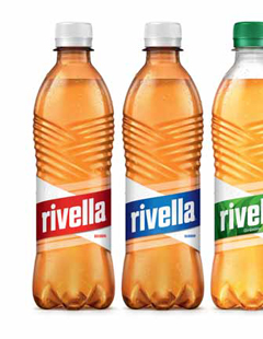
Swiss cross reinterpreted
Andrys Aardema, Head of Marketing at Rivella, talks about the relaunch of the Rivella brand and the new focus.

Werbewoche: What is the main focus of Rivella's new image?
Andrys Aardema: We didn't want to be reduced to rural folklore in the mountains. Rather, the new Rivella should embody modern and diverse Switzerland with all its facets. It is essential to expand our target group and build a stronger bond with young consumers. In the future, they should be proud to hold a Rivella in their hands when they are with friends.
How is the repositioning of the Rivella brand reflected?
Andrys Aardema: Rivella is the unique ≪Gutfuhl≫ taste of active Switzerland. We stand for an active and optimistic life like no other brand in the category. Sportiness is an integral part of our brand DNA. However, we want to interpret activity more broadly and encourage creative creation. This strong attitude is also expressed in our new communication campaign.
Why Yves Béhar?
Andrys Aardema: There are three important reasons why we took this big step together with Yves Behar. Firstly, Yves and his team understand how to fuse graphic and industrial design in a unique way like no other. Secondly, Fuseproject is a very progressive design studio that has a lot of experience when it comes to transforming traditional brands into the future. Nivea is an excellent example of this. And last but not least, Rivella is part of Swiss culture and Yves still knows this heritage from his childhood in Lausanne.
How is Rivella implementing the new era in concrete terms?
Andrys Aardema: We rely on Rivella's unique color combination with the brown bottle and the white and red label. To create an iconic design, you have to reduce: So today you no longer see a sun, mountains or Swiss cross on the label. However, the new Rivella logo itself is a modern interpretation of the Swiss cross, inspired by the sharp edges of our mountains. These are also expressed in the texture of the bottle, which forms an integrated unit with the contour die-cut label. On the production side, this means that each label is precisely aligned with the texture on the bottle, for which we had to procure special machines.
Interviews: Ursina Maurer