
Kraftkom stages price equality for Migrolino
Migrolino is launching a new campaign to highlight that Migros products are available at exactly the same price as at its parent company, Migros. The St. Gallen-based agency Kraftkom developed a minimalist design in the Migrolino style, which is being used nationwide for point-of-sale and (D)OOH initiatives.


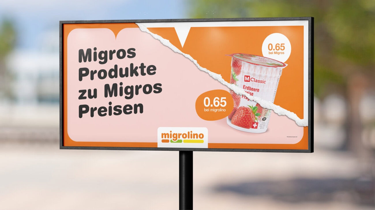
Migrolino stands for fast and uncomplicated shopping at busy locations such as train stations, petrol stations and other urban locations. What is less well known is that Migros products are available at Migrolino at exactly the same price as at the parent company Migros. It is precisely this aspect that forms the basis of the new campaign.
Based on an existing idea, the theme was further developed visually and implemented in Migrolino style. The campaign makes it clear at a glance that Migrolino's products are not associated with higher prices. This clearly communicates a key advantage and sets it apart from other providers in the convenience sector.
The design is deliberately kept clear and reduced and ensures clear recognizability. A concise visual bracket ensures that the message remains understandable even from a distance.
The campaign is used nationwide in various formats for POS and (D)OOH measures. In addition, animated elements with a tear-off effect are used to generate additional attention in public spaces.
Nina Wick, Marketing Project Manager at Migrolino, says: "The campaign shows at a glance that Migros products are available at Migrolino at the same price as in Migros. It conveys our message clearly and wherever our customers are. The collaboration with Kraftkom was professional and efficient."
Responsible at Migrolino: Alexandra Vogel (Head of Marketing), Nina Wick (Project Manager Marketing), Responsible at Kraftkom: Pascale Hoch (Strategy, Consulting), Sabrina Criscillo (Art Direction)


