The answer realized comprehensive relaunch for Ewopharma
To mark its 60th anniversary, Ewopharma treated itself to a completely revamped corporate design. Die Antwort is responsible for the implementation.


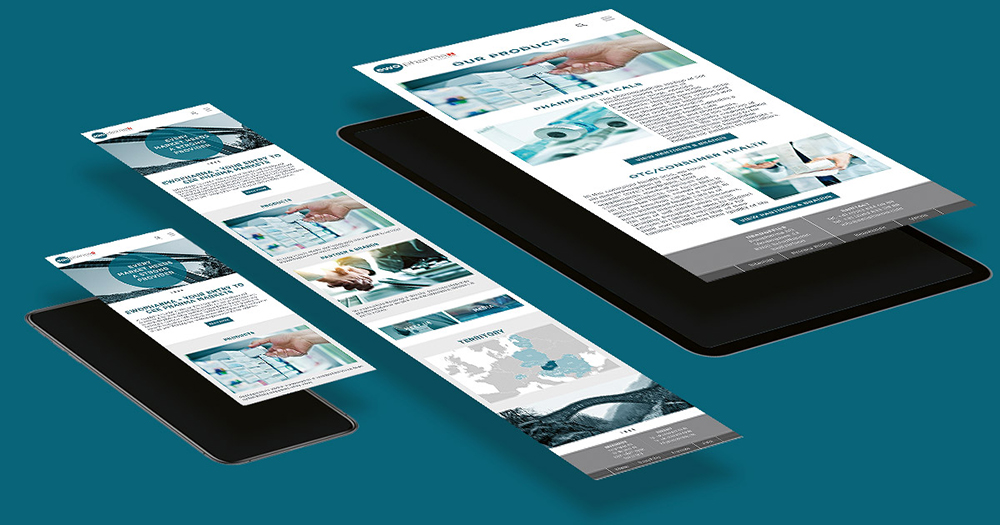
Ewopharma is a marketing organization specializing in the marketing of prescription and over-the-counter products in 15 Eastern European countries. The new corporate design is intended to reflect Ewopharma as a trustworthy partner for customers, partners and employees in all Eastern European target countries.
The circle has long been part of the pharmaceutical company's logo. In this way, the company also wants to take a piece of its heritage with it into the future as recognition. The new tagline wants to emphasize the long tradition and successful existence of the company, the Swiss cross the Swissness. The color petrol, as an elegant and profound color, is meant to inspire reflection. But it also has a friendly, natural and confident effect.
In addition to the overall implementation, Die Antwort was also involved in strategy development. The agency was also conceptually responsible for the website of the headquarters and the country websites. A 124-page CD manual comprises the entire corporate design and serves all countries as a basis for their communicative work.
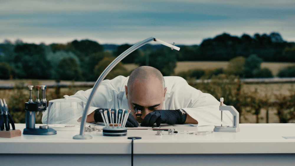
Furthermore, an image campaign was developed, which positions the company as a competent "bridge builder" for the Eastern European markets.