Give me names
As part of its rebranding, the ICT service provider Namics was looking for a brand identity that would reflect its open and flexible corporate culture. The solution is a dynamic, do-it-yourself word mark—the first real-time corporate identity. It was developed by the Zurich-based agency Heads.


Tomorrow is already yesterday. Work is not the same every day, nor does it feel the same every day. Tasks change, the daily mood of employees fluctuates. The web service provider Namics sees this changeability not as a threat, but as an opportunity. "Change and dynamism are part of Namics' culture," says Philipp Lämmlin, founder and partner of the company.
It is typical of Namics that everyone who understands the topic in question works on projects - no matter what position they hold in the company or what tasks they perform. If Namics employees have a question that they cannot answer themselves, they simply post it on the intranet or yammer, as Namics' internal tweeting is called. It doesn't matter whether the answer comes from an IT specialist, a project manager or an apprentice. What matters is that gaps in knowledge are filled as quickly as possible. "Participation is part of Namics' DNA. People who need a uniform and rules of conduct don't feel comfortable with us," says Lämmlin about the special way Namics employees interact with each other.
A brand like a friend
Ideally, a brand's name should be its program. A brand must not only be authentic and fit the company, but also have a clear face so that it is always recognizable in all its uses. But what can the corporate identity of a company look like that changes every day and cultivates this change, in which it is part of the self-image to constantly exchange knowledge on the fly, to be flexible, eager to learn and eager to change? How should the corporate design be so that it captures the creative and spontaneous spirit of the company and offers employees a place to identify with it, while also tangibly conveying this spirit to the outside world? And then the logo must also be usable for business cards, paper, lecture presentations, give-aways, banners and the company's website.
Namics wanted to fulfill all these requirements with its new brand. The only thing missing was the idea. Namics went through several creative brainwashing rounds, internally and with various agencies. But the project stalled. "We sensed that the conventional approach to branding no longer worked for us," explains Susanne Franke, PR manager at Namics. "A classic logo is too rigid, too immobile for Namics and doesn't correspond to our social media culture, in which everyone participates."
Profile without logo
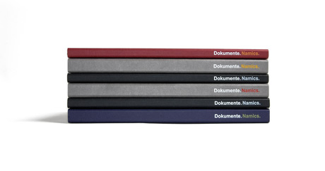
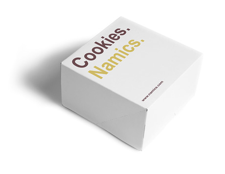
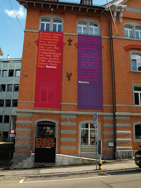
The Zurich agency Heads Corporate Communications finally had the brilliant idea and thus the solution to the problem. It developed a dynamic word mark for Namics that can be changed by every employee on a daily basis, a kind of social application as a brand. And it works like this: The wordmark consists exclusively of typography in the Arial bold font. It is made up of several words or even whole sentences, each separated by a period. Heads has christened these terms "Impuls". Any number of impulses can be strung together; the sequence of words always ends with the company name Namics, followed by a period.
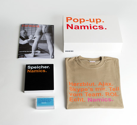
For example, the word mark can be "Substance. Taggen. From a single source. Room to dream, Structured. Knowledge management. Experience. Namics." or "Uff. Marketing. Be there. Rain today. Try it out. Reinvent yourself. Namics.". There are no limits to the imagination of Namics employees when it comes to combining words and short sentences. "The only framework is the 24 colors we have defined that our employees can use for the font and background," says Philipp Lämmlin. This creative leeway allows individuality to unfold, for example in the design of the business cards.
Participation is everything
After Lämmlin and Franke had presented the new corporate identity to the Namics employees, there was resistance from some of them along the lines of "Do we also have to design our own business cards now?". But we had prepared for this eventuality: "We had prepared some ready-made combinations from which everyone could have chosen one," says Franke. "Interestingly, in the end everyone wanted to design their own business card, even those who weren't so keen on the idea beforehand." Some Namics employees have now even created different versions of their card, which they use depending on the area of application. Jürg Stuker, CEO of Namics, is also convinced by the new logo: "Our dynamic word mark is an active contribution to less visual noise, which comes from ever more 'original' and therefore even more nonsensical logos."
Employees can also put together their own logo for presentations or lectures. For a lecture, for example, it could read: "Knowledge management. Impressions. Zurich. Looking forward to feedback. Move. Namics." And for those who are currently preoccupied with the weather and their home renovation work, "Sunshine. Wonderful. Good mood. Knowledge management. Painting the kitchen. Namics.". It is not important that the meaning of the impulses is always immediately apparent to everyone. The flexible brands are primarily intended to raise questions and get people talking to each other. This plan should work.
Impulses in demand
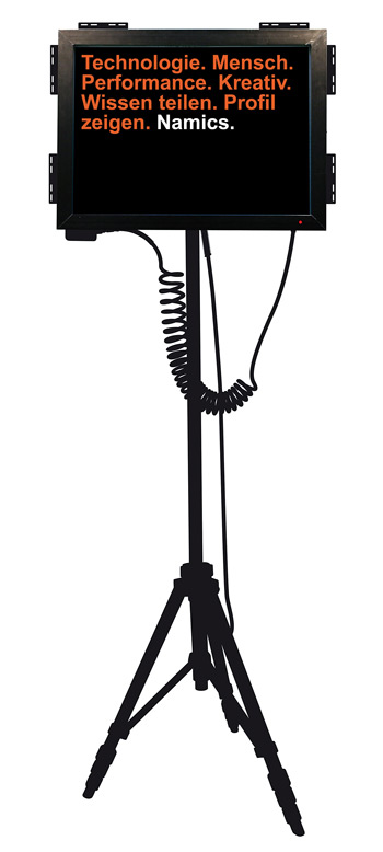
The most exciting aspect is the use of the flexible word mark in digital media, i.e. on the Internet and on the "tripods" developed by Heads, screens on three legs that will welcome visitors to Namics branches in the future. Every Namics employee can also influence these word combinations in real time - although in this case not without restrictions. Certain impulses are defined in the word mark, which are filled from a memory with changing corporate words, for example "guru", "dynamic", "here and now" or "heartbeat". For the other impulses, the ideas and feelings of Namics employees are required: they can send terms to the system via Twitter, Yammer, SMS, Skype or the intranet, which then immediately become part of the dynamic wordmark after a format check. In times of low impulse, i.e. at night or during the lunch break, the employee impulse points are filled with corporate words from the memory. This keeps the brand in constant motion.
Namics activated its word mark on June 3. Since then, all employees have been working on the company image in both senses of the word. "Of course, our employees could also place negative statements or insults in the logo," admits Philipp Lämmlin. "But I can't imagine that happening with us. Common sense is widespread here, we trust and value each other. That is also part of how Namics sees itself. That's why there is no blacklist of forbidden words and no muzzle."
As beautiful as the idea is - the concept of the flexible word-image brand is not suitable for every company. Marco Simonetti, Creative Director of the agency Heads, also emphasizes this. "Only the special corporate culture of Namics makes it possible to put the corporate identity in the hands of the employees." Of course, Namics is a special case. Because the most striking characteristic of the company and its brand image is change. Whether this core value translated into the brand will also achieve recognition and brand identity remains to be seen. It also remains to be seen whether the dynamism of the brand will be maintained after the launch hype. Corporate identity. New. Does it work. Hmmm. Gathering experience. Tense.
Anne-Friederike Wilhelm
In a nutshell
The IT and web service provider Namics was founded in 1995 as a spin-off of the HSG St. Gallen. The company primarily offers its customers services that contribute to the consistency of processes. For example, Namics integrates new and existing IT systems into internal company networks and optimizes websites and stores. The customer focus is on established companies and groups as well as public administrations and organizations. Namics has three branches in Germany and three in Switzerland and employs 280 people. Namics is a Publigroupe company.
It is typical of Namics that everyone who understands the topic in question works on projects - no matter what position they hold in the company or what tasks they perform. If Namics employees have a question that they cannot answer themselves, they simply post it on the intranet or yammer, as Namics' internal tweeting is called. It doesn't matter whether the answer comes from an IT specialist, a project manager or an apprentice. What matters is that gaps in knowledge are filled as quickly as possible. "Participation is part of Namics' DNA. People who need a uniform and rules of conduct don't feel comfortable with us," says Lämmlin about the special way Namics employees interact with each other.
A brand like a friend
Ideally, a brand's name should be its program. A brand must not only be authentic and fit the company, but also have a clear face so that it is always recognizable in all its uses. But what can the corporate identity of a company look like that changes every day and cultivates this change, in which it is part of the self-image to constantly exchange knowledge on the fly, to be flexible, eager to learn and eager to change? How should the corporate design be so that it captures the creative and spontaneous spirit of the company and offers employees a place to identify with it, while also tangibly conveying this spirit to the outside world? And then the logo must also be usable for business cards, paper, lecture presentations, give-aways, banners and the company's website.
Namics wanted to fulfill all these requirements with its new brand. The only thing missing was the idea. Namics went through several creative brainwashing rounds, internally and with various agencies. But the project stalled. "We sensed that the conventional approach to branding no longer worked for us," explains Susanne Franke, PR manager at Namics. "A classic logo is too rigid, too immobile for Namics and doesn't correspond to our social media culture, in which everyone participates."
Profile without logo
The Zurich agency Heads Corporate Communications finally had the brilliant idea and thus the solution to the problem. It developed a dynamic word mark for Namics that can be changed by every employee on a daily basis, a kind of social application as a brand. And it works like this: The wordmark consists exclusively of typography in the Arial bold font. It is made up of several words or even whole sentences, each separated by a period. Heads has christened these terms "Impuls". Any number of impulses can be strung together; the sequence of words always ends with the company name Namics, followed by a period.
For example, the word mark can be "Substance. Taggen. From a single source. Room to dream, Structured. Knowledge management. Experience. Namics." or "Uff. Marketing. Be there. Rain today. Try it out. Reinvent yourself. Namics.". There are no limits to the imagination of Namics employees when it comes to combining words and short sentences. "The only framework is the 24 colors we have defined that our employees can use for the font and background," says Philipp Lämmlin. This creative leeway allows individuality to unfold, for example in the design of the business cards.
Participation is everything
After Lämmlin and Franke had presented the new corporate identity to the Namics employees, there was resistance from some of them along the lines of "Do we also have to design our own business cards now?". But we had prepared for this eventuality: "We had prepared some ready-made combinations from which everyone could have chosen one," says Franke. "Interestingly, in the end everyone wanted to design their own business card, even those who weren't so keen on the idea beforehand." Some Namics employees have now even created different versions of their card, which they use depending on the area of application. Jürg Stuker, CEO of Namics, is also convinced by the new logo: "Our dynamic word mark is an active contribution to less visual noise, which comes from ever more 'original' and therefore even more nonsensical logos."
Employees can also put together their own logo for presentations or lectures. For a lecture, for example, it could read: "Knowledge management. Impressions. Zurich. Looking forward to feedback. Move. Namics." And for those who are currently preoccupied with the weather and their home renovation work, "Sunshine. Wonderful. Good mood. Knowledge management. Painting the kitchen. Namics.". It is not important that the meaning of the impulses is always immediately apparent to everyone. The flexible brands are primarily intended to raise questions and get people talking to each other. This plan should work.
Impulses in demand
The most exciting aspect is the use of the flexible word mark in digital media, i.e. on the Internet and on the "tripods" developed by Heads, screens on three legs that will welcome visitors to Namics branches in the future. Every Namics employee can also influence these word combinations in real time - although in this case not without restrictions. Certain impulses are defined in the word mark, which are filled from a memory with changing corporate words, for example "guru", "dynamic", "here and now" or "heartbeat". For the other impulses, the ideas and feelings of Namics employees are required: they can send terms to the system via Twitter, Yammer, SMS, Skype or the intranet, which then immediately become part of the dynamic wordmark after a format check. In times of low impulse, i.e. at night or during the lunch break, the employee impulse points are filled with corporate words from the memory. This keeps the brand in constant motion.
Namics activated its word mark on June 3. Since then, all employees have been working on the company image in both senses of the word. "Of course, our employees could also place negative statements or insults in the logo," admits Philipp Lämmlin. "But I can't imagine that happening with us. Common sense is widespread here, we trust and value each other. That is also part of how Namics sees itself. That's why there is no blacklist of forbidden words and no muzzle."
As beautiful as the idea is - the concept of the flexible word-image brand is not suitable for every company. Marco Simonetti, Creative Director of the agency Heads, also emphasizes this. "Only the special corporate culture of Namics makes it possible to put the corporate identity in the hands of the employees." Of course, Namics is a special case. Because the most striking characteristic of the company and its brand image is change. Whether this core value translated into the brand will also achieve recognition and brand identity remains to be seen. It also remains to be seen whether the dynamism of the brand will be maintained after the launch hype. Corporate identity. New. Does it work. Hmmm. Gathering experience. Tense.
Anne-Friederike Wilhelm
In a nutshell
The IT and web service provider Namics was founded in 1995 as a spin-off of the HSG St. Gallen. The company primarily offers its customers services that contribute to the consistency of processes. For example, Namics integrates new and existing IT systems into internal company networks and optimizes websites and stores. The customer focus is on established companies and groups as well as public administrations and organizations. Namics has three branches in Germany and three in Switzerland and employs 280 people. Namics is a Publigroupe company.