Numéro10 launches TamTam's new branding for LRG
The Bern-based agency Numéro10 has carried out a comprehensive rebranding of the iconic Swiss flan brand TamTam for LRG. With a redesigned logo and packaging, the brand—which has been around since 1966—now sports a retro-modern look that honors its heritage while bringing it into the present. The accompanying campaign showcases the TamTam packaging as a cult object.


TamTam is more than just a dessert - the brand is a true Swiss flan icon. It has accompanied the everyday lives of consumers in Switzerland since 1966 and has established itself as a constant in a segment heavily influenced by promotional prices. This longevity makes TamTam a valuable asset. In times when new products are introduced at a rapid pace, consistency takes on the form of iconic status.
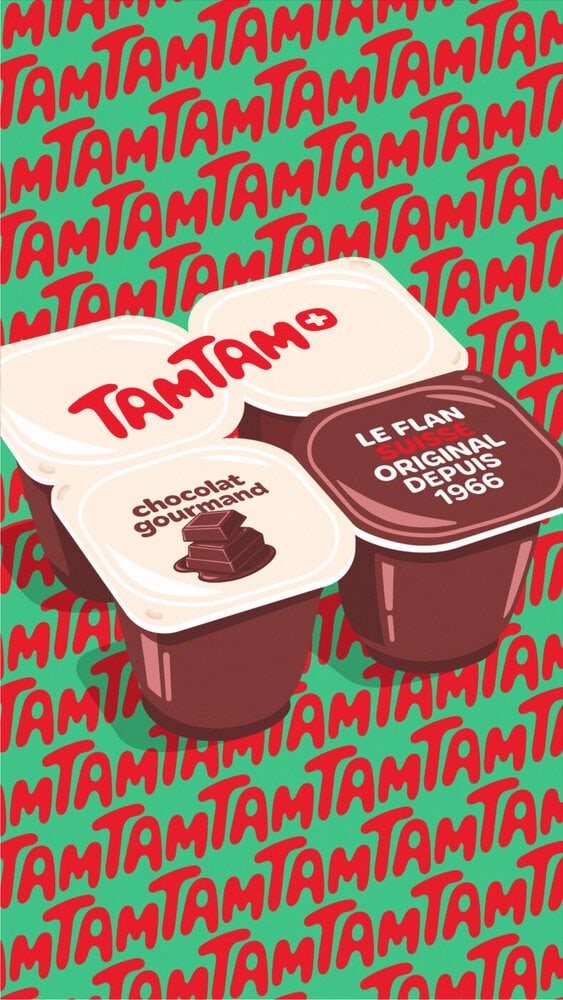
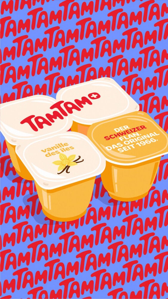
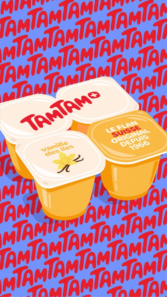
With the redesign of the logo and packaging, Numéro10 is renewing TamTam's identity while remaining true to the brand's heritage. The new visual identity embodies TamTam's legendary character through retro-modern codes inspired by the 1970s, while firmly anchoring the brand in the present. The graphic implementation of the packaging is characterized by a deliberately chosen minimalism and at the same time becomes an advertising medium: The claim «The Swiss Flan. The original since 1966».
Packaging staged as a cult object
In the rebranding campaign designed by the bilingual Bern-based agency, the new TamTam packaging is stylized as the central element and thus as a cult object. Illustrated and staged in an oversize format, the TamTam cups enter an artistic dimension. They are no longer just a container, but a cult object.
The campaign is based on three strong leitmotifs: Nostalgia, which evokes memories and conveys a sense of security. Pop culture, in which the product is both viewed and consumed. And cultural heritage, which acts as a Swiss frame of reference.