
Four tips for rebranding the future


REBRANDING The design experts at 99designs name four aspects that will point the way forward for graphic design this year.Always being up to date is not just an empty phrase, but a decisive factor in remaining successful as a company in the long term. It therefore comes as no surprise that many companies rebranded again in 2015. The main focus was on checking the design for its scalability, choice of colors and flexibility with regard to its possible applications on the web.
1. customizability
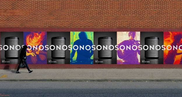
As more and more companies focus on their communities and the individuality of their members, logos and brands need to become more dynamic in order to do justice to this. The speaker manufacturer Sonos is the best example of how to attract attention with its brand - consisting of a three-part wordmark system, a gradient and an op-art highlight. With these modules, the brand has created a multitude of creative points of contact. The bright colors and patterns are perfect for transporting the diversity of music and conveying a lively feeling.
2. geometric, sans serif fonts
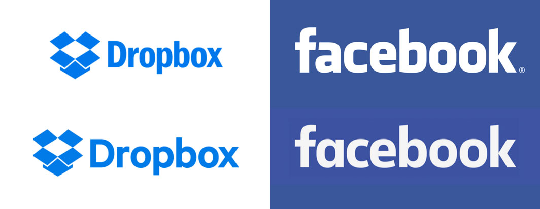
From Facebook to Dropbox to Google, companies have played with the geometric style, overcoming the condensed tech look to present a more personal and friendly logo. With these changes, however, companies weren't just aiming for appearance: Geometric fonts scale and look better, even in very small spaces. Google's "G" fits perfectly into boxes or squares and is therefore ideal for avatars, favicons ("favorite icon") or profile photos in social media.
3. more personality

The tourism industry sparked a renaissance in 2015 by focusing on playful, appealing logos that reveal the personality of a place. Around the world, the industry has worked hard to ensure that destinations clearly distinguish themselves from one another with individual designs.
4. clean design
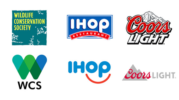
Minimalism has evolved from flat design. This not only had a decisive influence on rebrandings and new creations in 2015, but will also play a key role in 2016. Designers have turned away from thick fonts and now prefer to use looser and thinner letterforms. Logos have been reduced and superfluous symbols removed. Clear wordmarks rank high on the popularity scale of companies, and details that make legibility difficult or cause distraction are replaced by a white space to draw attention to the brand name. As with geometric representations, this has a particularly positive effect when a logo is greatly reduced in size, as in this way no details are lost during mobile use. "When designing a new logo, as with a rebranding, it is no longer just personal preferences that play a role. The technical conditions and usage habits of users are much more important, because only if the design works where it is called up does it become an eye-catcher and encourage customers to buy and/or use a product," says Marcos Gutiérrez Sanjuán, General Manager Europe at 99designs.


