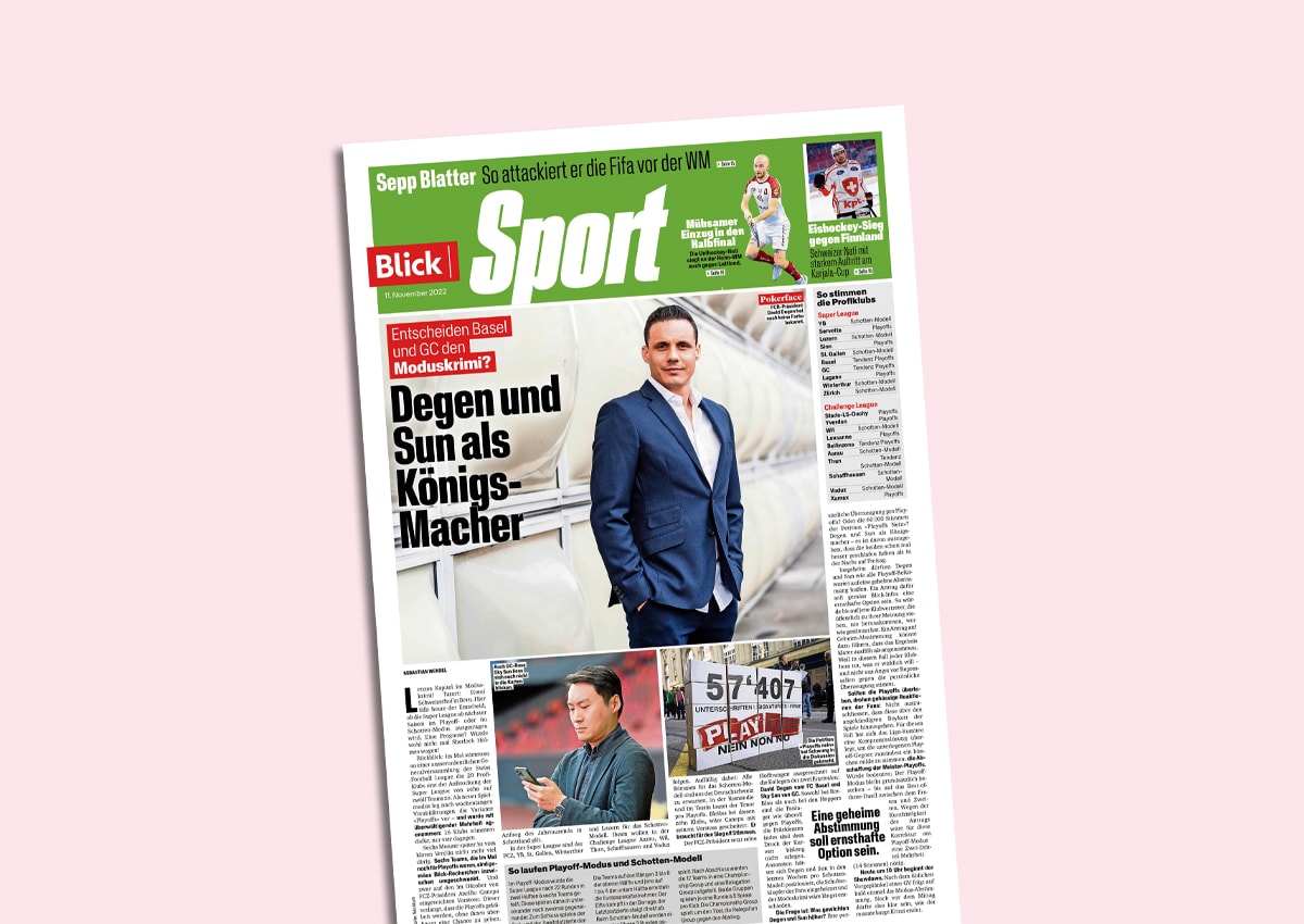
New layout for Blick print edition
As of Friday, Blick will appear in a refreshed design. Key features of the new layout, which was implemented in-house, include a new title font, adapted colors and additional style elements.


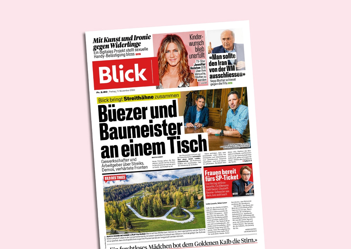
The soft redesign is intended to continue Blick's visually strong tradition, according to a statement from Ringier. At the same time, the redesign brings out the changed content orientation more strongly by emphasizing "value and relevance". Among other things, the font sizes of the titles have been reduced.
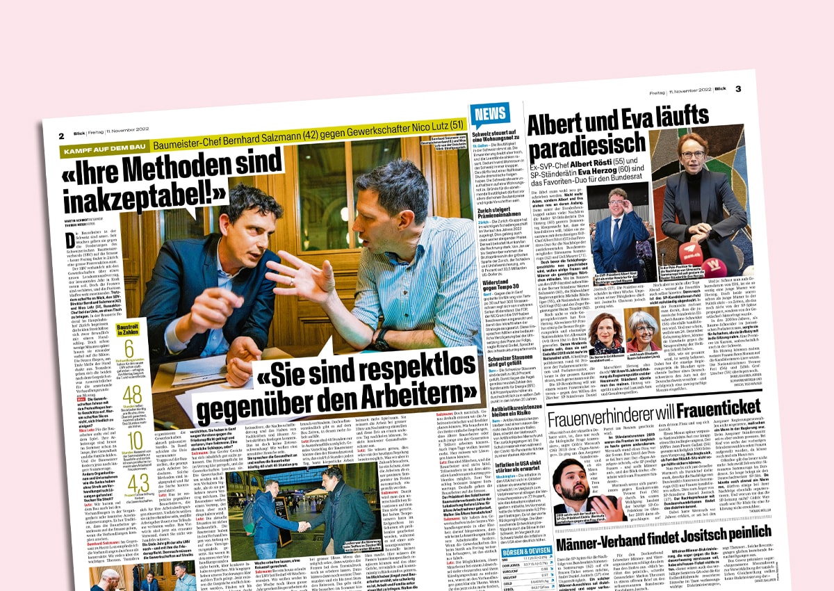
The adapted layout was designed in-house by Christian Waeber, Art Director of the SonntagsBlick-magazine. Waeber was already responsible for the redesign of the SonntagsBlick from the beginning year shaped (Werbewoche.ch reported). He was accompanied by View-Art Director Emanuel Haefeli and Andreas Dietrich, Editor-in-Chief View.
"The strengths of the newspaper as a medium include selection, weighting, clarity and the staging of content - we want to play these trump cards with wild determination with the new layout," says Editor-in-Chief Andreas Dietrich.