Kernbrand builds appearance for Stünzi Architekten
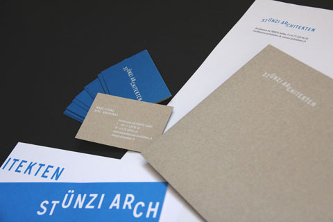
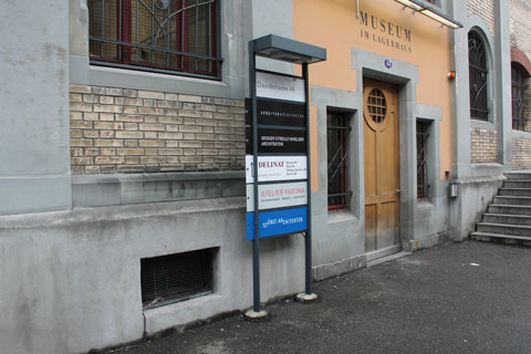
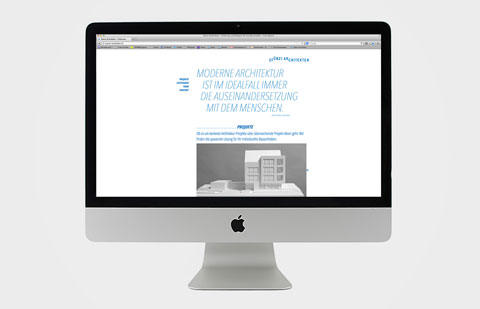
Kernbrand has developed a corporate design for the new office of Stünzi Architekten: From the logo and printed matter to the one-page website in responsive design, the overall appearance plays with human visual habits.


The idea for the visual approach was derived from one of the architect's main activities: Sketching designs on paper. Kernbrand developed an appearance that is characterized by an inky blue and is reminiscent of writing with a pen.
Word mark as optical illusion
The client's wish was to illustrate the "golden ratio" in the visual design. The new word mark therefore plays with a typographic division ratio. The lettering "Stünzi Architekten" is designed with offset letters and conveys an impression of spatiality.
Natural paper is used for the printed matter. The choice of paper is intended to create a closeness to nature and is based on the idea that architecture is always part of nature and blends into it.
The architects also rely on the new online presence. A one-pager in a responsively programmed flat design with integrated sliders provides information about services, expertise and numerous reference projects.