Noord gives the design guidelines of the canton of Bern a new look
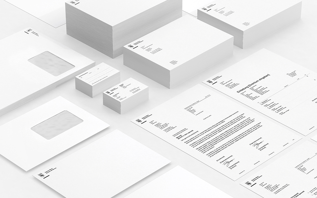
The Bern-based branding agency Noord developed the graphic concept and implementation of the new design guidelines for the Canton of Bern.


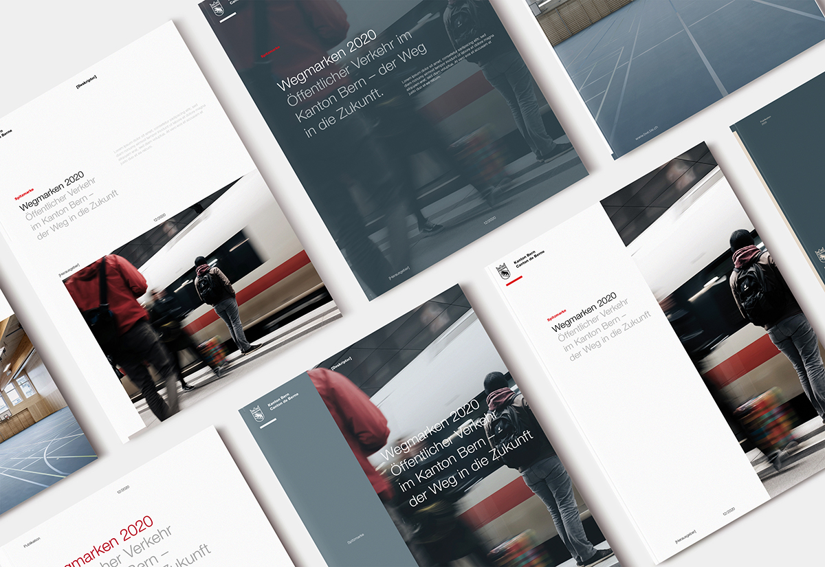
The design guidelines dating back to 1992 have been adapted to today's communication requirements and made more precise. In order to emphasize the bilingualism of the canton, the unchanged symbol (Bernese coat of arms with crown and line element) has been supplemented with the text "Kanton Bern / Canton de Berne". The canton's logo is now placed at the top left and no longer in the middle left of the page.
With the renewed overall appearance, the Canton of Bern wants to take center stage as a service provider. Thanks to the new design guidelines, savings can be expected as they are clearer, more unambiguous, adapted to current needs and their application entails fewer uncertainties and possibilities for interpretation. This applies in particular to agency and production costs. The new standardized envelope for the canton will also save costs. The design guidelines are available at Be.ch/cd2020