Last but not least: A font for Lisbon
Leo Burnett Lisboa developed a typography based on the Lisbon tram's power supply network. This idea gave rise to a uniquely beautiful commercial promoting city trips to Lisbon.


There are thousands of ways to discover Lisbon. But none is as characteristic as a streetcar ride. The cables along the historic streetcar lines are also omnipresent in the city. Although not photographed on purpose, they can be found in numerous travel photos taken by tourists.
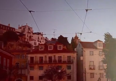
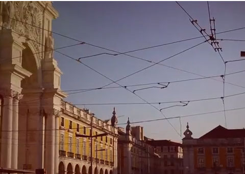
The creative minds at Leo Burnett Lisboa discovered a typography in this tangle of cables. It doesn't impress with its legibility, but is reminiscent of scribbly first attempts at writing. But it symbolizes Lisbon in a way that no other font could do better.
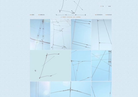
With the support of the city council, the font was printed on a Website released for use. There you can also find out from which angles the letters were taken. Each of them stands for a specific place in the city that you can visit by streetcar. This creates personal and spontaneous city tours, for example when you follow your own name through Lisbon. (sis)