Suva and MetaDesign: Brand Identity as an Evolution
Suva has further developed its brand identity in collaboration with MetaDesign. Rather than a redesign, the refresh—according to Suva—focuses on evolution: greater clarity, consistency, and emotional appeal across all touchpoints.


Suva has further developed its brand identity in collaboration with MetaDesign. According to a press release, the focus was not on a new visual identity, but rather on how to ensure that Suva’s identity is experienced in a contemporary and consistent manner. The foundation is built on experience principles designed to convey Suva’s approach in communication and design.
Since 2018, the existing corporate design has shaped Suva’s brand identity. Since then, communication habits, digital applications, and the requirements for a consistent brand experience have continued to evolve. An analysis conducted with internal and external experts showed that the strong identity and high level of brand recognition provide a solid foundation. The goal, therefore, was a deliberate evolution: to preserve what has proven successful, refine the brand’s image and communication, and make the brand more consistent and emotionally engaging across various channels.
Four Principles of Experience as a Framework
The starting point was Suva’s brand identity: «We are committed to people and their place in the community.» From this, MetaDesign and Suva jointly derived the four experience principles: «committed, fair, reliable, and approachable.» These principles are intended to form a common framework for communication, design, and experience, providing guidance across all media, channels, and applications. The goal is for Suva to be recognizable as the same brand—from personal contact to digital offerings to prevention campaigns.
Daniela Bassi, Head of Marketing and Communications at Suva, says: «Our starting point wasn’t the question of how we could simply make Suva look more modern. What was crucial for us was: How do we want Suva to be perceived?»
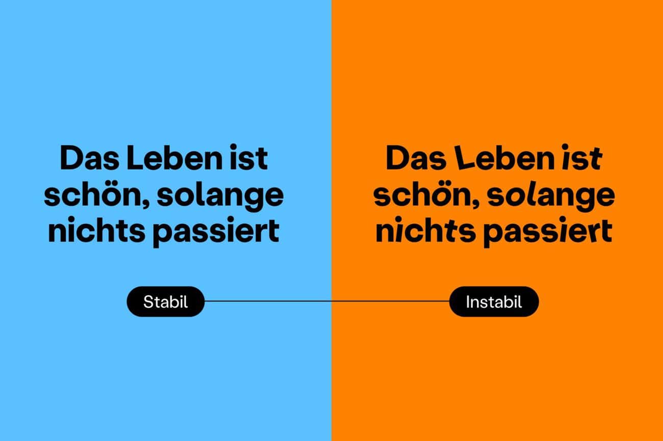
Suva's Brand Identity: Evolution Rather Than Revolution
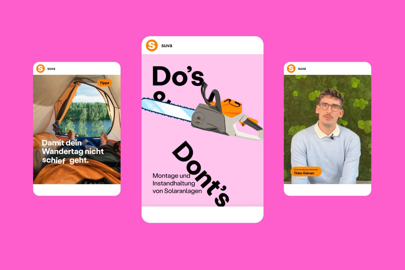
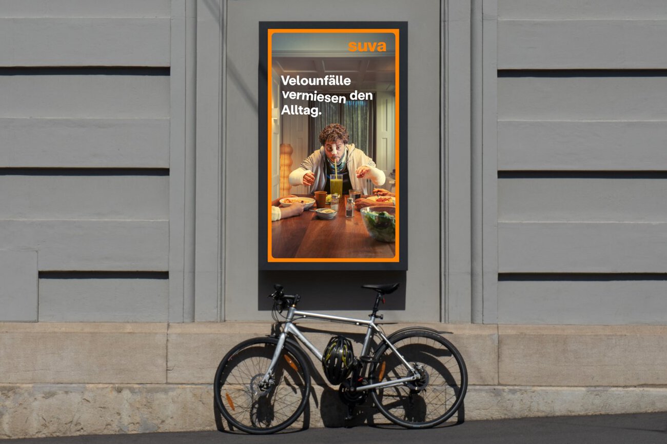
According to the press release, the brand’s signature orange and blue will be complemented by bolder and more intense colors. A new illustration style is intended to make complex content more accessible and support storytelling. The new typography can be used strategically to incorporate surprising elements and is designed to lend messages additional impact.
According to the press release, the design is guided by a clear philosophy: minimalist, accessible, and generous—yet at the same time emotional and offering visible added value for the respective target audience. Images, themes, and campaigns are intended to capture attention, convey a clear message, and tell stories that resonate and leave a lasting impression.

According to those involved, the redesign is intended to provide autonomy and flexibility for a wide variety of communication tasks and to strengthen Suva’s brand recognition.
Lukas Eiselin, CEO of MetaDesign, says: «The defined experience principles and their consistent implementation ensure both clarity and emotion, as well as moments of surprise.»
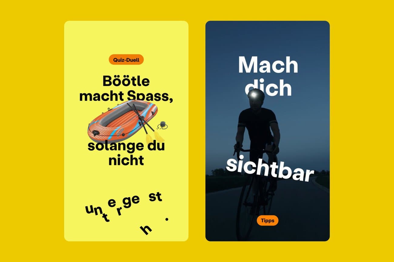
Bassi emphasizes that the design refresh now more consistently reflects Suva’s values in its visual and communicative identity. In this way, Suva is carefully building on its strong and familiar brand while at the same time connecting more closely with people.