Egloff Wörwag Architects: More Brand Presence with Less Space
An established architecture firm is sharpening its brand: In collaboration with Egloff Wörwag Architects, andfrank has further developed the firm’s positioning, redesigned its brand identity, and implemented the new brand identity, including a new website. At the heart of this effort is the belief that quality of life is not a matter of space, but of attitude.


Egloff Wörwag Architects has further developed its brand identity. This was prompted by Andrin Wörwag’s joining the firm as a co-owner and the resulting realignment of the architectural firm. According to the agency andfrank, it provided comprehensive support throughout the process: from strategic positioning and rebranding to the design and implementation of the new website.
Rethinking Urban Densification
Cities are changing, demands are growing, and available space is becoming scarcer. The shared vision of the firm and the agency is therefore to consistently rethink urban densification. The goal is architecture that is both visually compelling and economically sustainable.
«More. With less.» as our guiding principle
Under the guiding principle «More. With less.», a brand positioning was developed to capture the firm’s vision in a nutshell. Egloff Wörwag Architects develops residential projects for urban spaces and is convinced that quality of life is not a matter of space, but of attitude. They challenge the status quo, break away from familiar patterns, and strive to create solutions that achieve more with less space.
A flexible logo system instead of a fixed version
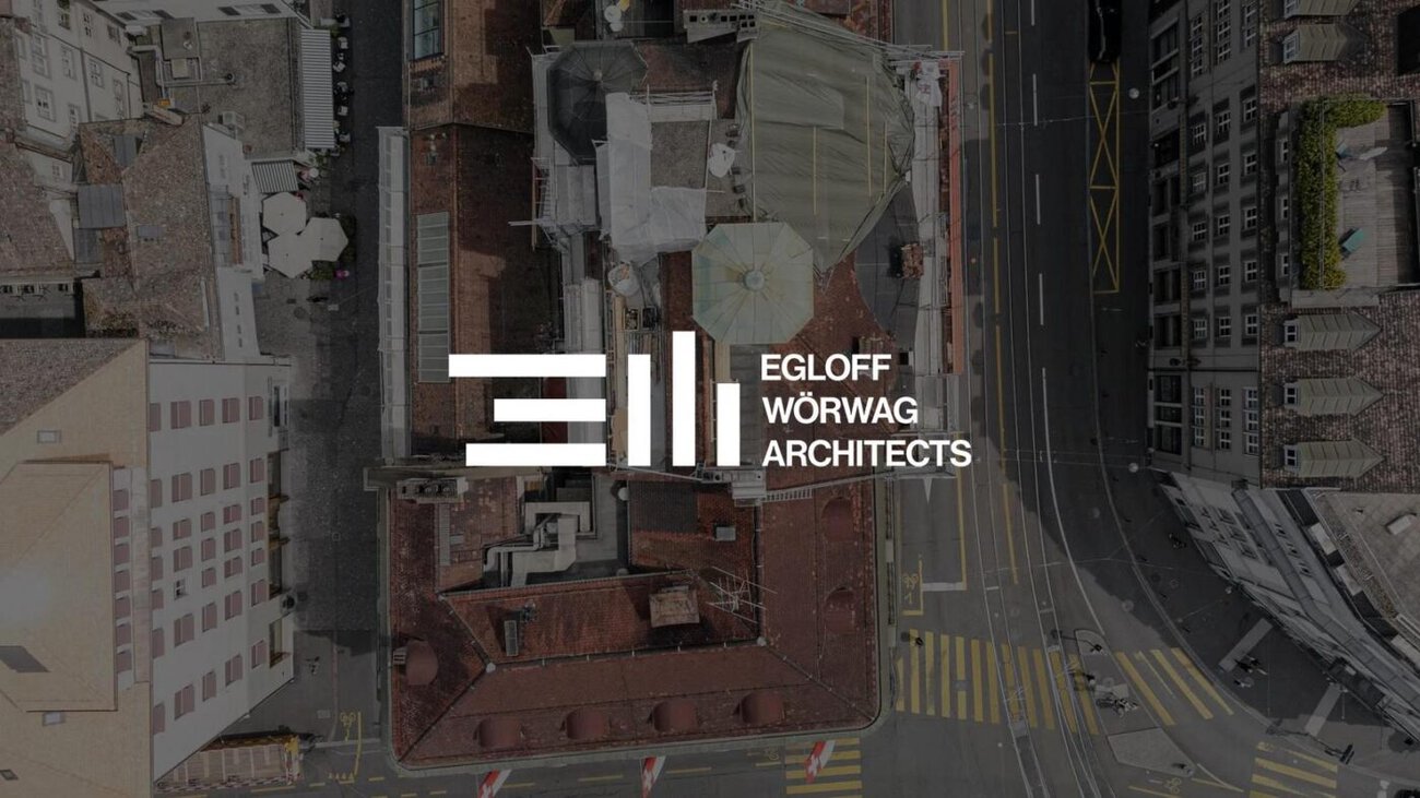
This philosophy is reflected in the new brand identity. The logo incorporates the letters «E» and «W» and abstracts them into floors and towers. Three horizontal lines represent dense spatial structures, while three vertical lines symbolize upward growth.
What makes this approach special is not just the form, but the principle behind it: there isn’t just one fixed version of the logo. Just as the firm’s projects vary, the interplay of the elements can constantly be repositioned. The result is a flexible logo system that adapts to different applications and contexts while remaining clearly recognizable at all times.
Typography, Color Scheme, and Website
Typography and the color palette also follow this logic. A deliberately compact typographic design carries the principle of condensation directly into the typeface. The minimalist color palette is inspired by the hues of the sky, clouds, and architecture and is complemented by an accent color. On the new website, the firm’s positioning, projects, and approach are brought together through a clear digital user experience.