Branding for architektoni: Clarity as a Design Principle
Schläfle Trittibach developed a new corporate design and website for the Zurich-based studio architektoni—streamlined to a single typeface, yet with a precise impact.


Branding for architektoni: When Typography Thinks Like Architecture
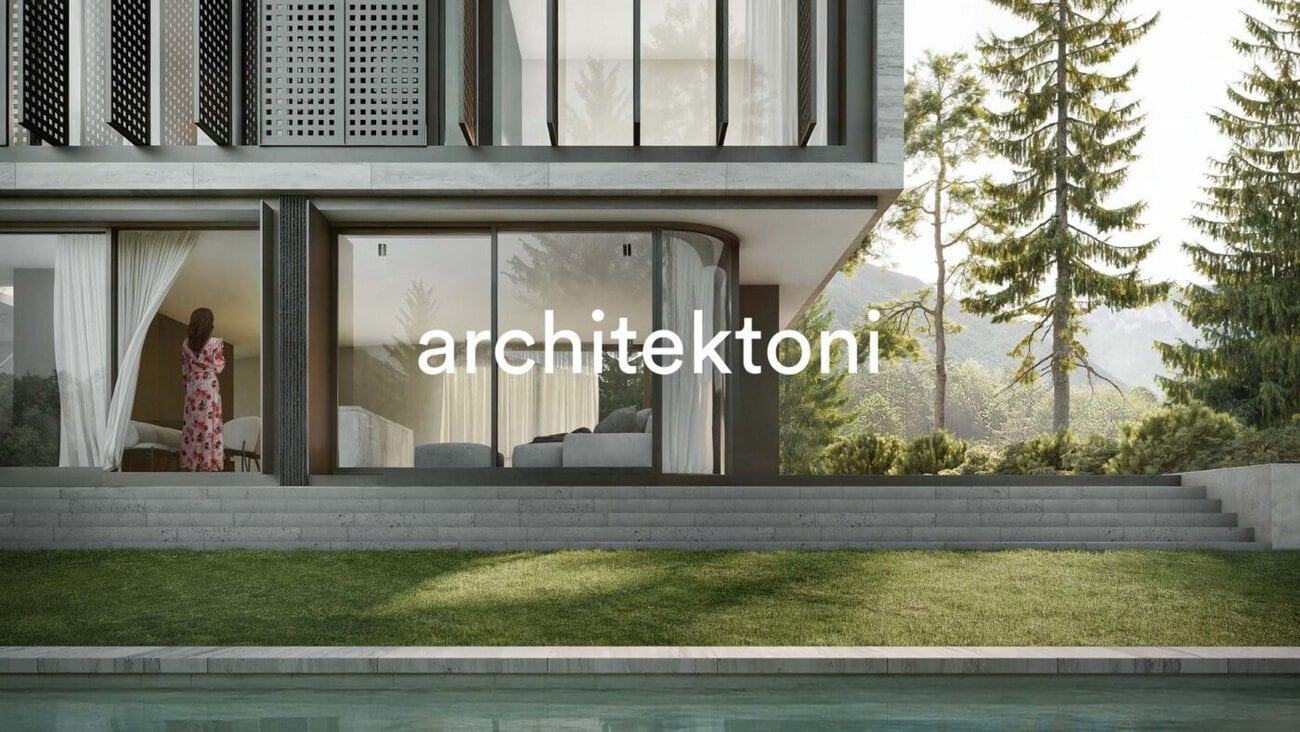
The Zurich-based studio architektoni embodies a design philosophy that views architecture and interior design as an inseparable whole. Founded in 2023 by Antonio De Luca, the firm’s portfolio ranges from single-family homes to commercial and large-scale construction projects—with a particular focus on exclusive residential buildings. The new branding for architektoni, developed by Schläfle Trittibach, now consistently translates this approach into a visual identity.
Stripped Down to the Essentials
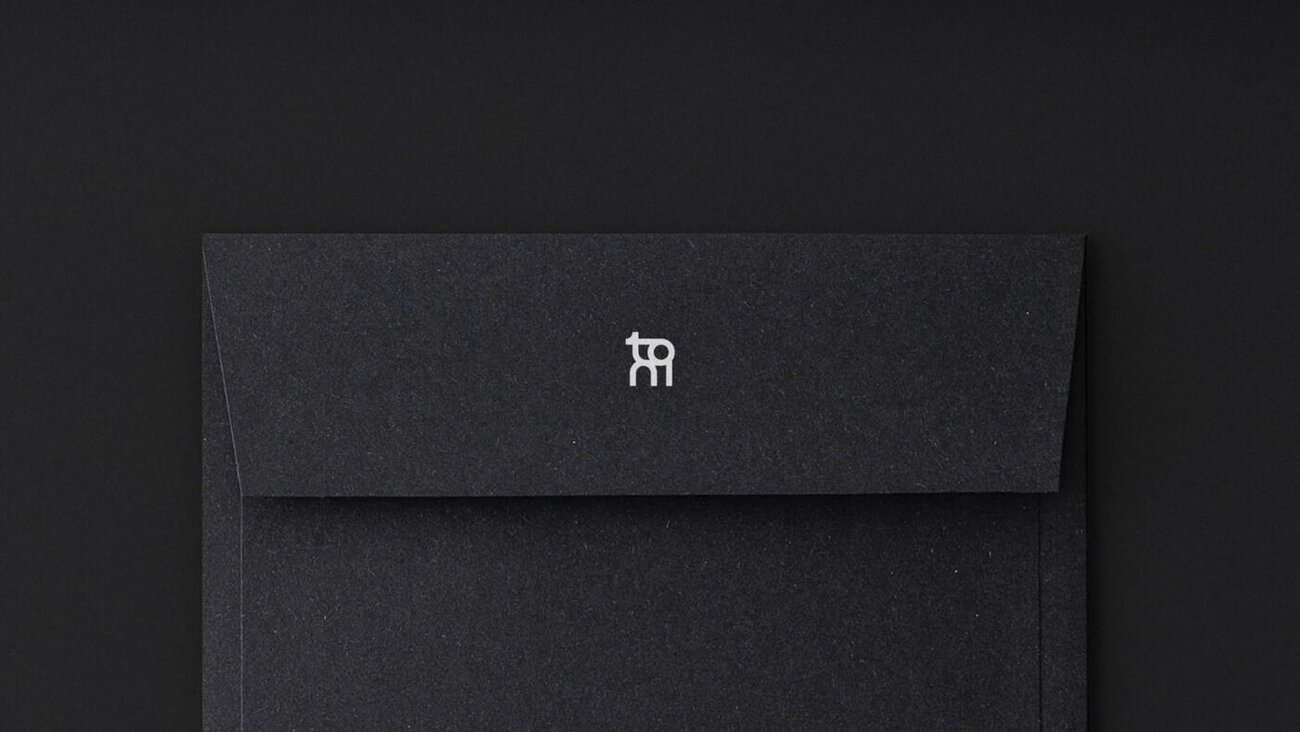
The brand identity has been deliberately kept to a minimum: it is based on a single typeface. According to Schläfle Trittibach, this creates a precise, distinctive visual identity that conveys quality through clarity. The typography follows architectural principles—it is concise, structured, and understated all at once. The goal, according to the press release, is a timeless brand identity that is durable yet open enough to evolve alongside the language of architecture.
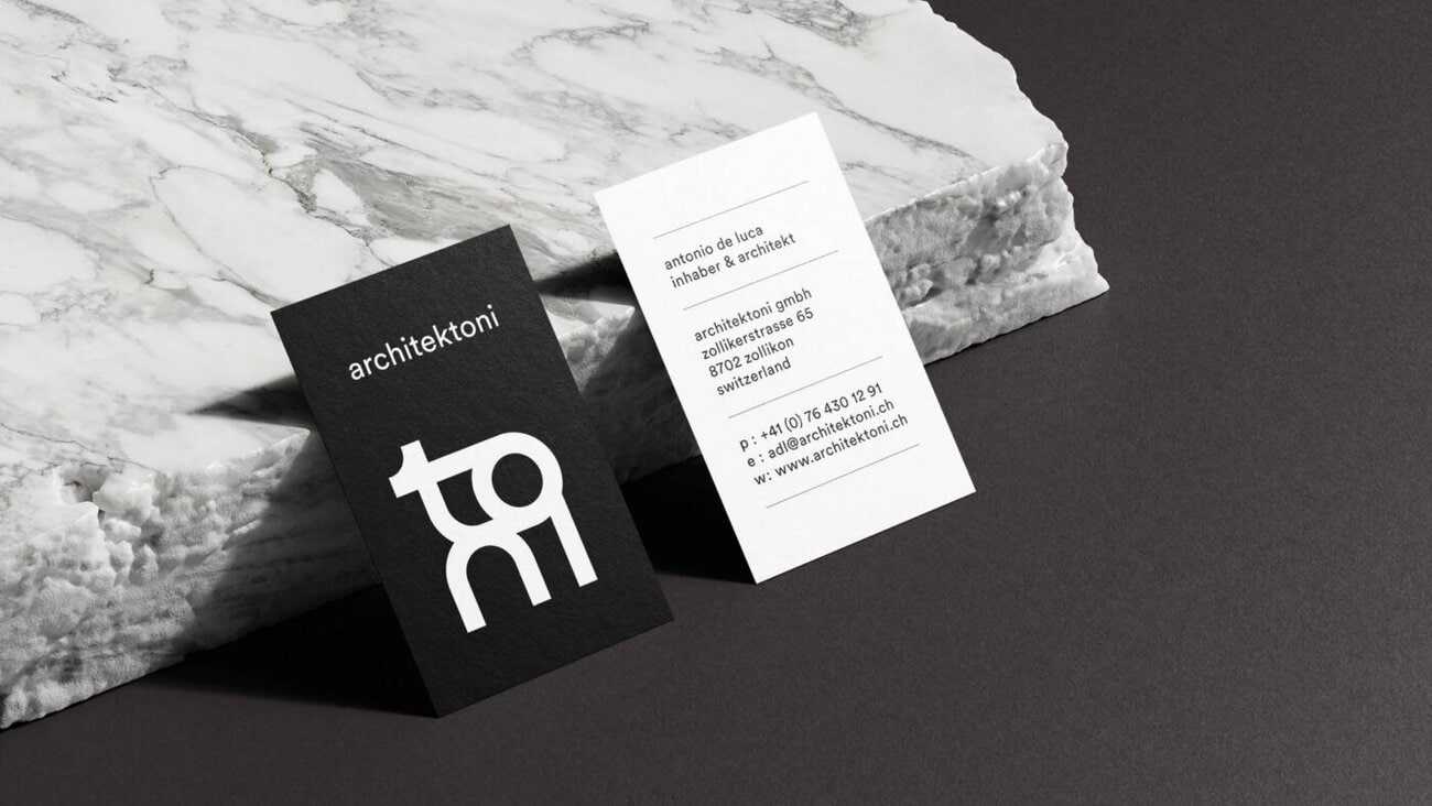
Space, texture, light—and a clean, minimalist look
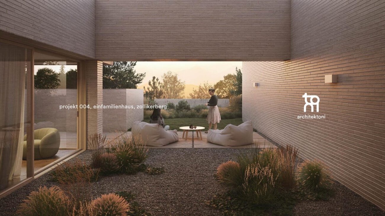
architektoni’s design philosophy is based on the use of pure and tactile materials. The unique atmosphere of each project arises from a refined sense of space, texture, and light—according to the studio’s description of its own work. Schläfle Trittibach translated this design philosophy not only into the corporate design but also into architektoni’s new website.
More about the studio and its projects: https://www.schlaefletrittibach.ch
Person in charge at architektoni: Antonio De Luca (Managing Director and Owner). Responsible at Schläfle Trittibach: Marcel Schläfle (Creative Direction), Christoph Trittibach (Creative Direction), Micha Indermaur (Web Development).