View with new dramaturgy
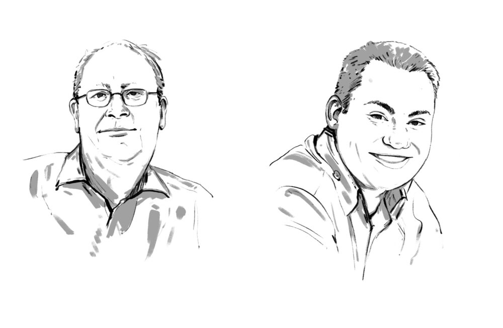
Layout chief Willy Lüscher gives the tabloid a new layout


Layout chief Willy Lüscher gives the tabloid a new layout "Readers won't notice much," orated Blick editor-in-chief Jürg Lehmann in Ringier's in-house magazine Domo. He was right. Those who held last Tuesday's Blick in their hands hardly noticed the changes in layout. Only a close comparison of the old and new appearance shows the quite numerous innovations. They range from a changed image and text dramaturgy to the reduction of the number of columns from seven to six and new fonts. Better differentiating between big and small stories was one of the guidelines for the relaunch. This principle also applies to the images, which now do without the black framing: The lead image is given more weight, while the other page images are subordinated.
Decluttering was another focus for the new layout. The number of design elements has been greatly streamlined. The look also uses boxes more sparingly than before. And fresher colors are the order of the day: texts previously highlighted with "syrup" are now given a beige color as a primer, which should increase readability.
One of the most striking changes, the switch from seven to six columns, ends an old problem. Says Lehmann: "We are now much more successful in avoiding unsightly holes in the text."
Kurt Schwerzmann rebuffed by Michael Ringier
The road to the new layout was an arduous one. A year ago, media designer Kurt Schwerzmann had already been commissioned to develop a new visual concept for Blick. But his proposals were rejected by the management. The criticism: "Too elegant and not enough boulevard."
For the next round of presentations, Blick layout chief Willy Lüscher and his team were also invited to prepare a layout proposal. And lo and behold, the in-house project found favor over that of master Schwerzmann. Daniel Schifferle