More illustrations, sharper profile
Michael Adams, Creative Director at Infel AG, identifies three trends in the design of corporate publishing products: more illustrations, more infographics, more individuality.


Illustrations
Themes translated into images: illustrations are increasingly being used as a stylistic device in the media and in corporate publishing. This illustration, which appeared in Axa Winterthur's customer magazine "Meine Firma", is about money - or more specifically about how SMEs can prevent bad debt losses.
Themes translated into images: illustrations are increasingly being used as a stylistic device in the media and in corporate publishing. This illustration, which appeared in Axa Winterthur's customer magazine "Meine Firma", is about money - or more specifically about how SMEs can prevent bad debt losses.

Infographics
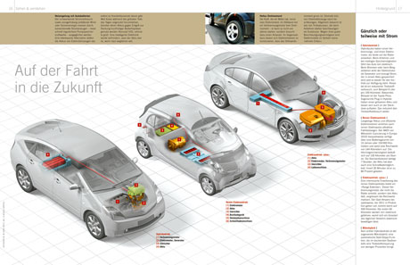
The complex world explained simply: an increase in highly complex infographics can be seen in corporate publishing products. In the magazine "Strom", the diagrams are the heart of the magazine. The car diagram shows the different types of electric motors.
The complex world explained simply: an increase in highly complex infographics can be seen in corporate publishing products. In the magazine "Strom", the diagrams are the heart of the magazine. The car diagram shows the different types of electric motors.
Individualization
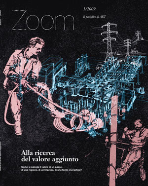
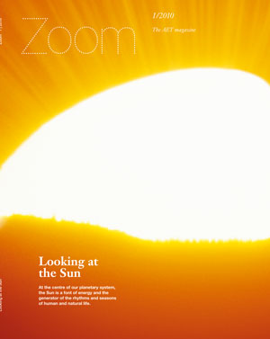
A sharper profile instead of uniformity: publications are becoming more visually individualized - such as the "Zoom" magazine published by the energy company AET from the canton of Ticino. The cover is an eye-catcher - with different visual elements depending on the topic.
A sharper profile instead of uniformity: publications are becoming more visually individualized - such as the "Zoom" magazine published by the energy company AET from the canton of Ticino. The cover is an eye-catcher - with different visual elements depending on the topic.