
"Branding is and always will be the art of simplification, focus and reduction"
In an interview with MK Werbewoche, management consultant and branding expert Stefan Vogler explains what to consider when redesigning a brand and what the current and future trends are.


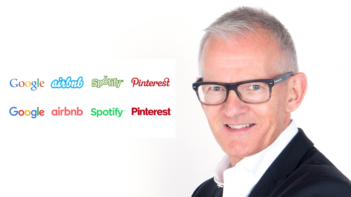
Werbewoche.ch: Stefan Vogler, what are the reasons for a brand redesign?
Stefan Vogler: First of all, the question arises as to what is meant by a redesign. Is it a new design, i.e. redesigning the visual appearance of a brand, or is it a further development of the existing design? Experts use the terms revolution or evolution. Or should the word mark also be changed or a new name created? In contrast to redesign, this process is referred to as rebranding. While redesigning is about adapting the brand identity to the spirit of the times and refreshing the visual communication, a comprehensive rebranding goes deeper. It is based on a strategic rationale. The reason for this can be a merger, the purchase of a brand, a repositioning, a company transformation or a radical change to the product, service or an entire company. A redesign, on the other hand, can make a development in the sense of an evolution visible. At the Promarca anniversary conference, the renowned brand specialist, author and university lecturer Franz Rudolf Esch used his studies to impressively demonstrate that sustainably successful brands manage the balancing act between consistency - he aptly called it "attitude" - and change in the best possible way. Standing still or changing too radically is poison for brands. Accordingly, a periodic redesign is sensible and valuable and rebranding should only take place in the event of a sustainable, strategically justified change.
Are there also bad reasons for a brand redesign?
Yes, this is the case, for example, when a brand or company needs to undergo fundamental strategic development and is considering a rebranding, but believes that a new design is all it needs. This could be called "opaque cosmetics". As soon as it starts to rain, the make-up literally runs off, revealing the same core as before the new coat of paint. A redesign must be authentic and fit the core of the brand. McDonalds has changed its red with a yellow (golden) M to a dark green to signal that they serve healthy food. But who goes to a McDonalds for a salad? Sales of the "healthy" products remained marginal, while the dark green of the illuminated lettering is barely visible compared to the signal red. An increasingly rapid change of CEO, CMO or CCO can also be a bad reason for a redesign. Unfortunately, a change of boss often results in a redesign of the brand. This usually serves the ego of the new boss more than the positive perception of the brand.
When is the right time for a brand redesign?
Quite simply, when the current design no longer fits because something has changed in the market. Even if it's just that the brand no longer looks contemporary. The half-life of brand designs has decreased with the ever faster pace of change in the economy and society. In the past, a redesign was only carried out after ten or more years. Today, in the FMCG market, for example, this happens at shorter intervals.
Who should definitely be involved in a redesign?
The CCO and/or CMO must ensure a good briefing for the commissioned designers. And good design is never created in a jekami exercise. Development is not a democratic process. The most important thing is a very small circle of competent decision-makers who know what makes their brand's stakeholders tick. And they need the courage to implement innovative solutions. Uniqueness is still one of the most important prerequisites for the success of any brand. I would also like to take up the cudgels for aesthetics: The "beautiful" usually prevails regardless of the subjective taste of the observer.
What are the current trends in brand design?
Icons, videos and voice, keyword: renaissance of the word mark! All elements playfully applied and constantly restaged. Uniformity and uniformity are passé. The design police have had their day because a brand manual is hopefully no longer formulated as a law, but as a source of inspiration for brand users. The Institute for Brand Technology in Geneva propagated the term "self-similarity" decades ago. It is particularly valid today: a brand must be visible and tangible across all touchpoints, not uniform, but "self-similar".
Figurative mark versus abstract word mark, where do you see the advantages and disadvantages?
Both are needed, but visually a strong symbol with distinctive colors is sufficient. A word mark must be as simple as possible, acoustically pronounceable and understandable in all relevant markets and languages, registrable and therefore protectable, and it should not trigger any false or negative associations. Phonetics will be a decisive factor in the future, because how will Alexa accept a voice order if she doesn't understand the brand?
Even traditional companies like Lufthansa are changing their logos. What is gained here with a redesign?
A redesign, especially of classics such as Lufthansa, generates attention and ensures that the brand (re)triggers interest among the relevant stakeholder groups and is perceived as agile and contemporary. People develop, move forward, want or need to change in the life cycle. And they will identify with brands that also move, refresh their appearance from time to time and thus appear progressive. Only brands with a contemporary design will continue to play an important role in the lives of their customers in the future - the goal of every brand.
Zara's logo redesign was described in the media as a clumsy attempt to be a luxury brand. What should the company have paid more attention to?
In my opinion, Zara is and remains a strong, extremely popular brand. Because the product and the price are right. The brand cleverly positions itself as an affordable alternative to the premium and luxury fashion brands. The decision to design the logo like a luxury brand was obvious and made sense. However, there is a gap between aspiration and reality. The new logo triggered a major discussion among designers. Many were not enthusiastic. And one joker suggested showing all four letters on top of each other, because that would show the limited space in the Zara stores and would therefore be highly authentic. The great response to the rebranding demonstrates a high level of identification. Obviously, customers are not indifferent to "their" brand changing its logo. At least the goal of attracting attention was achieved.
Interview: Karin Bosshard
Stefan Vogler was an entrepreneur in the communications industry for 23 years, most recently as Chairman and Managing Partner of Grey, part of WPP, the world's largest agency holding company. Since 2006, he has worked as an independent management consultant in the fields of branding, marketing and communication and as a member of the Board of Directors. For brand development and brand design, he often works with the renowned Zurich branding agency schneiterpartner, which, among many others, created and designed the successful CHOPFAB brand for the Winterthur brewery Dopelleu. Vogler lectures at the HWZ University of Applied Sciences in Business Administration Zurich (Bachelor in Business Communications, various CAS/MAS). He has been head of the CAS Marketing Communications course at the HWZ since 2015 and is a lecturer in branding at the Bern-Bienne School of Design (HF Visual Communication). The communications expert is a founding member of SwissVR, a member of the ASCO Association of Management Consultants Switzerland, the IAA International Advertising Association and a jury member of the Xaver Award. The distinguished brand expert lectures and publishes, including as a columnist ("Brand of the Month") in the Unternehmer-Zeitung.
Rebranding: From Germania to chair
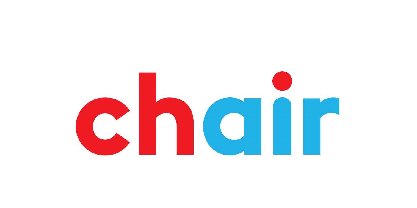
After the Swiss subsidiary was rescued from the insolvency of the German airline Germania, a new brand was needed. In a pitch, the "chair" brand won the race. This name came from the combination idea of "ch" for Switzerland and "air". Because they wanted to communicate "schweizair", the logo was designed in two colors: red (association with Switzerland) and light blue (association with air). The fact that this resulted in the English term for "chair" was announced as a new and unique name in the aviation business: "A company needs a strong foundation. Chair' a chair' stands for stable legs' a supporting seat and a strong backrest. A place to sit' dream' fly." However, the self-declared "freshest airline in Switzerland" still offers the well-known "Seats". The new name attracted attention and quickly became well-known. Not least because it polarized people.
Redesign: Mastercard
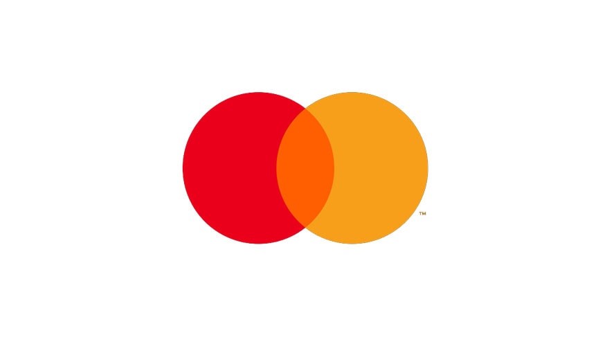
In January 2019, Mastercard (brand value by Interbrand 7.5 billion US dollars, 70th place in the "Best Global Brands" ranking) announced that it would no longer use the Mastercard lettering in its logo and would only use the familiar symbol with the overlapping red and orange dots. The reduction was justified by the new demands placed on brands by the digital transformation. Mastercard wanted to appear radically simple and purely visually recognizable, the symbol as a strong brand signal was easier and more effective to use on its own, especially in digital channels. As with (almost) every redesign of a strong brand, the experts were divided. Some find it ingenious, others have doubts and fear a decline in awareness of the word mark. World brand champion Apple (brand value USD 214.4 billion) does not have to fear this thanks to a synonymous figurative and word mark.
What characterizes a good brand redesign?
As the term "re" implies, recognition should be possible despite all renewal. Visual recognition features such as logos, symbols, colors, fonts and images help to identify and differentiate brands. Consumers must not be allowed to negate this familiarity. The brand must also be recognized in the new design, but it must appear fresher, more modern and therefore more attractive. The art of redesign is to present familiar visual elements in new and different ways. Swisscom recently removed its symbol, which had previously mostly appeared in combination with the lettering, and now uses it on its own. This was a redesign that lives up to its name.
How important are colors in branding?
Colors are a formative, important element for brand identification. Today's king element of every brand is the icon, for example on Insta. It consists of shape and color, and ideally there is also an animated version with sound. And there are brands that are only recognized by their color, such as the yellow for the post office or the purple for Milka. Colors can even be entered in the trademark register as a so-called figurative mark and thus monopolized and protected in the respective classes of goods and services.
How can the effect of a new brand design be tested?
The impact of a brand, especially its design, can never be precisely predicted. Of course, the impact of new brand designs can be determined in a pre-test. But a new design that is completely new in a particular industry, for example, requires the courage of the brand owner. It is difficult to test in advance. Sales or turnover after a redesign is the most important measure of success. But it takes patience. Customers need time to get used to the new design of their brand.


