TopCC presents itself in a new look for its 50th anniversary
To mark its 50th anniversary, Top CC is giving itself a fresh new look, both inside and out. It can be seen for the first time at Top CC’s newly opened flagship store in Zuzwil.


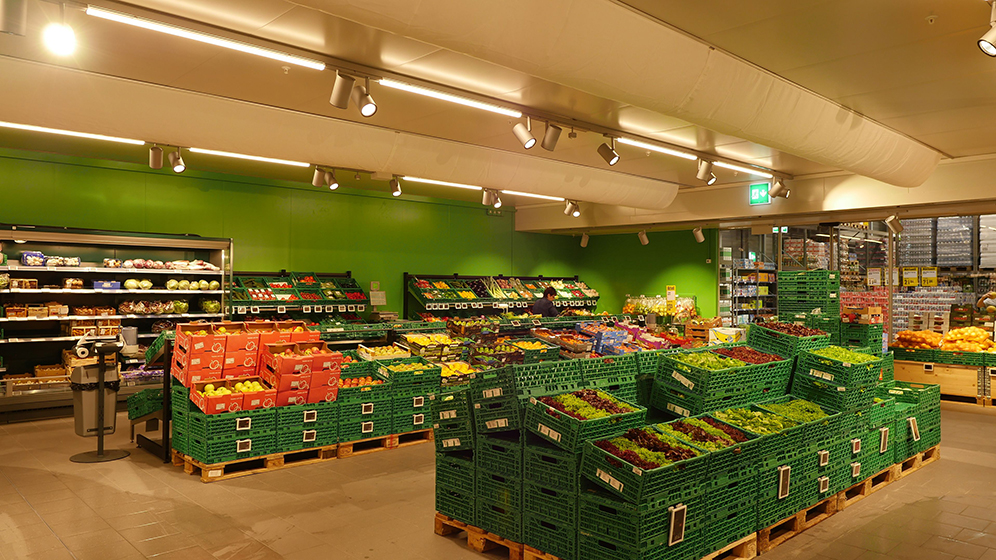
Away from the warehouse atmosphere that often surrounds wholesale and pick-up markets. During the approximately one-year construction period, not only was a new TopCC flagship store created in Zuzwil, but also a new identity. On the one hand, this is evident in the bright purple logo, the employees' clothing and the large-format posters that accompany customers as they shop and also serve as orientation aids in the store. On the other hand, it is the commitment to cleverness and charm, which the double C in the company name now stands for.
The new colors and language are the result of a four-day workshop involving 80 employees from the eleven TopCC branches. "We also drew on Dr. Hans-Georg Häusel's seven limbic types of neuromarketing," says CEO Dominic Möckli. "We want to express our warmth and our interest in the customer with our appearance. Shopping at TopCC should take place in an atmosphere that is characterized by imagination, magic, creativity and joie de vivre."

Red gives way to the color violet. This best conveys the TopCC brand value, says Möckli: "We want to be warm, far-sighted and creative". This is also emphasized by the new claim "clever & charming". The new appearance was designed in collaboration with the Silberball agency from Bregenz.
The new image launched in Zuzwil will now be gradually transferred to all other TopCC branches - even if this is likely to take "a few years" according to Möckli. All employees are already dressed according to the corporate identity. The flyer design will also be adapted to the new image with immediate effect and should be "more valuable and emotional" than before. (hae)