Election advertising analysis for the 2017 federal election with Neuroscale
In connection with the 2017 federal election, the Bremen-based branding agency Red Pepper and the Berlin-based market research firm Emolyzr analyzed the campaign posters of the six major parties (CDU, SPD, Greens, FDP, The Left, AfD).


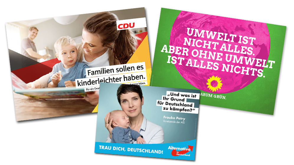
An interdisciplinary study design was developed to understand exactly how the posters work, what spontaneous emotions they evoke and what associations they arouse.
The procedure
A sample of swing voters looked at the newly published election posters while their eye movements, the activation of their brains and the attractiveness of their emotional reactions were recorded using neuroscientific equipment.
"Instead of simply interviewing our test subjects, we wire them up and measure their emotions," explains neuropsychologist Johannes Meixner from Emolyzr. "This allows us to create a very precise, unadulterated picture of their perception and better predict the effectiveness of an election poster." In order to fully understand the emotional impact mechanisms, an interdisciplinary team of experts from Red Pepper's neuromarketing, design and communication experts also decoded the meaning and associations of the various design elements in a comprehensive expert analysis. In doing so, they succeeded in deciphering the conscious and subconscious messages that the parties were sending out. "The subconscious codes must match the party's program and values in order to anchor the message deeply in the minds of voters," explains Sabrina Lehmann, Head of Strategy at Red Pepper.
Results CDU
Conclusion: Securing the status quo without rough edges
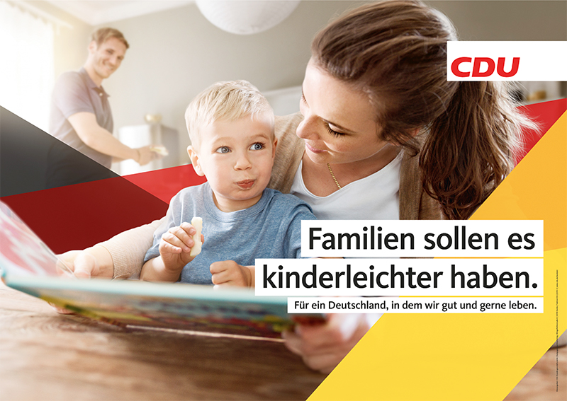
With the CDU, everything remains great in beautiful Germany. The national colors radiate towards the viewer and run through the entire election campaign. This is a pattern that is more familiar from the AfD and something that the CDU has yet to learn. In addition to the logo, images and message, this is another element that does not really make it easy for the viewer to find their way around and clearly direct their attention. Despite the abundance of elements, the design quality of the brand pattern is clearly recognizable.
The imagery radiates warmth, the messages convey optimism and there is a basic feeling that everything will somehow work out. In the bright sunlight, a bright future awaits the electorate - or at least the people in the motifs. Neither linguistically nor visually is the viewer encouraged to take action or involved in any way.
The ideal world pays off: the main values activated are family, security and justice. It could hardly be more relevant. And didn't the SPD actually try to claim justice for itself?
The first impression of the posters is often positive, but this is not always maintained over longer (or more frequent) viewing. There are no corners and edges that show a position or encourage you to delve deeper into the content. The impression is that every step in any direction could be a step in the wrong direction. So the CDU limits itself to not annoying the viewer and its core voters. If the sender could be clearly identified, they could sit back and relax.
1st place
Results SPD
Conclusion: Complicated, distant, SPD - (not) a party for the little man
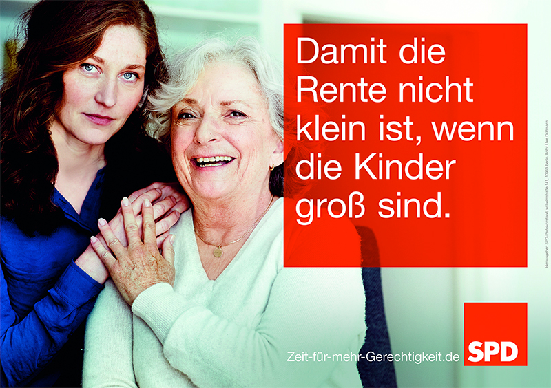
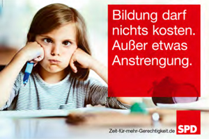
Apart from the educational motif, the SPD does not manage to create closeness to the viewer and activate them in a positive way. Cold images create distance, even though smiling people are shown. In technical jargon, this is referred to as "cognitive dissonance". Angular shapes and a clear structure support the sobriety. The messages are complicated, not very activating or are stored incorrectly, for example "small pension". The SPD does not come across as a party that tackles important issues, stands up for justice or cares about people. Central values such as solidarity and justice are not addressed at the forefront; instead, control and individualism dominate.
The positive overall performance of the SPD at impact level is solely due to the educational motif with the girl. This motif is the only one that manages to consistently activate positive emotions, but unfortunately the activation here is not very strong.A race to catch up definitely looks different.
3rd place
Results Greens
Conclusion: Better loud than natural
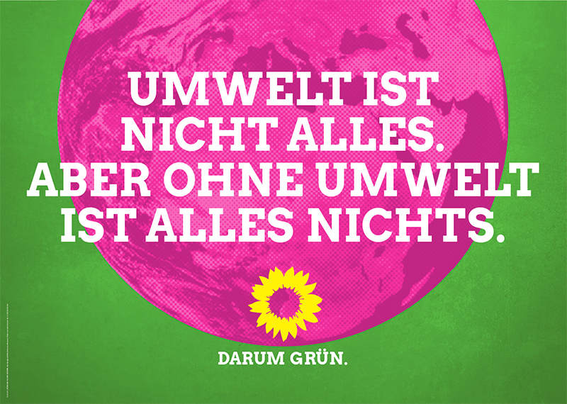
At first glance, the Greens' new design pattern appears bold, loud and fresh because it breaks with existing patterns. This suggests a standpoint and self-confidence. But that doesn't really make it easy for the viewer. On the text-only posters, you are almost shouted at by the messages, so the messages are clearly the focus. However, these are not supported by the images, are often complicated in their wording and the consistent capital letters do not make them easy to decipher. The attention-grabbing color contrast also makes it difficult to process the content, which makes the entire poster seem exhausting. There is no element that has a positive effect, but negative words such as "not" or "without" - which, together with the design, seems like a "cry for help". The magenta coloring of the images demonstrably weakens the emotional impact of images and also looks unnatural - and this for a party that has the environment and naturalness at its core.
The tonality of the messages is rather accusatory, morals and discipline are strongly perceived by viewers - not a trace of positive emotions far and wide. Only the candidate, Göring-Eckardt, is well received.
The massive use of green is intended to look like a return to the roots, when the Greens were still representatives of a clear attitude to life. However, the color contrast with the Telekom magenta, which was chosen for its loudness and boldness, works against this. Addressing the relevant values is thus sacrificed in the fight for attention: rather loud than natural.5th place
FDP results
Conclusion: With lifestyle for digitalization
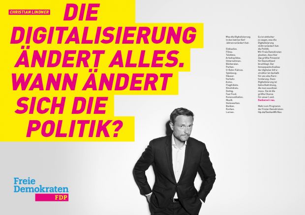
The FDP is using the pattern that was successful in previous state elections: strong personalization, activating colors, high-quality design that is more reminiscent of a lifestyle magazine than an established party. The rejuvenation also continues consistently with the choice of the central election campaign topic: digitalization.
Colors, font, statements: at first glance, everything appears young, dynamic, demanding. Christian Lindner, on the other hand, is staged in black and white pictures, leaning back, critical, passive - more fashion model than doer. Together with the message, he attracts the viewer's initial attention, arousing slightly pleasant or unpleasant feelings depending on the motif. The demand for change frightens the voter: although change is necessary, it is also readily avoided. At second glance, "the small print" is perceived - something that does not have a positive connotation in our everyday lives does not become our friend on an election poster either. Despite an apparently attractive, contemporary design, dynamic colors and intelligent statements, the posters do not manage to activate the voter - the leaned-back, distanced stance of the leading candidate seems too heavy.
It will be difficult for the FDP to persuade the broad mass of swing voters to vote with this communication. Nevertheless, it cannot be ruled out that the rejuvenation and symbolized dynamism alone will convince some voters that the FDP can once again achieve more in the Bundestag.
2nd place
Results The Left
Conclusion: Peace, joy, pancakes
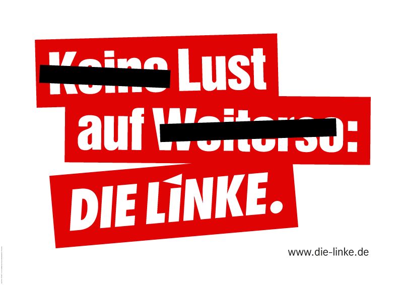
The left has remained true to its pattern of loud, bold messages and white and red color contrasts. At first glance, this attracts attention and activates - but unfortunately not in a really positive way. The message is the defining element, but the black bars add complexity. What shouldn't I pay attention to now? The themed posters follow a different pattern: instead of using images like other parties, the Left uses graphic elements with a positive slogan on them. "Human", "Respect", "Just" - who can have anything against that? "Living people dancing world" for advanced users. This is also staged in WordArt graphics, as we all tried to do once. Design quality looks different, but that doesn't necessarily have to be negative. The words are striking, attract attention and are easy to grasp. Unnecessary money for an advertising agency has apparently been saved in order to put more money into the content - or so it would seem.The messages try to give the poster depth of content, but sometimes miss the point. They are cerebral, complicated and difficult to remember. But if the positive slogans alone stick, the left has already won something. However, the emotional activation in the ads is not as strong as one would wish - and the positive emotions are also a long time coming. There are no images that can build up closeness to the viewer, signals that are not always coherent, a demanding tonality and usually a somewhat chaotic structure - they are still rebellious, which supports the values of freedom and morality, but the posters do not really give the Left a sense of performance and responsibility.
4th place
Results AfD
Conclusion AfD:
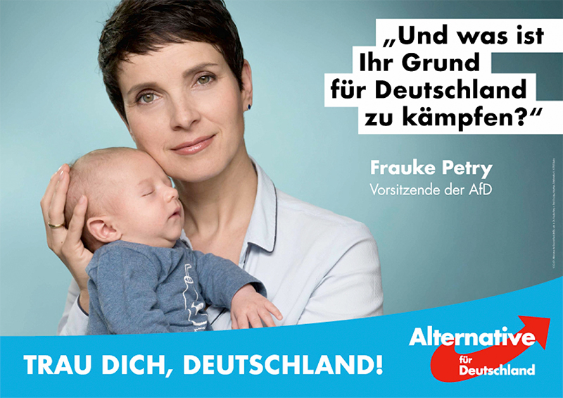
The AfD's communication reflects a party that is still young and strongly differentiates itself from the political establishment. The design quality is rather low, the visual language is inconsistent, only the blue binding and the use of messages are uniform. The posters have many signals, so it is inevitable that some of them contradict each other and that attention first has to find its bearings.
In the motif examined, Frauke Petry and the message compete for attention in the first impression. The baby is so far out of the line of vision that it is only noticed after 4 seconds and only then can the "family" concept be activated - too late for an effective election poster. The text is quickly grasped, the first impression is slightly negative. Only after the message can be attributed to Frauke Petry does it make sense to the viewer - few people still talk about "fighting for Germany" today. A topic that has been forgotten, so that the concepts of tradition and discipline are also addressed. The staging of the "virgin with the child" evokes mixed feelings; after the first negative impression, positive feelings are also aroused by the baby - Frauke Petry may want to fight, but she is still perceived as a human being. The basic effect is positive and is quickly identified, but unfortunately the poster does not really manage to activate the voter. The strong entry point is missed.
The overall effect of the campaign shows that there is something for everyone: tradition and a sense of home, fear of rioting refugees, starting a family and prospects for the future. Something for everyone, anyone looking for an alternative will find it here - regardless of the spectrum.6th place
Overall conclusion
"In the battle for swing voters, no party was able to claim a clear victory," says Sabrina Lehmann, strategic head of Red Pepper. The emotion and attention measurement shows that no party can win a place in the hearts of voters across all motives - the activation is too low, the feelings too mixed.The tame competition between the two major parties, in which no risks are taken, is won by the CDU with a slight lead over the FDP. Their consistent addressing of the relevant motifs of family and security leaves a shallow, comfortable feeling: no rough edges, but it doesn't hurt either. This means that the CDU is more in tune with the brand heritage than the SPD, which is unable to establish proximity and eye level with the viewer and thus position itself as a serious opponent to the CDU.
The battle for the top spots is exciting: more risk, more volume, more position. The Greens suffer from cerebral messages and unnatural colors, which frustrates the core value of naturalness. The Left is nowhere near as combative and rebellious as we are used to, but still manages to remain true to itself. The FDP wins the race in second place: clear visual rejuvenation, coherent address of contemporary issues. Christian Lindner's pop star staging unfortunately creates too much distance to appeal to the broad masses and activate them in the long term. But younger voters (18 to 40) in particular are likely to guarantee the FDP's re-entry into the Bundestag with this campaign.
The AfD cooks its own soup: on the one hand, they are still young and inexperienced as a party, but on the other hand, they clearly address highly relevant topics and thus show that they activate voters: The creative inconsistency stands for the antithesis to the "smoothly ironed" established parties. Those who are disenchanted with politics and mistrustful undecided voters certainly feel addressed by this - the campaign should work for this target group.
The election seems to have been decided in the polls, but there are still many undecided voters. An analysis of election posters shows that no party really manages to activate and emotionalize voters in the long term. "Activation and positive feelings are essential in the first moment and help to anchor the message in the memory," explains neuropsychologist Johannes Meixner from Emolyzr. Sabrina Lehmann from Red Pepper adds: "The sender must be clear and the message must match the values of this party. On election day, voters must have a sense of what issues the party stands for, otherwise the campaign will have missed its mark." But with the election posters examined, no party has achieved pole position in this emotional mishmash.
The dashboards of all six parties can be here can be downloaded (PDF).
Ranking:
1ST CDU
2ND FDP
3. SPD
4. left
5. greens
6 AfD