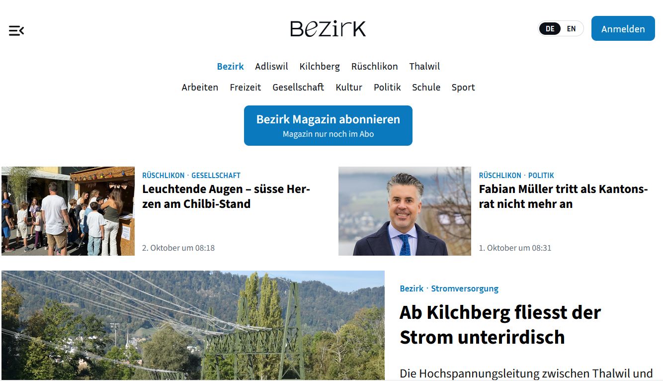
St. Galler Tagblatt with slightly different layout
Since Monday, the online edition of the St. Galler Tagblatt has had a new look. The print editions of the St. Galler Tagblatt, its regional editions, and partner newspapers have also undergone minor changes. However, the layout of the paper has not been altered.


"In the online edition, the red color has given way to blue, a new font has been introduced and the links to further text have moved to the center," writes Tagblatt editor-in-chief Philipp Landmark. The changes in the print editions ranged from barely perceptible "fine-tuning" of the tried-and-tested, easy-to-read basic font to a stronger emphasis on the corporate color blue and the renewal of the title fonts. (SDA)