20 Minutes: New logo, new newsroom
20 Minuten and 20 Minuten Online will be appearing with a new, joint logo from May 2013. The logo designed by Rod Kommunkation replaces the two previous, different logos of the commuter newspaper and the news platform.


The new logo is intended to express the merger of the two teams into a convergent editorial team, according to a statement on Wednesday. In the future, the 20 Minuten brand will no longer distinguish between commuter newspaper and news platform, but will now be applied uniformly. In addition, the further development of the brand signals the step into the digital future without changing the core values of 20 Minuten. The number "20" and the white font on a blue background will continue to dominate the logo in the future. The font of "Minuten" will be modernized and the logo as a whole will be given a three-dimensional look. The logo, designed by Rod Kommunikation, will be introduced at the beginning of May.
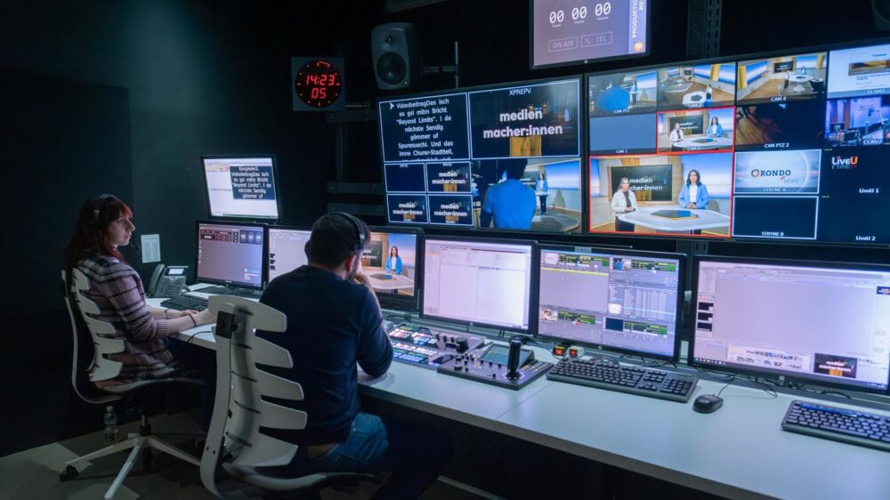
20 Minuten is taking another step into the future with its move to new office premises. A modern newsroom is currently being built at Stauffacherquai 8 in Zurich, on the premises of the Tamedia media group, to which 20 Minuten belongs. The new infrastructure will allow 20 Minuten's editorial team to work in a fully convergent way from mid-June.