More profile, more differentiation
Thurgauer Kantonalbank has commissioned Branders, a consulting firm specializing in branding, to provide comprehensive support for a rebranding process



WW: What task did Branders have to solve for Thurgauer Kantonalbank?
Pascal Geissbühler: Thurgauer Kantonalbank has formulated a new corporate strategy, which formed the basis for the assignment to Branders. The bank wants to strengthen its customer focus even more in the future and has set itself the goal of becoming the most customer-oriented bank in the canton. One element that is particularly emphasized in the strategy is differentiation.
That's not easy in the banking world.
At least its main competitor, Raiffeisen, has done a lot for its brand image in recent years - the Raiffeisen brand has a strong presence. The image of Thurgauer Kantonalbank was originally very heterogeneous, around 20 values were defined and each brochure looked different. The aim was now to sharpen the brand's profile in terms of content: What does the bank stand for? Together with the CEO and the Executive Board, we defined the basics of the brand strategy. Based on this, we developed the brand identity. At the very least, we had to take the ASCB logo system into account.
What is the outstanding element that Branders was able to contribute?
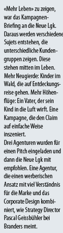
Various aspects. Firstly, the focus on content and the commitment to the claim "More from life". We find this quite bold, because "More of life" is an attitude to life and goes quite a long way beyond the products and service promises offered by banks. But it reflects exactly what Thurgauer Kantonalbank intends to do, namely to create real added value, become more customer-oriented and thus place the customer more at the center of the advisory process. The branding attempts to take existing values into account - and yet be much fresher, more emotional and more consistent than before.
Is it even possible to do something independent here? After all, bank customers are the same everywhere and everyone wants to be close to their customers?
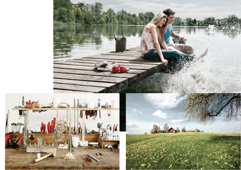
Customer proximity alone is not a unique selling point - Raiffeisen is also close to its customers. In order to be independent, it is important to take equal account of our own strengths and the needs of the market. The canton's high quality of life meets the sustainable business model and the comprehensive expertise of Thurgauer Kantonalbank. This combination sets it apart from the big banks and Raiffeisen. For the CEO, the quality of life was an important attraction factor for his commitment to Thurgauer Kantonalbank - a place with an optimal life balance. It is therefore exciting that the claim also positions Thurgau as a location. After all, it is precisely the cantonal affiliation that distinguishes the individual institutions. The color combinations and images in the brand identity are unique. We play with the green of Thurgau, but contrast it with different shades of green to make it look even fresher. A design element was also defined - the focus frame. This can be used to focus the main message of the communication. With the claim "More of life" as a binder.
What's next for the brand templates?
In addition to a classic campaign in the region, there are also explanatory brochures for employees to introduce themselves. It's not just about the image. Branders is also working on communicating the brand to potential and existing employees. Internal branding and employer branding in the sense of labor market positioning. The claim "More from life" also plays into the employer's promise. "Achieving more together" is the motto, especially in contrast to the big banks, where an elbow culture prevails in many places. Thurgauer Kantonalbank is a small bank where everyone relies on teamwork and can achieve much more together. With visible results in the market.
Interview: Andreas Panzeri