Rosarot Develops a New Brand Identity for Pro-Tent
The Zurich-based boutique agency Rosarot has redesigned the brand identity for the pop-up tent manufacturer Pro-Tent. Among other elements, the agency revamped the logo, tagline, typography, color scheme, visual identity, and website.


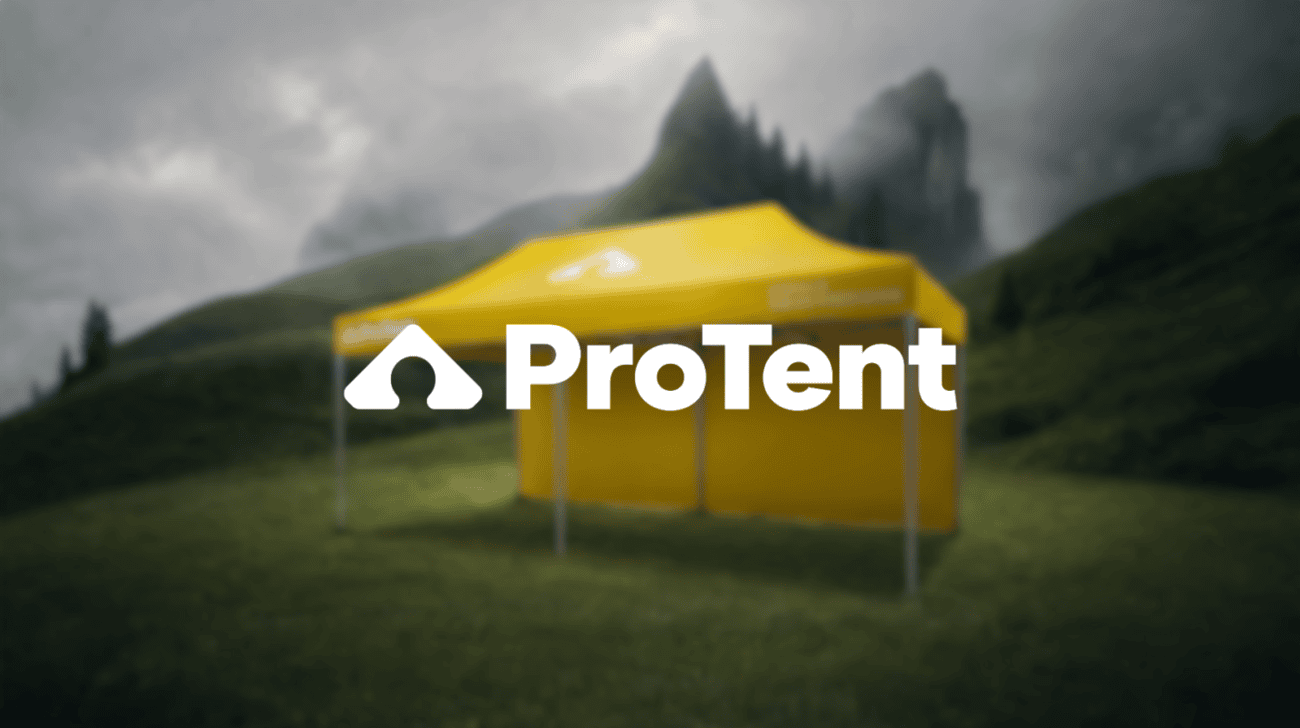 The Zurich-based creative agency Rosarot has developed a new brand identity for Pro-Tent. The manufacturer of folding tents received a revamped visual identity as well as a redesigned website.
The redesign was based on Pro-Tent’s patented Omega profile. The distinctive shape was incorporated into the new logo and is intended to highlight the company’s technical focus in its brand identity.
The color scheme, typography, and visual language have also been revamped. Zeist is now the new corporate typeface. According to Rosarot, the color palette is inspired by materials such as metal and textiles, among others.
New tagline in English
With its new slogan, «Unfold Swiss precision,» Pro-Tent will be using an English brand message going forward. This is intended to highlight both the company’s international focus and its Swiss origins.
The new development was preceded by a joint branding workshop held by Pro-Tent and Rosarot. Building on that, the agency developed the brand strategy and subsequently translated it into a logo, tagline, and visual identity.
New Website as the First Comprehensive Application
The Pro-Tent website has also been completely redesigned. In addition to its visual design, the site’s structure, content, and user navigation have been redesigned.
On the agency side, those involved in the project included Co-CEO and Creative Director René Karrer, Art Director Sherida Kuffour, Senior Copywriter Carmen Stähelin, Motion Designer Maria Alcover, Head of Performance Marketing Antonia Lattarulo, Consultant Alessia Togni, and UX Designer Noah Nachtrab.