Ad School Rebranding: A New Identity for the Talent Incubator
The Ad School is unveiling a completely revamped brand identity. In collaboration with the agency andfrank, a new brand identity was developed that emphasizes the interplay between strategic thinking, a creative mindset, and practical implementation.


Ad School Rebranding: Positioning Itself Against Interchangeable Educational Programs
How do you position one of the most prestigious continuing education programs in the Swiss communications industry when the multitude of educational options is constantly growing and, at the same time, becoming increasingly interchangeable? The Ad School rebranding project began with precisely this question. The goal was to sharpen the brand and position it clearly: as a continuing education program for talented individuals who not only understand brand communication but also want to help shape it strategically and creatively.
The strategic foundation was a comprehensive analysis of the continuing education market. This analysis revealed that while many programs focus primarily on teaching models, processes, and marketing theories, the Ad School deliberately emphasizes the interplay of strategic thinking, a creative mindset, and practical implementation. Students learn directly from more than 30 leading experts from advertising, PR, digital, and communications agencies, as well as from the marketing and communications departments of well-known companies—thus combining sound theory with applied practice.
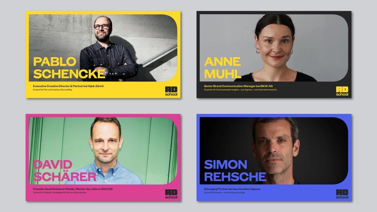
The new logo serves as both a stage and a figurative mark
Building on this positioning, andfrank developed a new, self-assured brand identity. At its heart is the new logo, which serves as both a figurative mark and a stage. By connecting the «A» and «D,» a compact, striking shape is created. In communications, its surface serves as a projection screen for images, videos, text, and animations. In this way, the «AD» becomes a flexible stage for creative ideas and a defining design element of the entire brand identity.
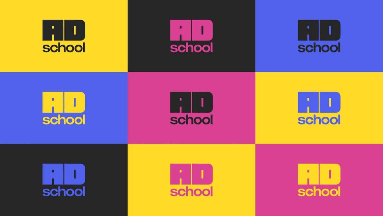
The color palette has also been further developed. The brand’s existing colors—yellow and black—have been deliberately retained and refined. As powerful primary colors, «Blast Yellow» and «Raw Black» form the foundation of the new brand identity and ensure maximum contrast, recognizability, and distinctiveness. They are complemented by «Buzz Blue» and «Punch Pink,» which add strategic accents. Together, the four colors evoke the CMYK color model—the color system that creatives and designers work with every day—and thus perfectly align with the Ad School’s DNA.
Ad School Rebranding: A Digital Presence as an Interactive Experience
In addition to the brand design, andfrank also developed the new digital presence. The website is intended to translate the new brand identity into an interactive user experience—featuring bold typography, moving content, scroll-based animations, and dynamic transitions in which content continuously changes and builds based on user behavior. In this way, the website is meant not only to convey information but also to allow users to directly experience the Ad School’s creative ethos.

With its new brand identity, Ad School is firmly positioning itself as a creative talent incubator for the Swiss communications industry—for people who not only understand brand communication but also want to actively shape the future of the industry.

The next course begins on August 21, 2026. There are currently a few spots still available. For more information and to register, visit www.adschool.ch.
Person in charge at Ad School and andfrank: Hanna Jackl, Managing Director of ADC Switzerland