Everything on pink: Finna agency in a new look
After almost two years, the social media agency Finna presents itself with a new online presence. With the new website, they want to represent the diversity of the offer and announce new projects.


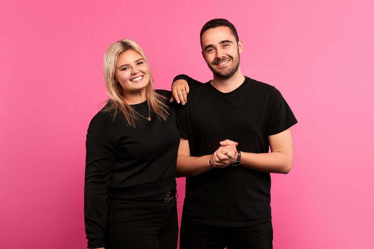 The social media agency Finna appears since this week on its website in new colors and with new images. Finna has opted for pink and is focusing more on the "Plus" in its logo: "We originally started out as a pure Tiktok agency with the Plus, but have long since expanded our range to include short videos and other social media channels as well as projects. That's why the sign today is intended to stand for even more diversity and a broad range of services. Already in the coming weeks we are launching new projects and want to
expand our horizons accordingly," says co-founder Noah Zygmont.
With the new design, the company can show its professionalism and better represent its own standards to the outside world. In addition, the concept should reflect the company philosophy and the fresh way of thinking of the founders and their team. The website was designed and developed by Sam Diener. Simeon Wälti was commissioned for the images.