The new SoZ appearance will be "s Zäni
On November 23, the SonntagsZeitung will be published with a new masthead and a standardized layout for its supplements.


Will the readers of the SonntagsZeitung notice next Sunday that their paper has changed? Probably not all of them. Although the changes themselves are obvious, they don't catch the eye. But that's fine with the SoZ makers. "The redesign doesn't have to stand out, but should primarily improve reader guidance," says Editor-in-Chief Andreas Durisch. It should also bring some freshness and new dynamism to the paper.
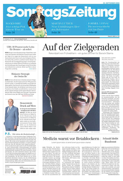
The newspaper header is the most striking change. Although it is not really new: the lettering is the same as before and also appears again as white lettering in a wide blue color field. Yes, again, because with the newspaper title in negative font, the SoZ is harking back to its early days - in its first years it had a similar appearance. Nevertheless, the new logo is by no means nostalgic, because the font is more curved than back then and the blue is also different today. The bar concept on the front is also used on the opening pages of the waistband, naturally in the corresponding colors. "This gives these pages a more powerful expression and helps with orientation," says Durisch.
The number of columns has also changed: previously the pages contained five columns each, now there are six. This will allow for more design variety in future. News columns, for example, now run across two columns. This not only makes them more airy, it also makes them stand out better from the articles. They can also be enriched with photos. "We're making the short stories more attractive for all those who only browse through the newspaper quickly," says Durisch. The amazing thing: Although hardly any two pages have the same layout, the paper still looks clear and tidy.
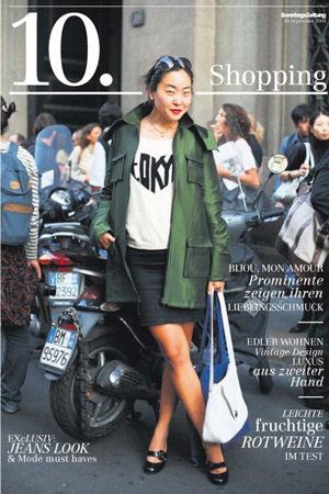
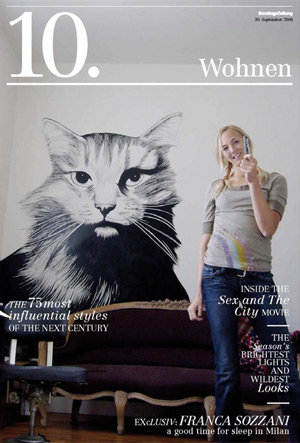
Of course, other things are also changing: subtitles are no longer in italics. And the Medicine page in the Knowledge section is now called Health - and the content is also less academic. Essentially, however, the SoZ, which was gently redesigned by Hamburg newspaper designer Dirk Linke and the SoZ's own art director Andrea Müller, remains true to itself: It continues to adhere to nine volumes and their order, and it retains the title and basic fonts, as well as colors and department names. Nevertheless, readers will occasionally see another striking change: the seasonal specials. As in the past, these will be published in newspaper format and, more rarely, as a SoZ magazine, but one way or another they will all have a uniform, recognizable appearance: a large 10 with a dot on the front page. This stands for the tenth bundle, called "s Zäni" in Swiss German, which means "good quality". Next to the 10 is the title of the special: shopping, job & career, money, real estate, golf or garden. The aim was to turn the "general store of regular supplements into a clear product line", says SoZ publishing director Diego Quintarelli. "Thanks to the uniform brand, it is possible to launch another extra bundle at any time without having to invent a layout." As was necessary for the Bond extra.
Markus Knöpfli
The newspaper header is the most striking change. Although it is not really new: the lettering is the same as before and also appears again as white lettering in a wide blue color field. Yes, again, because with the newspaper title in negative font, the SoZ is harking back to its early days - in its first years it had a similar appearance. Nevertheless, the new logo is by no means nostalgic, because the font is more curved than back then and the blue is also different today. The bar concept on the front is also used on the opening pages of the waistband, naturally in the corresponding colors. "This gives these pages a more powerful expression and helps with orientation," says Durisch.
The number of columns has also changed: previously the pages contained five columns each, now there are six. This will allow for more design variety in future. News columns, for example, now run across two columns. This not only makes them more airy, it also makes them stand out better from the articles. They can also be enriched with photos. "We're making the short stories more attractive for all those who only browse through the newspaper quickly," says Durisch. The amazing thing: Although hardly any two pages have the same layout, the paper still looks clear and tidy.
Of course, other things are also changing: subtitles are no longer in italics. And the Medicine page in the Knowledge section is now called Health - and the content is also less academic. Essentially, however, the SoZ, which was gently redesigned by Hamburg newspaper designer Dirk Linke and the SoZ's own art director Andrea Müller, remains true to itself: It continues to adhere to nine volumes and their order, and it retains the title and basic fonts, as well as colors and department names. Nevertheless, readers will occasionally see another striking change: the seasonal specials. As in the past, these will be published in newspaper format and, more rarely, as a SoZ magazine, but one way or another they will all have a uniform, recognizable appearance: a large 10 with a dot on the front page. This stands for the tenth bundle, called "s Zäni" in Swiss German, which means "good quality". Next to the 10 is the title of the special: shopping, job & career, money, real estate, golf or garden. The aim was to turn the "general store of regular supplements into a clear product line", says SoZ publishing director Diego Quintarelli. "Thanks to the uniform brand, it is possible to launch another extra bundle at any time without having to invent a layout." As was necessary for the Bond extra.
Markus Knöpfli