
Reinventing themselves: Nicole Lachenmeier and Darjan Hil, co-founders of Yaay, launch Superdot.
It all began with information design, when no one was talking about this discipline yet. Now, these simplified, condensed forms of conveying complex information through vivid, striking graphics, visual grammar and animation, and little text are on everyone's lips and are shaping everyday media life as well as corporate publishing. The Basel-based agency Yaay anticipated this trend early on, back in 2011. Now the six creators are going one step further. "Yaay has been operating in the national niche of information design for the past eight years. We're now ready to position ourselves internationally with a sharpened offering. It focuses on three specializations," says Darjan Hil, co-founder of Yaay and Superdot.

Superdot.studio: Far and wide no "burger" - screenshot from the new webpage.
Superdot.studio shows new key areas
The new Website of the Basel studio illustrates - among other things on the basis of concrete cases of assignments for the Swiss Tropical Institute in three African countries, for UNICEF or Roche - the three central fields of action: Information Architecture, Information Visualization and Information Aesthetics. "The three areas basically define the findings of the project and teaching practice of the last eight years. These schools of thought are in vogue worldwide when it comes to crystallizing and compressing complex issues. In doing so, we always take a data-based approach and also pursue a socially enlightening claim," explains Nicole Lachenmeier, founding partner of Yaay and herself a lecturer in information aesthetics as part of the "Digital Ideation" course at the Lucerne University of Applied Sciences and Arts HSLU in the Department of Design & Art.
The first area, information architecture, is about structuring and analyzing information. In information visualization, the explorative visual translation of content is called for, while information aesthetics is about the creative manifestations of the final design. And the Baslers take themselves right at their word. They conspicuously show why Yaay is outdated and a new name is in order. "It's always nice to put the old notebook in the archive and start over with a white sheet of paper, isn't it? Part of the practice of design is just that - making a design or sketch over and over again. Why don't we do this on a corporate level as well, why don't we reinvent ourselves over and over again?" - this is how Darjan Hil describes the motives for the name change - from Yaay to Superdot.

Instead of classic forms: easy-to-understand information design on health topics in three African countries - developed by Superdot for the Swiss Tropical Institute.
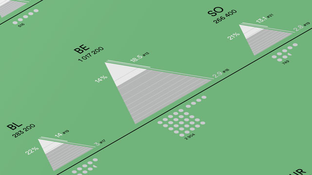
The infographic is the first journalistic project initiated by YAAY itself. The information graphic visualizes the cantonal comparison on the topic of Swiss naturalizations in 2015. The overview presents two very different ways of looking at the key figures. On the one hand, the number of naturalizations per 1000 inhabitants in the canton (general number of naturalizations) and the not so widespread number of naturalizations per 1000 foreigners, with permanent residence in the canton. This results in two very different views on the subject.
How the infographic was created
Each canton is represented by a triangle and shows various key figures on naturalization. The white tip represents the foreign resident population in percent. The gray area of the triangle marks the number of Swiss residents in percent. In addition, the triangles are sorted by the number of naturalizations per 1000 inhabitants. If the triangles are sorted according to the number of naturalizations per 1000 foreigners, the order changes. In addition, there is the Swiss map with the cantons in the upper right corner for a geographical overview. The representation of the cantons in triangles shows that it makes a big difference whether one looks at the number of naturalizations per 1000 inhabitants or the number of naturalizations per 1000 foreigners.
For example, Basel-Stadt granted a total of 1025 citizenships (gray dots) in 2015. Measured against its population of 191,800, Basel-Stadt ranks sixth out of a total of 26 in a cantonal comparison. By contrast, if the number of naturalizations is considered in relation to the number of foreigners, the canton falls to 18th place.


Do these situations sound familiar to you? A sprawling project presentation where the PowerPoint slides never seem to end? The overview has long since been lost, but the anticipation of the subsequent aperitif is all the greater?
Thick annual reports, alternating between loaded graphics and huge tables, while motivation slowly fades away? Today, more data and information is available than ever before. In research, IT, administration, in private companies, in short: everywhere. However, making this information and data accessible is not easy. If graphics first have to be laboriously deciphered, tables and files searched through, this costs time and nerves. A challenge for communication. The design agency YAAY was born out of these considerations. The team, consisting of specialists in the disciplines of graphic design, product design, computer science, economics and sociology, specializes in visualizing complex issues.
YAAY makes information and data that is hidden somewhere visible: in Excel sheets, work processes, concepts or studies. For example, the start-up ensures that study results do not disappear unused. "Research results often receive too little attention because they are not presented properly," explains information architect Darjan Hil. At YAAY, the study results are not presented in short summaries or PowerPoint presentations. "PowerPoint presentations are made for the moment, after which they are thrown away," says Hil. YAAY wants to create something that lasts longer and thus ensure sustainability in the handling of information. When furniture manufacturer Vitra commissioned a study on design factors in the workplace, YAAY analyzed, condensed and illustrated the results. YAAY used office scenes to illustrate how various factors - such as plants or lighting conditions - influence the productivity and creativity of employees. Simple, concrete and in a form that arouses the viewer's curiosity. YAAY designed and realized the year-end presentation for Burckhardt + Partner.
Previously, the architecture firm had presented the reports with a classic slide presentation. Now they wanted something that could be used beyond the event. In workshops, YAAY worked together with the architects to determine the form in which the implemented architectural projects should be presented. The result was a poster several meters long. At the top - in the form of a skyline - all the construction projects are lined up true to scale, with information on the dimensions, construction time and investment sum listed below. The architects' range of work is visible at a glance, and the buildings can be directly compared on a single sheet. An additional benefit: the project did not end up in the wastepaper basket after the ceremony, but was hung up in the meeting room as a new dynamic way of talking to customers. "This poster also strengthened internal communication and the awareness of our own employees themselves," says Hil. The company presentation folder had thus become obsolete.
YAAY also supports companies in ongoing projects with its visualizations. For example, the young company supported a development study for the area surrounding the new Vienna Central Station. In addition to Burckhardt + Partner, two other architectural firms were involved in the project. YAAY designed a visual working tool to simplify cooperation and communication between the parties involved in the project by providing an overview. The area around the main station was broken down into structures and typologized on a large poster. The requirements for the large-scale project - including spatial planning requirements - that the architects should keep in mind were listed in key words. "Visualizations simplify communication and decision-making," Hill is convinced. He had already experienced this during his previous job in project management at IBM and later at Credit Suisse. When the major bank cooperated with an external company for software development, Hil began not only to set out the requirements in writing, but also to record them. For the business IT graduate, this was the trigger to delve deeper into visual communication. He went on to study for a Master's degree at the Basel University of Art and Design (HGK). It was there that he met most of his current colleagues.
The idea to found YAAY was based on the desire to combine a wide range of disciplines with the skills of professional designers in an interdisciplinary way. The team set up their offices on the top floor of the old St. Johann SBB train station, which houses various start-ups from the creative industries. Hil is responsible for project management. He makes sure that the organization of the "colourful team" works. After all, YAAY not only brings together different disciplines, but also different cultures. Illustrator and product designer Indre Grumbinaite comes from Lithuania, video graphic and interaction designer Safak Korkut from Turkey, Darjan Hil's roots are in south-eastern Europe, sociologist and historian Kurosch Hadinia has an Iranian-Swiss family background and, last but not least, graphic designer Nicole Lachenmeier provides the Swiss balance. The common denominator at YAAY is not primarily a specialist field or a language, but visual communication. The agency name is representative of this. There is no verbal meaning behind YAAY, but rather a visual concept. The team played with the visually similar letters A and Y and created a logo (see image) that is memorable: "Once you've seen it, it stays in your mind." YAAY also used a visual approach to tackle a current social issue: social inequality. For an international competition for information design ("Out of Balance - Critique of the Present. Information Design after Otto Neurath"), they visualized data from a UBS study - and won the competition organized by the architecture magazine Arch+. The approach: YAAY received socio-economic data from various cities from UBS. Information on the income of various occupational groups, living and maintenance costs, etc. Their aim: to make social inequality visually tangible from the wealth of information.
YAAY has used the image of the income gap to illustrate the wage differences according to occupational groups (see right-hand side). The wider the gap, the greater the differences in the respective city. The higher a job is placed on the gap, the higher the salary. The gross domestic product was placed on the scissors as a reference point. If you compare the "scissors" with each other, you can see, for example, that a teacher in Beijing earns about the same as an engineer. However, if the teacher works in Dubai, he is paid less than the engineer, while in Moscow he is even on a par with a worker in terms of salary. On another subject, wages are shown with dots and purchasing power is illustrated with individual products and services.
Finally, a concept was developed for an exhibition in which visitors experience inequality first-hand. On entering, visitors are presented with a wheel of fortune. This assigns them an origin and a profession - financial analyst in Berlin or worker in Mumbai? With their new identity, visitors set off on the course. At one stand, they can measure their purchasing power by shooting a rifle. Depending on the profession and country, more or fewer balls are available to clear the pyramids of rifles - which are larger or smaller depending on the product. The financial analyst has tens of balls, the worker has to be accurate with his few balls if he wants to win an iPhone. Then it's on to a climbing wall. Here, visitors face an easier or more difficult climbing route, depending on their profession. Aesthetics are central to YAAY - but never arbitrary. There is a concept behind everything YAAY puts on paper. This can be seen, for example, in this year's campaign for the Basel club festival BScene, for which YAAY designed a trailer and various printed materials. At first glance, the campaign motif with triangles in various shapes, colors and positions does not suggest that it has a deeper meaning. If you take a closer look at the triangles, you will discover what the festival is all about: the countless ways in which a festival evening can be put together.
The background: at the club festival, various Basel bands perform in different clubs on two evenings. After each concert, visitors can change venues and make a pilgrimage to the next concert. Different clubs, different bands, at different times: Visitors have a total of 2916 alternatives for organizing their festival evening. YAAY has used these possible combinations as a design element. The color of the triangles stands for the day, the angle for the performance time, one length for the size of the stage, the other for the number of musicians. "We didn't want to present the bands, but rather get to the heart of the festival," says graphic designer Nicole Lachenmeier.
Festival visitors who are not interested in the combinatorics will read the program like any other flyer. The others have a means in their hands to engage with the festival in a playful way. The triangles created by the festival data were recombined for each application, sometimes strictly according to the program for the flyer, sometimes much more freely for the large festival poster. As the examples show, visualizations can be used in many different ways. To develop a new concept, for a company presentation or an annual report, to accompany a workshop, to illustrate large amounts of data or to prepare study results. One thing remains the same for all projects: whoever commissions YAAY buys design, but receives much more than that. Through the perspective of the various disciplines, YAAY offers a range of services that goes far beyond visualizations. "We scrutinize processes, ask questions and point out gaps," says Hil. YAAY forces clients to rethink their processes and workflows and to reflect on the key points at the end of a project. "Sometimes people can't see the wood for the trees." An outside perspective helps to regain an overview. "We sell information and data in a new way," says Hadinia. "We turn them into something aesthetic."
Isabel Imper


More data is available today than ever before. But how can meaningful information be extracted from this sea of data? How can we meet the need for legibility, clarity and orientation? Which facts are unobserved or underexposed? These were the questions addressed by the international competition "Out of Balance - Critique of the Present. Information Design according to Otto Neurath". The task was to record social inequality on the basis of empirical material and make it tangible.
499 designers, scientists and students from 18 countries took part in the competition. Six 1st category prizes, six 2nd category prizes and five commendations were awarded. The only Swiss participant to win was the young design agency Yaay from Basel. The interdisciplinary team, consisting of specialists in the disciplines of graphic design, product design, IT, economics and sociology, specializes in the visualization of complex issues.
Yaay's award-winning work "Looking beyond the horizon: wages and prices in the world's major cities" refers to the discourse on social justice and fairness. It addresses the growing discrepancy between the incomes of individual occupational groups within a society using the example of twenty cities in different countries.

One subject (see above) graphically illustrates the income gap for various cities, while another shows the different purchasing power of the income of the occupational groups for various consumer goods and services depending on the city/country. Finally, the purchasing power of food in the lowest income group is shown for the respective cities and compared with the purchasing power that the income of a Zurich worker would have in the respective city. You can find the subjects here as PDF.
All winners and further information on the competition: Archplus.net.