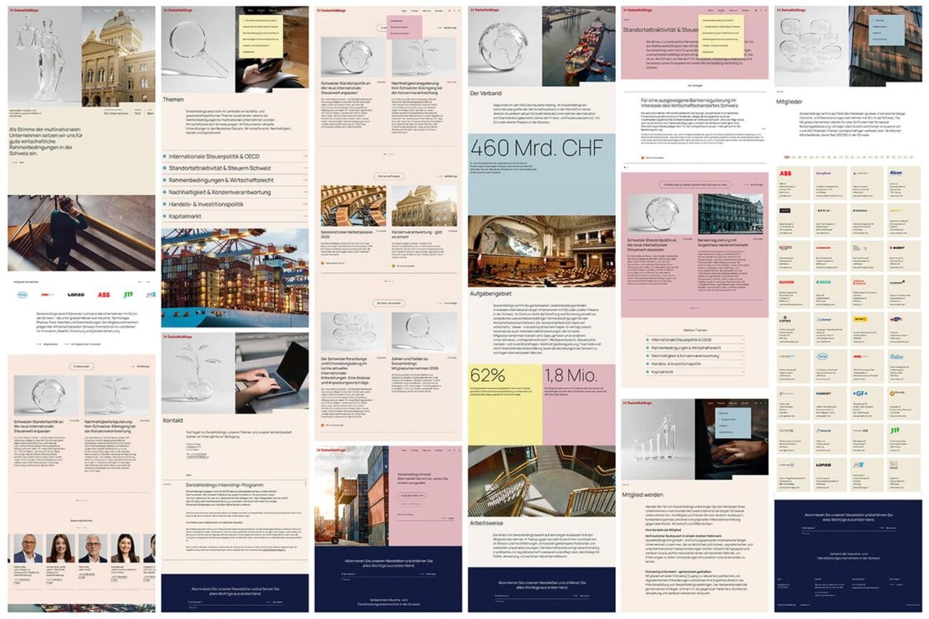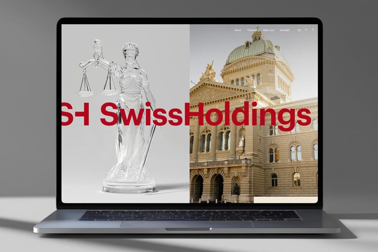
The SwissHoldings business association is unveiling a completely revamped brand identity and a new website. The new SwissHoldings brand identity was created by the Bern-based studio Thom Pfister, which was responsible for the concept, corporate design, screen design, and programming.
A two-letter character
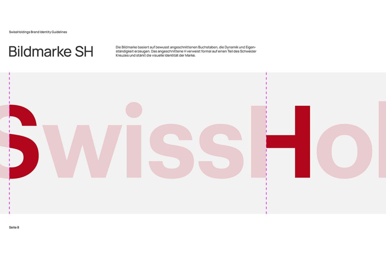
At the heart of the redesign is the new word and figurative mark. Through carefully chosen cuts, the initial letters “S” and “H” form a distinctive symbol. The simplified “H” references the Swiss cross in its form—thus, “Swissness” is not illustrated but derived directly from the typography.
This idea doesn’t stop at the logo: the entire design system is derived from the geometry of the figurative mark. The distinctive shapes become modular elements and form the basis for a flexible layout system that is consistently applied across all applications. The result is a visual identity based on a single design principle.
Glass Objects as a Visual Language
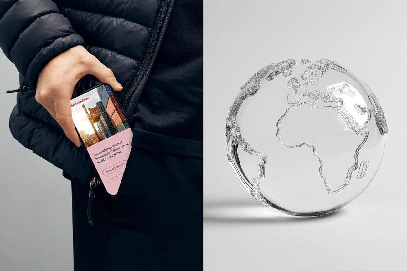
Another defining element of SwissHoldings’ new brand identity is its visual language. Transparent glass objects translate themes such as law, dialogue, growth, networking, and responsibility into a distinctive visual language. These are complemented by authentic photographs from the worlds of business, politics, society, and Switzerland’s institutional landscape.
New Website with a Members' Area
Alongside the brand identity, Studio Thom Pfister also developed the new website—from screen design to programming. A clear information architecture, intuitive user navigation, and a secure members-only area consistently carry the new brand identity into the digital space.
According to the company, the result is a distinct brand identity that positions SwissHoldings in a contemporary light and highlights its role as the voice of the Swiss economy.