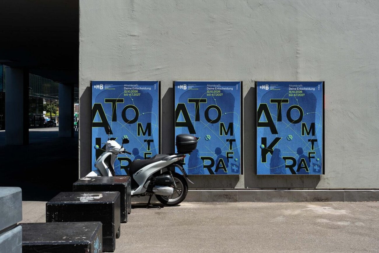
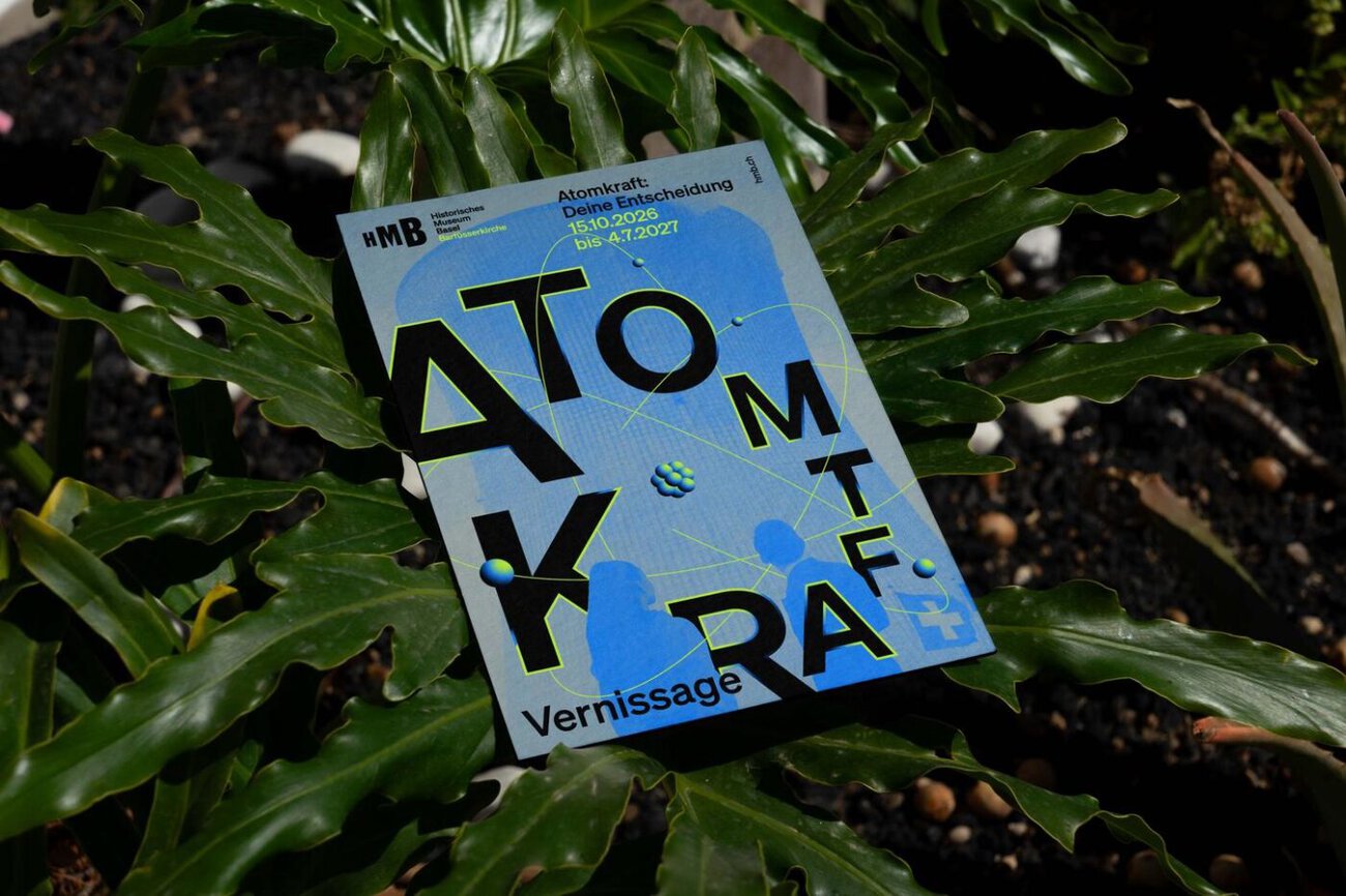
The Basel-based branding agency Suan has developed the exhibition poster and promotional materials for the Basel Historical Museum’s new special exhibition, «Nuclear Power—Your Decision.» Following their collaboration on the rebranding project, the museum has once again turned to the agency.
Basel Historical Museum: A Controversial Topic in the Spotlight
The exhibition focuses on nuclear energy, one of the most controversial topics of our time. Against the backdrop of climate change, energy supply, and social responsibility, visitors will learn about different perspectives, weigh the arguments, and form their own opinions.
Suan developed the visual communication for the exhibition, ranging from the key visual to the poster campaign, print media, and digital applications. According to the agency, the goal was to convey the theme in an eye-catching and aesthetically pleasing way, to spark curiosity, and to generate enthusiasm for the exhibition among a broad audience.
Collaboration with Suan Will Continue
Suan had already developed the exhibition communications for the Basel Historical Museum’s special exhibition «Treasure Finds—Hidden, Lost, Discovered.» In May 2026, the museum’s rebranding—developed by the agency—was also launched. The collaboration continues with «Nuclear Power—Your Decision.».
The special exhibition will be on view from October 15, 2026, through July 4, 2027, at the Barfüsserkirche in Basel.
Person in charge at the Basel Historical Museum: Bettina Lotz, Head of Communications; Micha Gasser, Digital Communications; Benjamin Mortzfeld, Curator; Marc Zehntner, Director. Contact person at Suan: Déborah Mayer, Senior Art Director; Domenico Bellantuono, Art Director; Erica David, Art Director; Rani Cha, Trainee; André Konrad, Creative Director; Susanne Hartmann, Creative Director.
]]>
Bühler Law's Brand Identity: A Single Line as a Symbol of Expertise
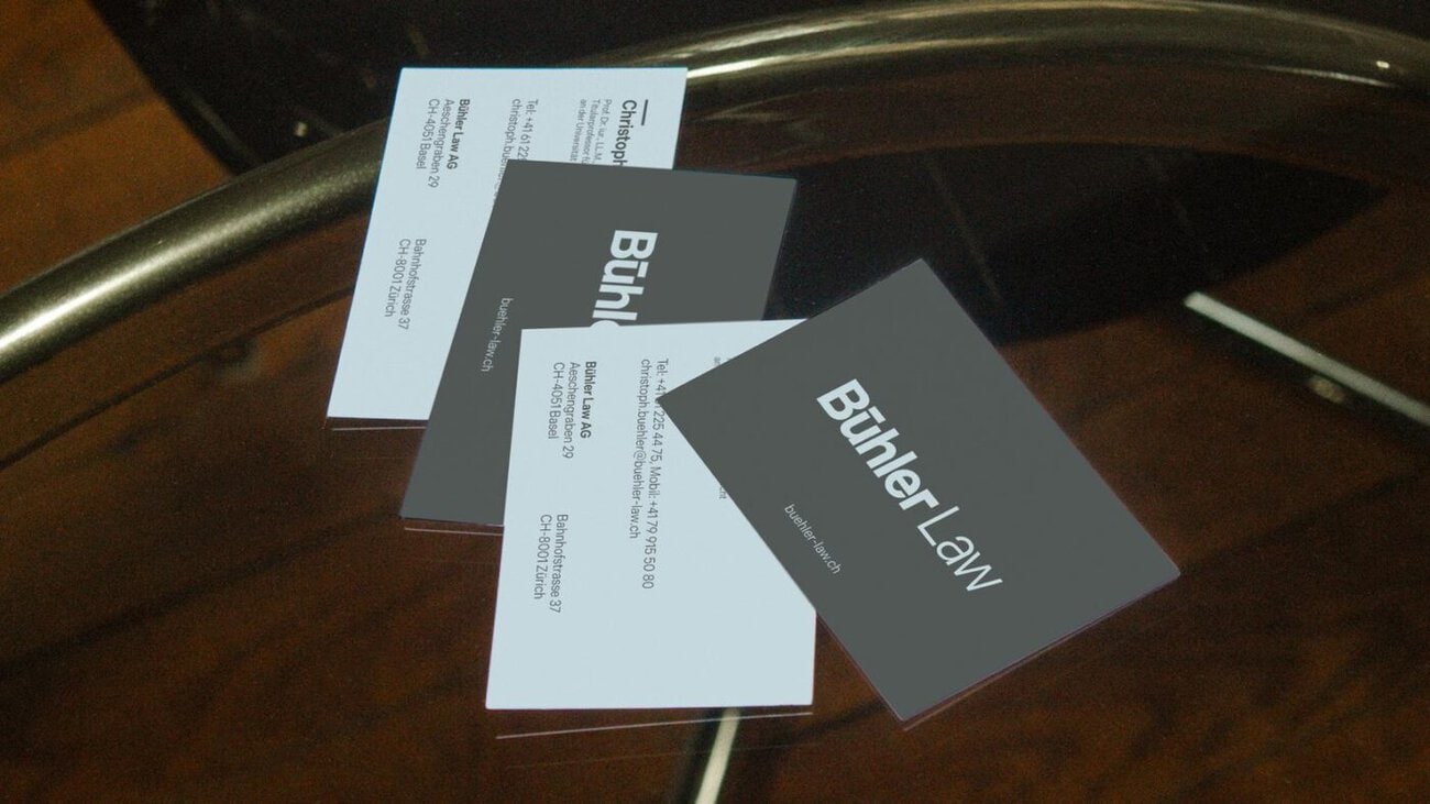
The Suan agency developed the brand identity, tagline, and website for Prof. Dr. Christoph B. Bühler’s corporate governance law firm. With Bühler Law, he is founding a new boutique law firm specializing in corporate governance, corporate law, and financial and capital markets law. For the brand identity, Bühler turned to Suan with the mandate to create a strong brand. The new website has been online at buehler-law.ch since October 12.
Minimalist Design for Bühler Law's Brand Identity
The law firm’s corporate design is minimalist: clean colors, plenty of white space, and understated typography—with no gimmicks or distractions. The practice areas are clearly numbered and organized.
One detail runs throughout the entire design: the line connecting the two dots of the «Ü» in “Bühler.” It appears in the logo, in the visual language, and on the website. According to the press release, it symbolizes what the law firm delivers: expertise.
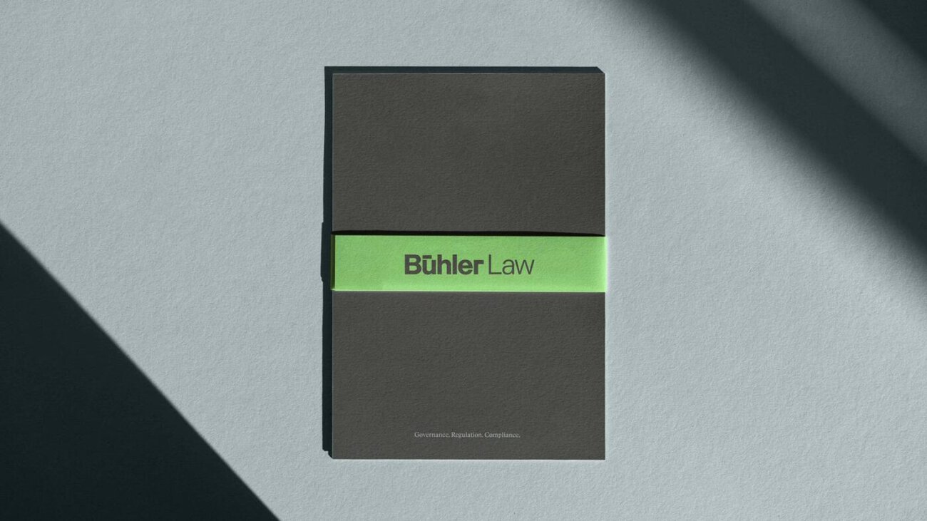
The tagline «Governance. Regulation. Compliance.» sums up the firm’s focus in three words.
Legal service providers are also brands
For Suan, the Bühler Law case illustrates a principle that goes beyond legal advice: legal service providers are brands, too. Those who recognize this gain trust before a single word is spoken. This applies just as much to a law firm as it does to a manufacturing company.
Bühler Law has offices in Zurich and Basel. Founder Christoph B. Bühler is a titular professor of commercial and business law at the University of Zurich. The firm advises companies on corporate governance, corporate law, and financial and capital markets law. Suan describes itself as a Swiss agency for bold brands.
More information: suan.ch
]]>
The Basel-based branding and design agency Suan is the new exclusive network partner of the Startup Academy Basel and Baselland in the areas of branding and communication. This formalizes a collaboration whose roots date back to the agency’s early days. The partnership between Suan and the Startup Academy is therefore not a new beginning, but rather the continuation of a relationship that now spans nearly a decade.
From Mentee to Network Partner
Shortly after Suan was founded, the agency itself participated in the Startup Academy’s mentoring program. The program helped the founders structure their fledgling company, clarify business-related issues, and build an initial network. This early connection evolved into a long-standing partnership. Suan co-founder and Managing Partner André Konrad has been volunteering as a mentor for the Startup Academy for many years, guiding founders through strategic and business-related challenges.
«The Startup Academy supported us during a crucial phase in our company’s history. That makes me all the more pleased that we can now give something back and contribute our experience even more to the network in the future,» says André Konrad, managing partner and co-founder of Suan.
Branding Expertise for Startups and Scale-ups
Since August 2026, Suan has been an official network partner of the Startup Academy Basel and Baselland for branding and communications. As part of the partnership, the agency contributes its expertise in brand strategy, positioning, brand design, and communications to the network.
Plans include joint activities and events, as well as consulting services for startups. Companies in the Startup Academy network will, among other things, have the opportunity to schedule a free consulting session with Suan. The partnership builds on Suan’s work with young companies. Especially in the early stages of growth, startups must make key decisions regarding positioning, branding, and communication—often with limited resources and under significant time pressure.

A Dedicated Program for Ambitious Startups
In addition to its network partnership, Suan has developed its own program for ambitious startups and scale-ups. The program is designed for companies that want to strategically build their brand, refine their positioning, or take their existing brand identity to the next level. In doing so, Suan combines its own entrepreneurial experience with its expertise as a branding and design agency to help young companies build a clear and sustainable brand early on.
Suan is an internationally acclaimed branding and design agency based in Basel. The agency develops brands, from strategic positioning and naming to brand design, communication, and digital brand experiences. Its clients include companies, institutions, and organizations from Switzerland and around the world.
Startup Academy is a nonprofit organization that connects startups, scale-ups, and SME entrepreneurs throughout Switzerland with the business community and universities, and supports them in their growth. According to Startup Academy Switzerland, its support program sets it apart in the market.
Contact person at Suan: André Konrad, Managing Partner and Co-Founder
More information about Suan: https://www.suan.ch
]]>
Rebranding of the Basel Historical Museum: Suan Sets a New Standard
The rebranding of the Historisches Museum Basel is official: As of May 19, 2026, the HMB is launching a new brand identity, which the Basel-based branding and design agency Suan spent more than a year developing. The goal of this comprehensive project was to highlight the museum’s strategic development and reposition the HMB as a contemporary, relevant cultural institution.
At the heart of the jointly developed brand strategy is the positioning of the HMB as a vibrant place of dialogue that brings history to life and connects the past with the present and the future. This gave rise to the new brand essence: «A place for all times.».

A distinctive logo system with high brand recognition
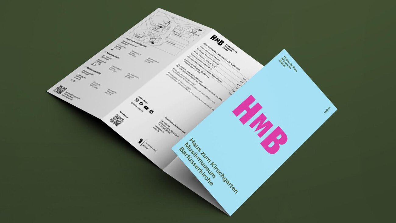
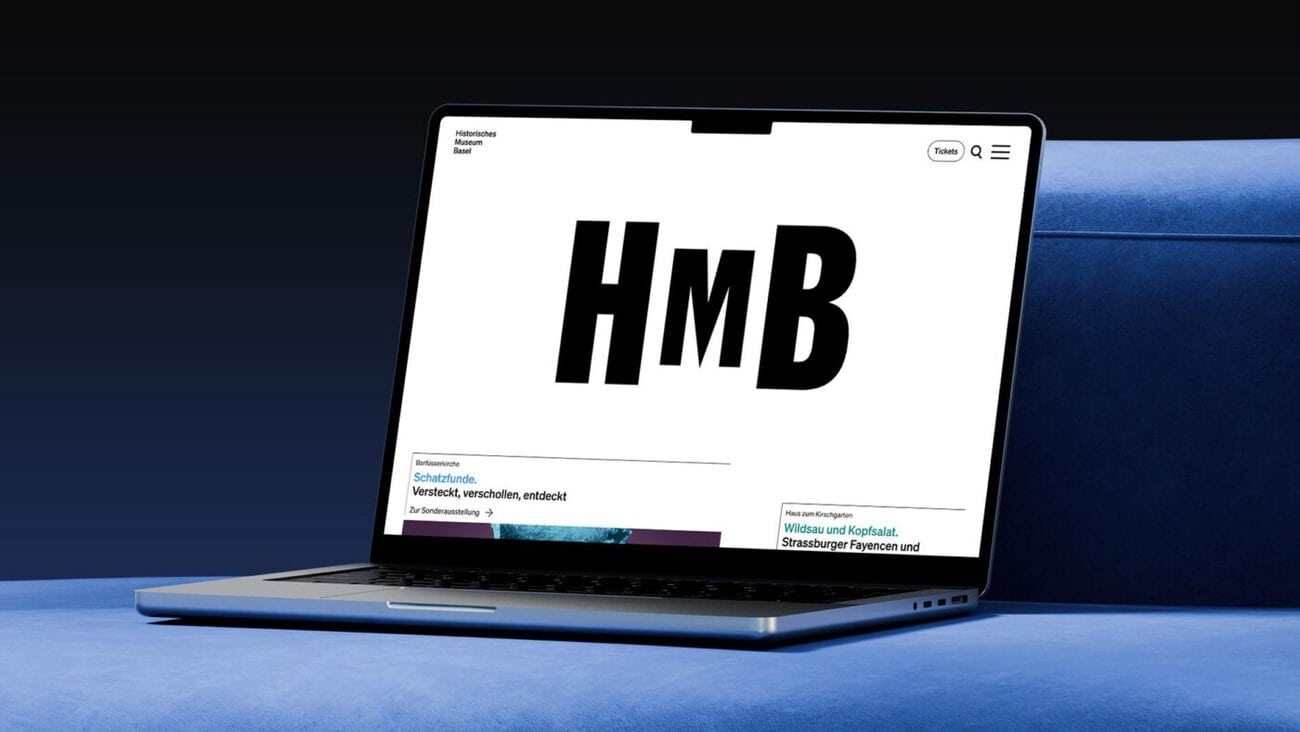
At the heart of the new identity is the logo system. According to Suan, the return to the abbreviation «HMB» has created a distinctive word mark that clearly stands out in the Basel museum context and gives the museum a modern and self-assured image. The umbrella brand is complemented by a flexible sub-logo system for the three venues: Barfüsserkirche, Musikmuseum, and Haus zum Kirschgarten. By selectively highlighting individual letters, each venue is given its own identity within a consistent overall system.

Strategic Design Across All Channels
The new design system was deliberately kept minimal and developed to be flexible. The typography, color palette, and layout system are intended to create a strong visual identity while enabling clear, target-audience-specific communication. In addition to the visual design, Suan worked with HMB to develop the communicative foundation for future messaging. Based on personas and brand stories, a new communication and web structure was created to make content clearer, more relevant, and easier to find.
The new brand identity is being implemented in collaboration with the museum’s in-house marketing and graphic design team across all channels—from the website to social media and print media, as well as signage and the annual report.
Rebranding the Basel Historical Museum: More Than Just a New Look
For Suan, the project exemplifies the importance of strategic brand management in the cultural sector. André Konrad, Managing Partner at Suan, puts it this way: «With its new brand identity, the HMB is sending a clear message far beyond the canton’s borders. The brand now makes as striking an impression as the location of its main building and confidently demonstrates what it stands for: a place for all times.»
For more information about the project, visit Suan's project page: https://www.suan.ch/neuigkeiten/Rebranding-Historisches-Museum-Basel.html
Person in charge at the Basel Historical Museum: Bettina Lotz, Marc Zehntner, Micha Jakob Gasser, Delia Sieber, Patricia Bülhoff, Patrick Moser, Janine Meier, Noelia Berberat, Manuela Frey. Contact at Suan Branding: André Konrad (Managing Partner), Susanne Hartmann, Déborah Mayer, Domenico Bellantuono, Erica David. Programming: Open Interactive; Text: Textair.
]]>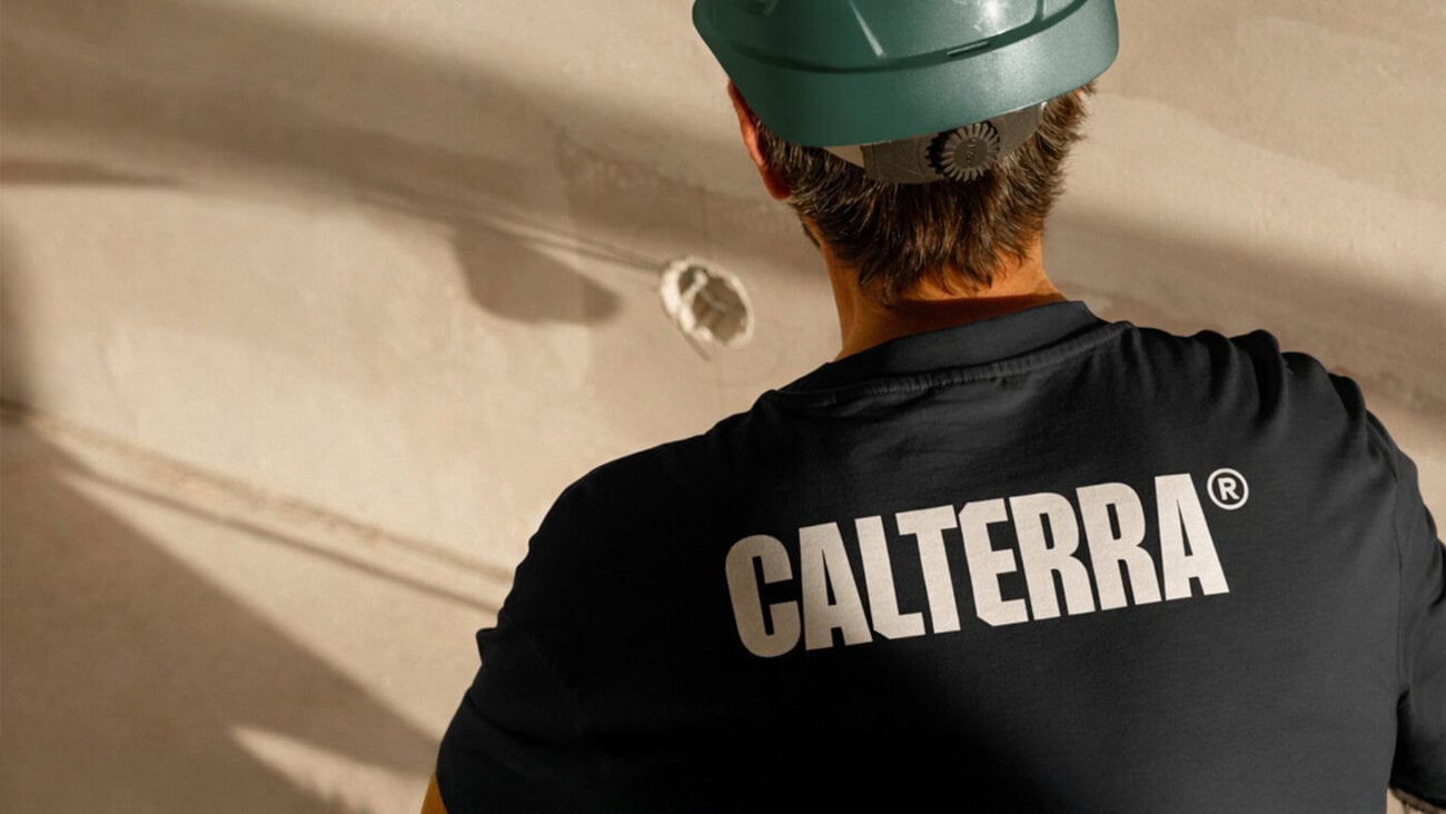
With Calterra, Jura Materials is launching a new product brand for the Swiss market. The aim was to clearly position CO₂-reduced cement not only technically, but also in terms of brand strategy and to make it visible as a high-performance new standard. The brand identity was developed by the branding and design agency Suan, from the strategic basis to naming and visual design through to digital and animated applications.
Sound strategy process as a basis
Calterra emerged from a well-founded strategy process with workshops, a cross-departmental team from Jura Materials and interviews with key target groups and personas. On this basis, a brand narrative was developed that combines an understanding of materials, responsibility and performance and structures complex content in an understandable way.
Clear name and scalable brand architecture
The name Calterra combines "cal" for calcined clay with "terra" as a reference to material, origin and durability. It forms the basis of a scalable brand architecture and creates clear orientation within the product family. The claim "Cement of the next generation" precisely formulates the strategic claim.
Design as a strategic tool
The design system translates the positioning into a reduced, powerful visual identity. Typography, color scheme and layout create recognizability, consistency and differentiation in the Swiss building materials market. Design acts as a strategic tool that reduces complexity, creates orientation and builds trust.

Motion, film and animation as mediators of technology
Illustration, iconography, animation and film are an integral part of the system. A brand launch video translates the visual identity into a moving brand experience. An animated representation of the production process makes the technology understandable and comprehensible. The animations are also embedded in an overarching technology video and ensure a consistent appearance across all moving image formats.
Digital platform as a central brand presence
The website serves as a central brand platform and translates strategy and design into a clearly structured digital experience. Typography, movement and interaction support orientation and strengthen brand perception. The customer website is available at www.calterra.ch reachable.
Staged brand launch with a direct customer experience
The brand launch was conceived as a three-phase campaign with a pre-launch, launch and post-launch. A launch event directly at the customer's site on February 5, 2026 will bring Calterra to life for the first time and bring together brand, product and design. Calterra is thus positioning itself as a credible Swiss product brand and a new reference point for sustainable cement.
About Jura Materials: As a building materials supplier operating throughout Switzerland and based in Aarau, the company covers the entire value chain from raw material extraction to production and recycling and is part of the international building materials group CRH. About Suan: Suan is the owner-managed branding and design agency from Basel. Internationally recognized and active beyond the borders of Switzerland. For over 10 years, Suan has been developing brands that are memorable, create trust and are successful.
]]>
What does the end of an electronic device actually sound like? That’s exactly the question posed by Sens eRecycling’s new 2025+ campaign, conceived and produced by Suan in collaboration with Dreifive. The audio-driven campaign focuses on the sounds of broken electronic devices, making recycling not only visible in a distinctive way, but above all audible.
«That’s really what it sounds like when a device is nearing the end of its life,» explains Nando Erne, Head of Marketing and Communications at SENS eRecycling, who has been involved in the annual campaigns of Switzerland’s largest take-back system for electrical appliances for many years. «We’re all familiar with these sounds. They mark the starting point for the next step: proper e-recycling.»
Onomatopoeia Brings the Circular Economy to Life
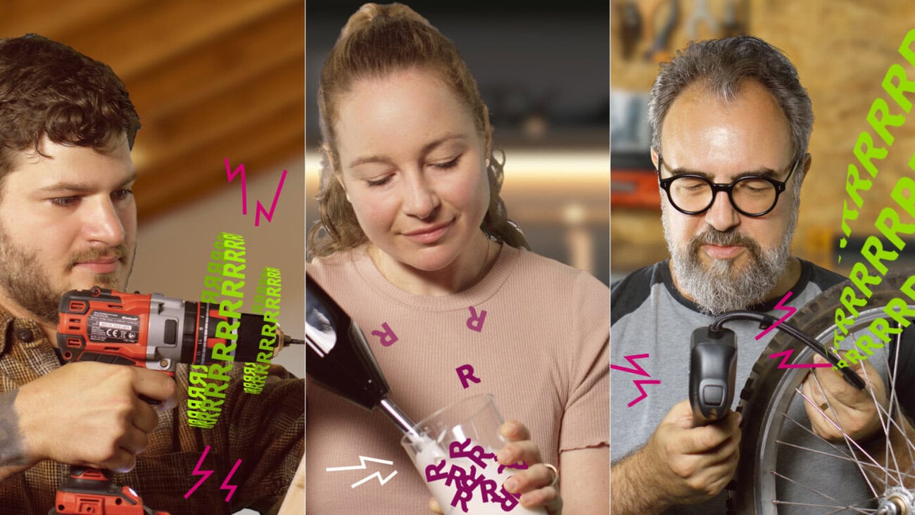
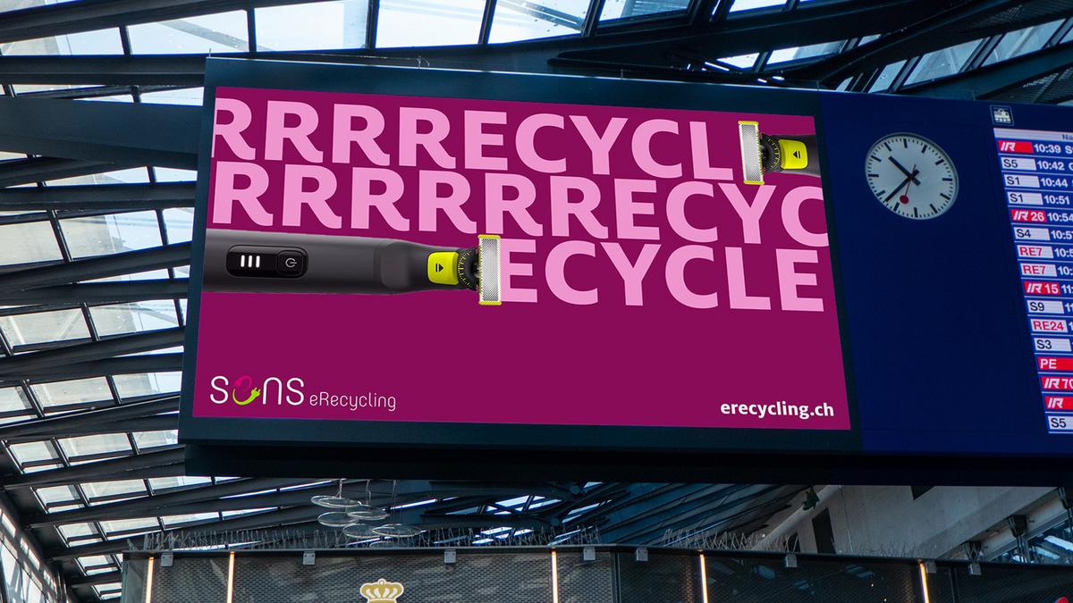
The campaign relies heavily on onomatopoeia, accompanied by real sounds. This brings the concept of a circular economy to life on both a visual and auditory level. Through typography and sound, noises like “Rrratter,” “Knarrrz,” and “Drrröhn” convey the message: When a device makes strange noises, it’s time to dispose of it properly or have it repaired.
This idea forms the basis of a broad-based campaign that will be rolled out online, on the radio, and through print inserts. Short radio spots feature familiar everyday sounds—the hum of a razor, the whir of a blender, or the creak of a broken fan—and pair them with the message, which was further developed in collaboration with copywriter Diego Stocker (Textosteron).
Two Practical Solutions for Proper Recycling
The goal of the campaign is to provide the target audience with two main solutions for proper recycling: the Electro Recycling Bag, which allows small appliances to be conveniently returned by mail, and the Circular Platform, which helps users repair, reuse, or recycle their items.
In collaboration with Till Gmür, we also produced a series of video clips featuring real people, each representing one of the three target groups. The clips depict funny and authentic everyday stories and form the basis of a target-group-specific paid ad campaign that will air throughout Switzerland.
The eye-catching visuals and animations from the three-year campaign have been running since August 2025 on social media, YouTube, and Spotify. The highlight of this year’s campaign was International E-Waste Day, when AI-generated animal characters helped generate a great deal of attention among the Swiss public.
Person in charge at SENS eRecycling: Nando Erne (Head of Marketing and Communications), Daria Baur (Project Manager, Marketing and Communications), Contact person at Suan: André Konrad (Creative Director), Sabrina Scherzinger (Project Manager), Erica David (Art Director), Ramon Mohler (Art Director), Leila Epprecht (Intern), Text Production: Diego Stocker (Textosteron), Video Production and Casting: Till Gmür, Audio production: Nadja Ender and Bobby Gertsch (nice noise)
]]>
With the website relaunch in August 2025, Sens eRecycling, a leading take-back system for electrical and electronic equipment in Europe, took its digital presence to a new level. Suan Conceptual Design reworked the entire information architecture and also fundamentally redeveloped the interface design. It was particularly important to make content easier to find, to address the various user groups in a targeted manner and to improve the visibility of the Circular Platform and other key areas. The redesigned user guidance is geared even more towards the needs of consumers, but also simplifies research and interaction for partner companies.
The Suan design team relied on a consistently new visual language for the visual refresh, which provides realistic insights into the world of eRecycling through a specially designed photo shoot. Authentic images bring the various players in the recycling system into focus and make the content tangible. "Our website is the central point of contact for recycling topics for a wide range of user groups. With the new website, we are making information more accessible and creating an experience that is fun and builds trust," explains Nando Erne, Head of Marketing & Communication at Sens eRecycling.
Responsible at Sens eRecycling: Sabrina Bjoeoern (former Deputy Managing Director), Nando Erne (Head of Marketing & Communication), Daria Baur (Project Manager Marketing & Communication). Responsible at Suan Conceptual Design: André Konrad (Creative Direction), Sabrina Scherzinger (Project Manager), Erica David (Art Direction), Ramon Mohler (Art Direction). Text production: Diego Stocker (Textosteron). Technical implementation: Open Interactive: Matthias Widmer (consulting), Nora Niederer (project management), Frédéric Eguémann (frontend), Sam Hawkes (full stack), Dalibor Simic (backend), Gianluca Frongia (full stack). Photography: André Scheidegger (Moodpix GmbH).


The cross-media campaign by Sens eRecycling and Suan aims to raise awareness for the environmentally friendly disposal of e-cigarettes, thereby making an active contribution to environmental protection.
The environmental problem of disposable vapes
"E-cigarettes contain lithium batteries, which contain both valuable raw materials and harmful substances. To ensure that the raw materials can be recovered and no harmful substances are released into the environment, empty e-cigarettes should be recycled. Importers and retailers in Switzerland are legally obliged to take back all types of used e-cigarettes," says the website Vape-recycler.ch.
A Study from Great Britain suggests that disposable vapes are also a significant environmental problem in this country: In the UK, 50 percent of vapes end up in the trash and are not recycled. This could be used to produce 1,200 electric car engines a year, and such a return rate would even be desirable for Switzerland, because according to Sabrina Bjöörn from Sens eRecycling, almost no vapes ended up in recycling here as of 2023. The assumption was a negligible 5 percent.
As an initial communication measure, Sens eRecycling and Suan 2023 developed a recycling box for retail outlets and the website Vape-recycler.ch. This provides comprehensive information to make the topic tangible. These initial measures have reportedly increased the collection rate to 20 percent. The long-term goal is to achieve at least 50 percent.

Campaign expanded this year
To achieve this goal, the campaign for 2024 was scaled up and a cross-media design concept was developed to appeal to the target group of 18- to 30-year-old vape smokers at their leisure activities or in stores.
Sens eRecycling provides vape recycling bags and boxes designed by Suan at points of sale of e-cigarettes, making it easy to collect and return used vapes. The full bags can be deposited in the letterbox. There they are collected by the post office and sent for recycling.
A newly developed collection concept includes the placement of the cardboard boxes at festivals, bars and clubs, where they are prominently displayed on the counters.
A large sculptural recycling box in the shape of a vape as an eye-catcher was developed by the company Layercake, the surface was designed by Suan. It is currently in the test phase at points of sale.
With brightly colored stickers, stores and kiosks can actively declare themselves as vape recyclers and thus further raise awareness of environmentally friendly behavior. A comprehensive media kit will be made available to recycling collection points, vRB partners, recyclers and other interested parties to effectively support the implementation and dissemination of the campaign content. In a next step, eye-catching stickers will also be placed on public waste garbage cans to remind people that e-cigarettes do not belong in the bin.

Animated key visuals convey facts
The social media campaign developed by Suan spreads the animated key visual in collaboration with Dreifive. Selected facts from the website are used to illustrate the urgency of the problem in a playful way. The communication also refers to the Vape Recycling Bag and the website.
DOOH measures at highly frequented locations in Switzerland are intended to provide additional visibility and spread the message far and wide. In mid-July, the e-boards and e-panels at Zurich main station lit up in green. According to Suan, the key visuals reached numerous commuters and travelers, and SRF reported on the campaign.


 ]]>

With the redesign of its employer branding, the retailer wants to emphasize its commitment to inclusion and diversity and provide a convincing insight into the company's vibrant culture. The aim is for visitors to Coopjobs.ch get a real feel for Coop's culture and values.
This was achieved through the newly defined visual language. Models on the one hand and employees in their actual working environment on the other represent the different roles within the company and were available during eleven extensive shooting days. The resulting Captured authenticity is designed to make it easier for potential employees to connect with Coop on a personal level and develop a sense of belonging.
Contemporary graphic design
Designing a look and feel for Coop's employer branding involved not just a visual overhaul, but a strategic endeavor to authentically represent Coop's branding. The contemporary graphic design - also implemented by Suan - is intended to strike a balance between incorporating Coop's existing brand elements and differentiating the job portal as a unique point of contact for current and potential employees.
Managing diversity in the Coop Group
According to Suan, a comprehensive redesign is no easy task for a diverse company like Coop. Collaboration with in-house IT played a crucial role in the seamless integration of the new design into Coop's existing digital infrastructure. This collaboration extended beyond the online portal to templates for social media, graphics, icons, images and films. Close collaboration with photographers and filmmakers also ensured that every aspect of the redesign reflected Coop's commitment and design concept.

 ]]>

Together with the client, Suan revised the brand strategy and designed the target groups. On this basis, the following was created a completely new brand.
With the new appearance with bright colors, Derendinger has made a radical visual cut, according to a statement. The color "Lime" stands - in line with the values of the new brand - for dynamism, future orientation and commitment.
In an industry traditionally dominated by the colors red and blue, Derendinger wants to stand out from the competition with the bright color. The unique color feature ensures quick recognition and is intended to strengthen internal and external identification with the new brand.


The new trilingual claim "Power for your workshop" is intended to emphasize performance orientation and competence. The new corporate language is intended to convey sympathy through authenticity.
The imagery shows the people behind Derendinger close up in their everyday lives. The new workwear provides the lime accents in the picture.

From the image brochure to the new design of the vehicle fleet, from the stationery to the web presence: Suan also accompanied Derendinger in the implementation of all communication media, which should express the consistent future orientation and innovative strength of Derendinger. The public appearance was launched at the beginning of September at the "Swiss Automotive Show" in Fribourg.


 ]]>

Suan has been designing for the University of Basel since 2015. The collaboration started with the Sustainability Office and a variety of projects that discuss the concept of sustainability from both an ecological and social perspective. Among them the sustainability label "Denk weiter" and the event "Tatort Nachhaltigkeit"..
Over the years, other projects from other departments and faculties were added. For example, key visuals for Cultural Management and Center for Philanthropy Studies or concepts for "Diversity and Inclusion" and "People and Culture". Last but not least for the Ukrainian Research in Switzerland; URIS ... and much more. Over time, Suan was able to learn a lot about various topics - and will continue to do so in the future.
Because now the agency could assert itself in the pitch for the mandate of the lead agency for the University of Basel. From 2023, Suan will be in charge of the current branding of the umbrella brand University of Basel and will develop it further together with the responsible persons of the University of Basel.
]]>
"Second pillar. First class" is the name of the new claim, which is intended to express BLPK's brand essence directly. It makes it clear that BLPK takes care of the second pillar - occupational pension provision - within the three-pillar principle of the pension system, and also that through its work it maintains material security for its insured members after their working lives - and does so at the highest level. "Our new brand identity not only makes us come alive as a pension fund, but also forms the basis for the further development of BLPK. The BLPK brand will continue to evolve in the future, making a substantial contribution to achieving the strategic goals we have set ourselves," says Stephan Wetterwald, CEO of BLPK.
At the heart of BLPK's new brand identity is the newly designed and programmed website Blpk.ch. The motifs developed and photographed for the site focus on people and their personalities. The new corporate colors were incorporated into the images, creating a clear and graphic visual look. The studio shots were taken in Zurich in collaboration with photographer Andreas Zimmermann. The imagery is complemented by stills that create analogies to the various themes. The Swiss agency Open Interactive is responsible for the technical implementation of the website.
Ballhaus West cooperated with the Sun agency in Basel to implement and develop the corporate design. This collaboration will also produce a customer magazine and the annual report in the new look by summer 2021.
