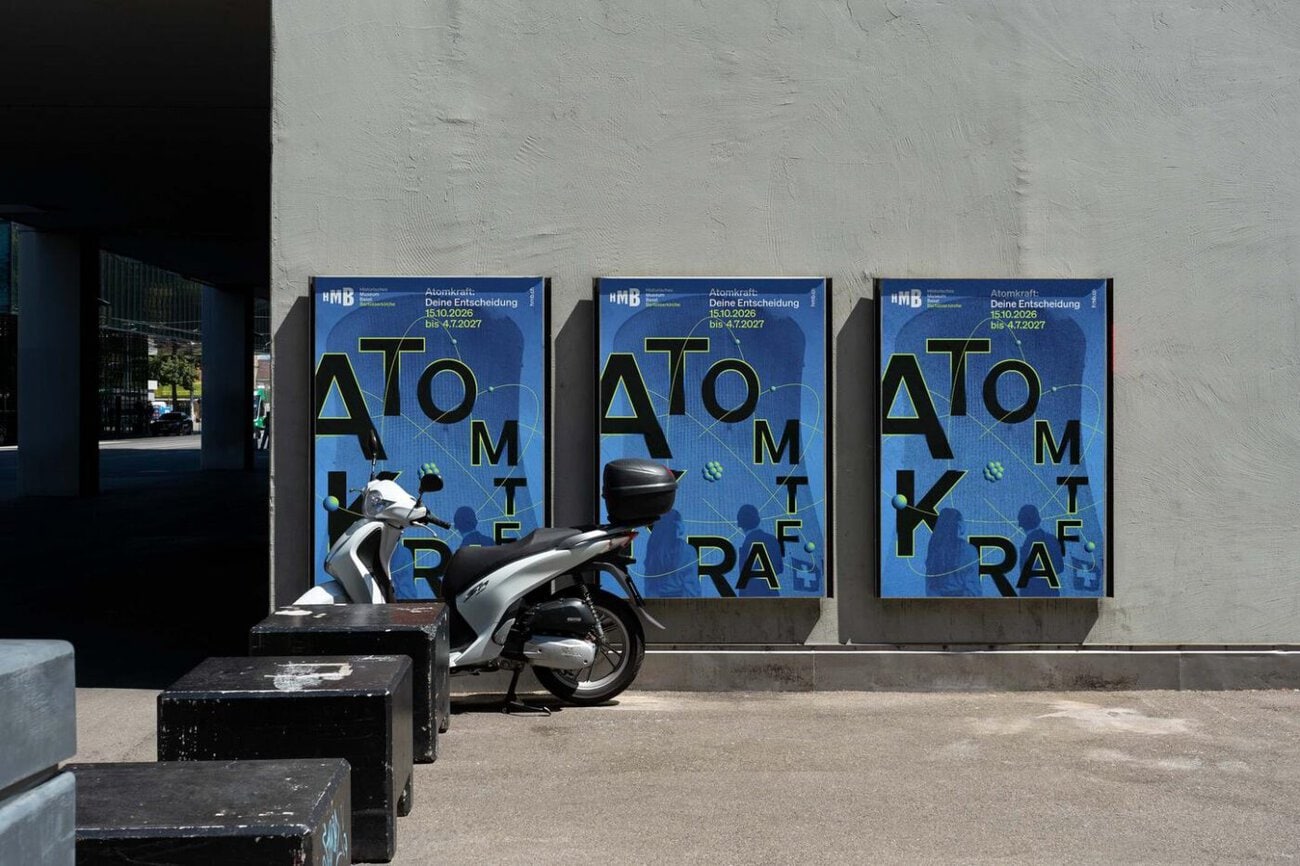
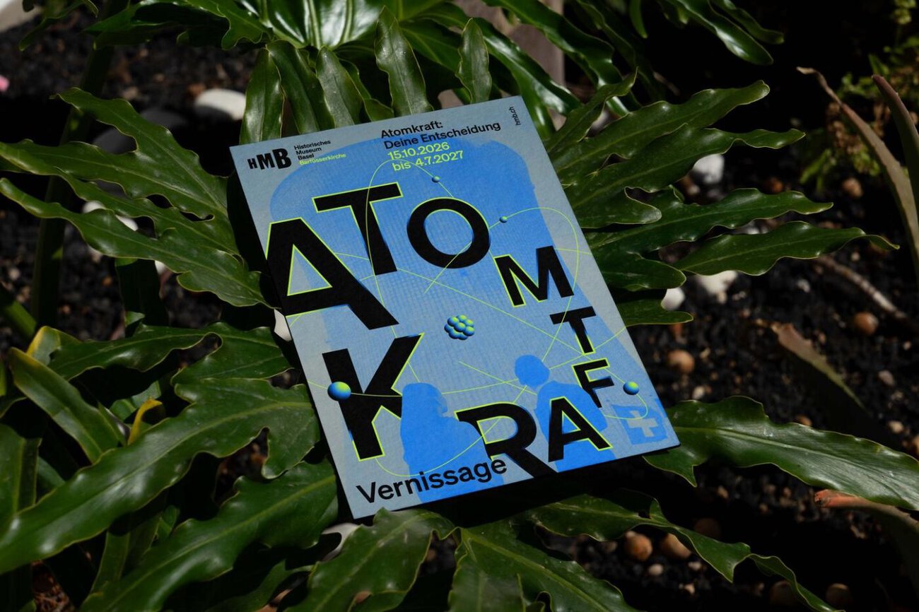
Die Basler Brandingagentur Suan hat für das Historische Museum Basel das Ausstellungsplakat und die Ausstellungskommunikation der neuen Sonderausstellung «Atomkraft – deine Entscheidung» entwickelt. Nach der Zusammenarbeit beim Rebranding setzt das Museum damit erneut auf die Agentur.
Historisches Museum Basel: ein kontroverses Thema im Fokus
Die Ausstellung widmet sich der Atomenergie, einem der kontroversesten Themen unserer Zeit. Zwischen Klimawandel, Energieversorgung und gesellschaftlicher Verantwortung sollen Besucherinnen und Besucher unterschiedliche Perspektiven kennenlernen, Argumente abwägen und sich eine eigene Meinung bilden.
Suan entwickelte die visuelle Ausstellungskommunikation, vom Key Visual über die Plakatkampagne und Printmedien bis zu digitalen Anwendungen. Ziel war es nach Angaben der Agentur, das Thema aufmerksamkeitsstark und ästhetisch zu vermitteln, Neugier zu wecken und ein breites Publikum für die Ausstellung zu begeistern.
Zusammenarbeit mit Suan wird fortgesetzt
Bereits für die Sonderausstellung «Schatzfunde – versteckt, verschollen, entdeckt» entwickelte Suan die Ausstellungskommunikation für das Historische Museum Basel. Im Mai 2026 wurde zudem das von der Agentur entwickelte Rebranding des Museums lanciert. Mit «Atomkraft – deine Entscheidung» wird die Zusammenarbeit fortgesetzt.
Die Sonderausstellung ist vom 15. Oktober 2026 bis zum 4. Juli 2027 in der Barfüsserkirche in Basel zu sehen.
Verantwortlich bei Historisches Museum Basel: Bettina Lotz, Leiterin Kommunikation; Micha Gasser, Digitale Kommunikation; Benjamin Mortzfeld, Kurator; Marc Zehntner, Direktor. Contact person at Suan: Déborah Mayer, Senior Art Director; Domenico Bellantuono, Art Director; Erica David, Art Director; Rani Cha, Trainee; André Konrad, Creative Direction; Susanne Hartmann, Creative Direction.
]]>
Bühler Law's Brand Identity: A Single Line as a Symbol of Expertise
Die Agentur Suan hat den Markenauftritt, den Claim und die Website für die Corporate-Governance-Kanzlei von Prof. Dr. Christoph B. Bühler entwickelt. Mit Bühler Law gründet er eine neue Boutique-Kanzlei, die auf Corporate Governance, Gesellschaftsrecht, Finanzmarkt- und Kapitalmarktrecht spezialisiert ist. Für den Markenauftritt wandte sich Bühler an Suan, mit dem Auftrag, eine starke Marke zu kreieren. Der neue Auftritt ist seit dem 12. Oktober unter buehler-law.ch online.
Reduziertes Design für den Markenauftritt von Bühler Law
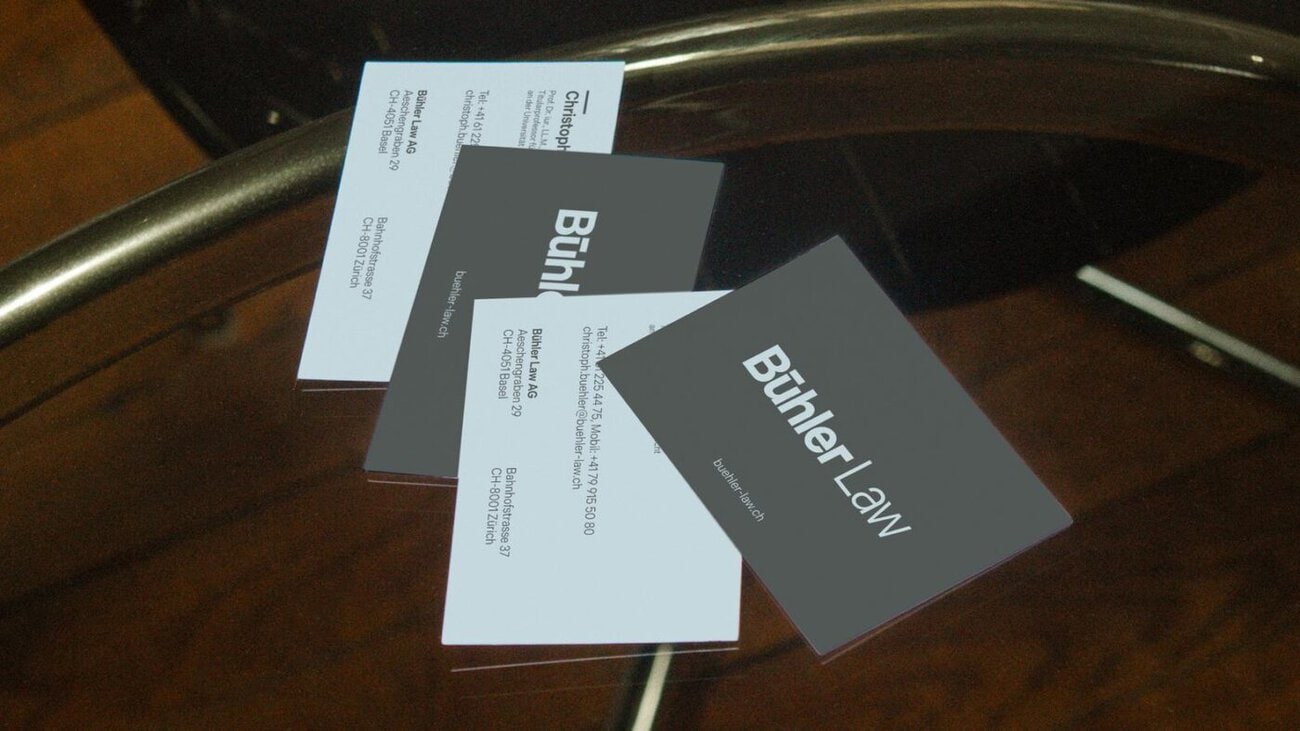
Das Corporate Design der Kanzlei ist reduziert: klare Farben, viel Weissraum und eine ruhige Typografie, dafür keine Effekte und keine Ablenkung. Die Leistungsbereiche sind klar nummeriert und strukturiert.
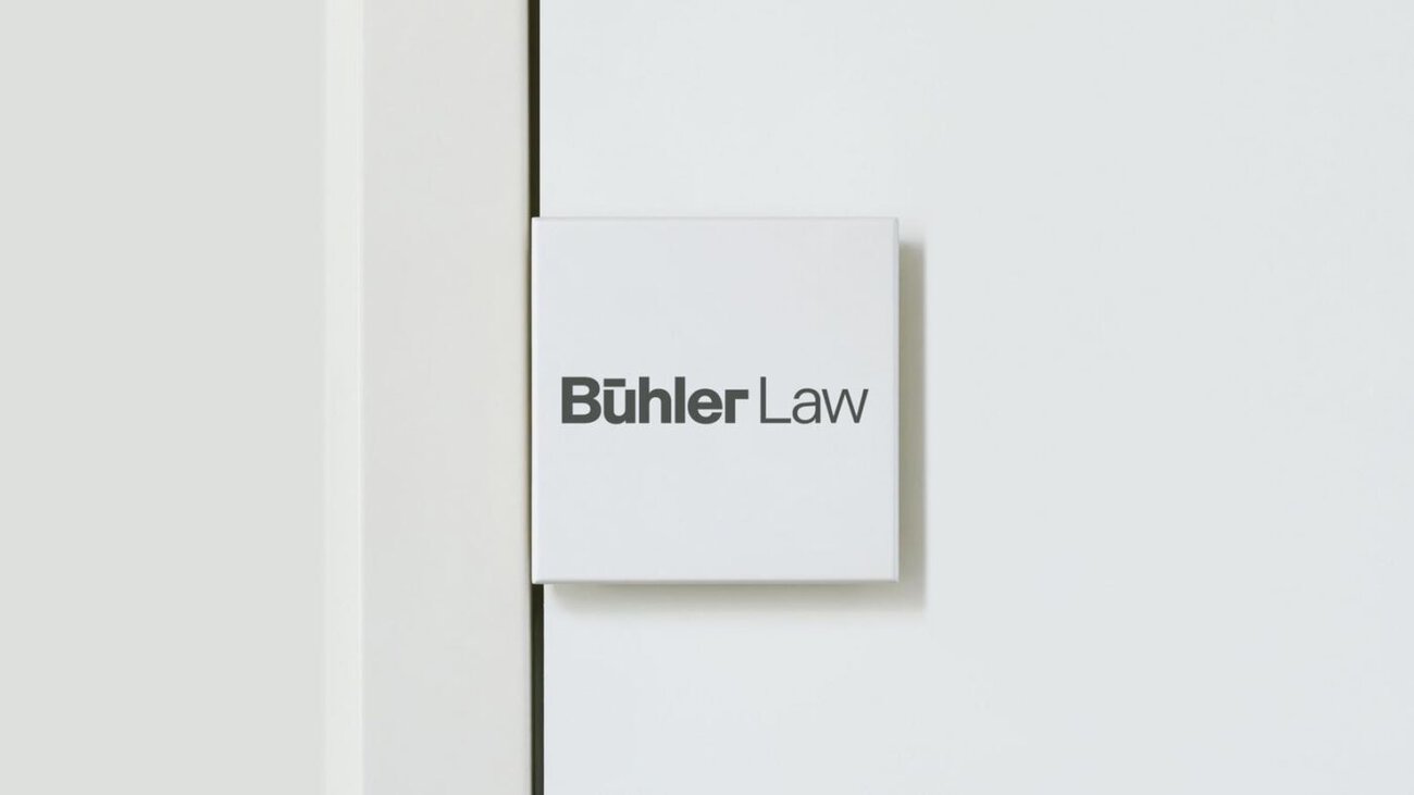
Ein Detail zieht sich durch die gesamte Gestaltung: der Strich, der die beiden Punkte des Ü in «Bühler» verbindet. Er erscheint im Logo, in der Bildsprache und auf der Website. Er steht laut Mitteilung für das, was die Kanzlei liefert: Expertise.

Der Claim «Governance. Regulation. Compliance.» bringt den Fokus der Kanzlei in drei Worten auf den Punkt.
Auch juristische Dienstleister sind Marken
Für Suan zeigt der Fall Bühler Law ein Prinzip, das über die Rechtsberatung hinausgeht: Auch juristische Dienstleister seien Marken. Wer das erkenne, gewinne Vertrauen, bevor das erste Wort gesprochen sei. Das gelte für eine Anwaltskanzlei genauso wie für ein Industrieunternehmen.
Bühler Law hat Standorte in Zürich und Basel. Gründer Christoph B. Bühler ist Titularprofessor für Handels- und Wirtschaftsrecht an der Universität Zürich. Die Kanzlei berät Unternehmen in Corporate Governance, Gesellschaftsrecht, Finanzmarkt- und Kapitalmarktrecht. Suan bezeichnet sich als Schweizer Agentur für mutige Marken.
More information: suan.ch
]]>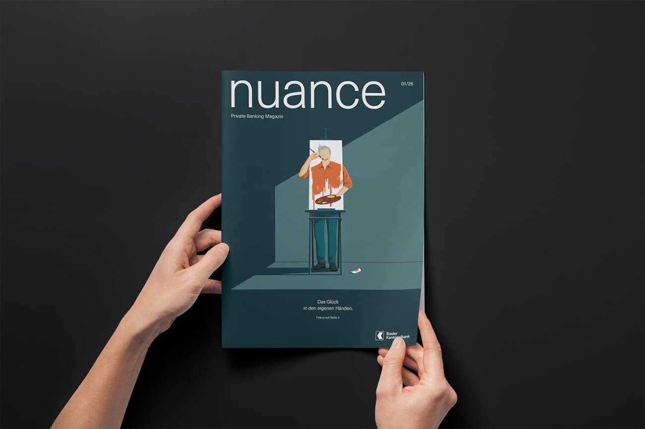
Die Basler Kantonalbank (BKB) lanciert mit «nuance» ein neues Magazin für ihre Private-Banking-Kundschaft. Das Basler Kantonalbank Magazin erscheint gedruckt und verknüpft Finanzthemen mit gesellschaftlichen Fragen, persönlichen Geschichten und Basler Perspektiven. Scholtysik verantwortet das Editorial Design, sda-awp multimedia die inhaltliche Konzeption und die redaktionelle Umsetzung.
Basler Kantonalbank Magazin: Glück als erstes Thema
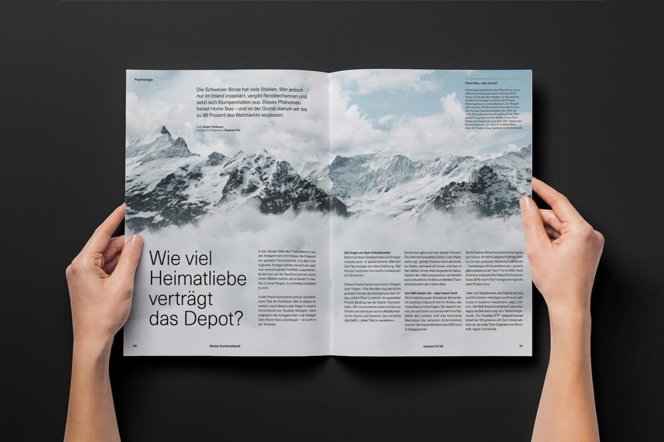
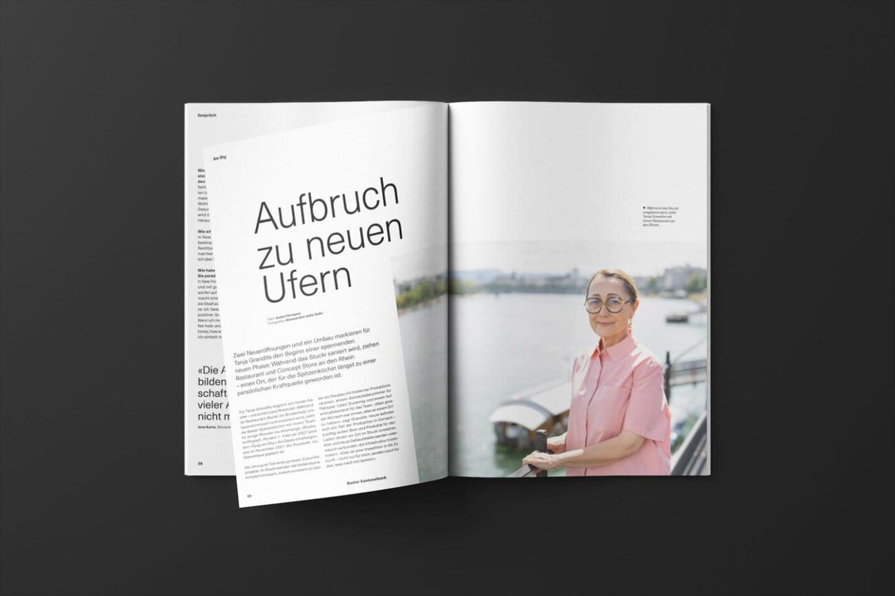
Das zweimal jährlich erscheinende Magazin blickt über Zahlen und Märkte hinaus. Auf 40 Seiten verbindet «nuance» Finanz- und Lebensfragen mit Menschen und Themen aus der Region. Die erste Ausgabe vom 12. Oktober 2026 widmet sich dem Thema Glück. Der Verhaltensökonom Reto Odermatt beleuchtet den Zusammenhang zwischen Konsum und Zufriedenheit. US-Börsenkorrespondent Jens Korte spricht über Amerika im Umbruch, und Spitzenköchin Tanja Grandits berichtet über ihr neues Gastspiel am Rhein.
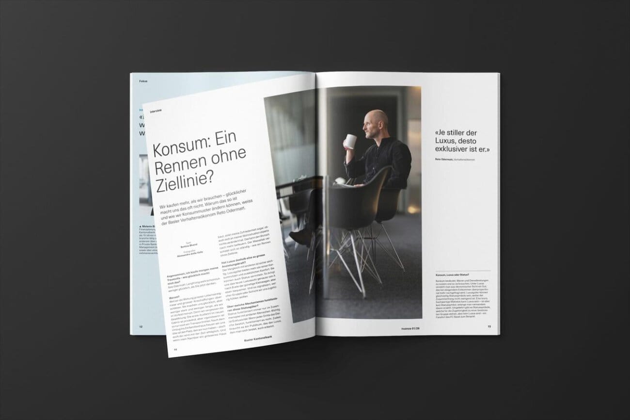
«Mit Scholtysik und sda-awp multimedia ist es uns gelungen, aus einer strategischen Positionierung ein relevantes redaktionelles Erlebnis zu schaffen. Das Magazin zeigt, wofür wir im Private Banking stehen: für Weitblick, ganzheitliches Denken und ein tiefes Verständnis für die Lebensrealität unserer Kundinnen und Kunden.», sagt Nicolà Kaiser, Fachspezialist Branding & Sponsoring bei der Basler Kantonalbank.
Von der Markenstrategie zum Magazin
Scholtysik begleitet die Basler Kantonalbank seit mehr als zehn Jahren in der strategischen und visuellen Markenführung. Im vergangenen Jahr überarbeitete die Schweizer Branding- und Designagentur den Markenauftritt der BKB und stärkte die Sichtbarkeit des Private Bankings. Mit «nuance» findet die neue Ausrichtung nun ihren Ausdruck in einem eigenständigen Magazin.
Für das Magazinkonzept und die journalistische Aufbereitung der Inhalte spannte Scholtysik mit sda-awp multimedia zusammen. Für die Fotografie zeichnet KEYSTONE-SDA verantwortlich, die Illustrationen stammen von Stephan Schmitz und Janine Wiget.
Scholtysik wurde 1996 gegründet und betreut nach eigenen Angaben Unternehmen und Institutionen bei der Führung und Transformation von Marken. Zum Kundenportfolio gehören unter anderem UBS, ABB, SBB, ETH Zürich, Bank Cler, Maxon, Pax, Bell Food Group, JURA Materials, Avenir Suisse sowie das Paul Scherrer Institut PSI.
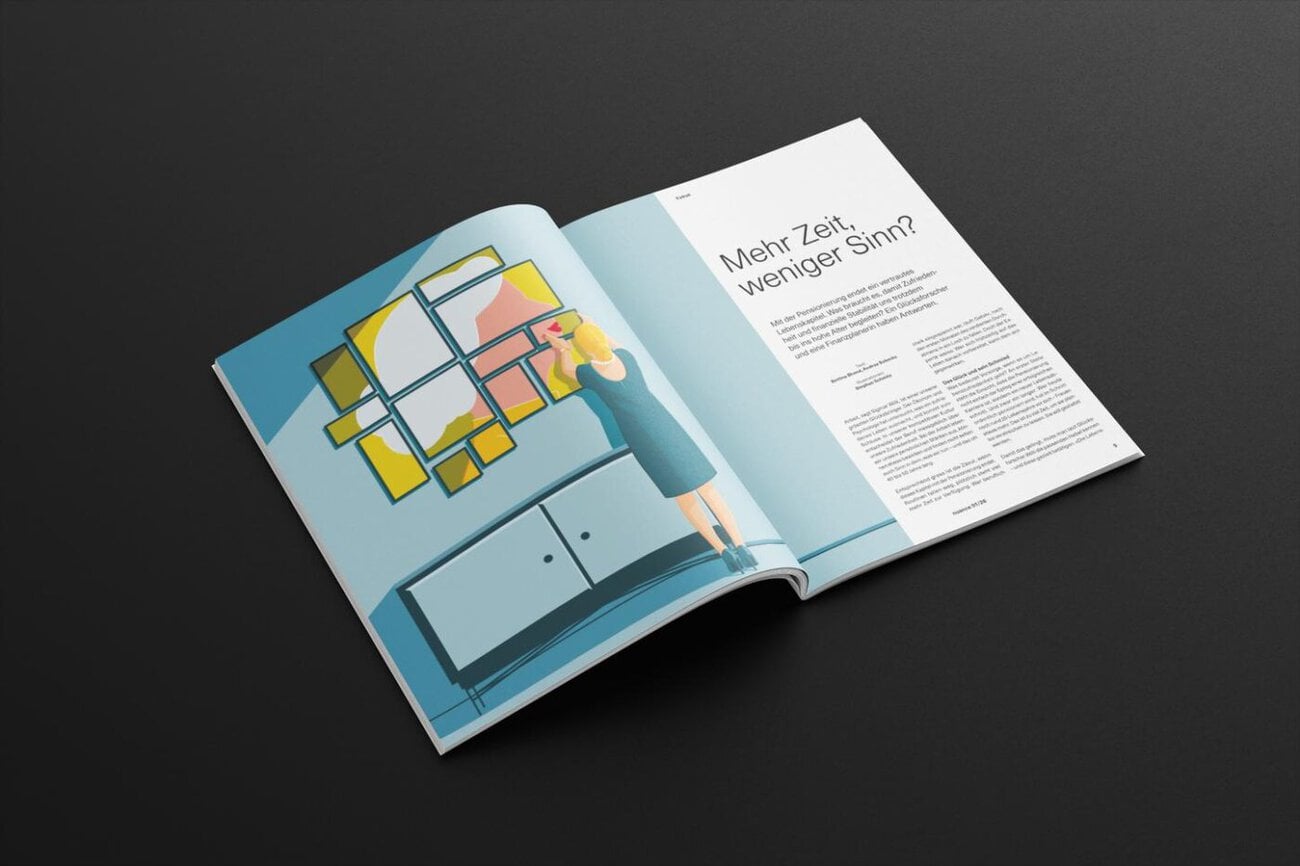
Contact at Scholtysik: Sibylle Frutiger, Holger Huber, Fabian Sander, Ivana Schenk, Lukas Staudenmann (Designkonzept und Umsetzung). Verantwortlich bei sda-awp multimedia: Bettina Bhend, Luise Dambly, Christoph Gaberthüel, Isabel Hempen, Ralph Hofbauer, Thomas Peterhans, Andrea Schmits (Redaktion). Responsible at Basler Kantonalbank: Nicolà Kaiser, Raffael Kouril, Stephan Preiswerk, Mathias von Wartburg.
]]>
Seit dem 1. Oktober bringt ANORR nordisches Design in die Berner Altstadt. Für das neue Einrichtungsgeschäft hat Fruitcake Communications den kompletten Markenauftritt ANORR entwickelt: vom Logo und Corporate Design über die Website bis zu den Drucksachen. Auch Instagram und LinkedIn betreut die Agentur laufend.
Markenauftritt ANORR: Logo mit klaren Formen
Klare Formen gehören zu nordischem Design. Diesen Anspruch hat die Agentur nach eigenen Angaben im Logo aufgenommen. Die entwickelte Wortmarke verbindet feine Linien mit markanten Buchstaben und soll der Marke einen eleganten, eigenständigen Charakter geben. Sie funktioniere auf einer Visitenkarte ebenso gut wie auf der Website und lasse den Produkten im Sortiment Raum.
Corporate Design in Blau und Creme
Abgestufte Blautöne, ein warmer Cremeton und ein dunkler Kontrast prägen das Corporate Design. Dazu kommen klare Typografie und grosszügige, geschwungene Gestaltungselemente. Diese Linie führt Fruitcake über alle Medien hinweg weiter, damit Website, Drucksachen und Social Media als Teile derselben Marke erkennbar sind.
Website und Druckmedien
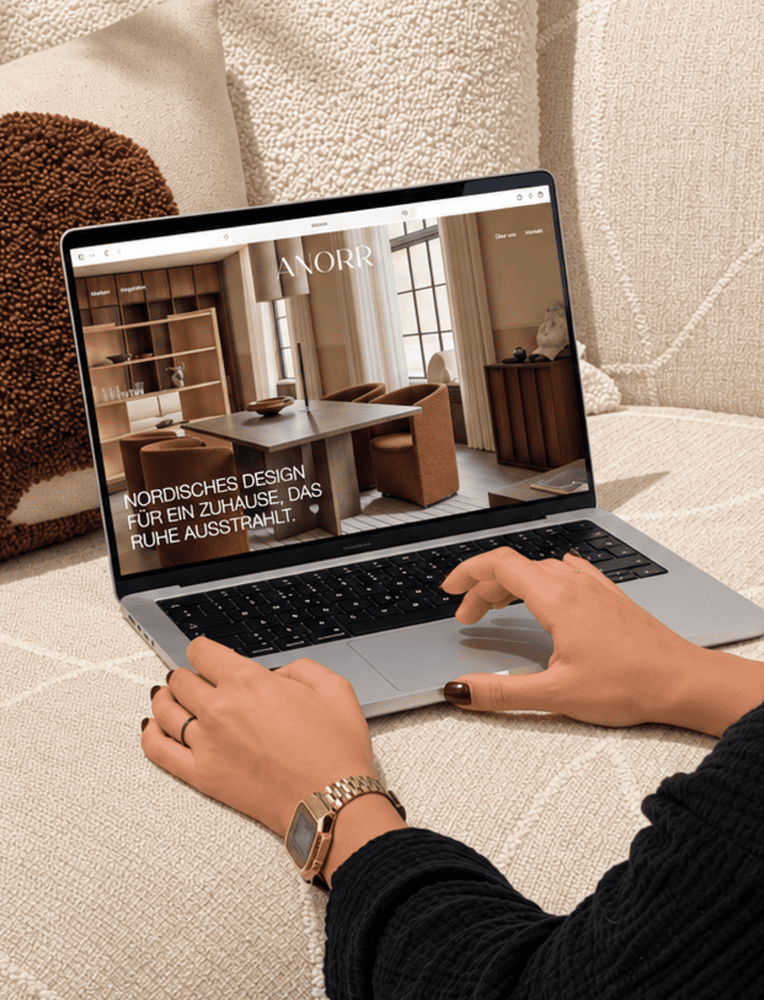
Die Website setzte die Agentur vom Konzept bis zur Programmierung um. Grosszügige Bilder zeigen Möbel, Leuchten und Wohnaccessoires, Markenseiten, Inspirationen und Angebote laden zum Stöbern ein. Besucher:innen können einen Beratungstermin im Showroom anfragen oder direkt im Laden vorbeischauen.
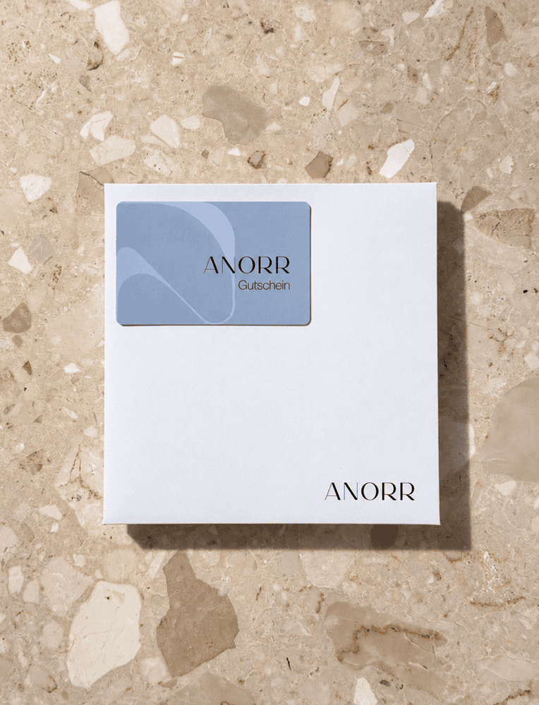
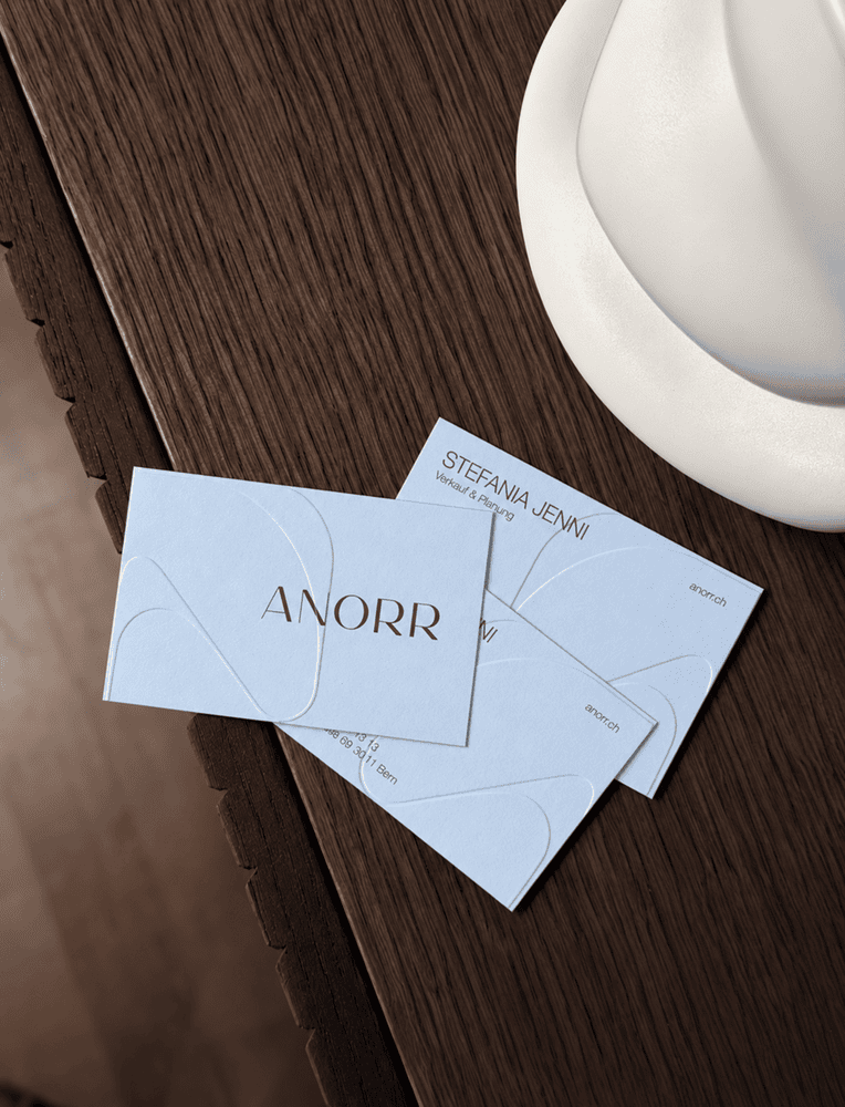
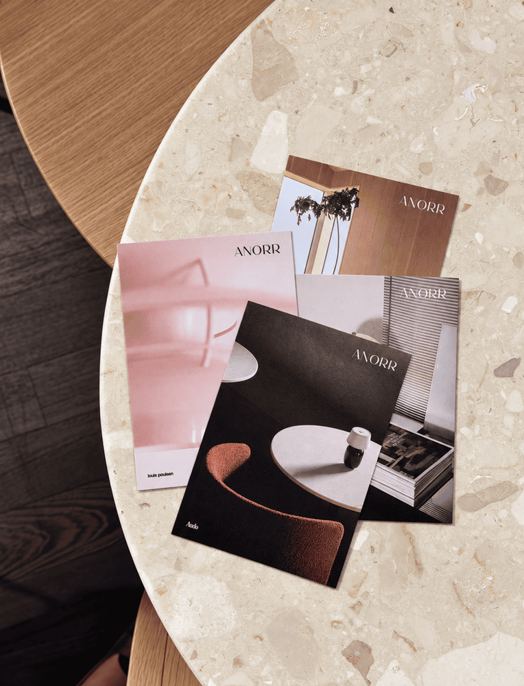
Auch zum Mitnehmen hat ANORR einen eigenen Auftritt: Fruitcake gestaltete Visitenkarten, Postkarten und Gutscheine im neuen Corporate Design und bereitete sie für den Druck auf. Wortmarke, Farben und grafische Elemente verbinden die unterschiedlichen Formate, damit die Marke auch nach dem Besuch im Laden präsent bleibt.
Social Media mit eigener Content-Unit
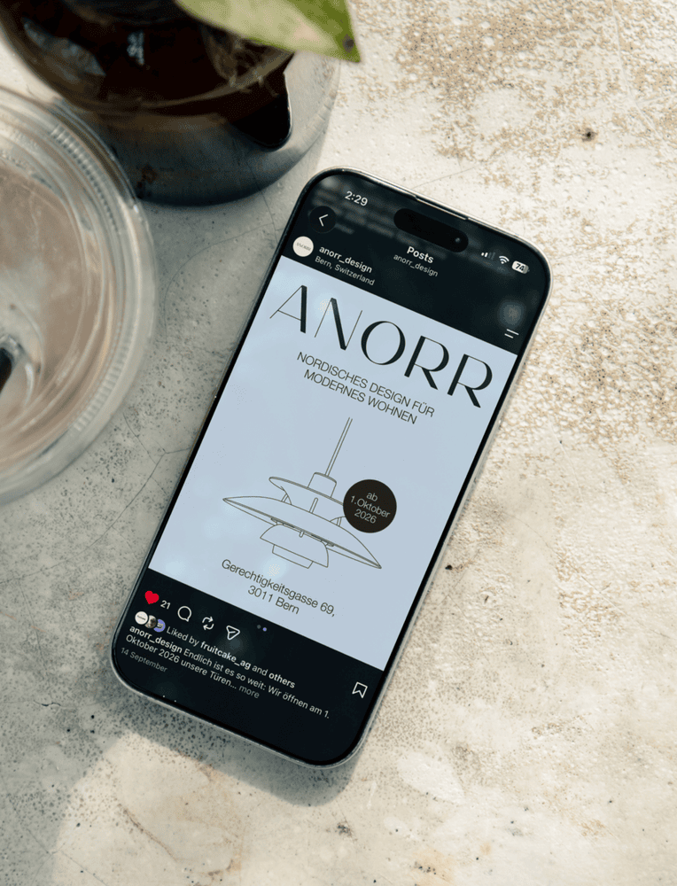
Für ANORR entwickelte Fruitcake ein Social-Media-Konzept und bespielt Instagram und LinkedIn laufend. Die Agentur plant, gestaltet und veröffentlicht die Inhalte. Die Content-Unit Moodhouse übernimmt die Foto- und Videoproduktion und setzt Produkte, Menschen und den Showroom in Szene. Daraus soll eine lebendige Kommunikation entstehen, die regelmässig Einblicke gibt.
Das Rebranding visavis ist abgeschlossen: Die Schweizer Spezialistin für Unternehmensversicherungen, bisher als «Branchen Versicherung» bekannt, tritt neu unter dem Namen visavis auf. Die Zürcher Branding-Agentur MADE Identity hat die Marke nach eigenen Angaben von Grund auf neu entwickelt: Positionierung, Name, Identität und Website. Im Zentrum steht das Versprechen «Auf Augenhöhe versichert».
Persönliche Beratung statt Chatbot
Der Schweizer Versicherungsmarkt sei gedrängt und von grossen Namen geprägt, heisst es in der Mitteilung. Internationale Konzerne, wachsende Portfolios und eine Kundenberatung, die zusehends digitalisiert und anonymisiert werde, prägten das Bild. Wer eine passende Police suche, spreche immer seltener mit einem Menschen und immer öfter mit einem Chatbot. Hier setzt die Positionierung von visavis an: Die Versicherung will Zugänglichkeit nicht über Digitalisierungsszenarien beweisen, sondern über persönliche Beratung, von KMU zu KMU.
Ausgangslage mit Fragezeichen
Neu ist die Versicherung nicht. Gegründet 1902 als «Metzger Unfall», versicherte sie hundert Jahre lang vor allem Fleischfachleute, ehe sie sich für weitere Branchen öffnete und pragmatisch zur «Branchen Versicherung» wurde. Dieser deskriptive Name warf laut Mitteilung mehr Fragen auf, als er beantwortete: «Ihr versichert Branchen?» Dieses Hindernis soll mit der neuen Positionierung und Identität überwunden werden.
Rebranding visavis: Die Strategie in sieben Buchstaben
«Dieses Rebranding hatte von Anfang an den Anspruch mehr zu sein als reine Auffrischung. Wir wollten uns unmissverständlich positionieren und sind den Prozess mit MADE entsprechend ganzheitlich und analytisch angegangen», berichtet Daniel Stettler, CEO von visavis Versicherung Genossenschaft. Die Markenstrategie stellt das Versprechen «auf Augenhöhe versichert» ins Zentrum. Der Naming-Prozess trägt diese Identität bis in den Namen: visavis fasst die Strategie in sieben Buchstaben zusammen.
Konsequente Einfachheit im Auftritt
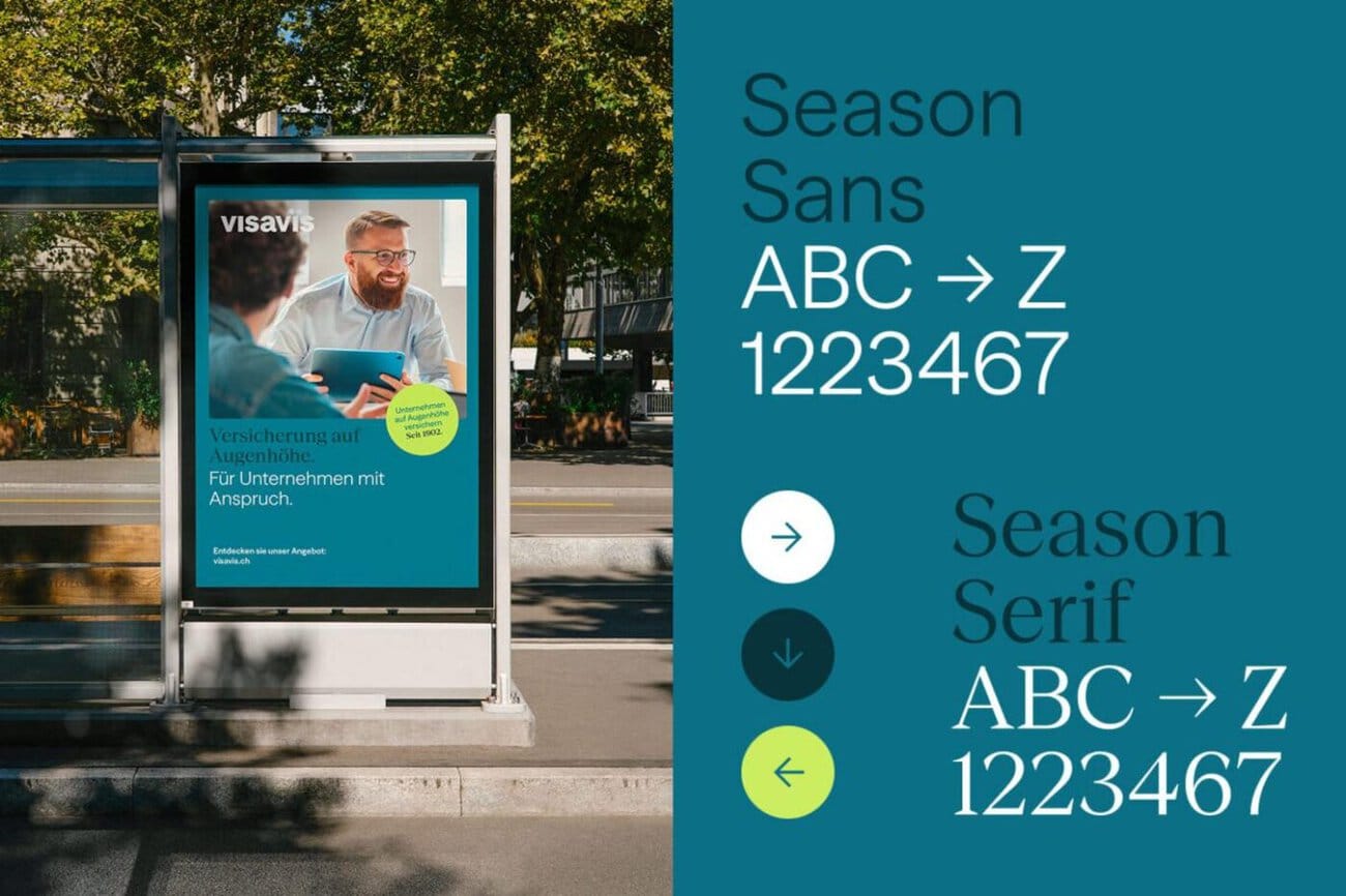
Der Auftritt sucht die Balance zwischen Modernität und Bodenständigkeit. Im Zentrum steht das Logo, das das Versprechen des Namens visuell übersetzt: Die beiden i-Punkte begegnen sich auf Augenhöhe und sollen einen Ausgangspunkt für Bewegung, Verdichtung und Storytelling schaffen. Zudem besetzt visavis bewusst einen eigenen Farbraum. Der Versicherungsmarkt sei vor allem rot und blau, visavis nicht. Die Farbe soll zum stärksten Unterscheidungsmerkmal werden und Eigenständigkeit wie Wiedererkennbarkeit schaffen.
Auch online auf Augenhöhe
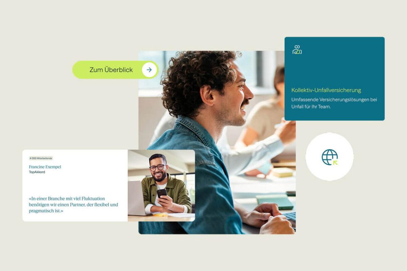
Dieselbe Haltung prägt laut Mitteilung die Kommunikation: weniger Konzern, mehr Zugänglichkeit. Die neue Website stellt Kundinnen und Kunden ins Zentrum, führt sie über eine schlanke Architektur zu den relevanten Inhalten und baut auf echten Nutzerbedürfnissen und Personas auf. Modulare Komponenten sollen das System flexibel und erweiterbar halten. SEO und GEO seien von Anfang an in Struktur und Content mitgedacht worden.
«Eine gelungene Identität hat etwas Selbstverständliches. Strategie ist Name ist Design. Bei visavis ist genau das gelungen. Alle Elemente greifen nahtlos ineinander und sind bereit mit einem überzeugenden Versprechen den Markt aufzumischen», sagt Georg Gadient, Strategy Director und CEO bei MADE Identity.
]]>
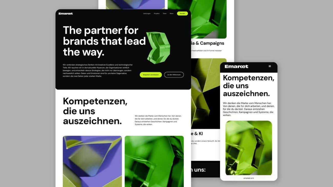
Die Agentur Emarket tritt zu ihrem zehnjährigen Bestehen mit einem neuen Erscheinungsbild auf und baut ihr Angebot in Technologie und KI aus. Der Emarket neuer Auftritt richtet sich nach eigenen Angaben an Marketing- und HR-Teams, die mit KI mehr aus ihren Kampagnen und Prozessen herausholen wollen. Dafür bündelt Emarket die eigene Expertise in Employer Branding, Social Media und Content mit den Technologiekompetenzen der ERNI Gruppe.
Emarket neuer Auftritt: Agentur für Daten und Emotionen
Emarket wurde 2016 gegründet und hat sich in den vergangenen zehn Jahren als Spezialistin für Employer Branding und digitale Kommunikation etabliert. Zu den Kunden zählen internationale Grossunternehmen, die Emarket aus der Schweiz oder von der Slowakei aus betreut. Mit der Neupositionierung bediene die Agentur die zunehmende Nachfrage nach Spezialisten für die Transformation von Marketing- und HR-Teams im Zuge von KI, heisst es in der Mitteilung.
«Der Markt verlangt von Agenturen, dass sie Kommunikation nicht nur noch gestalten, sondern auch intelligent machen und mit KI skalieren. Als Teil der ERNI Gruppe waren Daten und Emotionen für uns schon immer die zwei Seiten jeder starken Marke. Das machen wir nun explizit zum Angebot.», sagt Roy Müller, CEO von Emarket.
Technologie und KI mit eigenen Produkten
Im Bereich Technologie und KI bündelt Emarket KI-Enablement für Marketing-, Kommunikations- und HR-Teams, Plattformen und Systemintegrationen sowie Data und Intelligence. Dazu gehören auch eigenentwickelte Produkte, die Marketing- und HR-Kampagnen smarter machen sollen. Ein Beispiel ist das Schnellbewerbungs-Tool Quapply, das conversionoptimierte Bewerbungsfunnels an bestehende Bewerbermanagementsysteme wie SAP, Workday oder Teamtailor anbindet. Für die technische Umsetzung greift die Agentur auf die Engineering-Kompetenz der ERNI Gruppe mit mehr als 800 Expertinnen und Experten für Software, Data und AI zurück.
Neuer Auftritt, gleiche DNA
Die Entwicklung zeigt Emarket nun auch nach aussen. Der neue Auftritt sei moderner und zeitgemässer und baue auf der Erfahrung aus zehn Jahren Agenturarbeit auf. Die neue Website ist unter emarket.erni live.
Die Emarket Gruppe ist eine international tätige Agentur für Marketing und Kommunikation mit Standorten in Bern, Zürich und Bratislava. Emarket ist Teil der ERNI Gruppe, eines Schweizer Software-Engineering-Unternehmens mit weltweit mehr als 800 Mitarbeitenden.
]]>
With the "Swiss Wine" campaign, Swiss Wine Promotion—the national promotional body for Swiss wines—is launching its first large-scale campaign. It was developed in collaboration with the agency Family. The campaign tells the story of Swiss wine from two perspectives: with in-depth expertise for those in the know, and with a lighthearted touch for everyone who simply enjoys drinking good wine.
Swiss Wine Campaign: Breaking Down Barriers to Entry
According to the press release, the starting point was that technical jargon, appellations of origin, and traditional wine terminology can quickly seem complicated to people who aren’t very familiar with wine. Swiss Wine Promotion and Family therefore developed a strategic repositioning. The goal is to make Swiss wine as a category more accessible while at the same time highlighting its diversity and distinctiveness more strongly.
To this end, the positioning, target audiences, and tone of voice were refined and integrated into a consistent brand identity. In addition, a five-step communication model was developed that is tailored to the needs of Swiss Wine Promotion, its members, and its retail partners. At the heart of this is the new category promise: «surprisingly diverse.».
Two Halves, One Message
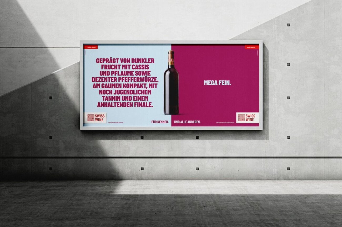
Under the tagline «For connoisseurs. And everyone else,» the campaign brings together two perspectives. Some are interested in vineyard sites, grape varieties, vintages, and winemakers« styles. Others mainly want to know whether the wine is »super tasty,« »truly regional,« or »sparkling.” On posters, digital out-of-home displays, and in print materials, each group gets its own half of the ad, with its own message, its own Swiss Wine logo, and its own website link. The links lead to a landing page for connoisseurs and one for everyone else.
At OOH locations with longer viewing times, technically worded benefits are contrasted with their everyday-language translations. Where viewing times are shorter, the campaign avoids longer headlines and juxtaposes the two worlds purely visually. In digital advertising formats such as Digital Out of Home and display ads, short, three-word headlines for those in the know are paired with a concise, one-word translation.
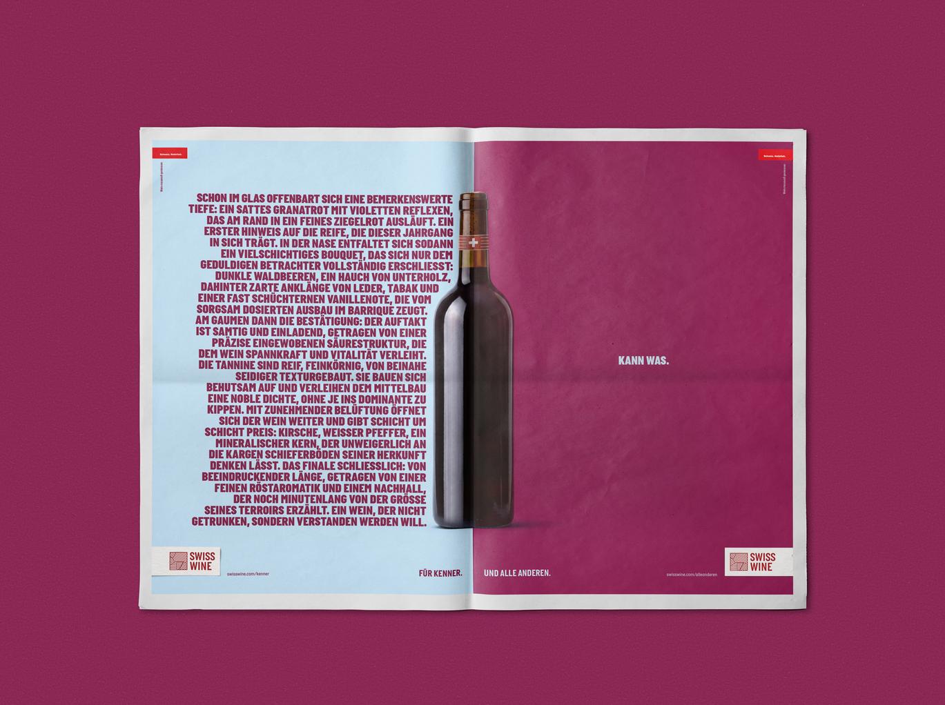
In print ads, the campaign takes the opposite approach: one page, aimed at connoisseurs, describes Swiss wine in great detail—almost novel-length—while the other half conveys the same message in just a few words. In terms of content, the messages focus on taste, regional character, craftsmanship, and diversity.
TV Commercials and Media Strategy
Three TV commercials, which air during primetime, complement the campaign with humorous storytelling. In them, wine connoisseurs encounter novices who have their own unique ways of choosing, talking about, or enjoying wine. The campaign doesn’t make Swiss wine any simpler than it is, but it does make it more accessible. Expertise remains part of the appeal, but it isn’t a prerequisite.
Since October 8, the campaign has been running throughout Switzerland in all three language regions and across all relevant channels, with a special feature at the Olma trade shows in St. Gallen. The Family Media Unit (FaMe) is responsible for media strategy, planning, and execution. It developed a media strategy focused on awareness that takes regional characteristics and the national scope into account. The 360° media mix is also designed to allow for a high degree of flexibility, particularly when dealing with the varying restrictions on alcohol advertising that apply depending on the region and channel.
Responsible at Swiss Wine Promotion: Pierre-Alain Bapst (Managing Director), Océane Gex (Deputy Managing Director), Christophe Théodoloz (CMO), Pauline Berchier (Project Manager)
Responsible at Family: Philip Meier, Tobias Peters, David Voges, Cédric Fuchs, Cécile Ducourant, Severin Binkert, Christian Stüdi, Cosima Pereira (Creative), Johnny Grubenmann, Jan Walser, Florian Weitzel (Creative Direction), Anina Trachsler, Tayba Babar (Consulting), Ruwanie Hayoz (Agency Producing), Mark Becher (Strategy), Marc Ambühl, Mery Wunderlin (Post-Production), Claudio Catrambone, Svenja Hässig (Overall Responsibility)
Person in charge at Family Media Unit FaMe: Mareike Hofer, Lucas Mariétan
Film Production at Shining Film: Stefan Bircher (Executive Producer), Mirjam Fröhlich and Lukas Fröhlich (Directors), Nathalie Maibach (Line Producer), Pascal Walder (Director of Photography), Patrick Starman (Color Grading), DubDub Studios (Audio), Lorenz Wahl (Post-Production)
]]>
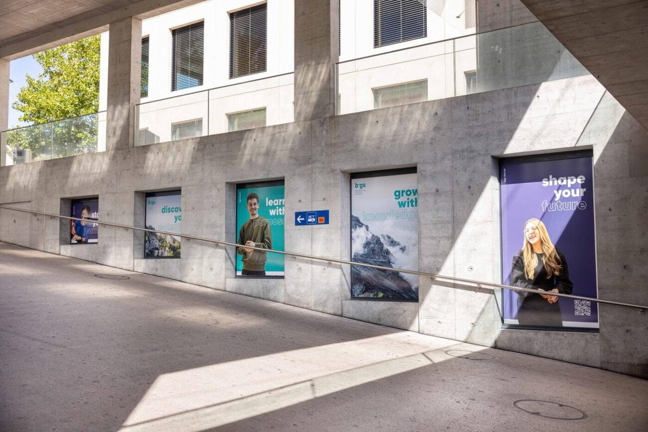
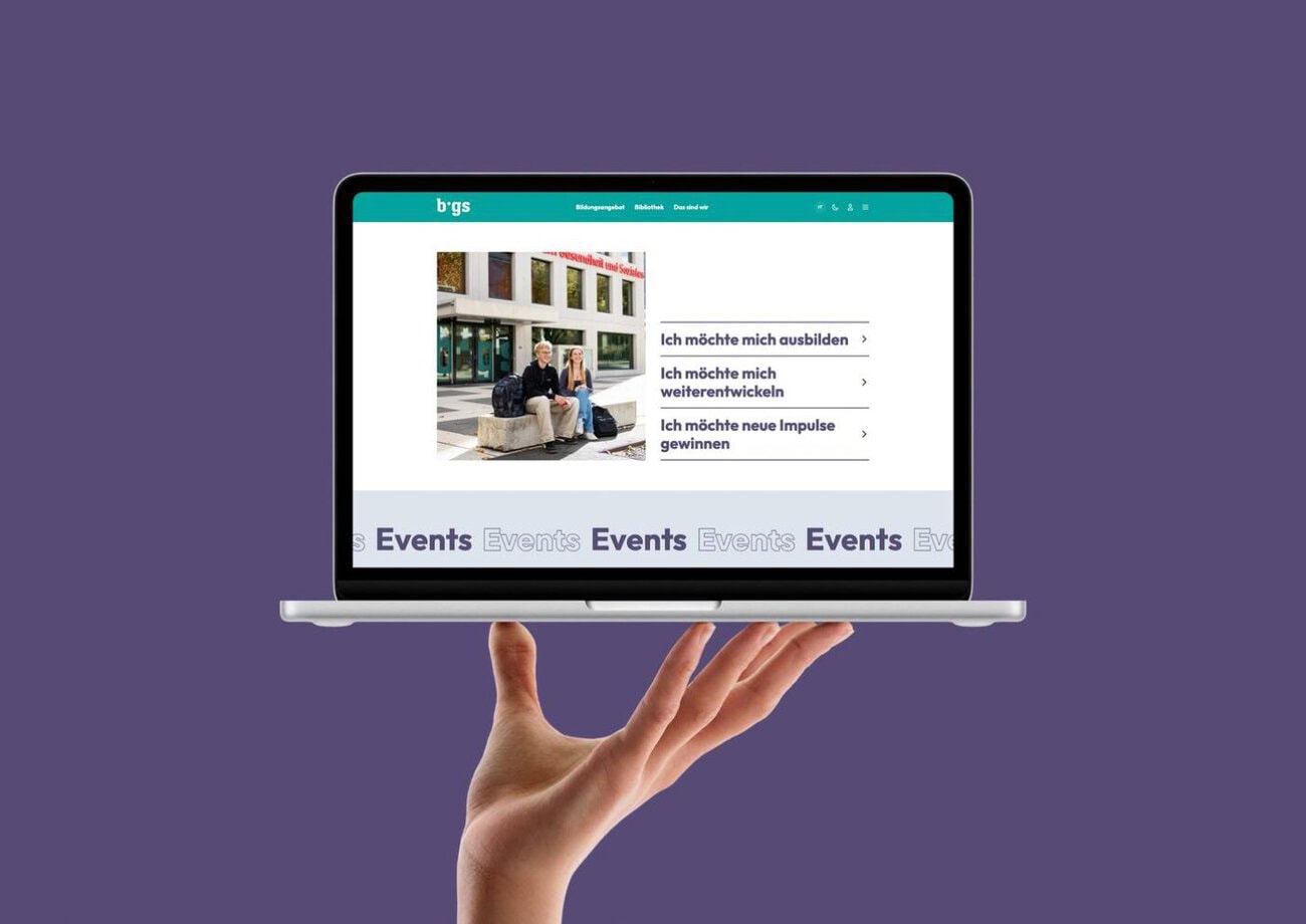
According to those involved, the new brand identity for bgs Chur includes numerous touchpoints: The Education Center for Health and Social Services (bgs) has unveiled a completely revamped brand identity. The brand has been redesigned across the board—from the website to videos and photography, as well as business stationery, building signage, and campaigns. The Graubünden-based communications agency communicaziun.ch is responsible for the concept and implementation.
bgs Chur's New Look: One Look, Many Points of Contact
In recent years, the bgs has evolved in response to new offerings, changing needs, and diverse target audiences. This should also be reflected in its brand identity. The goal was to create a contemporary and distinctive identity that consistently represents the bgs across all communication channels and touchpoints.
communicaziun.ch oversaw the process from conception through production and implementation. This included the development of the new website, the foundation for which was laid during a joint workshop. New video and photo content was also created for the digital presence and other communication initiatives.
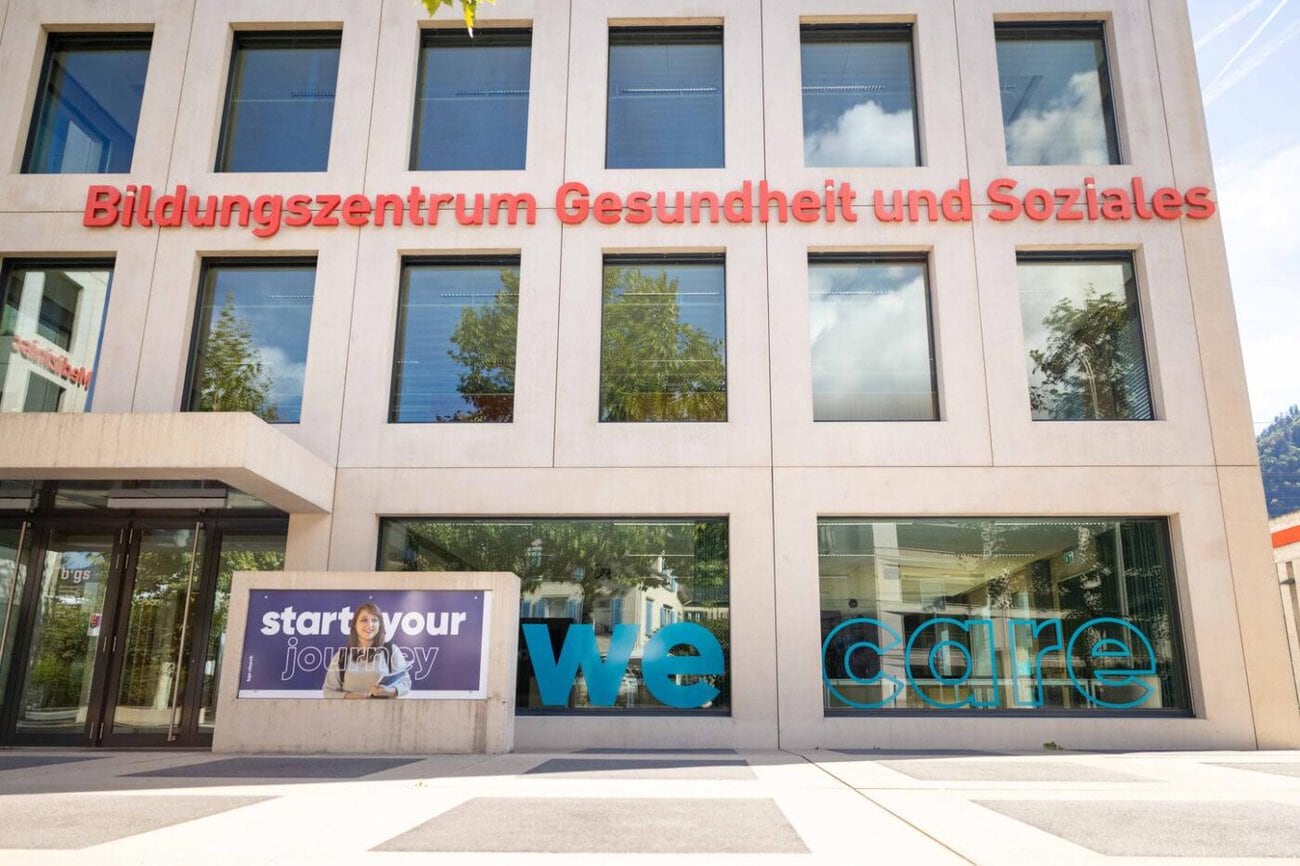
The new brand identity is also visible on-site. The agency designed and implemented the building signage for both the exterior and interior. Elaborate illustrations feature prominently on the door and floor signage, among other elements. The agency handled the layout, production, and installation.
There are also other applications: from stationery and social media templates to clothing and promotional items. The new bgs mascot was also given a visual identity and is used in a variety of applications.
Experience the New Look at the Open House
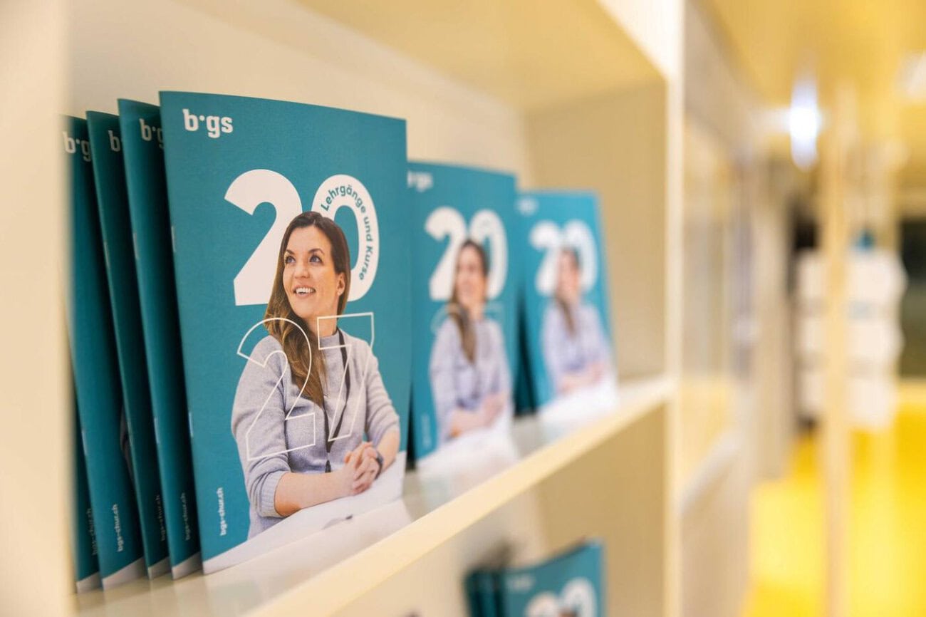
The new corporate design was rolled out on a large scale at the open house on October 3, 2026. Here, too, communicaziun.ch supported bgs from the conception and development of the key visual through to its implementation. Program booklets, signage, posters, postcards, and video presentations allowed visitors to immediately experience the new brand identity.
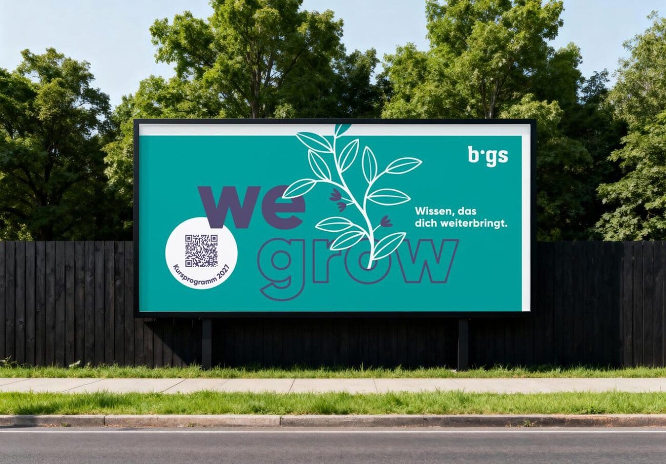
«With our new brand identity, we wanted to highlight what bgs stands for today while also laying a foundation that will serve us in the long term. It was particularly important to us that the new identity be consistent across all areas—from the website to our communications to the building itself,» says Ursina Bernhard, Head of Marketing at bgs.
Collaboration Continues
The collaboration between bgs and communicaziun.ch extends beyond the new brand identity. The agency also supports the educational center in promoting various courses and informational events. The agency also collaborates on the center’s exhibition presence at Fiutscher and the annual report. The agency’s support thus ranges from strategic and conceptual work—including copywriting, creative design, and digital applications—to production, printing, and advertising technology.
«The particular challenge lay in the diversity of applications. The new brand identity had to work just as well digitally as it did on paper, on a building’s facade, or in an interior space. It is precisely this interplay of different disciplines that defines the new brand identity. I really value the collaboration with bgs and look forward to our next joint initiatives and campaigns featuring the new brand identity,» says Sarah Bussenius, project manager at communicaziun.ch.
More information: www.bgs-chur.ch
Person in charge at communicaziun.ch: Sarah Bussenius (Project Manager), Marlen Schwarz and Aline Dermont (Copywriting), Anika Hartmann (Creative), Thomas Blaas (Web), Ely Barbonaglia and Thierry Gysler (Film/Photography), Ralph Wurzbacher / Franco Tiri and Renato Pargätzi (Printing/Advertising Technology). Person in charge at bgs: Daniel Ammann (CEO), Ursina Bernhard (Head of Marketing)
]]>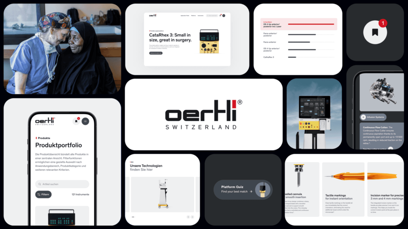
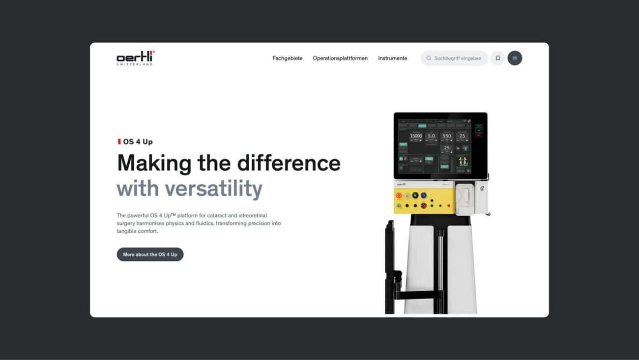
The Wirz agency has redesigned and redeveloped the Oertli Instrumente website. The platform was implemented by development partner extra virgin. According to a press release, the result is a scalable digital operating model designed to translate the Swiss medical technology company’s surgical precision into a well-thought-out digital experience and to support decision-making processes for healthcare professionals.
Oertli Instrumente develops high-precision technologies for eye surgery. The project’s central focus was on the digital architecture: highly specialized product lines needed to be intuitively accessible to various medical audiences—from specialized surgeons to operating room staff—while also complying with strict regulatory requirements.
Instead of reinventing the wheel, Wirz, extra virgin, and Oertli focused on digital substance. «A good website for medical B2B products creates clarity through hierarchy. The goal was to create a platform that structures information precisely and guides professionals through the product universe in a targeted manner,» explains the project team.
Structured Guidance for Healthcare Professionals
Since decisions in medical technology require a thorough evaluation, the focus is on guiding users through the product portfolio. An interactive quiz to help evaluate the right surgical device, dynamic comparison tables, a platform finder, and a digital wish list with PDF export are designed to help surgical teams and decision-makers compare product solutions and compile information for the internal decision-making process.
Efficient Processes for the Oertli Instrumente Website
The new website is also expected to deliver added value at the operational level. By directly integrating the Frontify digital asset management system with the CMS, the editorial team no longer has to go through the extra steps of exporting and uploading content. An MDR-Gate controls access to specialized information in a way tailored to specific target audiences, including market-specific requirements for the U.S. market. The technical architecture is also designed on a multi-tenant foundation: In the future, additional brands and websites within the corporate group will be able to be operated centrally via the same system without duplicate data storage.
A system that grows with your business
The technical foundation consists of a modular design system with token logic and a headless architecture featuring Payload CMS and Next.js. This is intended to ensure that the platform can scale flexibly to accommodate new products, markets, and future personalization requirements.
The new website is designed to make precision products easily accessible, reduce the organization's workload, and lay the groundwork for the brand's further digital development.
Responsible at Oertli Instrumente: Melanie Weder, Project Management; Corinne Seitz, Overall Responsibility; Project Team: Silvano Pellin, Alain Mundwyler, Sean Benz, Morena Botta. Responsible at Wirz Group: Louise Chanton, Interaction Design; Chiara Killer, Interaction Design; Valentina Meier, Consulting; Sébastien Donzel, Overall Responsibility. Person in charge at extra virgin: Nina Braschler, Project Management; Philipp Sutter, Project Management; Kevin Müller, Technology; Joachim Hummel, Consulting and Concept Development.
]]>
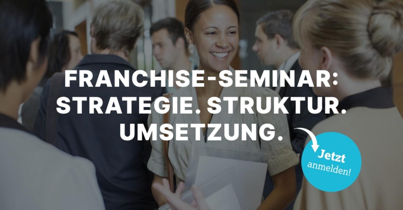
How does a successful business idea become a professional and sustainable franchise system? And what does it take to further develop an existing franchise business? These are the questions addressed in the full-day seminar «Franchise 360°—From Concept to Successful Practice» hosted by the Swiss Franchise Association. It will take place on Saturday, October 31, 2026.
Opportunities and Challenges in Franchising
Franchising offers opportunities for companies: successful business models can be replicated, new markets can be tapped, and strong brands can be further developed. At the same time, building a franchise system presents numerous challenges. From developing a compelling concept to positioning the brand and collaborating with franchise partners, there are many factors to consider.
Practice Over Theory at the Swiss Franchise Association
The seminar is aimed at potential and established franchise companies that wish to build, professionalize, or strategically develop their franchise systems. According to the announcement, the focus is not on theoretical concepts, but rather on concrete experiences and practical solutions that can be implemented directly within their own companies.
Participants will gain first-hand expertise and benefit from different perspectives on the topic. The goal is to identify factors for success, examine existing structures, and take away new approaches to apply in their own practice.
Questions about structure and further development
The seminar addresses questions such as: What are the prerequisites for a successful franchise system? How can a concept be built on a sustainable basis? What challenges might arise along the way, and what solutions have proven effective in practice? «Franchise 360°» brings these questions together in a one-day seminar. The focus is on direct benefits: expanding knowledge, sharing experiences, gaining new perspectives, and taking away concrete ideas for your own work.
This program is designed for anyone who wants to use franchising as a growth model or further strengthen their existing system. You can register online: www.franchiseverband.ch/de/angebot/weiterbildung/
]]>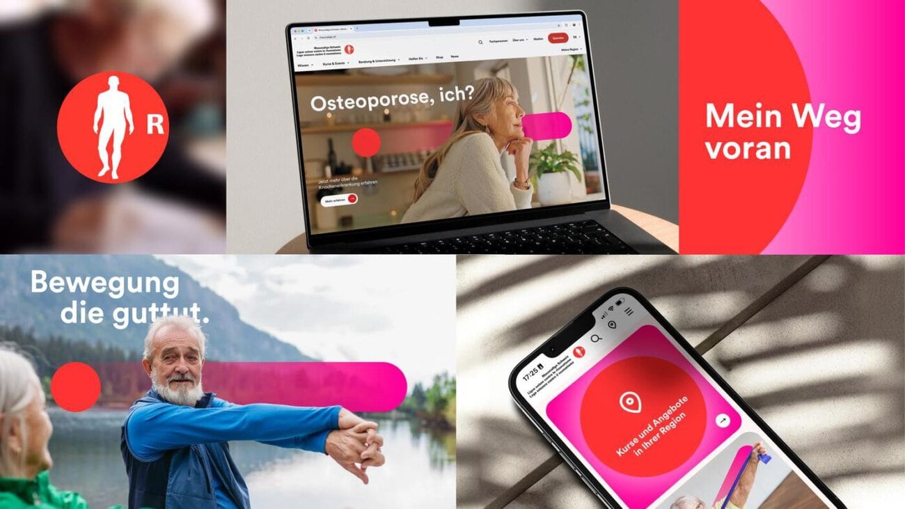
The Rheumaliga has refined its brand identity in collaboration with the Wirz agency. Under the slogan «My Path Forward,» the organization—which, according to its own figures, serves 2.8 million people with rheumatism—is bringing its strengths together. The Rheumatism League’s brand identity is intended to clarify its profile and make its support for those affected more visible and tangible.
The Coaching Philosophy as a Brand Promise
According to the press release, the Rheumatism League fills gaps in care. As a support partner, it assists people with rheumatism on their individual journeys through education, counseling, and exercise. The brand promise «My Path Forward» captures this coaching philosophy. It stands for confidence, independence, and concrete next steps at one’s own pace.
The focus is on the individual, their unique potential, and their personal journey. The Rheumatism League describes itself as encouraging, motivating, and solution-oriented, and aims to communicate these qualities more clearly to the public in the future. In-depth knowledge, personalized counseling, and a wide range of support services are intended to come together to form a clear, understandable, and emotionally resonant overall picture of rheumatism. According to the press release, rheumatism is a blind spot for many people. No other group of diseases leads to a greater loss of quality of life.
Pascal Künzli of the Wirz Group says: «We have placed people and their potential at the heart of the brand. »My Path Forward’ combines the Rheumatism League’s social mission with a clear identity that provides guidance, inspires courage, and carries through all of our offerings.”
Annette Stolz of the Rheumatism League adds: «As a national center of expertise, we serve as the unifying force in rheumatism care. We build networks, develop solutions, and engage with both patients and healthcare professionals as equals.»
Visual Identity and Rollout
The visual identity of the Rheumaliga brand was developed on this strategic foundation. The guiding principle of the personal journey shapes the design and user experience: clear, human, and dynamic. The three pillars of the organization’s offerings—education, counseling, and exercise—are intended to be accessible, with connections made clear and support immediately tangible—from knowledge and counseling to courses and regional programs.
The new website, the first touchpoint of the new brand identity, has been live since mid-August. The brand rollout will then proceed gradually across all other channels and offerings.
]]>
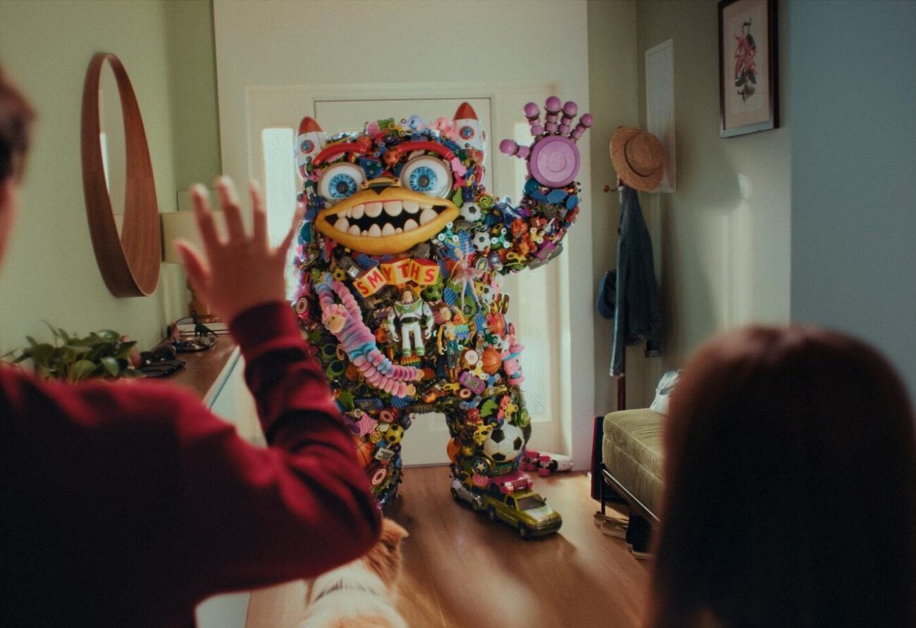
Droga5 Dublin, part of Accenture Song, has launched a new brand platform for the European toy retailer Smyths Toys Superstores. The Smyths Toys campaign reimagines the iconic catalog as a child’s best friend, made entirely of toys. According to those involved, it marks a significant shift in brand strategy and is launching in eight European markets.
From Campaign Partner to Long-Term Brand Platform
For two years, Droga5 developed and executed campaigns for Smyths Toys Superstores. Afterward, the agency sought to create a distinctive, long-term platform for brand-building. This platform is intended to draw more heavily on the retailer’s unique heritage and its commitment to bringing childlike joy to every retail interaction.
To achieve this, the campaign draws on the brand’s most iconic element: the catalog. For more than 30 years, the catalog—which is over 300 pages long—has been mailed to households across Europe. Millions of copies are printed every year. For generations of children, it has become an integral part of the countdown to Christmas.
Smyths Toys Campaign: One Figure from More Than 700 Toys
The campaign highlights the special relationship children have with the catalog: they eagerly await its arrival, carry it everywhere with them, and circle the gifts they want. Droga5 therefore portrayed the catalog as a larger-than-life, lovable best friend made entirely of toys.
The character was conceived as a long-term brand element. It was developed in collaboration with Hungryman and GABHA Studios and brought to life using CG animation. More than 700 individual toy models were used in the process, ranging from soccer balls and dinosaurs to dolls, rockets, and action figures.
Rollout in eight markets
The platform combines brand-building and sales. It is designed to support key sales events such as Top Toys, Black Friday, and Christmas. The integrated campaign is running in the United Kingdom, Ireland, France, Germany, the Netherlands, Austria, Belgium, and Switzerland. It includes TV, social media, digital channels, in-store promotions, retail offers, and catalogs.
Jen Speirs, Chief Creative Officer at Droga5 Dublin, says: «Kids can hardly wait for him to arrive, and for a few months out of the year, they treat him like their best friend. So we thought: Why don’t we make him a real best friend?»
Sinead Byrne, Joint European Marketing Director, says: «For so many families, our catalog is at the heart of the Christmas season. That’s why, together with Droga5 Dublin, we wanted to put it in the spotlight this Christmas.»
Emma Sharkey, Chief Strategy Officer at Droga5 Dublin, highlights the client’s position: «As the only specialty toy retailer of this size, Smyths Toys Superstores occupies a unique position.»
Contact at Droga5 Dublin: Jen Speirs (Chief Creative Officer), Emma Sharkey (Chief Strategy Officer), Jimi McGrath (Chief Executive Officer), Carina Caye (Creative Director), Stephen Rogers (Group Creative Director), Alex Ingarfield (Creative Director), Bruno Lopes (Senior Art Director), Niamh Aremband (Copywriter), Shay Madden (Creative Director), James Moore (Agency Director), Gemma Sherlock (Account Director), Donna McCarthy (Account Manager), Steven Nagle (Senior Account Manager), Caitriona Coakley (Project Director), Emer Fitzgerald (Head of Engagement), Jessica Bermingham (Head of Production), Rory O’Connell (Executive Producer), Siobhan Coakley (Producer), Christina McGuckian (Business Affairs Director), Dominique Mulvaney (Business Affairs Manager). Responsible at Smyths Toys Superstores: Sinead Byrne (European Marketing Director), Martina Ruane (European Marketing Director), Leo Cannon (Senior Designer). Production at Hungryman: Alex Roberts (Director), James Sorton (Managing Partner), Matt Buels (Founding Partner), Hannah Stone (Head of Production), Nicola Dempsey (Producer), Benjamin Kračun (Director of Photography), Agnieszka Dębska (Production Designer), Ty Hack (First Assistant Director), Jordan Maxwell (Production Manager). Radioactive Service Company: Kate Galytska (Executive Producer), Kasia Targońska (Producer), Justyna Trzeciak (Production Manager). Cut at Stitch: Adam Spivey (Editor), Laura Reyes (Assistant Editor). Post-production at GABHA Studios: Daniel Morris (Creative Director and VFX Supervisor), Stephen Pepper (2D Lead), Rebekah King-Britton (CG Lead), Keith Rogers, Alvydas Jatkialo, and Herman Fernz (CG Team), Tomas Juchnevic and Conor Ryan (Character Animators), Graham Gallagher and Donal O’Keefe (Character Development Artists), Julie Nixon (VFX Producer), Laura Bricnet and David Birkill (2D Comp Team), Dafydd Upsdell (Executive Producer), Matt Turner (Colorist). Audio at Pressure Cooker Studios: Astrid Iverson and Sarah van der Spuy (Creative Producers), Denys Marcel, Angelique Murray, and Dylan Apollis (Foley Artists and Sound Designers), Alex Smillie (Final Mix Engineer and Creative Lead). Music: Blackbook Music. Catalog Retouching: Laundry Room.
]]>