
Over the past few months, Sanitas has worked intensively on redesigning its website, the digital sales process in the premium calculator, mailings and the Sanitas newsletter, its social media presence and all brochures. The new design concept conveys a modern aesthetic and focuses on user-friendliness, as the company notes in a press release. Key features of the redesign include generous layouts and images, more white space and the increased use of bright green tones. "This creates more emotionality and a refreshing lightness while improving user guidance and readability," explains Kaspar Trachsel, Head of Sales & Marketing.
Readability has not only been visually optimized: all texts on the website and the premium calculator have been revised. They have been written with the customer in mind and the language has been consistently simplified. Numerous customer feedbacks and experiences were also taken into account. In addition, the website was optimized in terms of accessibility - for a modern and seamless user experience.
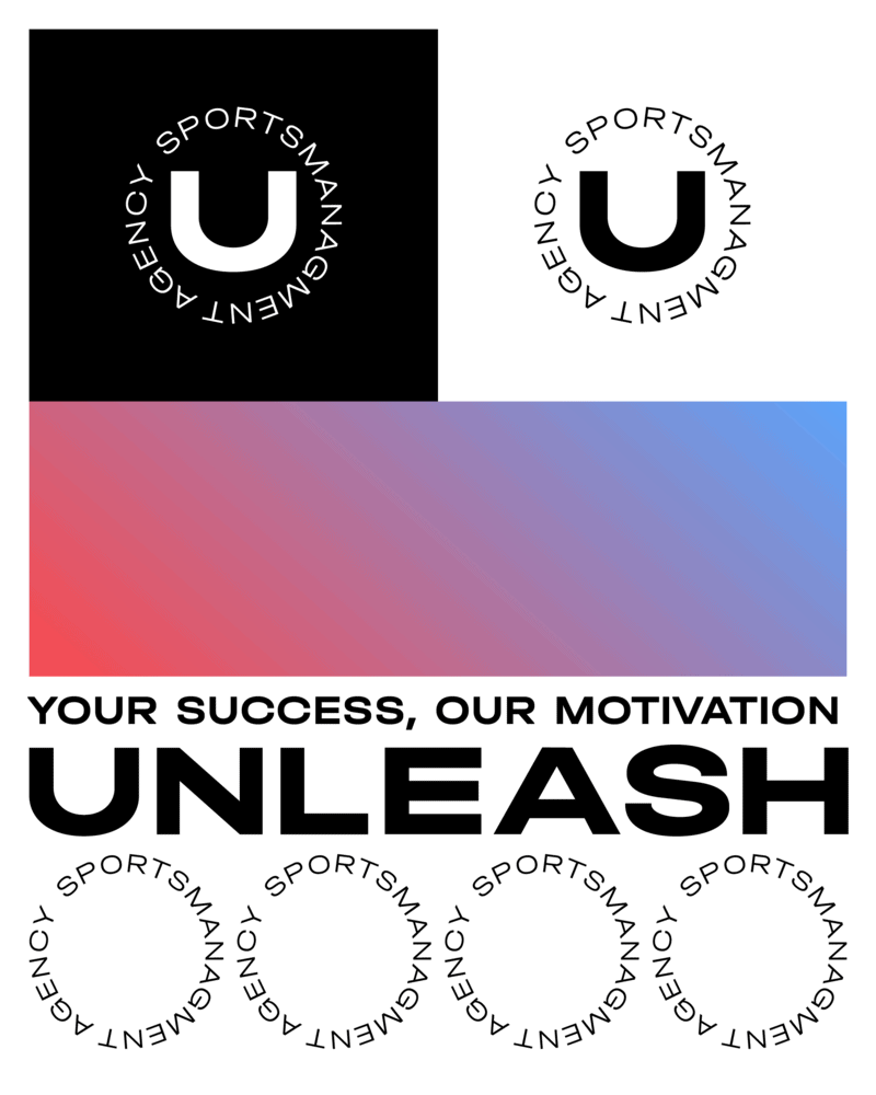
]]> Unleash's visual identity grabs attention and leaves a strong impression. Bold colors, dynamic lines and eye-catching typography.
The brand design was inspired by the energy and passion of the sports world. It embodies the dynamism and courage required to compete, while exuding a supportive atmosphere. The versatile design applies across multiple platforms and creates a strong brand identity. "Unleash is proud to present this exciting new brand design that underscores their mission to support athletes on their journey to success and give them a strong voice."
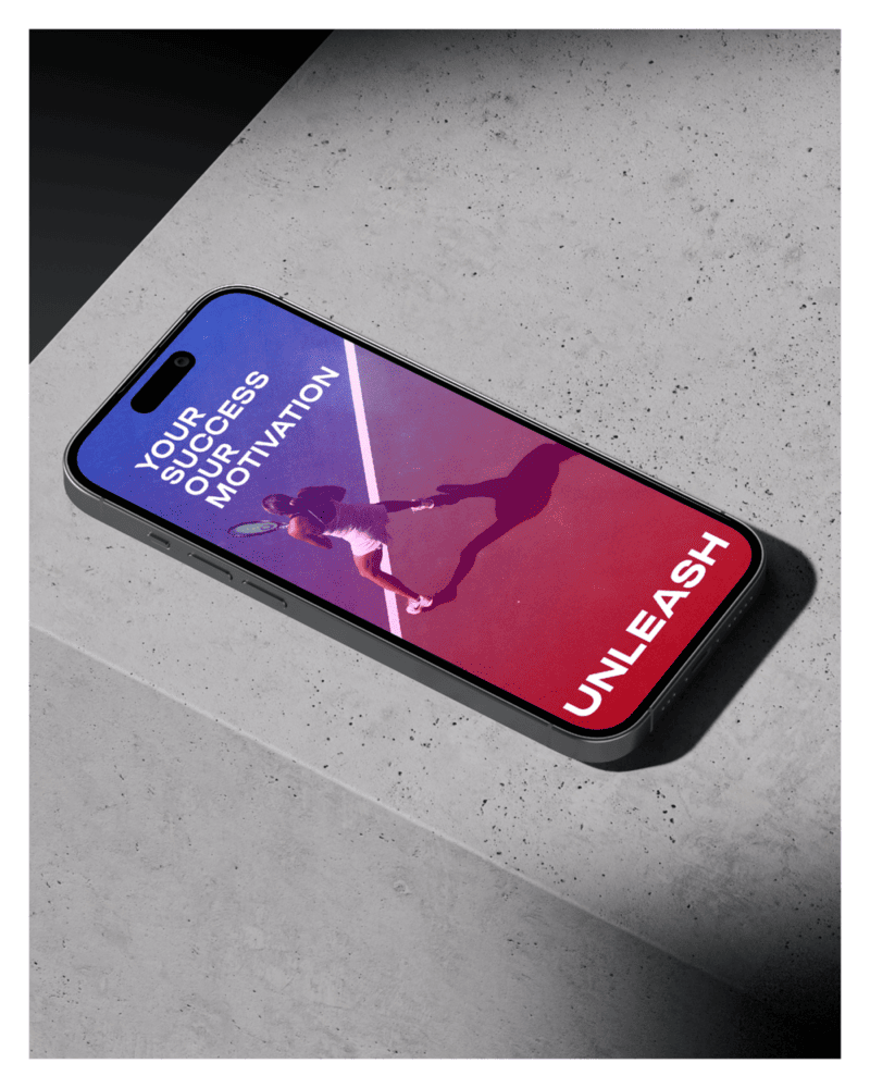
Loud, bold, athletic, supportive
The new brand design is eye-catching and embodies the company's values. It will attract the attention of the sports world and consolidate its position as an agency. In a second phase we will publish the website and various social media ADs.
Responsible at Unleash: Sven Biner, (Agency Management) Responsible at sofies communication design: Kevin Casado (Creative Consulting & Consulting), Delia Guerriero (Art Direction, Design), Anja Meier (Design), Pasquale Li Voti (Consulting Digital), Luca Moor (Code), Melissa Federer (Code).
]]> The Dermatology Clinic Zurich (DKZ) is constantly evolving, but always remains true to its aesthetic and medical standards. This arc between modern and consistent excellence is picked up by Jung von Matt Brand Identity in the clinic's sharpened brand positioning.
DKZ and Jung von Matt Brand Identity developed a new brand promise for the positioning: "Rethinking skin - healthy and beautiful skin with lasting effect." This promise is intended to get to the heart of the leading skin competence center's claim to use sound medical and aesthetic expertise to give patients treatment that is individually tailored to their skin type and has a lasting effect.
New logo for recognition
The individuality and diversity of human skin was the basis for the revision of the brand identity, a statement said. The new corporate colors define the brand identity: skin tones contrast with a medical light blue, uniting the aspects of medical and aesthetic treatment. The emphasis on perfect, natural skin and the visual representation of the natural incidence of light are intended to reinforce the emotional impression. The geometric interpretation of the skin structure is intended to serve the visualization of the dermatological aspect and the modernized logo underlines the recognizability.
The new brand identity is implemented in various elements such as vouchers, business cards and letterheads as well as in the newly launched website, which was developed by Jung von Matt Tech.

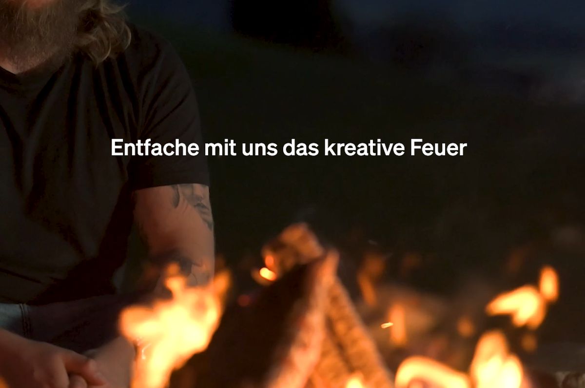
Kernbrand wants to become more of a creative Full-service agency and has revamped its brand presence for this purpose. The new look, including the new claim "Light the Fire," is now visible on all Kernbrand digital channels. Everything revolves around the theme of fire: "Light the creative fire with us," for example. Or "This is where the sparks fly". In addition, the "Monday Five" blog and newsletter have been relaunched.
Together with the Gossau-based media company Cavelti, Kernbrand offers services in the areas of strategy, creation and communication.
]]> The Do It DIY store in Graubünden is getting a new look. The focus is on positioning itself as a sustainability pioneer - for which the Martin et Karczinski agency has completely revised the brand presence. This has already been prototypically implemented in the Punt Muragl/Samedan branch.
Green tones for quality and regional roots
The guiding idea of the new appearance: to show the DIY store as a living workshop. This is also reflected in the logo: letters in a free construction brought together in two shades of green, which are intended to express both quality and the regional roots between Arve and Moos.
The new concept is also reflected at the POS: the design of the salesroom is characterized by local wood, the corporate color green and a manifesto-like communication that is intended to express the claim to have set out on the path to exemplary sustainability.
The branches in Zernez, Küblis and Chur are also to be rebranded in the coming months, and major renovations are planned for the headquarters in Chur, with sustainable energy concepts. The rebranding is scheduled to take place in the spring. By then, the cross-site communication tools such as the website will also be redesigned.


