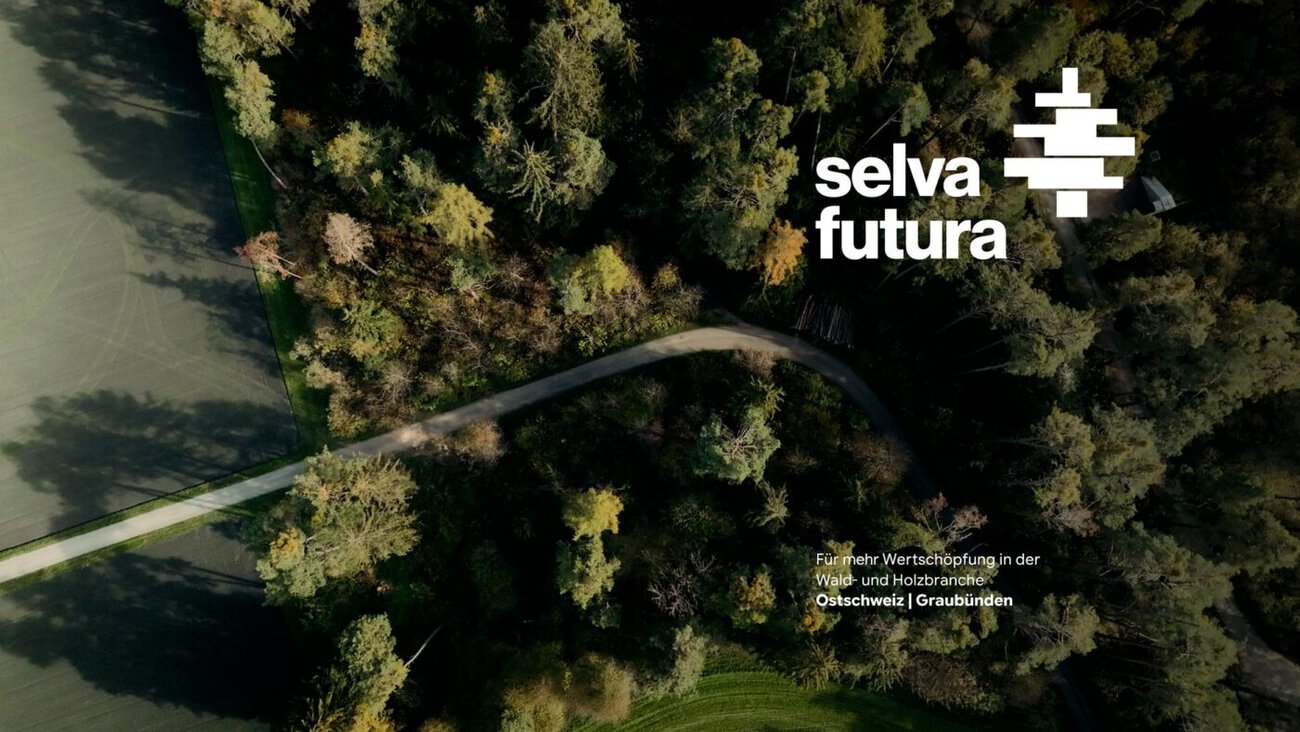
DACHCOM Selva Futura is a new brand project designed to strengthen the forestry and timber industry in Graubünden and Eastern Switzerland over the long term. DACHCOM developed the naming, branding, communications, and website for the Selva Futura SME initiative.
Selva Futura aims to establish a regional wood value chain that is as integrated as possible—from the forest to innovative wood products. Behind this flagship initiative are stakeholders from business, research, and politics who are working together to develop new approaches to the processing and use of wood as a regional raw material. According to the press release, the goal is to create a model whose influence extends beyond the region.
DACHCOM Develops the Selva Futura Brand
DACHCOM supported the initiative from the very beginning and worked with the core team to develop the Selva Futura brand. This included, among other things, naming, communication positioning, and corporate design, as well as initial communication efforts, the conceptual design and UX/UI design of the website, and its technical implementation.
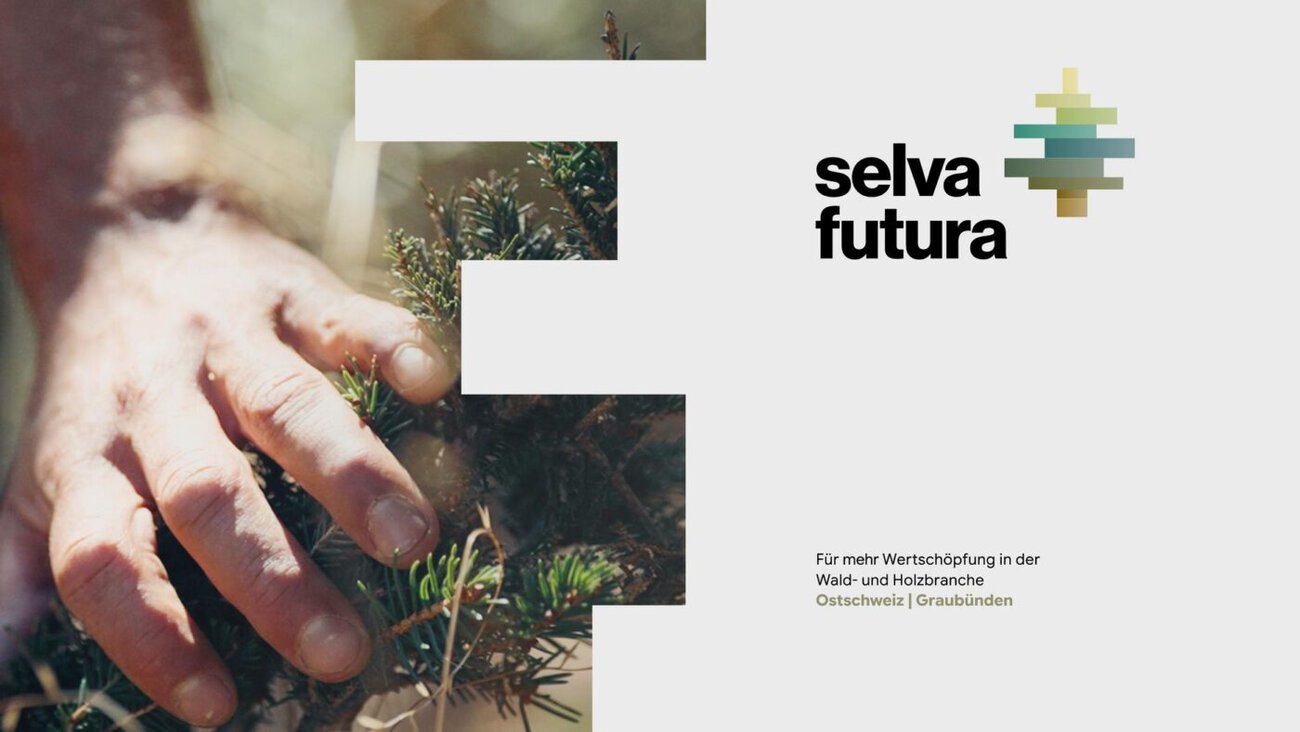
The name Selva Futura connects the forest—as the source of the raw material wood—with a clear vision for the future. The minimalist logo captures this idea: It evokes wood and wooden building elements, while also revealing the silhouette of a tree, and symbolizes the interplay of different forces. Together with the typography, imagery, and color palette, a corporate design was created that combines regional roots with a sense of new beginnings and is intended to give Selva Futura high brand recognition across all touchpoints.
Website as a Central Platform
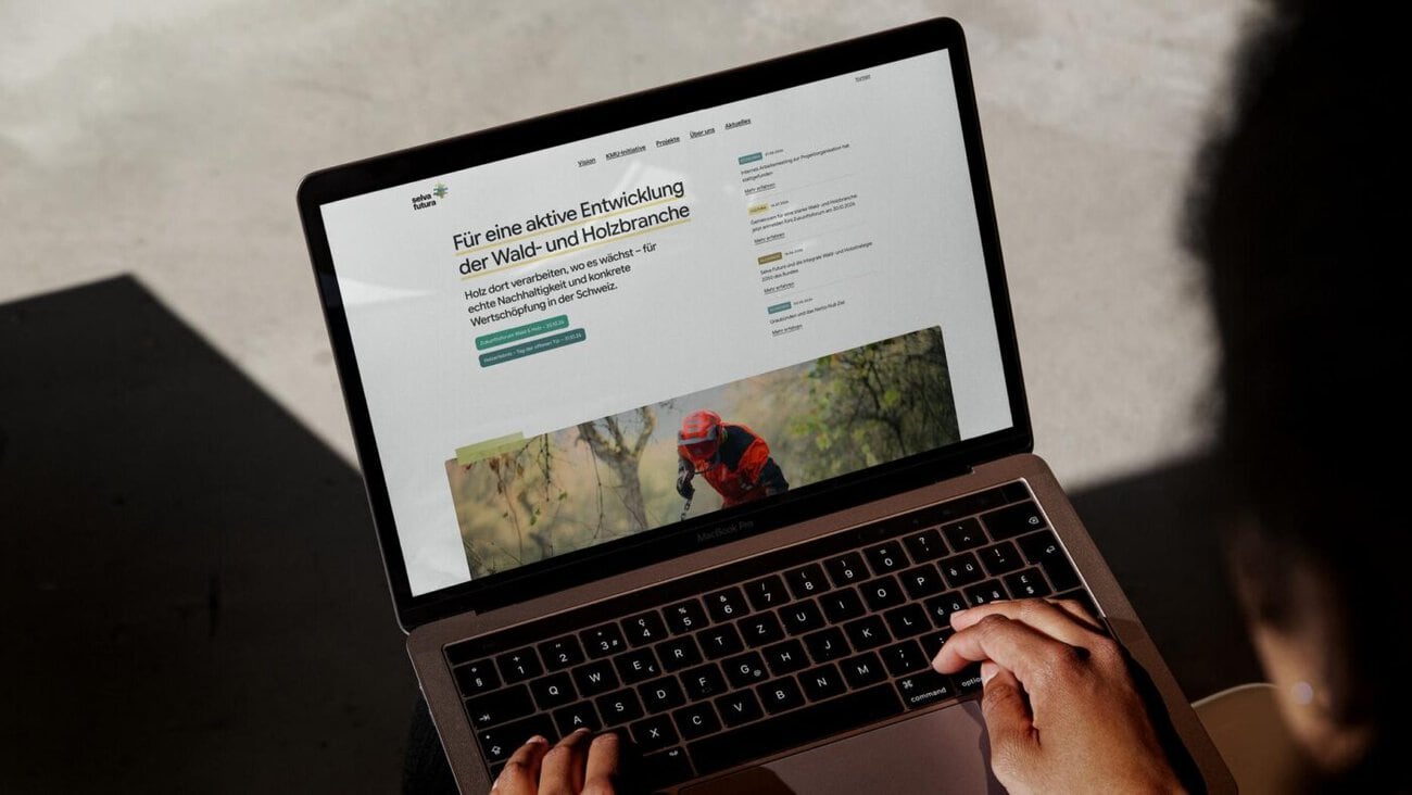
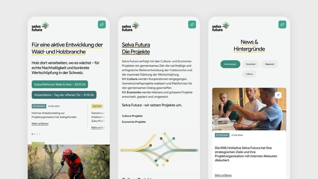
DACHCOM designed and developed the website selva-futura.ch as a central digital platform. It communicates the initiative’s vision and objectives, presents its projects, network, and supporting organizations, and explains the regional wood value chain. At the same time, the site is designed to grow as new projects and events are added.
The Future Forum as the First Event
One of the first applications of the new brand identity is the communications campaign for the «Zukunftsforum Wald & Holz» (Forest & Wood Future Forum), which will take place on October 30, 2026, in Savognin. DACHCOM developed the invitation and other communications materials for the event. During the event, the Selva Futura initiative will be presented in full for the first time and discussed extensively with stakeholders from the forestry and timber industries, research, politics, and other fields.
The Future Forum thus also serves as the first public appearance of the newly created brand: It brings together the various stakeholders, communicates the idea behind Selva Futura, and creates a platform for further discussion about the future of the forestry and timber industry in the region.
]]>

Economic Strategy 2040 as a Starting Point
With its Economic Strategy 2040, the municipality of Dietlikon aims to sustainably strengthen its appeal as a business location. To implement this long-term plan and realize the full potential of the economic region, it commissioned the agency DACHCOM to develop a location promotion and communication concept. This provides Dietlikon’s business promotion efforts with a clear strategic and communicative foundation.
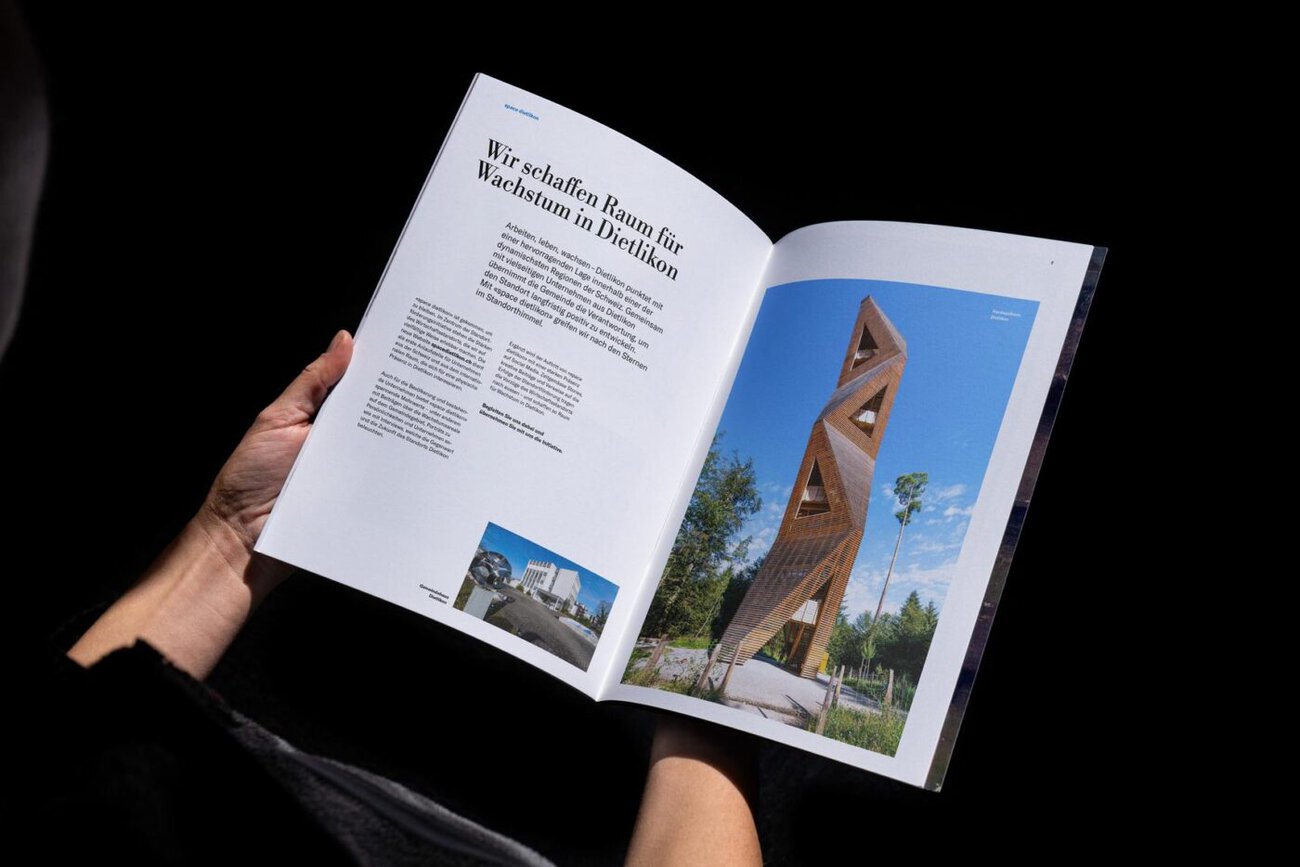
Since then, DACHCOM has been supporting the municipality as a partner for effective communication—with services in the areas of strategy and consulting, branding and design, digital solutions, and content production.
Naming and Tagline: «space dietlikon» with «work. live. grow.»
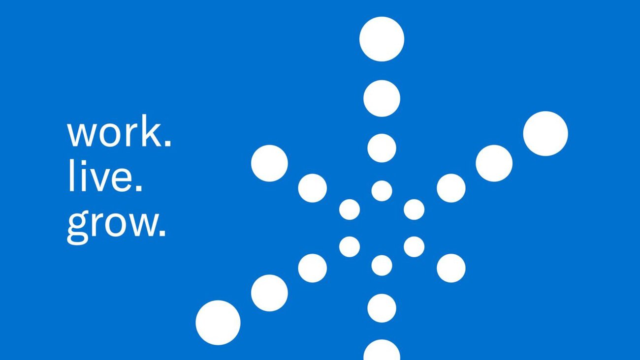
To establish a sustainable brand identity for the economic region, DACHCOM developed the name «space dietlikon.» It is intended to serve as a multifaceted message highlighting the location’s strengths, to be understood in an international context, and to deliberately evoke associations with the neighboring «Switzerland Innovation Park Zurich.» The name is reinforced by the three-part tagline «work. live. grow.» and by an icon featuring a modern interpretation of a starry sky, symbolizing networking, science, and innovation.
Platform and Content as Key Communication Tools
Dietlikon's business development initiatives are consolidated on a platform created by DACHCOM at www.space-dietlikon.ch. The platform showcases existing location advantages and highlights future growth opportunities for individual areas. The goal is to engage target audiences from the business community in location promotion through authentic success stories. DACHCOM is responsible for editorial planning, content creation, and the distribution of content on the platform as well as via social media channels.
«Space Dietlikon» is intended to maintain a continuous presence and engage in dialogue with stakeholders from the business community, the political sphere, and the general public.
More information about the initiative is available on the platform www.space-dietlikon.ch to find.
Responsible agency: DACHCOM Rheineck / St. Gallen
]]>
Dachcom Repositions Zendra Within the Alpine Solar Energy Brand
Ensuring a stable power supply in winter is one of the major challenges of Switzerland’s energy transition. With the Solarexpress initiative, the federal government has created the framework to accelerate the expansion of alpine photovoltaic systems. This is precisely the arena in which Zendra operates: The company—backed by three Graubünden-based firms with combined expertise—serves as a partner for the planning, implementation, and operation of alpine solar projects. To communicate this mission more clearly and effectively to the outside world, Dachcom has strategically refined Zendra’s brand identity, website, and content.
A New Approach to Positioning and Design
As part of the collaboration, Dachcom analyzed Zendra’s existing market presence and strategically developed the brand further. The goal was to communicate Zendra’s expertise, values, and identity more clearly and comprehensibly. This resulted in a refined brand identity featuring a redesigned logo, new typography, a distinctive color scheme, and the brand tagline «Your partner for alpine solar energy.» The new visual identity is intended to build brand recognition and convey both the company’s technical expertise and its collaborative approach.
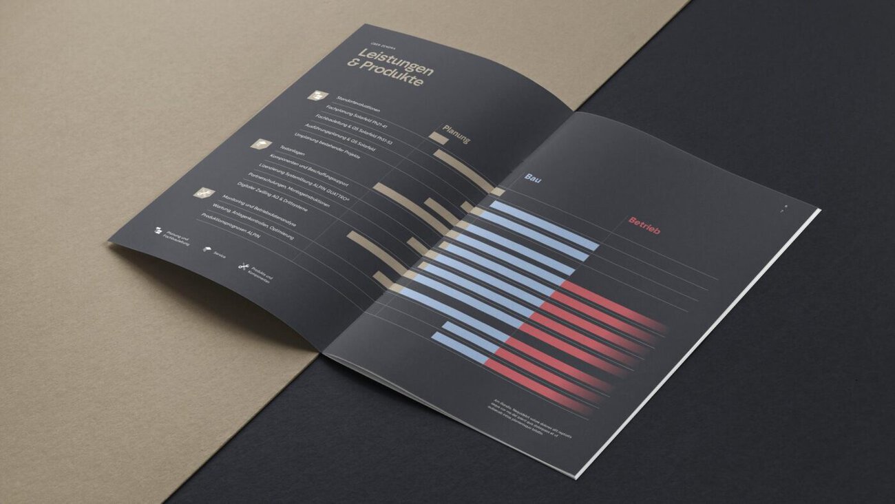
Digital Communication with Substance
In addition to the branding, Dachcom also developed Zendra’s new website. The website clearly organizes services, areas of expertise, and solution modules, and is designed to make complex content easily accessible. The content was created in close collaboration with the client. Authentic imagery conveys a realistic impression of the alpine solar installations. Custom-created renderings also showcase the use of Alpin Quattro®, the system solution developed specifically for this application.
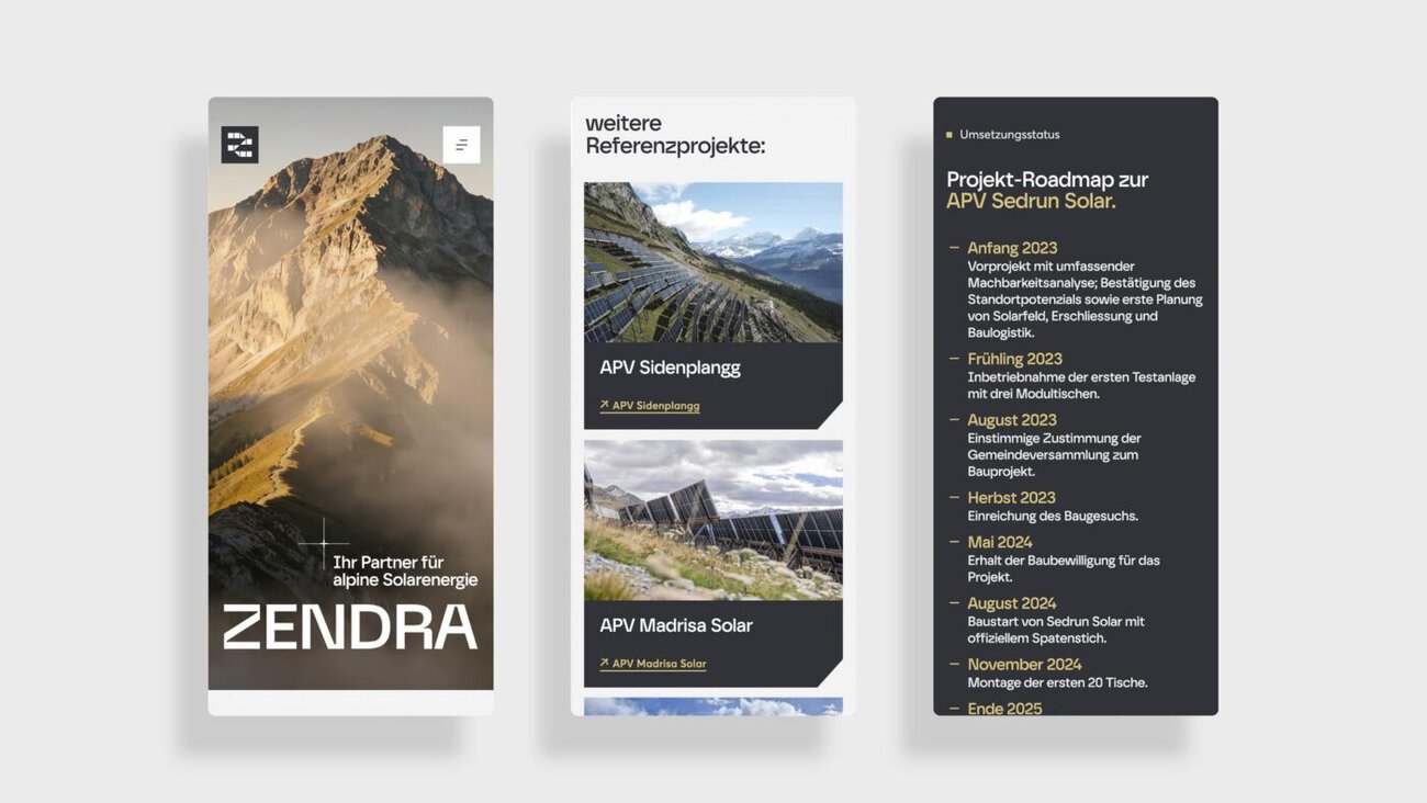
The social media presence was also revamped to increase Zendra's visibility on relevant digital channels.
A Foundation for a Future Topic
With its new brand identity, Zendra aims to establish a sustainable foundation for clearly and effectively communicating its projects, specialized expertise, and commitment within the Solarexpress ecosystem—and thereby make a significant long-term contribution to winter electricity production in Switzerland.
More about Zendra and its alpine solar projects: https://www.zendra.ch
Responsible at Dachcom: Team Rheineck
]]>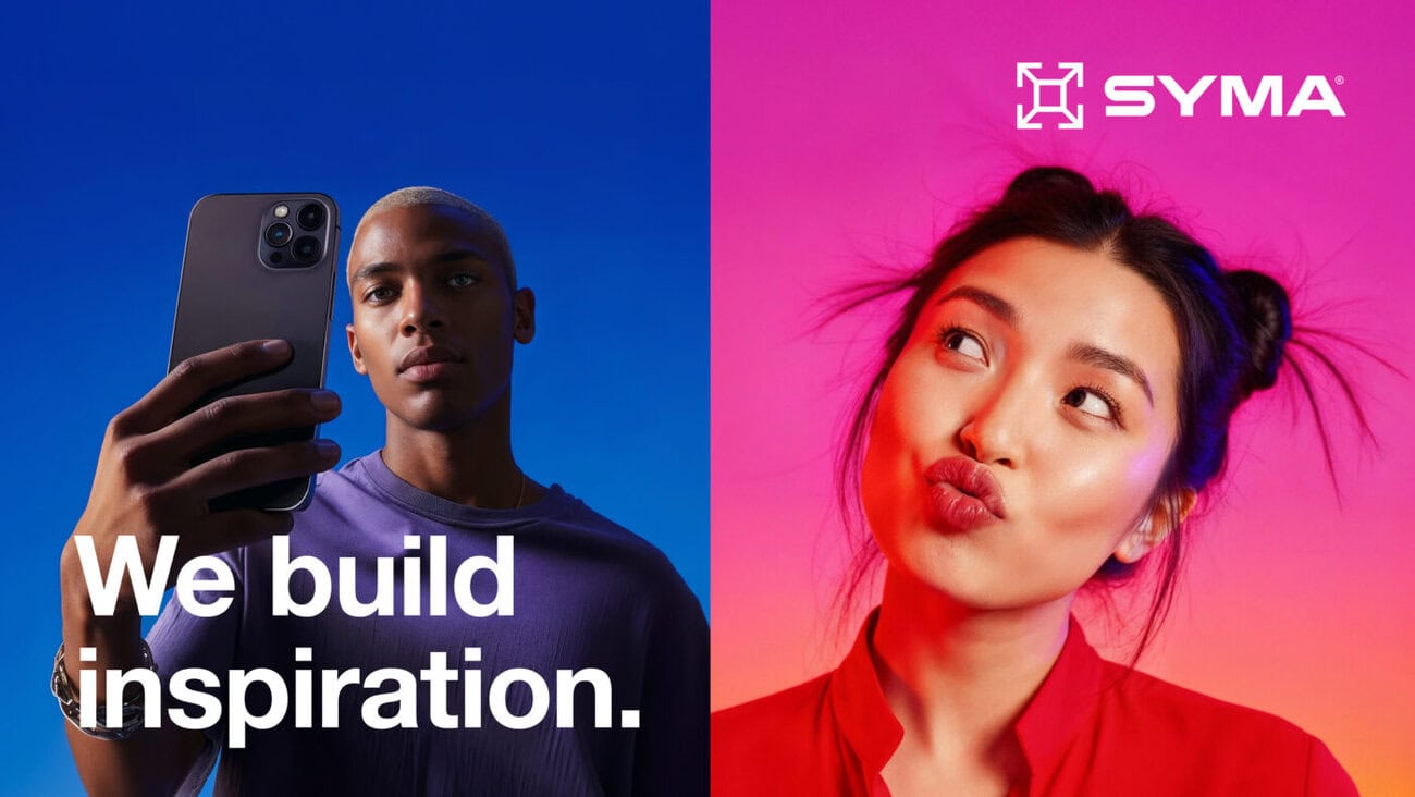
Syma has been established in international exhibition stand construction for over six decades and sets standards in the industry. The St. Gallen agency Dachcom has now developed a comprehensive new brand identity for the company that focuses on the self-confident promise "We build inspiration".
The company demonstrated just how inspiring the world of Syma is with its new appearance at EuroShop 2026 in Düsseldorf, the retail industry's largest trade fair. The overall presentation developed by Dachcom is based on the fact that Syma inspires, excites, arouses emotions and amazes people.
Bright colors and emotional messages
Bright background colors and expressive clips as well as portraits of astonished people characterize the branding and ensure radiance and attention as moving LED screens. Appropriate sub-messages link the visuals to Syma's systems and services and create a holistic brand experience.
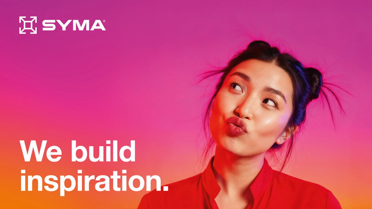
In addition to the implementation of the overall appearance and trade fair experience, Dachcom realized numerous accompanying measures, including a special edition of the magazine "inspire". Just in time for EuroShop 2026, the agency also launched the website www.syma.com completely renewed. Based on Dachcom's own open source solution OpenDXP, a digital presence was created that brings the inspiring world of Syma to life on the Internet.
Responsible agency: Dachcom Rheineck / St. Gallen
]]>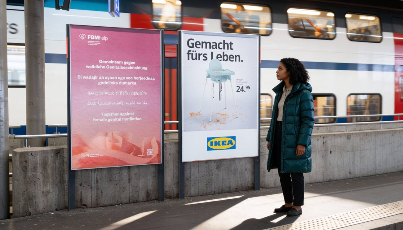
FGMhelp is the counseling, information and competence platform for FGM/C (Female Genital Mutilation and Cutting) in the Canton of Zurich. It does valuable work as a contact point for those affected, those at risk and relatives. Through networking with specialists, associations, organizations and advice centres as well as through community work, FGMhelp contributes to a sustainable discussion of the topic. Dachcom has already implemented the new brand identity and web platform for FGMhelp.
Multilingual message
Dachcom has developed an effective poster campaign to raise awareness among the general public and publicize the contact point. This is intended to appeal to the general population of the Canton of Zurich and, in particular, to people from the affected cultural groups.
This is precisely why the message "Together against female genital mutilation" appears on the posters in English, Tigrinya, Somali and Arabic as well as German, thus reaching as many people as possible. The posters and animated DooH posters can be seen in two waves at the train stations in Zurich, Uster and Winterthur as well as at important meeting centers and themed events.
Responsible agency: Dachcom Rheineck / St. Gallen.
]]>
Lachen Hospital stands for first-class medicine, professional care, a proven team culture and a close connection with the region. The new overall image is intended to give these values even more meaning and visibility.

To this end, Dachcom initially turned its attention inwards to the hospital. The newly developed figurative mark symbolizes the employees who shape and advance the hospital with their professional expertise, their humanity and their team spirit. Medical and human strengths merge into a concise symbol that is intended to create trust. The closeness and humanity of the hospital is also expressed in the new core message "Laughter makes you healthy".

With a fresh color scheme, emotional imagery and modern, clear typography, Lachen Hospital aims to strengthen its internal identification and external differentiation. The new branding is used in all applications and communication measures and also characterizes the new website, which is currently being designed by Dachcom.


Responsible at Spital Lachen: Martin Kaspar (Head of Communications and Marketing). Responsible at Dachcom: Team Winterthur.
]]>
The new portal of the Swiss Painting and Plastering Contractors' Association SMGV "Appliform" is explicitly aimed at end users. Clients, architects, planners and other target groups can find inspiration and specialist knowledge here.
Dachcom developed the naming, branding, content concept, screen design and content integration for the new platform. The overarching goal: an optimal user experience. The agency also developed the marketing concept for the new portal.

After the agency had already developed the association's website Smgv.chwhich is primarily aimed at industry professionals and association members, has undergone a visual and content-related makeover, the focus of the platform Appliform.ch The focus is now clearly on the end consumer. The aim is to draw their attention to the creative diversity of the painting and plastering trade and new industry trends with an inspiring and informative website.
The name for the new platform is independent, but at the same time maintains the proximity to the SMGV and the existing publication "Applica". Visually, Appliform breaks new ground and stands out from other association measures. The portal is intended to strengthen the association's image and present the painting and plastering professions as apprenticeships with a future.


Appliform's screen design is spacious and modern and offers a convincing user experience with clear user guidance and elegant aesthetics. The collection of references, ideas and specialist knowledge is constantly being expanded. The business directory enables interested parties to find the right painting or plastering company in their region at any time. For companies, the portal offers the opportunity to place advertising on the platform and the connected channels and thus reach their target audience efficiently. Appliform also offers the renowned "Swiss Prize for Plaster and Paint" a new platform to bring it to the public's attention.
In addition to the new portal, social media channels were also set up for Appliform in order to address the target groups efficiently in this way too.


Open Circle relies on open source technologies and offers secure data storage in Switzerland with the Swiss Business Cloud. The aim is to offer customers an alternative to international IT groups and to enable digital independence through knowledge transfer.
Brand presence with clear differentiation
Dachcom has placed the topic of "digital sovereignty" at the center of its new brand strategy. The key message "Welcome to digital independence" underlines this claim. The brand identity is complemented by a black-and-white image world with ballet dancers symbolizing independence and freedom, which is atypical for the industry.


Visual and content realignment
The brand itself has also been redesigned for the new look. The revised logo combines the initials "O" and "C" as an open circular shape. In terms of color, red and blue accents contrast with the monochrome imagery. The new brand identity is consistently implemented across the website, business equipment, sales documents and the design of the offices. The essence of Open Circle's new image was also captured in a brand movie.


 ]]>
]]>
With its premium chocolates from Swiss production, Stella Bernrain offers a universe full of indulgent moments with a strong focus on sustainability and innovation. People in more than fifty countries enjoy Stella Bernrain's high-quality private label products.
With its own Chocolat Stella brand, the long-established company also produces a wide variety of chocolates for private customers. With the "New Quality & Diversity" line and two limited editions, the range is now being expanded to include further innovative varieties. Dachcom created a fresh and "foody" design for this.


The innovative flavors "Crispy Pretzel", "Caramel & Salt" or "Tasty Amaretti" as well as the two limited editions "ChoViva & Cookies" and "Cocoa Fruit Crunch" were staged with realistic illustrations of the ingredients and "foody" typography in such a way that they convince and inspire even the most demanding chocolate lovers.
]]>
The entire world of opo is brought together in one place at the trade fair. Experts from the carpentry, wood, glass and metal construction industries meet here to discover new products, trends and inspiration and to exchange ideas. "Opo World" emerged from the "Schreiner" trade fair, which has established itself as an important meeting place for the Swiss carpentry trade. The success story of the trade fair is now to be continued under the new name "Opo World" and with a broader focus.
The trade event will now have much more to offer - such as real experiences and sustainable added value. Over 5,000 trade fair visitors were able to see this for themselves this year.


Dachcom developed the new naming, brand and trade fair presence for "Opo World", including trade fair communication, trade fair signage and the design of the six Opo themed stands. The landing page Opoworld.ch bundles all the information about "Opo World", and the handy "Pocket World" trade fair guide also accompanied visitors to the trade fair.

The concise key visual of "Opo World" depicts a world in which various materials and products from the carpentry, wood, glass and metal construction industries merge into a compact whole.
The 3D animated world unfolds its effect in both dynamic and static forms and characterizes the entire trade fair communication.


 ]]>
]]> Labor Team is one of the five largest medical laboratories in Switzerland and is underpinning its commitment to the medical practice assistant profession with the new MyLab app. MPAs look after patients and are responsible for organizing, coordinating and processing orders for the laboratory. MyLab puts the focus squarely on the MPA and thus ensures straightforward communication.
Dachcom developed the MyLab brand, the associated app/platform and the target group-specific visual identity with new illustrations for the laboratory team. The agency also implemented communication measures such as advertisements, invitations, giveaways, publicity reports and social media measures.

Programmatic approach
The central strategic challenge was to deepen the hitherto selective commitment to the target group within the framework of MyLab with a programmatic approach. MyLab creates long-term trust among MPAs through knowledge transfer, offers, rewards and opportunities for exchange and networking.
The platform forms a community for MPAs and includes a series of events, a wide range of continuing education opportunities with courses and e-learning and a bonus program that rewards users for their active participation. Members can use the app to register for or cancel courses, network with colleagues, collect bonus points and check their current points balance under myPoints. The platform is complemented by the blog, which regularly provides users with interesting facts and news from the world of laboratory medicine.
]]>

Founded in 1985, Cent Systems claims to be one of the leading service providers in the field of input management services. For Cent Systems, 2024 is all about new beginnings - both at the site, which has been expanded and modernized, and in terms of its strategic direction. In addition to expanding its service portfolio and investing in modern technologies, Cent Systems intends to break new ground in the future with its newly founded Innovation Lab.
Dachcom has developed a clear and binding communication and brand strategy in order to make the transformation from a scanning provider to a comprehensive and innovative IT service provider visible to the outside world. The central guiding principles and the new, forward-looking corporate positioning were developed in strategy workshops.

The name "Cent" was the inspiration for the key messages and customer promises. Statements such as "100% digital into the future", "100% specializes in the digitalization of sensitive data" or "100% at the cutting edge of AI integration" are intended to get to the heart of the company's core competencies.
Cent Systems also received a visual redesign. In the company logo, the characteristic "C" of the brand name also functions as a defining tectonic element. Cent Systems' appearance is intended to impress with a modern and self-confident brand world, which is used in different forms and via various channels and means of communication - including the new web platform Cent-systems.ch.


Dachcom rebuilt Cent Systems' entire online presence. The basic content is continuously expanded via the cross-media reference and blog tool "Information Hub" and supplemented with relevant topic content. In addition to the concept, Dachcom is also responsible for the technical programming as well as the operation and maintenance of the website.


On Friday, the Grand Opening was held in Lohn-Ammannsegg, where the structural expansion and completed modernization of the company headquarters was celebrated and the new brand identity was presented - heralding a new era in the history of Cent Systems.
