 "About Us," "Who We Are," or "Our Profile" - on every corporate website, sections are publicly accessible in which the company is presented. However, companies are often unaware that these mission statements are not simply presentations, but should convey the brand identity including the brand values. Yet mission statements are enormously important, especially in external communication: After all, this section is the first thing that new customers, potential specialists or interested parties read and perceive when they want to find out about a company.
To make this first impression as positive as possible, the language used in the mission statements should be consistent with the corporate values. This is because the style, choice of words or sentence structure can evoke positive, negative or neutral reactions and associations - the so-called brand perception. For example, if a company wants to appear innovative, terms such as "modern," "future-oriented," or "new" are advisable; adjectives such as "classic" or "traditional" would be less appropriate. If a company manages to represent its brand identity through its language in the mission statement, it can become its flagship.
But the new study by H&H Communication Lab in cooperation with the University of Hohenheim shows that this basis - the language - is often still given too little attention in corporate mission statements. In this study, those responsible for the study identified the 160 companies with the highest turnover from Germany, Austria and Switzerland and analyzed their mission statements for their comprehensibility, gender-appropriate language and their language climate or their value concepts.
How comprehensible are mission statements?
Even the results of the first area of investigation - comprehensibility - show some need for improvement. Oliver Haug, communications scientist and managing director of the H&H Communications Lab, and his team used tried-and-tested instruments for the evaluation, such as the Hohenheim Intelligibility Index (HIX) for clear, comprehensible texts. The Corporate Language Index (CLIX), the world's only index for measuring brand language, was also used. "As might be expected, the range of how 160 companies describe themselves in their mission statements was very wide - from very understandable to not very understandable," says Haug, adding. "What is striking, however, is that the target group - shareholders, customers, employees, suppliers, journalists - is often forgotten."
The fact that the mission statements are not scrutinized more critically is all the more surprising because they are not about complex, technical approaches, products or solutions, but about brand values. "We were surprised by the complex sentence structures, word types and grammar that were used in some cases," notes Haug.
It was also noticeable that there was sometimes a large discrepancy between the company information and the rest of the impression of the company websites: other sections on solution-, product- or marketing-oriented websites were understandable and clearly formulated, so that the complexity of the language in the mission statements stood out all the more. Language expert Oliver Haug can imagine why this might be: "At times, reading the mission statements gave the impression that they had been taken over from outdated company descriptions. An adaptation to the medium "online" has not yet taken place."

The overall sector comparison shows who communicates most clearly: The winner here is the construction industry, followed by consumer goods and retail, and only then by transport and logistics. The automotive industry's mission statements bring up the rear.
Gendering - yes or no?
Taking into account the social moods and surveys on gender-appropriate language, in which 60-70 % of the respondents reject gendering, the studied corporate mission statements differ linguistically a good deal from the public's opinion. This was revealed by the second area of investigation in the study. According to this, 58 percent (69 out of 120) already use gender-sensitive or gender-appropriate language in their mission statements. However, since many gender-neutral terms such as "employees" or "students" have now become part of normal language usage, the first impression is again put into perspective. This is because there is still no consistent counter-gendering: "Numerous gender-specific terms are still prevalent," explains Oliver Haug. "Nevertheless, you can see a clear trend toward gendering - even in more conservative industries."
Language climate and value concepts
A mission statement should appeal to people, motivate them or possibly touch them emotionally. The fact that companies succeed in doing this much more often than one might expect is evident from the last point of analysis in the study on language climate and value concepts.
Many companies have apparently recognized the importance of emotionalizing their mission statements in order to better reach their target groups and also become more accessible themselves. One small fly in the ointment: some mission statements still lack terms that focus on the topic of innovation. As a result, the companies often appear less innovative and future-oriented to their target groups than they are.
To avoid such inconsistencies, it would be advisable for some companies to analyze the value concepts in their mission statements. Values in mission statements should be consistent with the company's brand values and considered in the overall context: Value concepts such as trust, reliability or even sustainability can quickly come across as trite, superficial or even meaningless. But if they are used in a targeted manner and illustrated by company-specific examples, they can convey precisely the values that suit the company and make the difference to potential competitors.
Conclusion
Since value concepts in mission statements do not stand alone, but are part of the entire text, it is worthwhile to review the entire mission statement language in relation to the brand identity: Does our mission statement deliver on the promise the brand wants to make? Does the language used correspond to the company language, the corporate language? What improvements can be made? Is it enough to swap individual terms or should the entire approach be improved? By examining the mission statement on their own corporate website, companies can take a critical look at themselves, can review their corporate language, or can even begin to build their own corporate language, which can then serve as the basis for brand communication.
]]>
 "The only constant is change" - for Franke, this brand philosophy stands for intelligently finding new ways to face constant change - together with customers and partners. To this end, the company aims to combine many years of engineering expertise with modern technology and functional aesthetics, as well as with integrated services and innovative solutions.


Tradition meets bold spirit
In order to stringently pursue this brand purpose through all areas of the company, Franke developed a brand identity that will be successively visible on all platforms, such as the updated website, and in all marketing communication from September 13. The role of design here is to express the newly developed brand positioning by means of visual identity.
True to the principle of "reliable and inspiring", the future design will be dynamic, flexible and contemporary, and will feature clear colors, lines and symbols. While retaining its origins, the modernized Franke logo appears in the activating color "Vibrant Red", an evolution of the existing brand color - for more precision and adaptability.
Particularly striking: the flexible layout with the new dynamic font "Antarctica" breaks the boundaries of formats and is thus intended to convey the message of constant change particularly clearly. Likewise, it allows for different combinations of design elements that can be subtle or striking, precise or dynamic, elegant or emotional; depending on the communication channel.
]]>
Under the leadership of CEO Peter Spirig, intensive work is being done on the long-term success of V-Zug. This includes addressing the positioning and sustainable orientation of the company. To this end, various working groups and different committees have worked out where V-Zug's particular strengths and opportunities lie.
Heads Corporate Branding was then commissioned to scrutinize and consolidate these results and to use them to formulate values, mission and vision for the company. In the project led by Peter Spirig and HR head Sandra Forster, Heads suggested giving even greater weight to external perception and also conducted interviews with various opinion leaders.
This brought together many appreciative voices about V-Zug from both home and abroad. While the Swiss designer, who grew up with V-Zug, admires above all the user-friendliness of the appliances, his British colleague is fascinated by their durability. And for the interior designer in Hong Kong, Swissness is particularly important. He perceives this not only in V-Zug's engineering skills, which Germans are just as good at, but also in their attitude of subordinating everything to functionality. This means that V-Zug can be perfectly integrated into interior design concepts and is made for the premium segment in China.
All these voices represent opportunities for V-Zug around the globe. But it was not easy to bring this down to a universal denominator. Moreover, the internal bodies - from the executives to the management to the board of directors - were concerned that (too) many of the V-Zug qualities were falling by the wayside in the formulation of values, mission and vision.
However, intensive cooperation with all reference groups showed that the three defined core values "reliable, supportive and inspiring" would be lived in the company for decades. The mission and vision do not focus on individual performance parameters, but convey the high customer benefit of the solutions.
]]>
It is a challenge for companies to ensure that their digital reputation is maintained. In addition, companies are generally struggling with declining credibility, which is partly due to the flood of information via a wide variety of channels. Content that employees share about their employer on their digital channels is considered more trustworthy by others and is read more. A study by Sturmer (2020) showed that content shared from a personal profile achieved up to eight times higher interaction rates than that shared from an official company account. This means that employees are often the only interface in the relevant communities and thus important ambassadors for the company. In addition, certain stakeholders can now be reached exclusively via online channels. A study on communication channels that will become even more important in the future was able to show that social media channels and employees as ambassadors are rated more important than the influence of executives as multipliers or the company's website (Mast, 2019). It is thus clear that traditional media relations are losing importance and that companies should pay particular attention to the topic of brand ambassadors or corporate influencers.
Employees as brand ambassadors
But what motivates employees to talk about company-related content and how is it possible to specifically involve them as multipliers for corporate communication messages? The concept of behavioral branding (Tomczak et al. 2012) provides an important starting point here, as it examines the role of employees' knowledge, commitment and skills in connection with the use of employees as brand ambassadors for the company. Annika Golz (2020, see box), in turn, examined the relevant part of digital communication as part of her master's thesis. Based on an online survey with 130 employees, all of whom are part of Swisscom's Ambassadors program, it was investigated what encourages them to use their social networks in a professional context and to what extent, according to their own assessment, their messages are in line with the brand. We would like to present the results of the study and the framework model developed for the targeted involvement of employees as ambassadors for corporate communications here.
What is brand-compliant behavior?
In order for employees and corporate influencers to act in the spirit of corporate communications, it must be understood which aspects contribute to brand-compliant behavior. In the context of the use of social networks by employees, competent handling of social media is important on the one hand, but reputation competence in particular. This refers to the competence of employees to use social media in accordance with corporate reputational goals. (Hoffend et al. 2018). One of the company's responsibilities is therefore to empower employees to use social networks in a way that enhances their reputation. This can take the form of training on how best to use LinkedIn, for example, or giving corporate influencers access to interesting reports about the company itself. Ideally, posts about the company should not only be shared, but actively authored. In addition, brand-compliant behavior requires that employees who are expected to positively contribute to their employer's image as ambassadors understand what the brand stands for and how their behavior contributes to branding. A well-anchored commitment to the corporate brand is also a key prerequisite.
Focus on intangible incentives
For companies, it is important to understand why employees place themselves at the service of the brand in order to be able to exert a targeted influence on this or to support employees with suitable measures. The list of motives for using one's own social networks for professional purposes is long. While some are primarily concerned with social contacts and building interpersonal relationships, others use it to stimulate discussions and gain recognition for their role as opinion leaders. However, it is striking that the use of social networks in a professional context is primarily intrinsically motivated (Figure 1). Thus, a company can achieve the most through an incentive system that relies primarily on intangible incentives and addresses different motives.

The framework model shown in Figure 2 can provide targeted support for those responsible for corporate communications when it comes to successfully using employees as multipliers of the company's messages. In addition to the basic prerequisite of building up brand-compliant knowledge, commitment and behavior, employees must not only be motivated with the right measures, but also empowered to act in the spirit of the brand. If this succeeds, a company can not only reach its target groups better, but also build much better relationships of trust with its stakeholders.

* Karin Jeker Weber holds a doctorate in economics, industrial and organizational psychology, and additional degrees in business mediation and university didactics. As a marketing expert, she has been teaching at various universities of applied sciences in Switzerland for over 20 years and is active in strategy consulting and diversity management.
Annika Golz is responsible for midmarket communications at Swisscom and wrote her master's thesis on "Motivation and integration of social corporate influencers in digital corporate communications". She holds a Master's degree in Business Communication from the Zurich School of Economics.
List of sources:
- Golz, A. (2020). Analysis of the Motivation of Social Corporate Influencers and Derivation of Recommendations for Action to Involve Employees in Digital Corporate Communications, Master's Thesis, HWZ Hochschule für Wirtschaft Zürich.
- Hoffend et al. (2018). Employee reputation competence for the use of social media. In: Competence management in small and medium-sized enterprises. Pp. 71-86. Berlin, Heidelberg, Springer.
- Mast, C. (2019). Corporate communications. A guide. 7th edition, Munich, UVK
- Sturmer, M. (2020). Corporate Influencer. In essentials. Wiesbaden, Springer Gabler
- Tomczak, T. et al. (2012). Behavioral branding. 3rd edition, Wiesbaden, Gabler.
Blueheard developed various measures for the new brand appearance of Studer Cables. In addition to the new logo, a video animation was created, which dynamically sets the scene for the logo and is displayed on the website, which was also implemented by Blueheart. Website is used. For the brand launch, various stationeries from letterheads to envelopes and business cards were also realized. Various other measures are currently in the works.

Responsible at Studer Cables: Bruno Fankhauser (CEO), Hans-Martin Rohr (Vice-President), Christoph Egli (Head of Marketing Communications). Responsible at Blueheart: Olivier Kilchherr (CD Art), Marianne Kieser, Janine Simmen (Art Direction), Michael Lang, Frédéric Renzen (Project Management / Consulting), Claudio Heller (Video Production), Nicolas Renzen (Project Manager Digital), Cyrill Lehmann (Web Development).
]]>
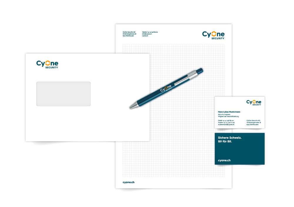
When one company becomes two, there is a lot to do. For Hug & Dorfmüller in Lucerne's Hirschengraben, the task was to create a brand from one name. On the one hand a traditional company, on the other a young company with a start-up mentality - a complex starting position. For this reason, the agency conducted a workshop on brand identity together with the newly acquired client. From this, they drew valuable information that was crucial for defining the corporate identity and thus the corporate design.
CyOne Security positions itself as the only purely Swiss company offering 360-degree security concepts and solutions for government and industry in the areas of Cipher Security, Cyber Security and Security of Things.
The logo created for CyOne Security symbolizes 360-degree competence as well as clarity, symmetry and stability. The color orange is a reference to the origin, petrol stands for competence and independence, turquoise for the lively cyber energy and the so important agility.
The introduction of the new brand took place in various stages. In a first step, the vision, mission, brand positioning and brand identity, the corporate story, the new company name and the new logo were presented to the employees. On January 1, 2019, the new website went live. Cyone.ch The newly branded social media channels are also live, a brand movie has been produced, the new offices have been moved into and the first customer event has already been held.

"Technology for Professionals." This is the new brand promise of the long-established company Heberlein, which expresses fundamental values. With the renaming of Saurer Components to the name Heberlein, the company also wanted to go back to its roots. The name Heberlein made history and still has a very good reputation in the industry.


"The basis of our daily work is the trust we have built and cultivated over more than a hundred years. We are problem solvers, offer fast response times and create real added value for our customers - they know that where it says Heberlein, high quality is guaranteed. Our products therefore stand for durability, technology and optimum cost-benefit ratio. This has been the case for over a hundred years and will remain so in the future. Thus, our business is based on a reliable, continuous and lasting partnership. Needs-oriented products and services make us the preferred system partner for your personal concerns", is the brand promise which can be found prominently on Heberlein's website.
The creative team of Nordwand developed a corporate design that combines tradition with innovation and is thus prepared for the future and worldwide market requirements. Heberlein is deliberately positioned as a competent system partner for high-tech solutions in the textile and medical industries. While the previous appearance focused primarily on the textile sector, the medical and industrial sectors are now positioned on an equal footing with the former. The new logo consists of a strong word and figurative mark. Furthermore, a brand asset was developed, which is used throughout the entire company and thus ensures optimal recognition.
In addition to the brand workshop and the creation of the corporate design, further communication tools were implemented, such as the website, trade fair stands, flyers, data sheets, car and building lettering, corporate clothing, visual language, image images, letterheads and other elements.


Responsible at Heberlein: Peter Forrer (Project Manager Rebranding), Klaus Lorenz (General Manager). Responsible at Nordwand: Silvan Widmer (Owner & Creative Director). Photography: Holger Jacob, Lucerne.

The best service meets the best material, antique letterpress and programming with an eye for detail - a tangible experience for all the senses. The characteristics and elegance of the high-quality fleet of vehicles was the central inspiration in the development of the new appearance. The elements of leather, embroidery and chrome are reflected in both the web presence and the high-end stationery. Dursun Limousine shines through the elegant combination of Gmund Cotton paper and deep embossed letterpress typography, communicating digital in the most modern language.
Responsible at Noord, agency for conception and design: Nicole Trasatti (Brand Strategy) Roger Mazzucchelli, Simon Baumann (Brand and Digital Design).
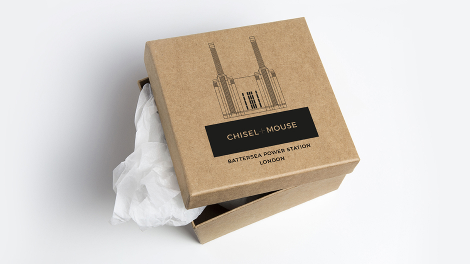
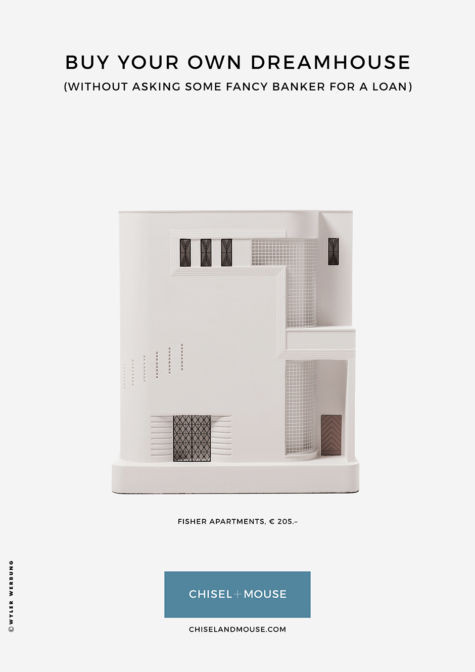
The two brothers Robert and Gavin Paisley have been designing small-scale architecture since 2011. Their range extends from the Guggenheim Museum to the Loos Villa, combining classic sculpture (chisel) and modern 3D printing (Mouse). It is now so successful that even the Times says: "A perfect gift for all friends of architecture". In addition to the logo and stationery, Wyler Werbung also created an advertising campaign that is running in selected trade magazines.

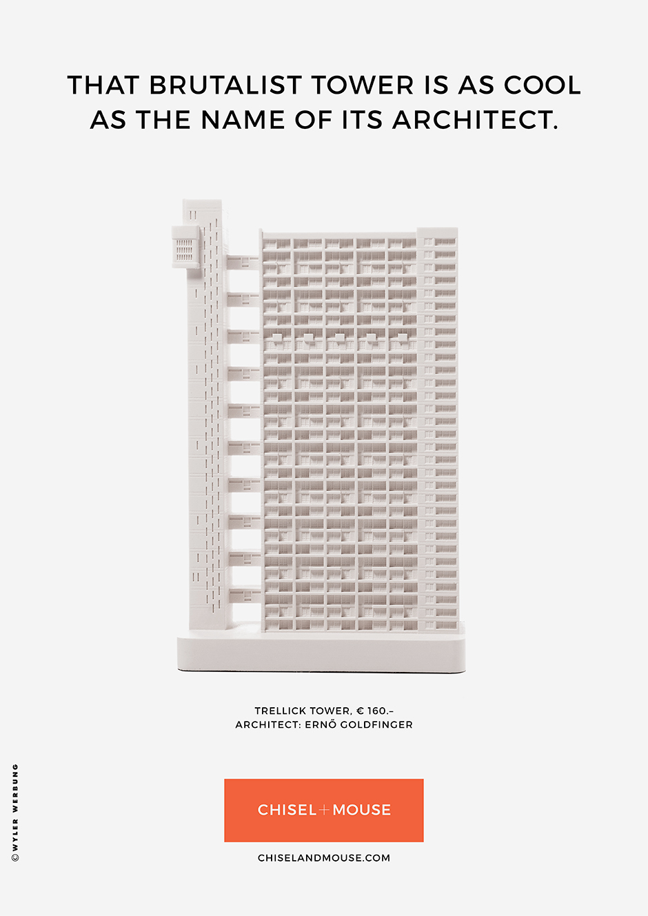
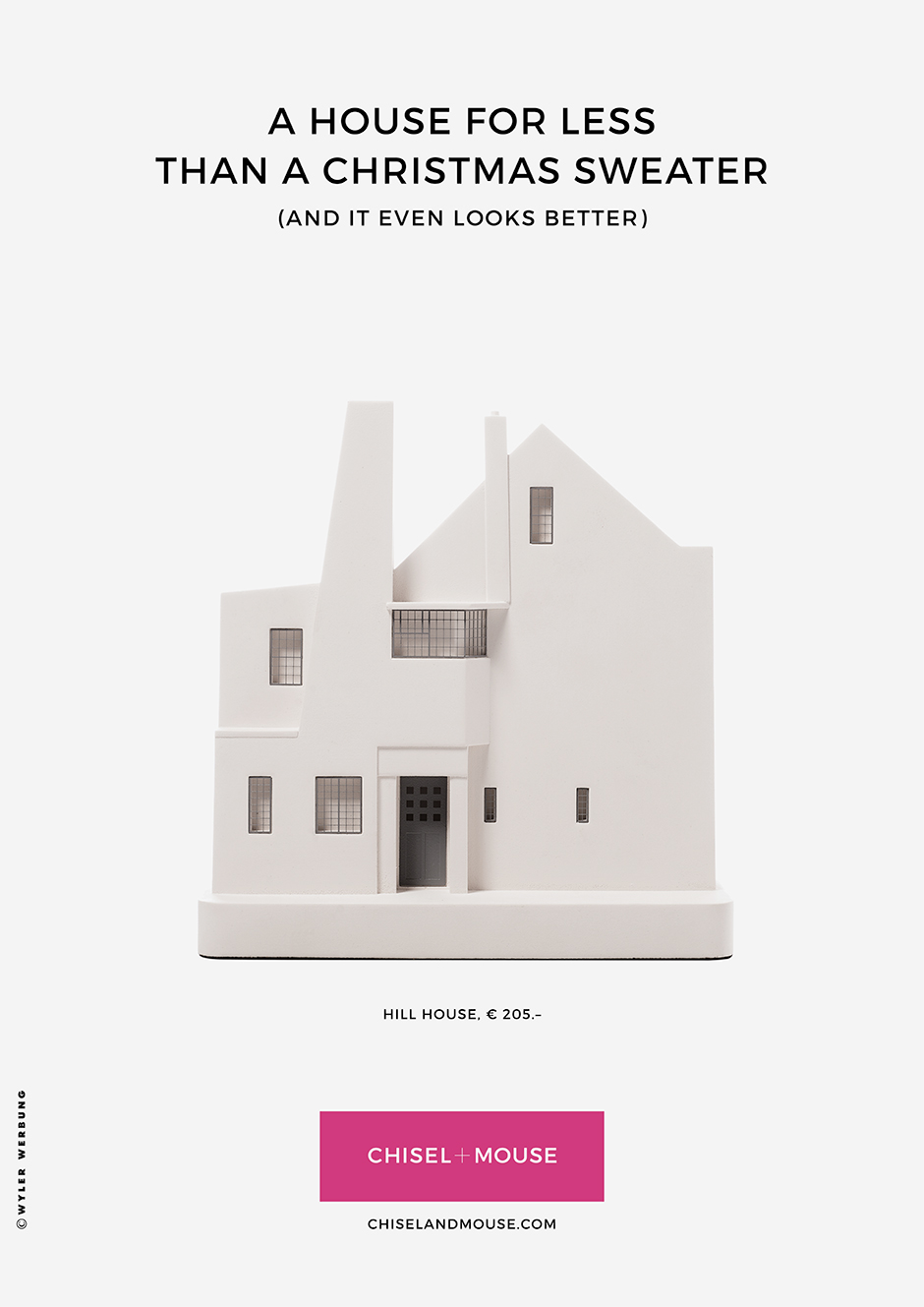
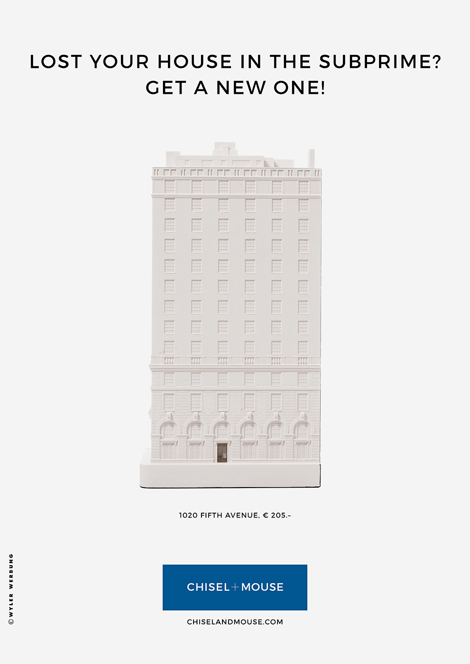
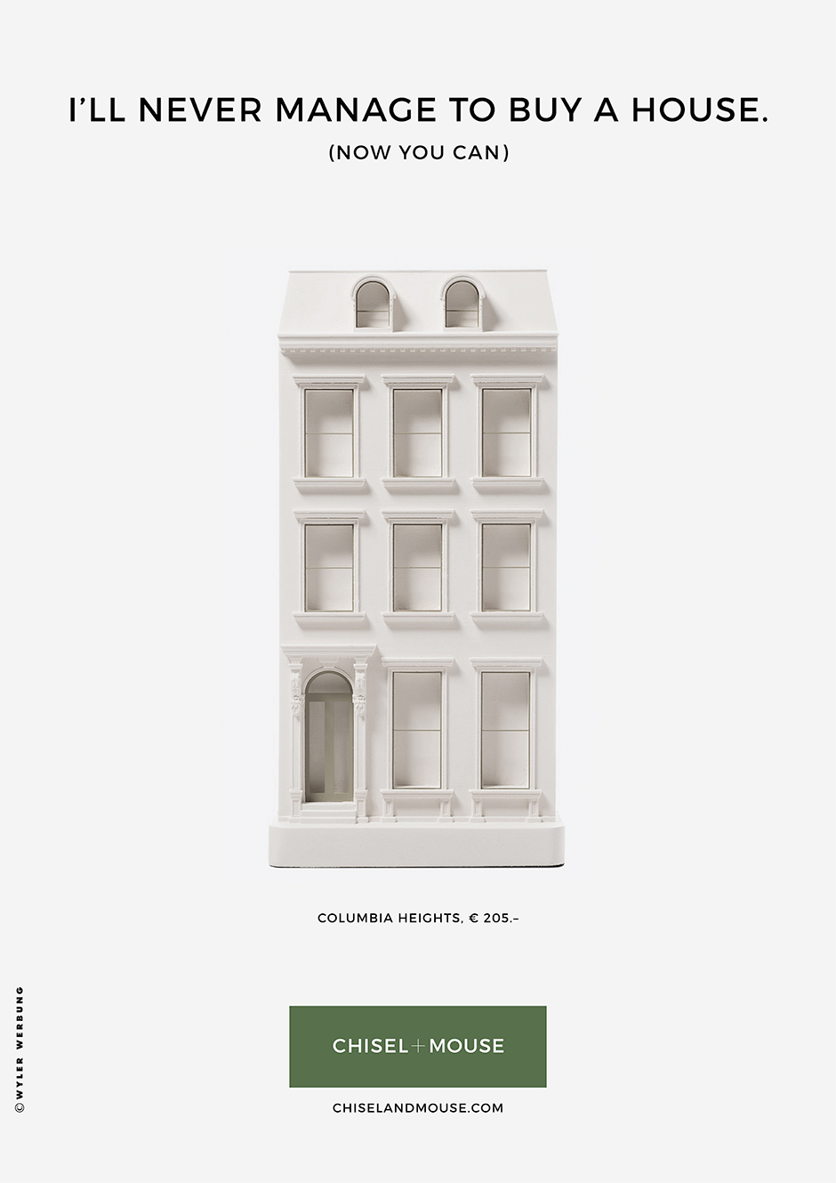
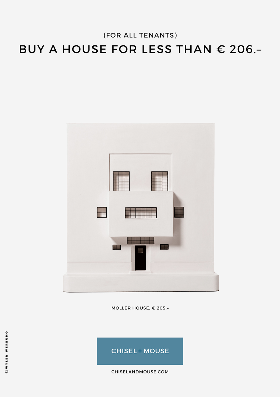
More: Chiselandmouse.com
Responsible at "Chisel + Mouse": Robert and Gavin Paisley. Responsible at Wyler Werbung: Ruedi Wyler (CD / text), Andreas Konrad (AD / text).

According to the announcement, the challenge posed by the merger of two former competitors was to build a new brand, as neither could be built upon. At the same time, the brand was to be prepared for possible national and international growth.

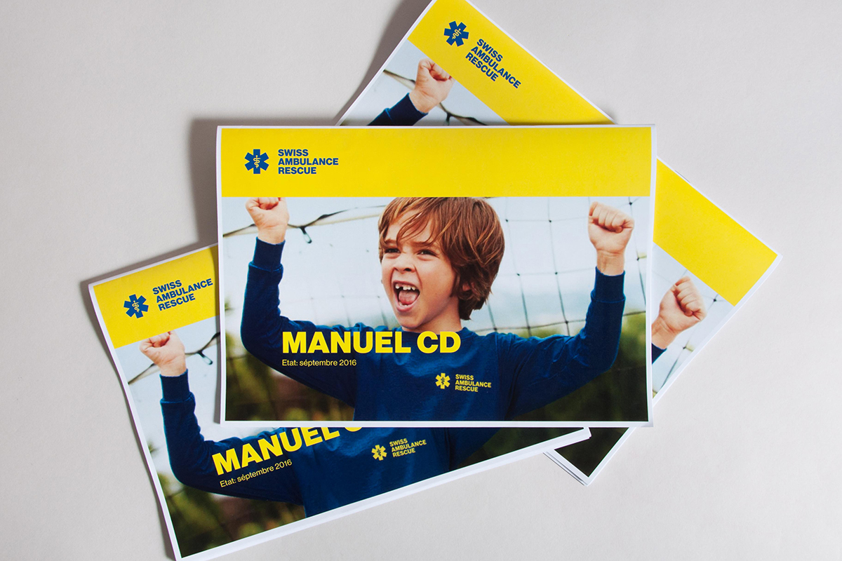
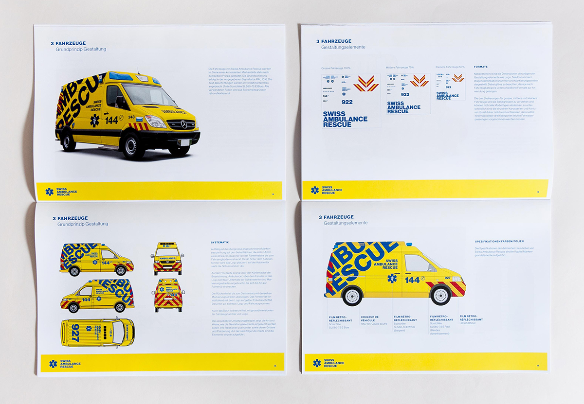
The clearly defined corporate identity process enabled the teams of both companies to be involved, fears to be reduced and motivation for the future to be generated. The new brand identity was launched in Geneva at the end of last year. The corporate design manual ensures the long-term correct brand management of the decentralized company.

Ernst Basler + Partner is considered a pioneer in sustainability. The company develops decision-making bases and solutions for the challenges of our intensively used living space, this in the broad subject spectrum of consulting, planning, construction, IT and communication. The international success as well as the long-standing practice of the web domain Ebp.ch suggested a name change. As of the end of November 2016, Ernst Basler + Partner will become EBP.

Representation of the corporate identity
EBP has been acting value-based since its foundation and is committed to the principle of interdisciplinarity and sustainability. The new brand to be created should remain connected to these values and make them visible and, above all, tangible to the outside world. The basis of the design work was thus a clear corporate identity with concise, tangible brand values and the claim "We shape the future". TBS & Partner developed this foundation together with the client: An ideal starting point to develop the new brand in a straightforward and adequate way. The resulting corporate design program encompasses all media areas. TBS & Partner not only took care of design tasks, but also worked intensively on the communicative and content-related orientation of all core media of corporate and marketing communication.


Communicating the breadth of topics
The new website Ebp.ch brings EBP's broad range of topics to life. More than 500 reference projects are either accessible by topic or can be queried via a classified search engine. The individual contributions can be collected in the download center, where they can be assembled as individualized, customer-specific reference booklets - an option that is welcome not only among customers, but also internally.

Responsible at EBP: Bruno Basler, Chairman of the Board of Directors; Daniel Schläpfer, Chief Executive Officer Switzerland, Chile and Hong Kong; Carolyn Bodmer, Head of Central Services; Kerstin Krage, Head of Corporate Communications. Responsible agency: TBS & Partners. Website: KiloKilo (frontend), Netnode (tech production).

Since its foundation in 1948, associated with the opening of the first restaurant in Zurich, Mövenpick today encompasses, in addition to a large wine and fine food offering, the hotel sector, which has now grown to become the largest company within the Mövenpick family. With the flourishing portfolio of Mövenpick Hotels & Resorts, the time was ripe for a new brand identity reflecting the roots, quality, personal touch and service of today's Mövenpick Hotels & Resorts.
London-based design agency Bulletproof was tasked with creating the new visual design, using the roots of the Mövenpick name for its implementation. Legend has it that the founder, Ueli Prager, simply named his company after the elegant movements of the seagull; the stylized bird was and has always been part of the brand logo. The Bulletproof agency now reinterpreted this element with "more depth and verve over a clear, modern brand with a contemporary adaptation of the company color."

Bulletproof explains, "The symbolic power of the bird is reflected throughout the brand. The visual identity is given a special architecture by the graceful lines of the seagull's wings and reflects the comprehensive world of Mövenpick. The curved wings are a perfect match for the Mövenpick red, bringing vibrancy and radiance to the logo and variety to hotel brochures and communications."

The launch of the new logo also brings the new service philosophy "We Make Moments" into focus for the first time. It unites the brand's vision and values and emphasizes the company's motivation to create unforgettable moments for guests. This includes, for example, typical brand signatures such as the already established "Chocolate Hour," which is held daily in the hotel lobbies as well as at events outside the hotels to treat guests to what could not be more typical of Switzerland: Chocolate in all variations. But "We make Moments" also stands for individual gestures by employees who turn "ordinary things" into something extraordinary, which was also Ueli Prager's motto.
Nick Bosworth, Vice President Brand and Marketing at Mövenpick Hotels & Resorts, says: "Mövenpick Hotels & Resorts is proud of its Swiss heritage. But in a world that is becoming increasingly global, and due to our growing number of international hotels each year, we needed a typeface that would fit all markets. Bulletproof fully understood this challenge and created a corporate identity that appeals to the modern, international guest, while still staying true to our Swiss soul and communicating us to the outside world in a lively and diverse way that matches the colorful world of travel."